Product Metrics, Root-Cause Analysis And Visualization
Asked of: Data Scientist
Last updated
What's being tested
Interviewers are probing whether you can turn ambiguous business movement into trustworthy metrics, diagnostic cuts, and clear visual evidence without over-claiming causality. For Amazon Data Scientists, this matters because decisions often depend on operational dashboards, funnel metrics, marketplace balance, recommender quality, or customer experience signals where a small metric shift can represent millions of dollars or degraded customer trust. You are expected to know how visualization tools like `Tableau` affect metric interpretation, but from an analysis layer: joins, filters, level of detail, aggregation grain, and dashboard usability. The strongest answers combine product intuition, statistical discipline, and practical dashboard design: define the metric, validate it, segment it, visualize it, and state what evidence would change your conclusion.
Core knowledge
-
Metric definition comes before visualization. For any decline or dashboard, define numerator, denominator, entity grain, time window, inclusion/exclusion rules, and refresh cadence. For example,
`conversion_rate`= orders / sessions differs materially from`buyer_conversion`= buyers / visitors. -
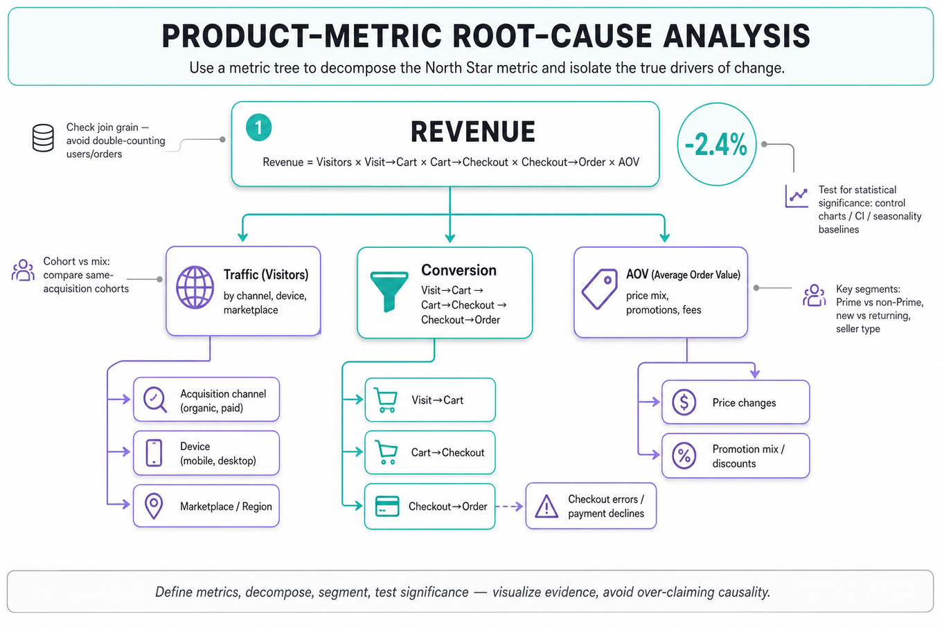
Metric decomposition is the core root-cause tool. Break aggregate movement into components:
More explicitly:`Revenue`= Visitors × Visit-to-Cart × Cart-to-Checkout × Checkout-to-Order × AOV. -
Segmentation should test plausible mechanisms, not create random slices. Common Amazon-relevant cuts include marketplace, device, acquisition channel, Prime status, new vs returning customers, category, fulfillment speed, seller type, inventory availability, and recommendation surface.
-
Cohort analysis separates mix shifts from behavior changes. Compare users acquired in the same period or exposed to the same experience, then track retention, repeat purchase, defect rate, or revenue over age. This prevents confusing “more new users” with “worse engagement.”
-
Statistical noise matters in root-cause diagnosis. Always ask whether a change is outside historical variance using confidence intervals, control charts, seasonality baselines, or year-over-year comparisons. A 2% drop in a low-volume segment may be noise; a 0.2% drop in checkout can be material.
-
Join grain can create silent metric inflation. In
`Tableau`, a physical JOIN between order-level and item-level data can duplicate rows and inflateSUM(revenue)unless the measure is pre-aggregated or calculated at the correct level. Always identify each table’s primary key before combining data. -
Relationships in
`Tableau`preserve logical tables and defer joins until query time, often reducing duplication risk when tables have different grains. They are usually safer for exploratory dashboards with facts at multiple levels, such as sessions, orders, and shipments. -
Data blending in
`Tableau`is useful when data sources cannot be physically joined, such as a`Snowflake`sales table blended with a`Google Sheets`targets file. But blends aggregate the secondary source before combining, limit row-level calculations, and can behave unexpectedly with filters. -
Filter order of operations affects what users see. In
`Tableau`, extract filters and data source filters happen early, context filters affect dependent filters and level-of-detail calculations, dimension filters happen before measure filters, and table calculations happen late. This is critical for percent-of-total and top-N views. -
Level-of-detail expressions let you control aggregation grain.
`FIXED [customer_id]: SUM([revenue])`computes customer-level revenue independent of most dimension filters unless those filters are in context. Use this when the analysis unit differs from the visualization grain. -
Chart choice should match the analytical task. Use line charts for time trends, histograms for distributions, box plots for spread and outliers, scatterplots for relationships, stacked bars sparingly for composition, heatmaps for two-dimensional intensity, and funnel charts only when stages are ordered and mutually meaningful.
-
Dashboard design should prioritize actionability. A strong operations dashboard has a top-level health metric, supporting drivers, leading indicators, freshness timestamp, alert thresholds, drill-downs by segment, and annotations for launches, outages, holidays, or policy changes.
Worked example
For “Diagnose Business Decline Using Key Data Metrics,” a strong candidate would start by clarifying the metric and context: “What declined: revenue, orders, active users, conversion, or margin? Over what time window, compared with what baseline, and is this localized to a marketplace, platform, or category?” Then they would declare assumptions, such as treating the decline as a weekly revenue drop in an e-commerce marketplace and using both year-over-year and trailing historical baselines to control for seasonality.
The answer skeleton should have four pillars: first, validate the metric pipeline and definition at the analysis level; second, decompose the aggregate metric into traffic, conversion, order value, cancellation/return, and fulfillment components; third, segment by customer, product, channel, geography, and supply-side dimensions; fourth, generate hypotheses and prioritize follow-up analyses by size of impact and reversibility. A concrete decomposition might be `Revenue` = Sessions × Conversion Rate × Average Order Value, followed by stage-level funnel checks such as product detail page views, add-to-cart, checkout start, payment success, and order confirmation.
A key tradeoff to flag is speed versus rigor: an executive diagnostic may need a same-day directional answer, but you should label findings as correlational unless backed by experiment, quasi-experiment, or a clean exogenous event. You might say, “If mobile conversion fell only after a checkout UI launch and desktop stayed flat, that is a high-priority hypothesis, but I would still check traffic mix, inventory availability, and payment error rates before assigning cause.” Close by stating what you would do with more time: build a counterfactual baseline, quantify contribution by segment, review experiment logs or launch calendars, and recommend either rollback, targeted investigation, or an A/B test.
A second angle
For “Choose Between JOIN, BLEND, and RELATIONSHIP in Tableau,” the same discipline appears through metric integrity rather than business diagnosis. The framing changes from “why did the metric move?” to “will this dashboard compute the metric at the right grain?” A strong candidate would ask what each table represents, such as one row per session, order, item, or customer, and whether measures should aggregate before or after combination. If session-level traffic is joined directly to item-level revenue, the chart may show a convincing but wrong conversion rate due to row multiplication. The transferable principle is that visualization is not cosmetic: data modeling choices determine whether the metric is analytically valid.
Common pitfalls
Pitfall: Jumping straight to anecdotes like “maybe competitors lowered prices” without decomposing the metric.
A better answer starts with the metric tree and lets evidence narrow the hypothesis space. External causes can be considered, but only after checking whether the decline is concentrated in traffic, conversion, average order value, supply availability, or post-order defects.
Pitfall: Treating
`Tableau`as a presentation tool only.
In these interviews, `Tableau` questions often test whether you understand aggregation grain, filter order, and dashboard semantics. Saying “I would use a join because it is simpler” is weak; saying “I would use a relationship because orders and shipments have different grains, and I want `Tableau` to aggregate each appropriately before combining” is much stronger.
Pitfall: Overloading dashboards with every possible metric.
An operations dashboard should not be a data dump. A stronger design distinguishes north-star metrics, driver metrics, guardrails, and diagnostic drill-downs, then uses visual hierarchy so the user can detect, localize, and act on anomalies quickly.
Connections
Interviewers can pivot from here into A/B testing, especially whether a diagnosed metric movement should be validated experimentally. They may also move into causal inference, funnel analysis, cohort retention, ranking/recommender evaluation, or anomaly detection using control charts and seasonality-adjusted baselines.
Further reading
-
Storytelling with Data by Cole Nussbaumer Knaflic — Practical guidance on choosing visual encodings and communicating analytical findings clearly.
-
The Visual Display of Quantitative Information by Edward Tufte — Classic reference on graphical integrity, data-ink, and avoiding misleading visuals.
-
Tableau Order of Operations — Essential for understanding how filters, LOD calculations, and table calculations interact.
Featured in interview prep guides
Practice questions
- Profile and visualize an unfamiliar datasetAmazon · Data Scientist · Technical Screen · medium
- Compare Tableau live vs extract and filtersAmazon · Data Scientist · Onsite · hard
- Measure PMF for Alexa ShoppingAmazon · Data Scientist · Onsite · hard
- Design an operations dashboard with justificationsAmazon · Data Scientist · Onsite · hard
- Choose Between JOIN, BLEND, and RELATIONSHIP in TableauAmazon · Data Scientist · Technical Screen · medium
- Diagnose Business Decline Using Key Data MetricsAmazon · Data Scientist · Onsite · medium
- Identify Issues and Redesign Customer-Conversion ChartAmazon · Data Scientist · Onsite · medium
- Identify Causes and Validate Web Product Performance DropAmazon · Data Scientist · Technical Screen · medium
- Choose Effective Graphs for Data ExplorationAmazon · Data Scientist · Onsite · medium
- Diagnose Causes and Test Hypotheses for Metric DropAmazon · Data Scientist · Technical Screen · medium
- Explore Dataset to Assess Quality and Choose VisualizationsAmazon · Data Scientist · Onsite · medium
Related concepts
- Product Metrics, Funnels, And KPI DiagnosisAnalytics & Experimentation
- Product Metric Design And Diagnostic Deep DivesAnalytics & Experimentation
- Product Metric Frameworks And Diagnostic AnalyticsAnalytics & Experimentation
- Product Metrics, Funnels, And SegmentationAnalytics & Experimentation
- Product Metrics, Trade-Offs, And CommunicationAnalytics & Experimentation
- Product Metrics, Guardrails, And Launch Decisions