1.1 How Take-Home Data Challenges Are Graded
Find the core decision, design, or behavior signal.
Turn the lesson into a concise response blueprint.
Name the trap you would avoid in a real interview.
Use these checkpoints as your reading path before diving into the full lesson.
- 1Why this matters in interviews
- 2The five things a grader scores
- 3What each score actually looks like
- 4What this model of grading implies
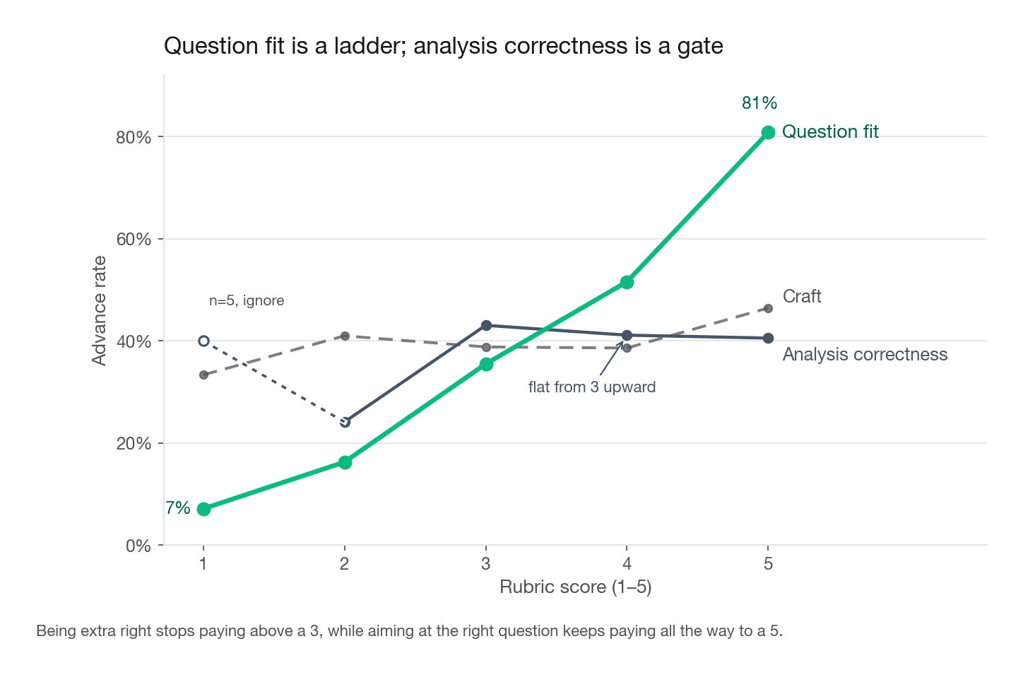
- 5Question fit has the steepest slope
A take-home is the only stage of a data science loop where nobody watches you think. There is no interviewer to nudge you back on track, no whiteboard conversation that rescues a wrong turn, and no chance to say "well, what I meant was" after the fact. You get a prompt, a table, and a deadline, and then a stranger who has never met you spends somewhere between eight and twenty-five minutes deciding whether you are worth four more hours of the company's time. This lesson is about that stranger. Specifically: what they are scoring, in what order they look at things, and how to spend a fixed budget of hours so the thing they open first is the thing that makes them say yes.
Why this matters in interviews
Candidates consistently mis-model the reader. The mental picture is a careful reviewer working through the notebook cell by cell, appreciating the elegance of a custom cross-validation splitter. The reality is a senior data scientist with four submissions in a folder, a sprint review at two o'clock, and a rubric form to fill in before they forget which candidate was which.
Here is roughly how that reader behaves. They open the write-up first, not the notebook. They read the first paragraph looking for a number and a decision. If they find one, they skim for the evidence behind it, then jump to the notebook to spot-check two or three things they are suspicious about. If they do not find a decision in the first paragraph, they start scrolling, and scrolling is where submissions die. Ninety seconds of scrolling past setup code and correlation heatmaps and the reader has already formed the sentence they will type into the rubric: "thorough but did not answer the question."
That sentence is fatal, and it is the single most common thing written about a technically competent submission.
The second mis-model is about effort. Candidates believe effort is legible and rewarded. It is not. A reader cannot see the six hours you spent reconciling two conflicting timestamp columns unless you write one sentence saying you did it and what you concluded. Unwritten work scores zero. Written work scores in proportion to how easy it is to find.
The third mis-model is about sophistication. Reaching for gradient boosting when the prompt asked why a rate moved is not a display of range, it reads as a candidate who could not decide what the question was and hedged by building something impressive. Range is shown by choosing the smallest tool that settles the question and saying out loud why the bigger tool was not needed.
Interview tip: Write the first paragraph of your write-up last, but write it as if the reader will read nothing else. Number, direction, recommendation, confidence. Four sentences maximum.
The five things a grader scores
Most take-home rubrics, whether they are written down or live in the reviewer's head, collapse to five axes. The names differ by company. The content does not.
| Axis | The question the reader is answering | Weight in practice |
|---|---|---|
| Question fit | Did this person answer the thing we asked, or a nearby thing they found more interesting? | Highest |
| Analysis correctness | Are the numbers right, and are the inferences supported by the numbers? | Gate |
| Recommendation quality | Could a PM act on this on Monday, and would that action be a good idea? | High |
| Write-up clarity | Can I follow the argument at reading speed without opening the code? | Medium |
| Craft | Does the notebook run, is it organized, are the assumptions stated? | Tiebreaker |
The word "gate" in that table is doing real work and I will come back to it. Correctness does not behave like the other axes. It is not a ladder you climb for more points, it is a floor you either stay above or fall through.
The weights also shift with seniority. For a new-grad or early-career loop, correctness carries more because the panel is checking whether you can be trusted with a query. For a senior or staff loop, question fit and recommendation quality dominate almost entirely, because the panel already assumes you can compute a rate and is checking whether you know which rate matters.
What each score actually looks like
Reviewers rarely have calibration guides, so the levels below are reconstructed from what reviewers write in the comment box.
| Axis | A 2 out of 5 looks like | A 4 out of 5 looks like |
|---|---|---|
| Question fit | A tour of the dataset with the prompt answered in one late sentence | The prompt restated in the opening, then answered directly, then supported |
| Analysis correctness | A rate computed on the wrong denominator, unnoticed | Denominators named explicitly, one sanity check shown |
| Recommendation | "The company should investigate further" | A named change, an expected effect size, and how to verify it |
| Write-up clarity | Eleven charts, no captions, reader assembles the story | Six charts, each with a one-line takeaway above it |
| Craft | Cells run out of order, hard-coded local paths | Runs top to bottom, seed fixed, assumptions listed up front |
Read the left column again. Almost none of those failures are about statistics. They are about attention and communication, which is exactly why strong analysts get rejected from take-homes and are baffled by it.
What this model of grading implies
Abstract rubric talk is easy to nod along to and hard to act on, so let us make it concrete. Below is a generator for 240 take-home submissions to Bramble, a fictional online grocery marketplace, each row scored 1 to 5 on the five axes with an advance-or-reject decision attached.
Be exact about what this is before you read a number off it. The generator encodes the model of grading I am arguing for, so the tables show what that model implies, they do not test it. Question fit is steepest because I gave it the largest coefficient, correctness plateaus because I wrote a floor into the logit, hours do nothing because they carry no coefficient. Argue with those choices, not with the advance rates: the live uncertainty is whether this model resembles a real panel, not how many rows it has. It is deterministic, so every number below reproduces exactly.
import numpy as np
import pandas as pd

SEED = 20260894
rng = np.random.default_rng(SEED)
N = 240

def band(mean, spread):                       # one 1-to-5 rubric column
    return np.clip(np.rint(rng.normal(mean, spread, N)), 1, 5).astype(int)

subs = pd.DataFrame({
    "submission_id": np.arange(1001, 1001 + N),
    "quarter": rng.choice(["2025Q1", "2025Q2", "2025Q3",
                           "2025Q4", "2026Q1", "2026Q2"], N),
    "question_fit": band(3.3, 1.05),
    "analysis_correct": band(3.5, 0.95),
    "recommendation": band(2.9, 1.10),
    "writeup_clarity": band(3.2, 1.00),
    "craft": band(3.1, 1.15),
    "hours_reported": np.clip(rng.normal(9.0, 3.4, N), 2, 24).round(1),
    "writeup_pages": np.clip(rng.normal(4.4, 2.7, N), 1, 18).round().astype(int),
})
subs["runs_clean"] = rng.random(N) < 0.62

logit = (-10.20
         + 1.00 * subs["question_fit"]
         + 0.80 * np.minimum(subs["analysis_correct"], 3)   # a floor, not a ladder
         + 0.75 * subs["recommendation"]
         + 0.45 * subs["writeup_clarity"]
         + 0.15 * subs["craft"]
         + 0.55 * subs["runs_clean"]
         - 0.16 * np.maximum(subs["writeup_pages"] - 8, 0))
subs["advanced"] = rng.random(N) < 1 / (1 + np.exp(-logit))
Ninety-five of the 240 advanced, an overall rate of 39.6 percent. That level is an artifact of where I set the intercept, so do not carry it around as a base rate for any real panel. The point is not the level, it is the shape of what separates the two groups.
Question fit has the steepest slope
def rate_by(col):
    t = subs.groupby(col)["advanced"].agg(n="size", advance_rate="mean")
    return t.assign(advance_rate=t["advance_rate"].round(3))

print(rate_by("question_fit"))
print(rate_by("analysis_correct"))
n advance_rate
question_fit
1 14 0.071
2 43 0.163
3 93 0.355
4 64 0.516
5 26 0.808
n advance_rate
analysis_correct
1 5 0.400
2 29 0.241
3 79 0.430
4 90 0.411
5 37 0.405Question fit climbs from 7 percent at the bottom to 81 percent at the top, a monotone ladder with no flat stretch. Analysis correctness does something else entirely: it jumps from 24 percent at a score of 2 to about 43 percent at a score of 3, and then stops moving. Scores of 3, 4 and 5 all land within three points of each other. The score-1 cell holds five rows, too few to read anything from.
That is the gate written out in the open: the logit caps analysis correctness at 3, and the table is what that cap looks like from outside. I put the cap there because it is what reviewers do. Being wrong disqualifies you, being extra right buys you nothing.
The cross-tab that should change how you spend hour six
The two axes above are independent by construction in this generator, so we can look at the corners.
math_no_answer = subs[(subs.analysis_correct >= 4) & (subs.question_fit <= 2)]
answer_no_math = subs[(subs.analysis_correct <= 2) & (subs.question_fit >= 4)]

for name, frame in [("clean math, missed the question", math_no_answer),
                    ("shaky math, answered the question", answer_no_math)]:
    print(f"{name:36s} n={len(frame):3d}  advance={frame['advanced'].mean():.3f}")
clean math, missed the question n= 34 advance=0.176
shaky math, answered the question n= 11 advance=0.636Thirty-four submissions had solid analysis pointed at the wrong question and 17.6 percent of them advanced. Eleven had wobbly analysis pointed at the right question and 63.6 percent advanced. Be honest about that second cell: eleven rows out of 240 is a thin corner, and 0.636 is a noisy read of the generator, not a measurement, durable only because I built the ordering in. The claim I am making lives outside the code: aiming carefully beats computing carefully, and the gap is not small.
Two things candidates think are scored
Candidates believe hours and page count both buy points. Hours carry no coefficient here, which is my claim about the real world and the reason I wrote it that way. Page count is a different story, and the difference is the mistake this lesson exists to prevent.
hours = pd.cut(subs["hours_reported"], [0, 6, 9, 12, 30],
               labels=["<6", "6-9", "9-12", "12+"])
print(subs.groupby(hours, observed=True)["advanced"]
          .agg(n="size", advance_rate="mean").round(3))
print("correlation, hours vs advanced:",
      round(float(np.corrcoef(subs["hours_reported"],
                              subs["advanced"].astype(int))[0, 1]), 3))
n advance_rate
hours_reported
<6 46 0.478
6-9 78 0.385
9-12 74 0.378
12+ 42 0.357The correlation between self-reported hours and advancing is negative 0.039, which is what an unweighted variable looks like from outside. Note the realised range, because it bounds what this generator can speak to: two hours at the bottom, 17.7 at the top, so nothing here touches a twenty-five-hour submission.
Page count gives a similar headline number, negative 0.032, and it is tempting to file the two together. Do not. Print the bands.
bands = pd.cut(subs["writeup_pages"], [0, 3, 5, 8, 20],
               labels=["1-3", "4-5", "6-8", "9+"])
print(subs.groupby(bands, observed=True)["advanced"]
          .agg(n="size", advance_rate="mean").round(3))
n advance_rate
writeup_pages
1-3 91 0.418
4-5 71 0.394
6-8 64 0.344
9+ 14 0.500Rates are flat from one to eight pages, where 226 of the 240 submissions sit. But the generator does penalise length past eight, 0.16 of log odds per page, and you can read that penalty in the code above. Only 14 submissions cross the line, and they advance at 50 percent, above the 39.6 baseline and pointing the opposite way from the penalty. Fourteen rows cannot show a penalty, or anything else.
So the near-zero correlation is not evidence that length is free, it is arithmetic: almost the whole mass sits below the threshold, so a coefficient that bites only above it barely moves the summary. The table does not kill the "more pages means more effort means more points" theory, it has no power to test it. Sit with how easy the other reading was: the correlation was right there, the bands looked flat, and the sentence wrote itself. That is the trap this lesson is about, and a real dataset makes it no less tempting.
One craft variable does move the needle:
print(subs.groupby("runs_clean")["advanced"]
          .agg(n="size", advance_rate="mean").round(3))
n advance_rate
runs_clean
False 82 0.293
True 158 0.449A submission whose notebook executes top to bottom without editing advanced at 44.9 percent versus 29.3 percent for one that did not. The 15.6 point gap is the 0.55 I put on runs_clean, so read the size as illustration. I put it there because a notebook that errors on a fresh kernel is the one defect a hurried reader always finds and always writes down. The check takes four minutes: restart the kernel, run all cells. Per minute spent, I know of no better trade in this format.
Interview tip: Budget the last twenty minutes for a kernel restart and a full re-run, and treat that budget as untouchable, ahead of any remaining modelling idea.
Answering the question that was asked
The prompt is a contract. Read it twice and write down, in your own words, the exact decision the requester wants to make. Bramble's most-used prompt reads: "Checkout conversion fell from 4.1 percent to 3.4 percent between February and April. Here is the event log and the order table. Tell us what happened and what you would do."
There are two questions in there and a hidden third. What happened is diagnostic. What you would do is prescriptive. The hidden one is: is this real, or is it a measurement artifact? A submission that never asks whether the metric definition or the instrumentation changed is missing the possibility that nothing happened at all.
Here is a weak opening, drawn from the failure pattern rather than from any one submission:
"In this analysis I explore the Bramble checkout dataset. The data contains 1.2 million events across three months. I begin with data cleaning, then perform exploratory analysis, then build a model to predict conversion."
Nothing in that paragraph is false and nothing in it is useful. It describes a process rather than reporting a finding, it makes the reader work for the payoff, and it promises a model before establishing that a model answers anything.
The stronger version:
"Checkout conversion did fall, from 4.06 percent to 3.38 percent, a relative drop of 17 percent. Roughly three quarters of that drop is composition rather than behaviour: a paid acquisition push starting 2 March roughly doubled first-session visitors, up 90 percent, and they convert at 1.9 percent against 5.2 for returning visitors. That mix shift alone moves the blended rate to 3.55, which is 0.51 of the 0.68 point fall. The remaining quarter is behavioural and I cannot explain it yet: returning-visitor conversion is flat at 5.2, while first-session conversion is down about 0.33 points, from 1.9 to 1.57. My recommendation is to report conversion split by visitor type going forward, and to judge the paid channel on cost per order rather than on its effect on the blended rate."
Six sentences, and the reader now knows the answer, the mechanism, the size, the part that is still open, and what to do. It also closes: 1.9 and 5.2 against a blended 4.06 pin February's first-session share at 34.5 percent, and 90 percent growth with returning visitors flat takes it to 50.1, which is where 3.55 comes from. Check that before you write it, because a reader will.
Notice the structure hiding in that paragraph. It is worth naming because you can reuse it on every prompt in the challenges ahead.
The third move is the one candidates skip. If composition explains 75 percent of a drop, say so, and say that the residual 25 percent is unexplained and here is what you would look at next with more time. Admitting a bounded gap reads as control. Implying you explained everything when the numbers do not add up reads as carelessness, and a reader who catches it will discount the rest.
When the prompt is deliberately vague
Some prompts are vague on purpose, because scoping is part of the test. "Here is our user table and event log. Tell us something interesting." The failure mode is producing a variety pack of eleven mildly interesting observations.
Do this instead. Pick one decision a real person at that company would face, state that you picked it and why, and answer it properly. Write the sentence explicitly: "I scoped this to the question of whether weekday and weekend signups differ enough to justify separate onboarding, because it is the one finding in this data with an obvious owner and an obvious action." You have now converted an unscored open prompt into a scored specific one, and you did it visibly.
Interview tip: When a prompt is open, spend ten minutes choosing the question and write one paragraph defending the choice, that paragraph is often worth more than the analysis that follows it.
Correctness is a gate, not a ladder
The plateau in the model above has a practical translation: past a certain point, additional rigour stops earning points and starts costing hours you needed elsewhere. The job is to clear the bar convincingly and visibly, then stop.
Readers spot-check. They do not re-derive. In practice they check four things, and if all four survive they stop being suspicious.
The denominator. Any rate you report, they will ask what is on the bottom. Conversion per session and conversion per user differ by a lot, and if you never say which one you used, a careful reader assumes you did not know there was a choice. Write it in the sentence: "conversion here is orders divided by sessions that reached the cart page."
The time window. Partial first and last periods are the most common silent error in take-homes. If your log starts mid-day on 1 February, your February daily average is wrong. Trim to complete periods and say you did.
Leakage. If you built a model, they will look for a feature that could only be known after the outcome. A refund_amount column in a fraud model, a cancellation_date in a churn model, a days_to_first_order in a signup-conversion model. This is the single fastest reject in machine learning take-homes, because a 0.99 AUC with no comment about why it is suspicious tells the reader you do not know what a suspicious result feels like.
The direction of the effect. A coefficient with an implausible sign that goes unremarked is worse than a weaker model that noticed. If price elasticity comes out positive, either you have found something and should say what, or you have a specification problem and should say that.
A short defensive block costs three minutes and neutralizes most of the spot-check:
assert orders["order_id"].is_unique, "order_id is not the grain of this table"
assert orders["order_ts"].between(WINDOW_START, WINDOW_END).all()
assert (orders["gross_amount"] >= 0).all(), "negative gross amounts present"

denom = sessions.loc[sessions["reached_cart"], "session_id"].nunique()
print(f"conversion denominator: {denom:,} cart-reaching sessions")
print("rows dropped by window trim:", n_raw - len(orders))
Put a cell like that near the top and let it print. It shows judgment rather than claiming it, and it turns your assumptions into part of the deliverable instead of into a footnote nobody reads.
Making the recommendation actionable
Recommendation quality is the second heaviest axis in the model above, and in review it is where the gap between an average and a strong candidate is widest, because most candidates stop early. I will not quote an advance rate here, because it would only be my own coefficient handed back. The claim is behavioural: an observation with no action attached reads as unfinished and the reviewer writes "so what" in the box, while a named change with a size and a way to check it reads as somebody who has done the job. That distance is one paragraph of work.
An actionable recommendation has five parts. Missing any one of them turns it back into an observation.
Compare the two versions below on Bramble's conversion prompt.
Weak: "Bramble should improve the checkout experience for new users, as new users convert at a much lower rate."
Strong: "Move address entry from step 2 to after payment for first-session visitors only. Address entry is where 38 percent of first-session carts are abandoned against 11 percent for returning visitors, but most returning visitors have a saved address and never really face the step, so that 11 percent is not a clean counterfactual. I cannot separate step ordering from lower first-session intent on this data, and intent is live here: first-session visitors convert at 1.9 percent overall against 5.2, which is what the intent story predicts. That is what the test is for, and if intent is the driver the move will not help. Sizing it on about 181,000 cart-reaching sessions a month, 100,000 of them first-session: carts that clear address entry today order at 1.9 divided by 62, about 3.1 percent, and recovered carts should convert at or below that. So a third of the 27 point gap is about 280 extra orders a month, 4.5 percent more orders, moving blended conversion from 3.38 to about 3.53 percent. This is a front-end change of maybe two sprints, and the risk is more failed deliveries, so I would gate the rollout on the address-correction rate rather than conversion alone. Run it as a 50-50 test on first-session traffic for three weeks, about 35,000 per arm, which gives roughly 80 percent power on a 0.3 point absolute lift."
The second version is not longer because it is padded. Every clause is a different rubric line: it names the mechanism, says why the comparison group is not a clean counterfactual, refuses to overclaim past what the data settles, does the arithmetic off a stated denominator, prices the work, names the failure mode, specifies the check.
The refusal is the part to steal. Naming a confound is not disposing of it, and a saved address is true under both explanations, so it is evidence for neither. Writing "which is the obvious confound and the reason I think ordering is the mechanism" cites the objection as if it were the answer, and a reader who notices spends the debrief there. "I cannot separate these on this data, here is the test that would" costs one clause and cannot be attacked.
Interview tip: If your recommendation could be pasted into a competitor's write-up without changing a word, it is not a recommendation, it is a genre convention.
Sizing when you cannot size
Sometimes you genuinely cannot estimate the effect from the data you were given. Say so, and give the reader the arithmetic anyway with the unknown left as a named variable. "Every one point reduction in first-session cart abandonment is worth about 31 orders a month: one point of 100,000 first-session cart-reaching sessions is 1,000 more carts past the step, converting at the 3.1 percent those carts already order at. So this clears two sprints if the fix recovers more than about five points, and I cannot tell from this data whether it will." That is a complete answer with an honest hole in it, and it scores far above silence. It is also the same arithmetic as the headline above, nine points at 31 orders being that 280. When a reader can convert between two of your sentences and land on different numbers, they assume the larger was picked for effect.
The shape of a submission that reads well
Send three artifacts, in this order of importance.
A write-up, two to five pages, as a PDF or a markdown file. This is the deliverable. Everything else is supporting evidence.
A notebook that runs top to bottom from a fresh kernel.
A short README saying how to run it, what the runtime is, and what versions you used.
That is it. Do not send eleven files. Do not send a slide deck and a document and a notebook covering the same ground, because the reader will find a contradiction between two of them and that contradiction becomes the thing they remember.
Inside the write-up, a structure that consistently survives contact with a hurried reader:
| Section | Length | What it must contain |
|---|---|---|
| Answer | 1 paragraph | The number, the direction, the mechanism, the recommendation |
| Assumptions | 5 to 8 bullets | Grain, window, denominators, exclusions, anything you decided for the reader |
| Evidence | 2 to 3 pages | The three or four charts and tables that support the answer, each with its takeaway written above it |
| What I would do next | Half a page | The analysis you would run with two more days, and what would change your mind |
| Appendix | Anything | Everything you could not bear to delete |
The appendix is a load-bearing device. It lets you keep the interesting side quest without letting it dilute the main line. Anything that does not directly support the answer goes there, and the reader who cares will find it.
Charts follow one rule: the takeaway goes above the chart, in a sentence, not below it in a caption and not implied by the axis labels. "First-session visitors abandon at address entry three times as often as returning visitors" above the bar chart. The reader now reads the chart to verify a claim rather than to guess one, which is roughly ten times faster.
Delete charts that do not carry an argument. The correlation heatmap of every numeric column is the most common example. It is generated in one line, it looks like work, and it says nothing a reader can act on. Six purposeful charts beat fourteen decorative ones every time.
The eight-hour budget
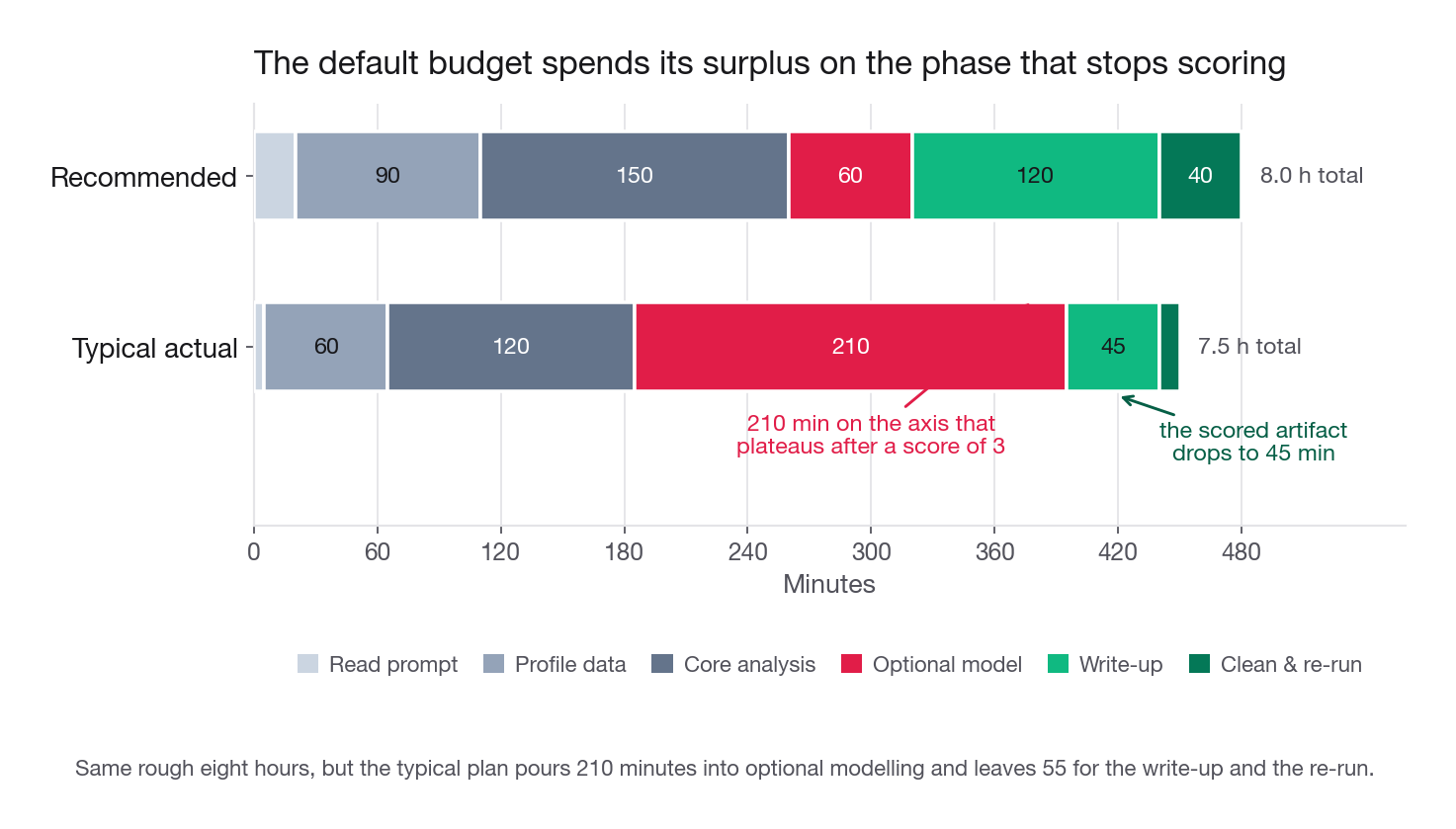
Most prompts say something like "this should take three to four hours" and most strong submissions take eight to ten. Plan for the real number and allocate it deliberately.
Two caveats, and only the first is a rule. If the prompt states a hard cap, a timed window or a line saying spend no more than four hours, respect it and submit what you have: the cap is part of the test. If the limit is guidance, the usual case, taking roughly double is normal and safe to report, because no reviewer I have worked with scores hours directly. Past two or three times the budget the worry stops being points and becomes scoping judgment, which is my judgment call rather than a measurement.
Here is an allocation that works, next to the one candidates fall into by default.
| Phase | Recommended | Typical actual | Why the gap hurts |
|---|---|---|---|
| Read prompt, write the question down | 20 min | 5 min | Scope drift starts here and never gets corrected |
| Load, profile, sanity-check the data | 90 min | 60 min | Undetected duplicate rows poison every number downstream |
| Core analysis on the stated question | 150 min | 120 min | Fine, this part is usually adequate |
| Optional model or deeper cut | 60 min | 210 min | Where four hours disappear for almost no rubric gain |
| Write-up | 120 min | 45 min | The scored artifact gets the leftovers |
| Clean, re-run, package | 40 min | 10 min | The fresh-kernel re-run, forfeited |
The default allocation spends its surplus on the axis that plateaus and starves the two axes that do not. That single misallocation explains more rejections than any statistical error.
Triage when you are behind
You will run out of time. Everyone does. The order of sacrifice matters, so decide it now rather than at midnight.
Cut first: the second model, hyperparameter tuning, the extra segmentation cut, the interactive plot, refactoring your functions.
Cut second: one of your evidence charts, the appendix, the alternative explanation you were going to test.
Never cut: the opening answer paragraph, the assumptions list, the recommendation, the fresh-kernel re-run.
If you are truly out of time, a three-page write-up with a clear answer and an honest "here is what I did not get to" section beats a sprawling notebook with no summary by a wide margin. State the gap explicitly: "I did not test whether the effect holds in the two smaller regions, which is the first thing I would check with more time." Readers respect a stated limitation. They punish an unstated one, because the second one makes them wonder what else you did not notice.
Interview tip: Write the "what I would do next" section at hour four, not hour nine, so it reflects real curiosity rather than exhaustion.
When the data is ambiguous
Every real take-home dataset contains at least one thing that does not make sense. That is deliberate. How you handle it is a scored signal, arguably the purest test of the job in the whole exercise.
The three ambiguities that show up most often:
Contradictory columns. Two timestamps that should agree and do not for 3 percent of rows. Do not silently pick one. Quantify the disagreement, look at whether the disagreeing rows differ in any other way, pick the one you trust with a stated reason, and note the size of the population you might be mishandling.
Impossible values. Negative quantities, ages of 200, orders timestamped before the account existed. Count them, decide, and say what you decided. If it is 0.2 percent of rows, dropping is fine and takes one sentence. If it is 8 percent, dropping is a decision with consequences and needs a paragraph, because whatever process produced those rows may also be producing subtler errors in rows that look fine.
Missingness with meaning. A null in promo_code almost certainly means no promo was used, not that the value was lost. A null in delivery_rating probably means the survey was not answered, which is not random. Say which kind of null you think you have, because treating an informative null as a missing-at-random one is the error that silently biases half the take-homes ever submitted.
Make the handling visible with a single structure near the top of the notebook, mirrored as bullets in the write-up:
ASSUMPTIONS = {
    "grain": "one row per completed order; 73 duplicate order_ids dropped, 0.4% of rows",
    "window": "trimmed to 2026-02-01 through 2026-04-30, both endpoints complete days",
    "denominator": "sessions that reached the cart page, not all sessions",
    "promo_null": "treated as 'no promo applied' rather than missing",
    "negative_amounts": "1,043 rows with gross_amount < 0 kept and read as refunds",
    "timezone": "all timestamps converted from UTC to the account's local zone",
}
for key, note in ASSUMPTIONS.items():
    print(f"- {key}: {note}")
That dictionary costs you six minutes and does four jobs at once. It documents decisions, it gives the reader something to disagree with productively, it stops you from forgetting what you decided at hour two, and it prints into the notebook so the evidence is inline rather than in your head.
There is a subtle scoring benefit too. When a reader disagrees with one of your choices but can see that you made it deliberately, they write "reasonable call, I would have gone the other way" in the comment box. When they cannot tell whether you noticed, they write "unclear whether the candidate checked." The first is neutral. The second is a reject.
Notebook hygiene and reproducibility
Craft is the axis I weight lowest, and the model above reflects that: its five levels wander between 33 and 46 percent with no reliable trend, which is what a 0.15 coefficient looks like once noise sits on top. Beautiful code does not get you hired. The one binary craft variable, whether the notebook runs, is the exception, and it is the exception in review too. The asymmetry is the lesson: nobody rewards elegance, everybody punishes breakage.
The minimum bar, and this genuinely is the whole list:
Two of those deserve a word. Saving outputs matters because a meaningful share of readers never execute your notebook at all. If your cells are cleared, they see code and nothing else, and your careful chart of the seasonal decomposition simply does not exist for them.
The seed rule matters because irreproducible numbers undermine everything else you claimed. If your write-up says the model reaches 0.81 AUC and the reader's run produces 0.77, that is now the topic of the debrief instead of your recommendation.
A header cell that costs ninety seconds:
import sys, platform
import numpy as np, pandas as pd, sklearn

SEED = 20260894
np.random.seed(SEED)

print("python  :", platform.python_version())
print("numpy   :", np.__version__)
print("pandas  :", pd.__version__)
print("sklearn :", sklearn.__version__)
print("seed    :", SEED)
print("runtime : full run takes about 4 minutes on a laptop")
One more habit worth building: put the load step behind a function with the raw row count printed. If a reader points at a number and you cannot say how many rows produced it, the conversation gets uncomfortable fast, and the debrief conversation is a real part of this process. Many companies bring you in to present the take-home, and every unlabeled decision becomes a question you have to answer live.
Scope control
Scope is the skill this exercise is actually testing, more than modelling and more than SQL. A take-home has no natural end, so the candidate who cannot stop produces a submission with no shape.
Three rules that hold up:
One question, answered completely, beats four questions answered partially. If you find a genuinely interesting second thread, it goes in the appendix with two sentences, not into the main line.
One model, not three. If you build a model, build one, justify why that family fits the question, and spend your remaining effort on interpreting it rather than on beating it by 0.004 AUC. A logistic regression with well-chosen features and a clear reading of the coefficients outscores a tuned ensemble with a feature-importance bar chart and no interpretation, because the second one answers "which model wins" and nobody asked that.
Every chart earns its place. Before you keep a chart, say the sentence it supports out loud. If you cannot, delete it. This one rule usually removes a third of a first draft.
There is a version of scope control that is really about ego. The urge to show range, to demonstrate that you know about survival analysis or causal forests, is strong and it is almost always wrong in this format. Range is a live-interview thing, where an interviewer can ask a follow-up. In a take-home, unrequested sophistication reads as poor judgment about what the reader needs, and judgment is the thing being graded.
Common traps
A trap here means something that reliably costs points and that a competent analyst still walks into.
The process narrative. Structuring the write-up as a chronological account of what you did, cleaning then exploring then modelling. The reader does not care about your journey. Fix: structure by conclusion, with the answer first and the method as support.
The undeclared denominator. Reporting a rate without saying what it is divided by. Fix: name the denominator in the same sentence as the rate, every single time.
The partial period. Averaging over a window whose first or last day is incomplete. Fix: print the min and max timestamps early, trim to whole periods, state the trim in the assumptions.
Silent row drops. Filtering out nulls or outliers without recording how many disappeared. Fix: print the row count before and after every filter, and put the total drop in the assumptions list.
Leakage in a model. A feature that encodes the outcome. Fix: for every feature, ask when it becomes known relative to the prediction moment, and delete anything that fails. Treat any AUC above about 0.95 on a messy business problem as a bug report about your feature set until proven otherwise.
Correlation stated as cause. "Users who use the mobile app retain better, so we should push the app." Fix: name the obvious confound yourself, in the same paragraph, and say what would distinguish the two explanations. Naming the confound is worth more than the finding.
Metric drift. Answering with a metric adjacent to the one asked, revenue when they asked about conversion, because your metric was easier to compute. Fix: quote the prompt's metric verbatim in your opening line.
The unlabeled chart wall. Nine charts, no takeaways, reader assembles the argument. Fix: one sentence above each chart stating what it shows, then delete any chart whose sentence you could not write.
The over-hedged conclusion. "Further investigation is needed before drawing firm conclusions." Fix: commit to the most likely explanation, state your confidence, and put the caveat in one clause rather than in place of an answer.
The notebook that does not run. Cells executed out of order, a dataframe defined in a deleted cell, an absolute path to your desktop. Fix: fresh kernel, run all, fix everything that breaks, then package.
Blowing past the stated time limit and then advertising it. Twenty-five hours on a four-hour prompt, and saying so. Fix: report the real number, and if it is far above the budget add one line on what you would have cut to hit it, for example "this took eleven hours; to land it in four I would have skipped the regional cut and shipped the diagnostic alone." That turns an overrun into evidence you can scope, which is the thing being doubted. Do not go quiet about hours instead: an unstated overrun is the same defect as an unstated limitation. Where exactly the line sits is a judgment call, not something measured on this page.
Quick self-check
Answer these out loud before you submit anything. If any one of them makes you pause, you have found your highest-value remaining edit.
Read only your first paragraph. Does it contain a number, a direction, a mechanism, and a recommendation? Could a reader who stops there still act?
Point at any rate in your write-up. Can you say its denominator and its time window without opening the notebook?
What did you decide about the ambiguous part of this dataset, and where in the submission is that decision written down where a reader will actually see it?
Name the confound that most threatens your main finding. Did you address it in the text, or are you hoping the reader does not think of it?
If your recommendation were implemented next sprint, what one metric would tell you within a month whether it worked, and did you say so?
Have you restarted the kernel and run every cell top to bottom since your last edit?
The next lesson turns this into a repeatable opening pass: the specific profiling, sanity-checking, and hypothesis-writing you do in the first two hours of any of the challenges that follow, so that the remaining six hours have somewhere to go.