1.2 The First Two Hours: EDA That Earns Points
Find the core decision, design, or behavior signal.
Turn the lesson into a concise response blueprint.
Name the trap you would avoid in a real interview.
Use these checkpoints as your reading path before diving into the full lesson.
- 1What this lesson is for
- 2The shape of the two hours
- 3Step 1: Load so you can see the damage
- 4Step 2: Establish the grain
- 5The three species of duplicate, and wha...
The clock starts and you have a CSV, a two-paragraph prompt, and no idea whether the file matches what the prompt claims. Most candidates spend the first two hours making charts. That is backwards. The first two hours are for finding out whether the file can answer the question at all, and for writing down what you will test once you know. This lesson gives you a fixed opening pass to run on every challenge in this course without thinking, so your thinking goes to the parts that are specific to the problem.
What this lesson is for
The previous lesson covered how a grader reads your submission. This one covers the two hours that decide whether there is anything worth reading.
Here is the failure this pass prevents. A candidate loads a signup export, sees 31,482 rows, computes an 8.8 percent purchase rate, splits it by acquisition channel, finds paid search worst, and recommends cutting paid search spend. Every step is arithmetically correct and every conclusion is wrong, because the extract job replayed 1,482 rows, the replay was concentrated in one channel, and inside that channel it favoured the users who had converted. Deduplicate first and the base rate is 7.9 percent, paid search sits unremarkably in the middle of the pack, and the channel that genuinely underperforms is paid social, which the careless read left funded. The candidate never checked. The reviewer checked in ninety seconds, because checking is the first thing an experienced person does.
The pass has seven steps and one hard exit condition: three written hypotheses. Not three charts, not a cleaned dataframe. Three sentences of the form "I think X is happening because Y, and if I am right then Z is true in the data." Everything before that exists to let you write those sentences.
The pass also buys written evidence of judgment, which every graded axis rewards. Blank 120 rows with negative session durations silently and you look like someone who did not notice. Blank them and add one line saying the field is a duration, negatives are impossible, they are 0.4 percent of rows, and the headline rate does not move, and you look like someone who audits inputs. Same work, different score.
Interview tip: Keep a running list called "decisions" from minute one, one line per judgment call, and paste it into the write-up as an appendix. It costs nothing and it is the cheapest credibility you will ever buy.
The shape of the two hours
Two hours buys one disciplined pass and no exploration for its own sake. Here is how the time splits when the pass is done well.
The order matters more than the individual steps, because every step inherits the errors above it. A base rate computed before dedup sits on the wrong denominator. A driver scan run before the range check will cheerfully report that users aged 214 convert well. Out of order, the pass does not just waste time, it manufactures confident wrong numbers, which is how a submission fails the correctness gate.
A rough clock for a challenge with one or two tables:
| Step | Minutes | What "done" means |
|---|---|---|
| Load and first look | 10 | Every column has a type you chose, and you have read the column names out loud |
| Grain and duplicates | 20 | You can state what one row is and how many rows disagree with that |
| Ranges and impossible values | 15 | Every numeric has a stated plausible range and you know the violation count |
| Missingness | 20 | Every column with missing values has a one-word verdict next to it |
| Target audit | 15 | Base rate, denominator, and the segment-size floor are written down |
| Driver scan | 30 | One table, every candidate driver, rate and interval per level |
| Hypotheses | 10 | Three sentences, each with a kill criterion |
That fills two hours with nothing left over for a heatmap, which is intentional.
Step 1: Load so you can see the damage
The default pd.read_csv call is built to hand you a dataframe, not a correct one. It coerces mixed columns to object, strips the leading zero off an ID and calls it an integer, and parses nothing as a date unless told. Each of those is a bug you meet forty minutes later while wondering why a join dropped half your rows. Load with types declared, dates parsed on purpose, and the raw frame kept aside so you can always answer what the file actually said.
Everything below uses Thicket, a fictional marketplace for secondhand books. The prompt: here are Q1 signups, one row per user, tell us which acquisition channels deserve more budget. The block below builds that dataset deterministically, so every number quoted later reproduces exactly. Its closing lines inject the two defects this lesson exists to catch: impossible values in two numeric columns, and an extract replay that duplicated rows non-randomly.
import numpy as np
import pandas as pd

SEED = 4417
rng = np.random.default_rng(SEED)
N = 30000

src = rng.choice(["organic", "paid_search", "paid_social", "referral", "email", "direct"],
                 N, p=[.28, .22, .18, .09, .08, .15])
dev = rng.choice(["desktop", "mobile_web", "ios", "android"], N, p=[.31, .34, .19, .16])
signups = pd.DataFrame({
    "user_id": rng.permutation(900000 + np.arange(N)),
    "signup_ts": pd.Timestamp("2026-01-01") + pd.to_timedelta(rng.integers(0, 129600, N), unit="m"),
    "source": src,
    "country": rng.choice(["US", "GB", "DE", "IN", "BR"], N, p=[.46, .14, .11, .19, .10]),
    "device": dev,
    "age": np.clip(rng.normal(34, 11, N), 13, 88).round().astype(int),
    "first_session_pages": rng.poisson(4.2, N),
    "first_session_seconds": np.round(rng.lognormal(4.6, 0.9, N)).astype(int),
    "referrer_domain": np.where(np.isin(src, ["organic", "paid_search"]), "search.example",
                                np.where(src == "referral", "partner.example", None)),
    "promo_code": np.where(rng.random(N) < 0.21, "SPRING10", None),
    "shipping_zone": rng.choice(np.array(["z1", "z2", "z3", None], dtype=object),
                                N, p=[.42, .33, .21, .04]),
})
lo = (-3.05 + 0.42 * (src == "email") + 0.36 * (src == "referral") - 0.28 * (src == "paid_social")
      + 0.07 * signups["first_session_pages"] + 0.55 * signups["promo_code"].notna()
      + 0.24 * np.isin(dev, ["ios", "desktop"]))
signups["purchased_14d"] = (rng.random(N) < 1 / (1 + np.exp(-lo))).astype(int)
bad = rng.choice(N, 240, replace=False)
signups.loc[bad[:120], "age"] = rng.choice([0, 3, 214, -1], 120)
signups.loc[bad[120:], "first_session_seconds"] = -1
w = np.where((signups["source"] == "paid_social") & (signups["purchased_14d"] == 1), 60.0,
             np.where(signups["source"] == "paid_social", 1.0, 0.25))
dupes = signups.sample(1482, weights=w, random_state=7).copy()
dupes["device"] = "mobile_web"
signups = pd.concat([signups, dupes], ignore_index=True)
Treat that frame as read-only and build a clean copy for analysis. Two frames instead of one costs a few megabytes and saves the moment where you cannot reconstruct what a number looked like before you filtered. The first look is three commands and under a minute:
print(signups.shape)
print(signups.dtypes)
print(signups.head(3).T)
Read the column names out loud. first_session_seconds and first_session_pages share a prefix, so they come from one upstream event source and will fail together. promo_code is a code, not a flag, so its absence carries meaning. signup_ts implies a window, and windows have edges. All of that from names alone, before a single aggregation.
Interview tip: If a column name is ambiguous, write the ambiguity into the submission rather than picking a meaning silently: "I read first_session_seconds as time on site during the signup session, not total lifetime seconds; the analysis is not sensitive to which."
Step 2: Establish the grain
Grain is the sentence saying what one row is. The prompt claims one grain and the file often has another. Reconciling them is the highest-value twenty minutes in the challenge, because everything after it is a rate, every rate has a denominator, and the denominator is the grain.
Ask five questions, in this order.
| Question | How to answer it | What a bad answer means |
|---|---|---|
| What does the prompt say one row is? | Read the prompt again, literally | You are about to analyze a different dataset than the one they asked about |
| Is the claimed key unique? | df[key].nunique() against len(df) | The grain is finer than claimed, or the extract double-counted |
| Are there fully identical rows? | df.duplicated().sum() | A pipeline replay or a union without a distinct |
| Do duplicate keys have different payloads? | Group by key, count distinct values per column | Slowly changing attributes, or a join fan-out |
| Does the row count match any external anchor? | Compare to a stated total, or to sum of a breakdown | The extract is filtered or partial and nobody told you |
Run it on Thicket:
print(len(signups), signups["user_id"].nunique())
print("exact duplicate rows:", signups.duplicated().sum())
dup_keys = signups[signups.duplicated("user_id", keep=False)]
print("rows involved in key collisions:", len(dup_keys))
varies = dup_keys.groupby("user_id").nunique(dropna=False).max()
print(varies[varies > 1])
31482 30000
exact duplicate rows: 489
rows involved in key collisions: 2964
device 2
dtype: int64That is the whole story. The prompt promised one row per user. The file has 31,482 rows and 30,000 users, so 1,482 rows are extra. Of those, 489 are byte-for-byte identical, which is a replay or a union without a distinct. The other 993 differ in exactly one column, device, the signature of a user re-recorded on a second device. Nothing else varies, so this is not a slowly changing dimension carrying real history, it is noise.
The three species of duplicate, and what to do with each
| Species | Signature | Correct move | What you write |
|---|---|---|---|
| Exact duplicate | Every column identical | drop_duplicates() | "489 byte-identical rows removed, almost certainly an extract replay" |
| Key duplicate, one field varies | Same key, one attribute differs | Pick a rule and state it | "Kept the earliest row per user; device is not the unit of analysis here" |
| Key duplicate, many fields vary | Same key, several attributes differ | Do not dedup yet, the grain is finer than you thought | "The file is one row per session, not per user; I aggregated to user before rating" |
The third case is the dangerous one, because dedup destroys real information there. If a user genuinely has three sessions with different page counts, collapsing to one row discards two thirds of the behavioural signal. The tell is how many columns vary within a key: one is usually a defect, four is usually a finer grain.
Here it is one, so dedup is safe:
clean = (signups.sort_values("signup_ts", kind="stable")
                .drop_duplicates("user_id", keep="first")
                .reset_index(drop=True))
print(len(clean))
kind="stable" is not decoration, it is the whole rule. A replayed row carries the same signup_ts as its original, so "keep the earliest row per user" is a tie on every one of the 1,482 duplicated keys, and sort_values defaults to quicksort, which is not stable. Drop the argument and the tie breaks arbitrarily: on the build I ran, 507 of the 993 device-differing pairs resolve to the replayed row, so more than half the rows you believe you cleaned still carry the overwritten device, and nothing raises. The count is not even reproducible, because quicksort's tie order is implementation defined, so the same script can disagree with itself across machines. A stated rule that the code does not actually implement is the exact silent cleaning failure this lesson is about, hiding inside the line that was supposed to prevent it.
Now the part most candidates skip: check whether the duplicates were random. If they were not, every breakdown computed before deduping is skewed.
before = signups["device"].value_counts(normalize=True).round(4)
after = clean["device"].value_counts(normalize=True).round(4)
print(pd.concat({"raw": before, "dedup": after}, axis=1))
raw dedup
device
mobile_web 0.3689 0.3377
desktop 0.2958 0.3104
ios 0.1823 0.1913
android 0.1530 0.1605Mobile web's share falls 3.1 points after dedup, because every duplicate row carried device = "mobile_web". That is the visible half. The damaging half is that the rate inside mobile web falls from 9.44 to 6.95 percent, which says the replayed rows were not a random slice of the file, they were disproportionately purchasers. Duplicates that copy the outcome move rates, not just counts. So run the same comparison on the dimension the prompt actually asks about.
raw_rate = signups.groupby("source")["purchased_14d"].mean().round(4)
dedup_rate = clean.groupby("source")["purchased_14d"].mean().round(4)
print(pd.concat({"raw": raw_rate, "dedup": dedup_rate}, axis=1).sort_values("dedup"))
raw dedup
source
paid_social 0.1028 0.0594
paid_search 0.0752 0.0747
direct 0.0769 0.0758
organic 0.0832 0.0827
referral 0.1043 0.1026
email 0.1042 0.1042Six rows, and the recommendation inverts. Before dedup, paid social reads 10.28 percent and sits fourth of six, so the worst channel looks like paid search at 7.52. After dedup, paid social is 5.94 percent and dead last by a point and a half, and paid search is ordinary. The blended rate moves as well, 8.81 percent raw against 7.93 percent clean. The replay re-emitted paid social conversion rows, all 321 of them, so the channel carrying the defect is exactly the channel the defect flatters. The other five channels move by at most 0.2 points, because their replays were roughly representative of the channel instead of skewed toward buyers. A candidate who skips this step cuts paid search, keeps paid social, and is confidently wrong in the direction that costs money. That is the opening story of this lesson, and it is one skipped check away from anybody. A reviewer can tell whether your number came from rigour or luck by whether you showed this comparison.
Interview tip: State the grain in one sentence at the top of the write-up, in the form "one row is one X, after removing Y duplicate rows because Z." Reviewers look for that sentence specifically.
Step 3: Impossible values and the edges of the window
A range check is not "read describe() and nod". For each numeric column, write the range a value could physically take, then count violations. The writing-down step is what makes it work, because the plausible range comes from domain reasoning, not from the data.
| Column | Physically possible range | Violations found | Verdict |
|---|---|---|---|
age | 13 to 100 for a marketplace with an age gate | 120 of 30,000 | 0.40 percent, set to missing rather than drop the row |
first_session_seconds | 0 or more, a duration cannot be negative | 120 | Sentinel for "not captured", set to missing |
first_session_pages | 0 or more, small integers | 0 | Clean |
signup_ts | Inside the stated Q1 window | 0 | Clean, but see the window edges below |
purchased_14d | Exactly 0 or 1 | 0 | Clean |
The code is short and worth having as a habit:
rules = {
    "age": (13, 100),
    "first_session_seconds": (0, 7200),
    "first_session_pages": (0, 200),
}
for col, (lo_ok, hi_ok) in rules.items():
    bad_mask = (clean[col] < lo_ok) | (clean[col] > hi_ok)
    print(f"{col:24s} violations={bad_mask.sum():5d}  "
          f"pct={bad_mask.mean()*100:5.2f}  "
          f"target_rate={clean.loc[bad_mask, 'purchased_14d'].mean():.4f}")
    clean.loc[bad_mask, col] = np.nan
Two details earn points. It blanks violations rather than dropping rows, which keeps the row usable for every other column; dropping whole rows over one broken field shrinks your sample and biases it toward users with complete instrumentation. And it prints the target rate among the violators. If impossible ages convert at 25 percent against a base of 8, that is not corruption, it is a distinct population of bots or test accounts, which is a finding rather than a cleaning step.
The calendar edge nobody checks
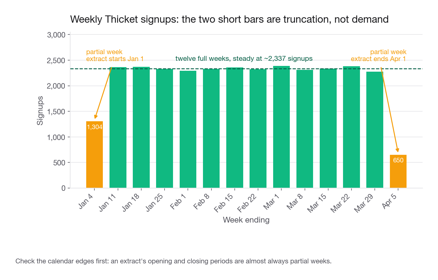
Extracts get cut on a date boundary, so the first and last periods are almost always partial. Check weekly volume before plotting any trend:
weekly = clean.set_index("signup_ts").resample("W").size()
print(weekly.head(3))
print(weekly.tail(2))
signup_ts
2026-01-04 1304
2026-01-11 2365
2026-01-18 2368
Freq: W-SUN, dtype: int64
signup_ts
2026-03-29 2273
2026-04-05 650Steady at roughly 2,350 per week in the middle, 1,304 in the first partial week, 650 in the last. Plot that without noticing and your chart shows a collapse at quarter end that you will be tempted to explain. There is nothing to explain, it is a truncated week.
Truncation attacks the target too, more subtly. purchased_14d needs fourteen days of observation after signup, so users who signed up in the final two weeks have an outcome that is either mechanically zero or genuinely unknown, depending on how the extract was built. Check before you trust the base rate:
last_day = clean["signup_ts"].max().normalize()
cohort = clean.assign(days_left=(last_day - clean["signup_ts"]).dt.days)
print(cohort.groupby(cohort["days_left"] < 14)["purchased_14d"].agg(["size", "mean"]).round(4))
If the recent cohort's rate is visibly lower, the outcome window is incomplete, and the honest move is to restrict to signups with a full fourteen days of follow-up, say so, and report the rows it cost. Here the two rates match within 0.3 points, which is itself worth a line: "I verified the outcome window is complete; recent and older cohorts convert within 0.3 points of each other."
Step 4: Missingness is a variable, not a nuisance
Most candidates treat missing values as an obstacle between them and a model: impute the median, move on. That discards one of the most reliably informative signals in any real dataset, and it is a cheap place to separate a good answer from a merely competent one. Start with the profile:
miss = pd.DataFrame({
    "pct_missing": clean.isna().mean().round(4),
    "n_missing": clean.isna().sum(),
})
print(miss[miss["n_missing"] > 0].sort_values("pct_missing", ascending=False))
pct_missing n_missing
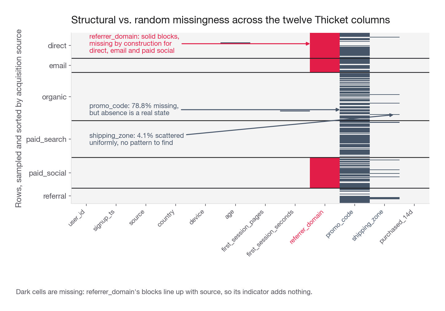
promo_code 0.7879 23636
referrer_domain 0.4123 12370
shipping_zone 0.0409 1226
age 0.0040 120
first_session_seconds 0.0040 120Now the part that earns the point. For each column, ask one question: does being missing predict the target? Two lines of code, and the answer determines your whole handling strategy.
base = clean["purchased_14d"].mean()
for col in ["promo_code", "referrer_domain", "shipping_zone"]:
    m = clean[col].isna()
    print(f"{col:18s} missing%={m.mean():6.3f}  "
          f"rate_when_missing={clean.loc[m, 'purchased_14d'].mean():.4f}  "
          f"rate_when_present={clean.loc[~m, 'purchased_14d'].mean():.4f}  "
          f"base={base:.4f}")
promo_code missing%= 0.788 rate_when_missing=0.0705 rate_when_present=0.1122 base=0.0793
referrer_domain missing%= 0.412 rate_when_missing=0.0744 rate_when_present=0.0828 base=0.0793
shipping_zone missing%= 0.041 rate_when_missing=0.0783 rate_when_present=0.0794 base=0.0793Three columns, three different verdicts.
promo_code is missing for 78.8 percent of users, who convert at 7.05 percent against 11.22 percent for code holders. A 4.2 point gap on a 7.9 percent base is enormous. This is not a data quality problem, it encodes a real state: the user did not redeem a promo. Handle it with a binary has_promo feature, and name the confound in one sentence, that redemption is downstream of intent, so the gap is not the causal effect of promos.
referrer_domain is missing for 41.2 percent, and those users convert slightly worse. But look at why:
print(pd.crosstab(clean["source"], clean["referrer_domain"].isna()))referrer_domain False True
source
direct 0 4483
email 0 2486
organic 8451 0
paid_search 6478 0
paid_social 0 5401
referral 2701 0Missingness is a deterministic function of source: direct, email, and paid social have no referrer by construction. This is structural, and the apparent signal in the indicator is source in disguise. Adding referrer_missing alongside source contributes a collinear column and zero information. Say so and drop it.
shipping_zone is missing for 4.1 percent with a 0.11 point rate gap, well inside noise. This one really is close to missing at random. Impute or leave it, either is defensible, and neither deserves more than a sentence.
The last row matters most. Missingness that appears suddenly in time is almost always a logging change, which means the periods either side are not comparable. Checking it is one line, clean.groupby(clean["signup_ts"].dt.to_period("W"))[col].apply(lambda s: s.isna().mean()), and it has rescued more analyses than any model I have fit.
Interview tip: Never say "I dropped the nulls." Say which columns, what share, why missing meant what it meant, and whether the rows you dropped looked different from the ones you kept.
Step 5: The target, its base rate, and the segment floor
Nothing downstream can be designed until you know three numbers about the target: the base rate, the denominator it sits on, and the smallest group where a difference is still detectable.
Thicket's base rate is 7.93 percent of 30,000 users, or 2,380 purchasers. Write both: the percentage gives the reviewer the class balance, the count tells them how much room you have to slice.
The denominator is where the quiet errors live. "Purchase rate" here could mean any of these, and they are different numbers:
| Candidate denominator | What it measures | When the prompt means this |
|---|---|---|
| All rows in the file | Nothing, if the file has duplicates | Never |
| All distinct users who signed up | Signup-to-purchase conversion | The usual reading of an acquisition question |
| Users with a complete 14-day window | Conversion, measured honestly | Whenever the extract ends near the window edge |
| Users who reached the catalogue | Browse-to-purchase conversion | When the question is about the product, not the channel |
Pick one, name it in the write-up, use it everywhere. A submission reporting 7.9 percent in one place and 8.4 percent in another because two cells used different denominators fails the correctness gate instantly, and no reviewer goes hunting for which one was right.
The segment floor is the arithmetic candidates almost never do and the most useful in the whole pass. At a 7.9 percent base rate, the half-width of a 95 percent interval is about 1.96 times the square root of 0.079 times 0.921 divided by n:
| Segment size | Half-width in points | Relative precision | What you can honestly claim |
|---|---|---|---|
| 200 | 3.7 | 47 percent | Nothing, do not slice this fine |
| 500 | 2.4 | 30 percent | Only very large differences |
| 1,000 | 1.7 | 21 percent | A 2x difference, maybe |
| 2,500 | 1.1 | 13 percent | A 30 percent relative difference |
| 5,000 | 0.7 | 9 percent | A 20 percent relative difference |
| 10,000 | 0.5 | 7 percent | Most differences worth acting on |
Read the top row again. At 200 users the interval spans roughly 4 to 12 percent, so any claim about that segment is unsupported. The table tells you in advance which cuts are worth making: 30,000 users supports a split by six channels, or four devices, or five countries, but not all three at once, because the smallest cell lands near 100 rows and every number in it is noise.
Interview tip: Before you make a cross-tab, compute the size of the smallest cell; if it is under about 500 at a single-digit base rate, collapse a dimension rather than showing a table you cannot defend.
Step 6: The driver scan
Now, and only now, you look at the target against each candidate driver. One pass, every driver, uncertainty attached, and no plotting until the table exists. The table is what you read; the plot is what you paste in.
A rate with no interval cannot be interpreted, so build a helper first. Wilson is the right default for proportions because it stays sensible at small counts and near zero, where the textbook normal interval returns impossible bounds like negative rates.
def wilson(k, n, z=1.96):
    """95 percent interval for a proportion, stable at small n."""
    if n == 0:
        return (np.nan, np.nan)
    p = k / n
    denom = 1 + z * z / n
    centre = (p + z * z / (2 * n)) / denom
    half = z * np.sqrt(p * (1 - p) / n + z * z / (4 * n * n)) / denom
    return (centre - half, centre + half)

def rate_by(df, col, target="purchased_14d", min_n=300):
    g = df.groupby(col, observed=True)[target].agg(n="size", k="sum")
    g = g[g["n"] >= min_n]
    g["rate"] = g["k"] / g["n"]
    g[["lo", "hi"]] = pd.DataFrame([wilson(r.k, r.n) for r in g.itertuples()], index=g.index)
    g["lift_vs_base"] = g["rate"] / df[target].mean() - 1
    return g.sort_values("rate").round(4)
Run it across every categorical driver:
for col in ["source", "device", "country"]:
    print(f"\n=== {col} ===")
    print(rate_by(clean, col))
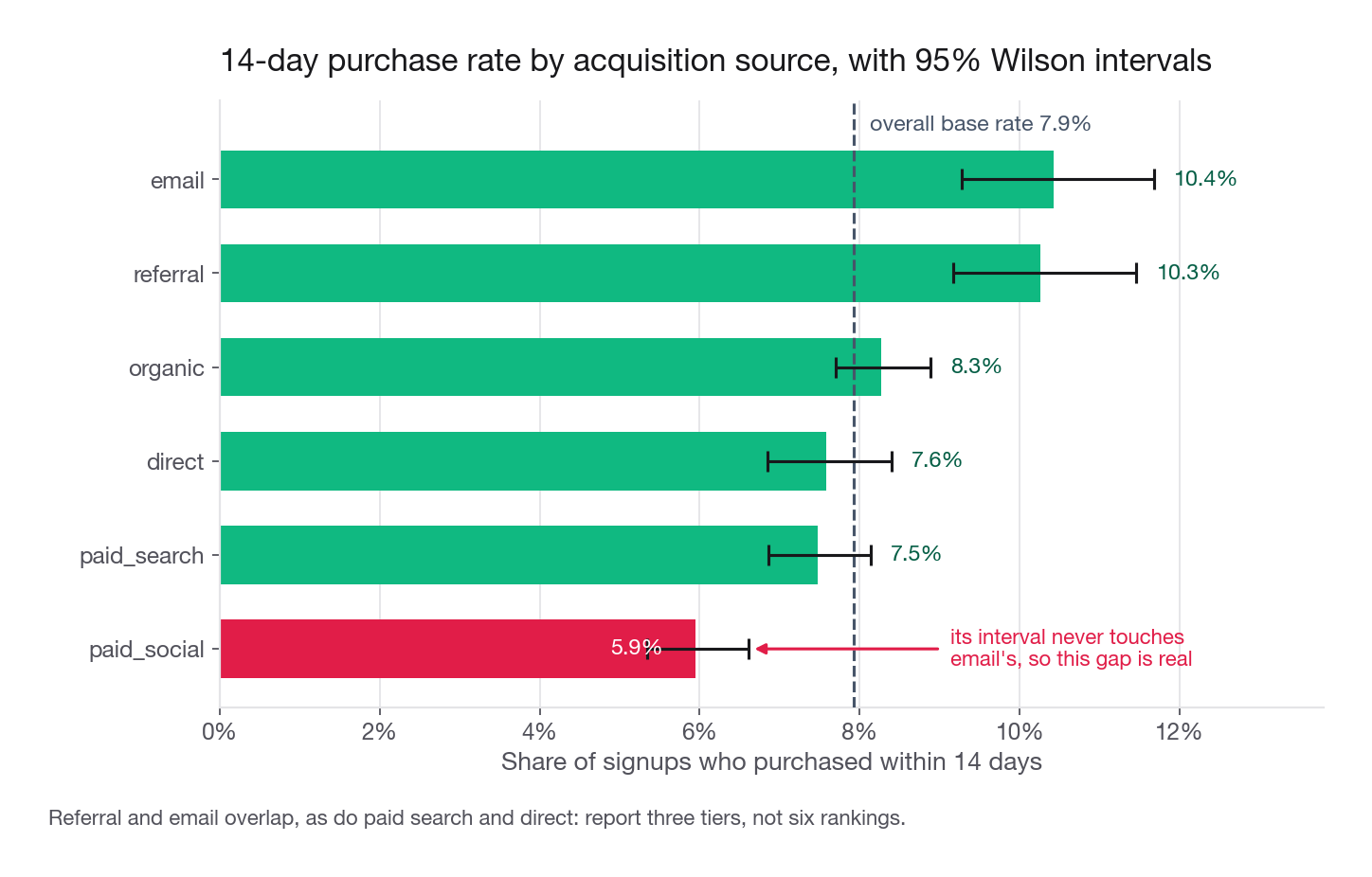
The source result is the one the prompt cares about:
=== source ===
                n    k    rate      lo      hi  lift_vs_base
source
paid_social  5401  321  0.0594  0.0534  0.0661       -0.2508
paid_search  6478  484  0.0747  0.0686  0.0814       -0.0582
direct       4483  340  0.0758  0.0685  0.0840       -0.0440
organic      8451  699  0.0827  0.0770  0.0888        0.0426
referral     2701  277  0.1026  0.0917  0.1146        0.2927
email        2486  259  0.1042  0.0928  0.1168        0.3132
Read it the way a reviewer would. Paid social sits at 5.94 percent with an interval of 5.34 to 6.61; email sits at 10.42 percent with 9.28 to 11.68. Those do not come close to touching, so that difference is real. Referral and email overlap almost entirely, so ranking them against each other is unsupported. Paid search and direct overlap too.
So report three tiers, not six rows: weak (paid social), middle (paid search, direct, organic), strong (referral, email). That small change reads as maturity, because it shows you know which of your own numbers you may distinguish.
Numeric drivers get binned, not correlated
For a binary target, a correlation coefficient against a numeric feature is close to uninformative and often misleading. Bin instead, on quantiles or business-meaningful cuts, and read the rate per bin. Monotonic is the pattern you hope for; non-monotonic is the interesting one.
bins = pd.cut(clean["first_session_pages"], [-0.1, 1, 2, 4, 6, 9, 100],
              labels=["0-1", "2", "3-4", "5-6", "7-9", "10+"])
print(rate_by(clean.assign(pages_bin=bins), "pages_bin", min_n=100))
n k rate lo hi lift_vs_base
pages_bin
0-1 2393 166 0.0694 0.0599 0.0803 -0.1256
2 3902 274 0.0702 0.0626 0.0787 -0.1149
3-4 11377 861 0.0757 0.0710 0.0807 -0.0461
5-6 8476 713 0.0841 0.0784 0.0902 0.0603
7-9 3509 315 0.0898 0.0808 0.0997 0.1315
10+ 343 51 0.1487 0.1149 0.1902 0.8742Cleanly monotonic, 6.94 percent up to 14.87 percent. Note the top bin: 343 users, interval 11.5 to 19.0 percent. That 14.87 is the most exciting number in the table and the least trustworthy, so quote the interval alongside it.
Name the trap inside this result too: pages viewed during signup is measured concurrently with the outcome, and browsing more is partly a consequence of intent rather than a cause of purchase. Fine as description, terrible as a basis for "force users through more pages."
Interview tip: For every driver you report, say in half a sentence whether it is actionable, descriptive, or downstream of the outcome; graders reward the distinction and almost nobody makes it.
Check the obvious confound before you believe a driver
Two correlated categorical drivers will each appear to drive the target. One cross-tab settles it:
print(pd.crosstab(clean["source"], clean["device"], normalize="index").round(3))If the device mix is roughly identical across sources, the effects are separable and you can report them independently. If paid social were 80 percent mobile web and mobile web converted worse everywhere, the two would be entangled and the honest statement is that you cannot separate them without a model or an experiment. Here the mixes are flat within about two points, so channel and device are separable, which is itself worth a sentence.
The reusable profiler
Everything above collapses into one helper worth pasting at the top of every challenge in this course. It answers the questions a reviewer will ask, in one call, in under a second at this scale.
def profile(df, target=None, max_levels=8):
    rows = []
    n = len(df)
    for col in df.columns:
        s = df[col]
        rec = {
            "column": col,
            "dtype": str(s.dtype),
            "pct_missing": round(s.isna().mean(), 4),
            "n_unique": s.nunique(dropna=True),
            "example": s.dropna().iloc[0] if s.notna().any() else None,
        }
        if pd.api.types.is_numeric_dtype(s) and s.nunique() > 2:
            rec["min"], rec["p50"], rec["max"] = s.min(), s.median(), s.max()
        elif s.nunique(dropna=True) <= max_levels:
            top = s.value_counts(normalize=True)
            rec["top_level"] = f"{top.index[0]} ({top.iloc[0]:.1%})"
        if target is not None and col != target and s.isna().any():
            m = s.isna()
            rec["miss_target_gap"] = round(
                df.loc[m, target].mean() - df.loc[~m, target].mean(), 4)
        rows.append(rec)
    out = pd.DataFrame(rows).set_index("column")
    print(f"{n} rows, {df.shape[1]} columns, "
          f"{df.duplicated().sum()} exact duplicate rows")
    return out
Call profile(clean, target="purchased_14d") and one table gives you the dtype you actually have, the missing share, the cardinality, the numeric range, the dominant level of each low-cardinality categorical, and the missingness-versus-target gap that decides imputation. It is deliberately unclever, because a profiler that tries to be smart will hide the thing you needed to see.
Pair it with the grain check:
def grain(df, keys):
    k = df.groupby(list(keys)).size()
    dup = df[df.duplicated(list(keys), keep=False)]
    varying = (dup.groupby(list(keys)).nunique(dropna=False).max() > 1)
    print(f"{len(df)} rows / {len(k)} distinct {'+'.join(keys)} "
          f"(max per key: {k.max()})")
print("columns that vary within a key:", list(varying[varying].index))Step 7: Three hypotheses before you model
The pass ends by turning observations into claims you can be wrong about. That is what converts a competent EDA into a project with direction, and it takes ten minutes. A usable hypothesis has four parts: a mechanism, a prediction the data can check, the test that checks it, and the observation that would kill it. Vague hypotheses are worse than none, because nothing can kill them and so they absorb hours.
| Weak version | Strong version |
|---|---|
| "Channel affects conversion" | "Paid social underperforms because it acquires low-intent users, so its gap should shrink after conditioning on first-session engagement, and disappear entirely if engagement fully explains it" |
| "Promos help" | "Promo redeemers convert 4.2 points better, but if this is selection rather than treatment, redeemers should already differ on pre-redemption behaviour" |
| "Mobile converts worse" | "The mobile web gap is real but small at 1.8 points; if it is a checkout friction problem it should concentrate in the drop from cart to payment, not in browse depth" |
The three I would write for Thicket after the pass above:
Paid social buys low-intent traffic. Prediction: paid social users show lower
first_session_pagesthan other channels. Test: mean pages by source, plus channel rates within a fixed pages bin. Kill criterion: if the penalty survives at similar size inside every pages bin, intent is not the mechanism and something channel-specific is at work.The promo gap is selection, not causation. Prediction: redeemers differ on pre-redemption behaviour and the gap shrinks once you condition on engagement. Test: compare
first_session_pagesdistributions for redeemers and non-redeemers. Kill criterion: if the distributions are indistinguishable and the gap survives conditioning, promos may be doing real work and a holdout test is warranted.Email and referral are small but high-quality, so the budget question is headroom, not rate. Prediction: their combined volume is under 20 percent of signups, so doubling them moves the blended rate by less than a point. Test: recompute the blended rate with referral and email volume doubled and the rest held fixed. Kill criterion: if that moves the blended rate more than two points, volume is not the binding constraint and the recommendation flips.
Notice what hypothesis three does: it turns a ranking into a budget decision, which is what the prompt asked. Stopping at "email converts best" produces a fact. Computing that doubling referral and email volume moves the blended rate from 7.9 to 8.3 percent produces an argument, and arguments are what get recommended for an onsite. Note that the plural is deliberate: the scan said referral and email cannot be separated from each other, so the lever is the pair, not a winner.
What to skip in the first two hours
Deliberate omissions, each of which eats an hour and returns nothing.
The full correlation heatmap. With a binary target and mixed types it mostly measures cardinality, and no reviewer has ever been persuaded by one.
Pretty plots. Styling a chart before the finding survives is work on a chart you may delete. Use defaults now, style the three survivors later.
Feature engineering. Ratios and encodings built before you trust the grain are elaborate structures on an untested foundation.
Any model. Not even a quick baseline. A model fit before the range check learns happily from the impossible ages, and the score will look fine.
Reading every column. Sixty columns do not deserve sixty profiles. Profile them mechanically, then read carefully only the target, the ones the prompt names, and anything with odd missingness.
Common traps
Computing the base rate before deduplication. Every downstream rate inherits the wrong denominator, and the error hides because the number still looks plausible. Fix: grain check first, always, and print the row count before and after.
Dropping rows with any missing value. dropna() on a wide frame can remove half your sample, and the survivors are the users with the most complete instrumentation, which is a biased sample of the thing you are studying. Fix: repair columns individually, drop rows only when the target itself is missing, and report the count.
Treating a sentinel as a real value. Values like -1, 9999, and 1970-01-01 are "not recorded" in a numeric costume, and a mean over them is meaningless. Fix: check every numeric against a plausible range and look for spikes at round numbers.
Ranking segments whose intervals overlap. Six channels in strict order when four are indistinguishable invites a question you cannot answer. Fix: group into tiers and say which pairs you cannot separate.
Slicing until the cells are empty. Channel by country by device on 30,000 rows gives cells of 100 users and rates that swing 8 points on noise. Fix: compute the segment floor first and let it cap your dimensions.
Believing a driver measured after the outcome started. Pages viewed, sessions, and support contacts logged during the outcome window are contaminated by it. Fix: for every feature ask when it was recorded relative to the target, and label anything concurrent as descriptive.
Explaining a truncation artifact. The drop at the end of the window is the extract ending, not demand collapsing. Fix: plot volume by period before plotting anything else by period, and mark partial periods.
Silent cleaning. A repair you do not write down is work the grader cannot score and a number they cannot reproduce. Fix: the running decisions list, pasted in as an appendix.
Confusing "no missing values" with "clean". A constant column, or a categorical carrying US, us, and USA as three levels, is dirtier than one that is 20 percent missing. Fix: print cardinality and top levels beside the missing share, which is what the profiler does.
Quick self-check
Answer these out loud, in full sentences, before calling the pass finished.
What is one row in this file, and how many rows disagree with the grain the prompt claims? If you cannot answer without rerunning code, you have not finished step two.
For each column with missing values, is missing structural, informative, or noise, and what is the one-sentence justification for that verdict?
What is the base rate, over which denominator, and what changes about the analysis if the outcome window is incomplete for the most recent cohort?
What is the smallest segment you are willing to interpret, and which cross-tab did that number forbid you from making?
Which two of your candidate drivers are most likely confounded with each other, and what did the cross-tab show?
What are your three hypotheses, and for each one, what specific observation would make you abandon it before you spend another hour on it?
Answer all six and you have two hours a reviewer can verify, a defensible cleaning story, and a plan for the next four. Every project in the rest of this course starts from exactly that state and assumes you have run this pass.