2.3 Project: Predicting Employee Attrition
Find the core decision, design, or behavior signal.
Turn the lesson into a concise response blueprint.
Name the trap you would avoid in a real interview.
Use these checkpoints as your reading path before diving into the full lesson.
- 1What this lesson is for
- 2The brief
- 3Generate the working data
- 4Step 1: Establish the grain, then prove it
- 5Step 2: Rebuild the daily headcount series
Attrition take-homes are the ones candidates most often finish and still fail. The notebook runs, the accuracy looks fine, and the reviewer stops at the second cell because the label was built against a snapshot date without correcting for how long each person had been around to leave. This lesson walks a full people-analytics build for a robotics manufacturer and drills the decision that separates a pass from a polite rejection: given a roster where most employees have not quit yet, what is the row, what is the label, and what does the executive do with the answer.
What this lesson is for
One flat roster, a snapshot date, three questions. Four things are graded and only one is the model.
Can you rebuild a time series from event dates without dropping days or silently reindexing a site out of existence?
Do you see that people still employed are censored observations, not negatives?
Can you separate a driver from its proxy, rather than telling the Head of People that pay causes attrition when pay stands in for job family?
Does the final page carry a number the business can act on, with a range around it?
Item 2 is where most submissions die, quietly. Nothing errors. The base rate comes out too low, every recently opened site looks like a retention success, and a reviewer sees from your label definition alone that the ranking is upside down.
Interview tip: When a prompt gives you a start date, an optional end date, and a snapshot date, say the word "censoring" in your first two minutes. It signals you know that a blank end date means "not yet", not "never".
The brief
Northwind Robotics builds warehouse picking arms across six sites, one of which opened partway through the window. People Operations exported one row per employment spell, covering everyone hired from 2022-02-07 through the snapshot date of 2026-06-30.
| Column | Meaning | Trap it carries |
|---|---|---|
person_id | badge number | assigned per site, so it repeats across sites |
site_id | facility, 1 through 6 | site 5 did not exist before 2024-07 |
function | job family, six values | strongly correlated with pay |
prior_years | years of experience at hire | uses 99 as an unknown sentinel |
base_pay | average annualized pay across the spell | measured over the outcome window |
start_date | first day on payroll | inside the window by construction |
end_date | last day on payroll, blank if still employed | blank means censored, not retained |
Three questions came attached: rebuild daily headcount per site starting from zero; explain what drives people to leave and whether the explanation is credible; name one additional field you would request. Underneath sits an unstated fourth, the one that got the work funded. The VP of Operations must sign a hiring plan and wants to know how many field service technicians to recruit.
Generate the working data
Everything below runs on a deterministic synthetic roster with that schema: 31,400 spells, six sites, a hiring ramp, a vest cliff on each anniversary, and a pay effect that is deliberately not monotone.
import numpy as np, pandas as pd
SEED = 20260826
rng = np.random.default_rng(SEED)
N, AS_OF, HIRE0 = 31400, np.datetime64("2026-06-30"), np.datetime64("2022-02-07")
FN = ["assembly", "field_service", "firmware", "supply_chain", "quality", "sales_ops"]
function = rng.choice(FN, N, p=[.29, .21, .14, .13, .12, .11])
site_id = rng.choice([1, 2, 3, 4, 5, 6], N, p=[.27, .19, .17, .14, .15, .08])
prior_years = np.clip(rng.gamma(2.4, 4.2, N).round(), 0, 42)
mid = pd.Series(function).map(dict(zip(FN, [58e3, 74e3, 152e3, 88e3, 79e3, 96e3]))).to_numpy()
base_pay = np.round(mid * (1 + .021 * prior_years) * np.array([0, 1.06, .97, 1., .93, 1.02, .99])[site_id]
                    * rng.lognormal(0, .21, N) / 500) * 500
span = (AS_OF - HIRE0).astype(int)
off = (rng.random(N) ** .62 * span).astype(int)                       # hiring ramps up over time
off = np.where(site_id == 5, 875 + (rng.random(N) ** .8 * (span - 875)).astype(int), off)
start_date = HIRE0 + off.astype("timedelta64[D]")                     # site 5 opened 2024-07-01
m = np.arange(60)                                                     # monthly hazard grid
base_h = .0125 + .0115 * np.exp(-m / 8.5) + .026 * np.isin(m, [12, 24, 36, 48])
pct = pd.Series(base_pay).rank(pct=True).to_numpy()
risk = (pd.Series(function).map(dict(zip(FN, [1.30, 1.55, .72, 1.00, .92, 1.15]))).to_numpy()
        * np.array([0, .96, 1.03, .90, 1.07, 1.42, 1.18])[site_id]
        * (.62 + .62 * np.exp(-((pct - .52) / .30) ** 2))             # mid-band pay leaves most
        * (1 + .006 * (18 - prior_years)) * rng.lognormal(0, .18, N))
surv = np.cumprod(1 - np.clip(np.outer(risk, base_h), 0, .8), axis=1)
hit = surv < rng.random(N)[:, None]
qm = np.where(hit.any(1), hit.argmax(1), -1)
days = np.where(qm >= 0, (30.44 * qm).astype(int) + rng.integers(0, 31, N), 10 ** 6)
end = start_date + days.astype("timedelta64[D]")
roster = pd.DataFrame({"site_id": site_id, "function": function,
                       "prior_years": prior_years.astype(int), "base_pay": base_pay,
                       "start_date": start_date,
                       "end_date": np.where(end <= AS_OF, end, np.datetime64("NaT"))})
roster["person_id"] = roster.groupby("site_id").cumcount() + 100001   # ids restart at each site
roster.loc[rng.choice(N, 46, replace=False), "prior_years"] = 99      # unknown-experience sentinel
roster = roster[["person_id", "site_id", "function", "prior_years", "base_pay",
                 "start_date", "end_date"]]
Of the 31,400 spells, 9,738 have an end date and 21,662 are still open. Hold that second number: it is the reconciliation target for the first question.
Step 1: Establish the grain, then prove it
The first cell after loading should not be head(), it should be an assertion about what one row means.
AS_OF = pd.Timestamp("2026-06-30")
print(roster.person_id.duplicated().sum())               # 22939
print(roster.duplicated(["site_id", "person_id"]).sum())  # 0
Badge numbers repeat. Person 100001 exists at every site, and those are six different people. Deduplicate on person_id alone and you destroy three quarters of the roster with no error raised. The key is (site_id, person_id), and the line proving it belongs in the notebook.
Then the integrity sweep, four checks, each worth a sentence whether or not it fires.
checks = {
    "end before start": (roster.end_date < roster.start_date).sum(),
    "hired outside window": ((roster.start_date < pd.Timestamp("2022-02-07"))
                             | (roster.start_date > AS_OF)).sum(),
    "exit after snapshot": (roster.end_date > AS_OF).sum(),
    "sentinel experience": (roster.prior_years == 99).sum(),
}
print(checks)
{'end before start': 0, 'hired outside window': 0, 'exit after snapshot': 0,
'sentinel experience': 46}Three clean, one live. Forty-six rows carry prior_years = 99, which is not a person with a century of experience, it is an HR system writing an unknown. Do not impute silently and do not drop the rows. Split the field: a numeric column with the sentinel replaced by the median, plus a flag marking it missing. Those rows will not move any coefficient, and that is the point: you now have a stated reason for ignoring them rather than an unexamined 99 inside your pay scatter.
Interview tip: A reviewer cannot tell "I checked and it was clean" from "I never checked" unless you print the check. Four lines of assertion output is the cheapest credibility available.
Step 2: Rebuild the daily headcount series
The prompt asks for day, headcount, site. The mechanics are a cross join and a cumulative sum; the judgment is the convention you pick first.
Decide who counts on the day they leave
Someone whose end_date is 2025-04-06 was at their desk that morning, so is headcount that day computed before or after subtracting them?
| Convention | Headcount on the exit date | Argues for it | Argues against it |
|---|---|---|---|
| Exit reduces the count that day | already reduced | matches "who is here tomorrow", simplest cumsum | undercounts by one day, disagrees with payroll |
| Exit reduces it the following day | still counted | matches payroll and badge access | needs an offset on the quit series |
Neither is wrong. Silence is wrong. Take the first and note that shifting the quit series by a day moves any single day by a handful of heads and changes no conclusion. A third convention, dating the exit from notice, is unavailable because notice dates are not in the export.
The cross join and the cumulative sum
cal = pd.date_range(pd.Timestamp("2022-02-08"), AS_OF, freq="D")
grid = pd.MultiIndex.from_product([cal, sorted(roster.site_id.unique())],
                                  names=["day", "site_id"])
joins = roster.groupby(["start_date", "site_id"]).size().rename("joins")
quits = (roster.dropna(subset=["end_date"])
         .groupby(["end_date", "site_id"]).size().rename("quits"))
hc = (pd.DataFrame(index=grid)
      .join(joins.rename_axis(["day", "site_id"]))
      .join(quits.rename_axis(["day", "site_id"]))
      .fillna(0).reset_index())
hc[["cj", "cq"]] = hc.sort_values("day").groupby("site_id")[["joins", "quits"]].cumsum()
hc["headcount"] = (hc.cj - hc.cq).astype(int)
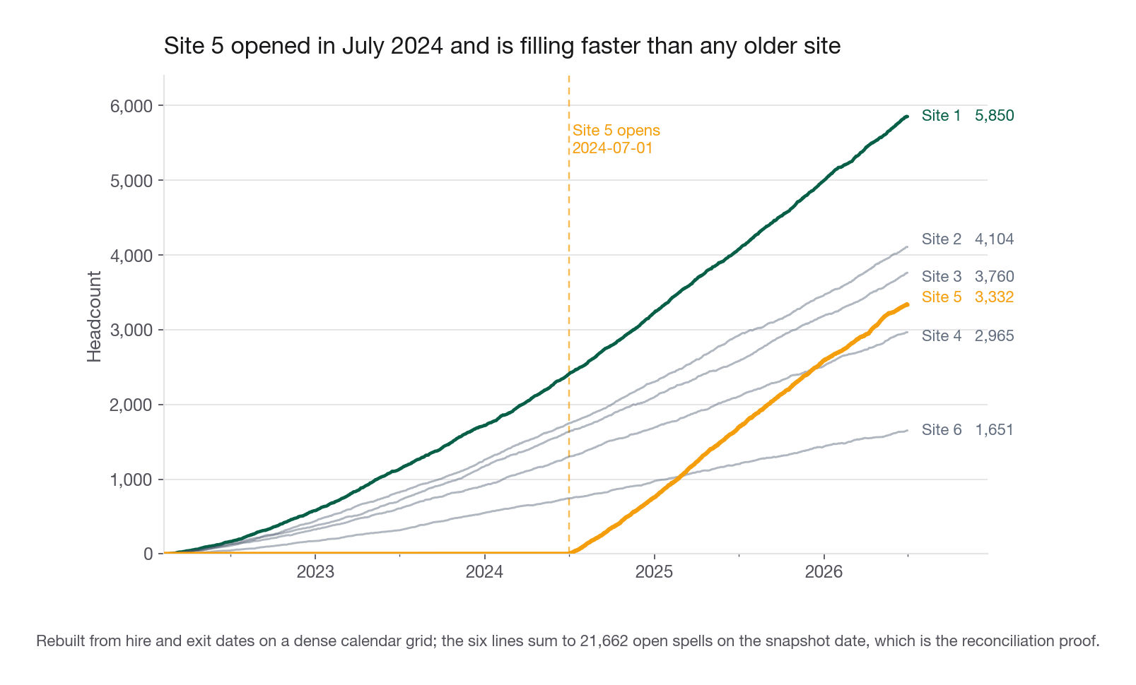
The grid does real work. Group events by day instead and any day on which a small site had neither a hire nor an exit vanishes from that site's series, after which the cumulative sum steps silently over the gap. It looks fine on a chart and is wrong in every join you later run against it. The grid is 1,604 days by 6 sites, so 9,624 rows. The sort_values("day") is not decoration either: cumsum walks rows in frame order, so any upstream reordering gives nonsense with no warning.
final = hc[hc.day == AS_OF]
print(final[["site_id", "headcount"]].to_string(index=False))
print(final.headcount.sum(), roster.end_date.isna().sum())
site_id headcount
1 5850
2 4104
3 3760
4 2965
5 3332
6 1651
21662 21662The last day of the series equals the count of open spells in the raw roster. That is the proof, and reviewers scan for exactly it.
Site 5 opens at 2024-07-01 and reaches 3,332 in two years, a level site 1 needed nearly three years to reach. Site 1 has not slowed down to let it happen either: its last eight month-end gains are 164, 160, 171, 83, 176, 138, 148 and 142, so it is still the steepest line at the right edge. Its apparent 5,852 on 2026-06-28 is two heads above the snapshot value, daily noise on a climbing series, not a plateau. The contrast in fill speed, not a slowdown anywhere, is the most useful picture in the deck.
The same thing in SQL, which is what an interviewer asks for if the role is data-adjacent:
WITH cal AS (
  SELECT generate_series(DATE '2022-02-08', DATE '2026-06-30', INTERVAL '1 day')::date AS day
), ev AS (
  SELECT start_date AS day, site_id, 1 AS delta FROM roster
  UNION ALL
  SELECT end_date, site_id, -1 FROM roster WHERE end_date IS NOT NULL
), daily AS (
  SELECT c.day, s.site_id, COALESCE(SUM(e.delta), 0) AS net
  FROM cal c
  CROSS JOIN (SELECT DISTINCT site_id FROM roster) s
  LEFT JOIN ev e ON e.day = c.day AND e.site_id = s.site_id
  GROUP BY 1, 2
)
SELECT day, site_id, SUM(net) OVER (PARTITION BY site_id ORDER BY day) AS headcount
FROM daily;
Interview tip: Asked for this in SQL, lead with the calendar CTE. A window function over the raw event table is the standard wrong answer, and it fails for the same reason the pandas version needs the grid.
Step 3: What the headcount series is for
A headcount chart alone is decoration. Decompose it into gross hires, gross exits, and net change and it becomes a diagnosis: two sites with identical net growth can be running different machines, one hiring 400 and losing 100, the other hiring 1,200 and losing 900. The decomposition also settles the denominator fight that surfaces in every people-analytics review.
| Metric | Trailing 12 months | What it answers | Why it misleads |
|---|---|---|---|
| Exits over average headcount | 25.8 percent | annualized turnover, the standard HR figure | needs an average, not a point in time |
| Exits over ending headcount | 21.6 percent | nothing useful in a growing company | denominator inflated by people who could not leave |
| Share of spells ever ended | 31.0 percent | cumulative over the window | mixes cohorts with unequal exposure |
| One-year attrition from survival | 24.0 percent | chance a new hire is gone in twelve months | the only one comparable across cohorts |
Northwind averaged about 18,100 heads over the last twelve months and ended at 21,662, which is why the second row understates the first by more than four points. In a shrinking company the bias flips. Both middle rows get quoted in board decks; only the last lets you compare the 2023 hiring class to the 2025 one. The first row is two lines off the reconstructed series: count exits inside the trailing 365 days (4,679), average the daily total headcount over the same window (18,113), divide.
Step 4: Tenure, anniversaries, and censoring
For leavers, tenure is exit minus start. For everyone still employed it is snapshot minus start, a lower bound rather than a tenure.
roster["tenure_days"] = (roster.end_date.fillna(AS_OF) - roster.start_date).dt.days
roster["left"] = roster.end_date.notna().astype(int)
roster["tm"] = (roster.tenure_days // 30.44).astype(int)
print(roster.loc[roster.left == 1, "tenure_days"].median())   # 230.0
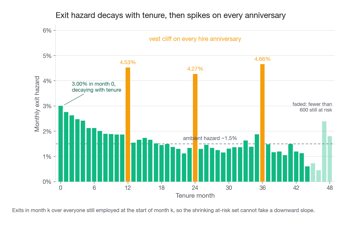
Bin the leavers by tenure month and something jumps out. Counts fall smoothly from 943 in month zero to 296 in month eleven, then month twelve, covering days 365 to 395, holds 671. Month thirteen drops back to 209, and the bulge repeats near two and three years.
That is a vest cliff. Northwind grants equity annually on the hire anniversary, and a visible slice of the workforce waits for the tranche and leaves. It is the most actionable finding here, because unlike pay or job family it names a policy the company controls.
Why the histogram is not a hazard
That histogram counts leavers only. It says nothing about how many people were eligible to leave at each tenure month, and that number collapses as tenure grows, both because people have already left and because recent hires have not lived long enough to appear. In a growing company a raw exit-tenure histogram always slopes down, even under a flat hazard. What you want is the conditional exit rate: among everyone who reached month k still employed, what fraction left during month k. That is the discrete hazard, and the running product of its complement is the Kaplan-Meier curve. Twelve lines, no library.
rows = []
for k in range(54):
    at_risk = (roster.tm >= k).sum()
    exits = ((roster.tm == k) & (roster.left == 1)).sum()
    censored = ((roster.tm == k) & (roster.left == 0)).sum()
    rows.append((k, at_risk, exits, censored, exits / at_risk))
km = pd.DataFrame(rows, columns=["month", "at_risk", "exits", "censored", "hazard"])
km["survival"] = (1 - km.hazard).cumprod()
The censored column is the one to read aloud: people leaving the risk set without the event. Here it is enormous, 1,007 spells in month zero alone, hired inside thirty days of the snapshot.
| Tenure month | At risk | Exits | Censored | Hazard | Survival |
|---|---|---|---|---|---|
| 0 | 31,400 | 943 | 1,007 | 3.00 percent | 0.970 |
| 11 | 15,848 | 296 | 724 | 1.87 percent | 0.761 |
| 12 | 14,828 | 671 | 645 | 4.53 percent | 0.726 |
| 24 | 6,162 | 263 | 343 | 4.27 percent | 0.591 |
| 36 | 2,105 | 98 | 178 | 4.66 percent | 0.482 |
Month 12 runs 4.53 percent against a neighborhood near 1.9, about two and a half times ambient; month 24 is 4.27 against 1.33, more than triple. The effect does not fade with tenure, it just applies to a shrinking cohort. Survival is 0.761 at twelve months, 0.617 at twenty-four, 0.506 at thirty-six: one in four new hires is gone inside a year and half are gone inside three. Set that against the 31.0 percent "share who ever left" figure to see how badly the naive number understates a single cohort.
Interview tip: If you cannot fit a survival model in the time available, compute the hazard by tenure bucket by hand anyway. Twelve lines, and it is the whole difference between an analyst who understands censoring and one who has heard the word.
Step 5: The modeling table, and the cutoff that makes it honest
You have a censored outcome and an interviewer who wants a classifier. Three bridges are defensible, and naming your choice out loud is worth more than the model that follows it.
Take option two at a horizon of 400 days. Not arbitrary: 400 sits just past the twelve-month bulge, so the label captures the cliff rather than splitting it, where a 365-day horizon scores a day-372 leaver as retained. The cohort restriction is the load-bearing line.
H = 400
cutoff = AS_OF - pd.Timedelta(days=H)          # 2025-05-26
elig = roster[roster.start_date <= cutoff].copy()
elig["left_400"] = ((elig.end_date.notna()) & (elig.tenure_days <= H)).astype(int)
print(len(elig), round(elig.left_400.mean(), 4))   # 18599 0.2789
Eighteen thousand five hundred ninety-nine rows, 27.89 percent positive, each with a full 400 days of opportunity. Build the same label on all 31,400 rows and the rate drops to 22.55 percent. That is a 19 percent relative understatement and it lands unevenly, concentrating on whichever site or function hired most recently, which is how a genuinely bad plant tops your retention leaderboard.
| Horizon | Cutoff date | Eligible rows | Share of roster kept | Rate with cutoff | Rate without |
|---|---|---|---|---|---|
| 200 days | 2025-12-12 | 24,750 | 79 percent | 15.7 percent | 14.2 percent |
| 400 days | 2025-05-26 | 18,599 | 59 percent | 27.9 percent | 22.5 percent |
| 730 days | 2024-06-30 | 10,029 | 32 percent | 38.4 percent | 27.6 percent |
The bias grows with the horizon: at two years the naive label is understated by nearly eleven points. Run this table, three lines, and it doubles as your horizon sensitivity check.
Audit which features exist at scoring time
The cutoff fixes the label and does nothing for the features, and this roster carries two feature problems.
Build the feature matrix first, and honour the Step 1 decision on the sentinel while you do it: the 99 becomes a median-imputed value plus a flag, never a live numeric 99. Then add the obvious violations one at a time.
from sklearn.model_selection import train_test_split
from sklearn.ensemble import HistGradientBoostingClassifier
from sklearn.metrics import roc_auc_score

med = elig.prior_years.replace(99, np.nan).median()                  # 9.0
elig["prior_years_known"] = (elig.prior_years != 99).astype(int)
elig["prior_years_c"] = elig.prior_years.replace(99, np.nan).fillna(med)
X0 = pd.get_dummies(elig[["function", "site_id", "prior_years_c",
                          "prior_years_known", "base_pay"]],
                    columns=["function", "site_id"], drop_first=True)
y = elig.left_400.values
for name, X in [("clean", X0),
                ("plus tenure_days", X0.assign(tenure=elig.tenure_days)),
                ("plus has_end_date", X0.assign(hed=elig.end_date.notna().astype(int)))]:
    Xtr, Xte, ytr, yte = train_test_split(X, y, test_size=.3, random_state=7, stratify=y)
    m = HistGradientBoostingClassifier(max_depth=4, learning_rate=.06,
                                       max_iter=300, random_state=7).fit(Xtr, ytr)
    print(name, round(roc_auc_score(yte, m.predict_proba(Xte)[:, 1]), 3))
clean 0.597
plus tenure_days 1.000
plus has_end_date 0.908An AUC of exactly 1.000 is not a great model, it is a confession: the label is a threshold on tenure, so tenure reconstructs it perfectly. The 0.908 is sneakier, because a reviewer skimming a feature list may not flag a binary "has an exit record" column, and 0.908 is plausible enough to survive a quick read.
The subtler problem is base_pay, defined as average annualized pay across the spell, computed after the spell ended. For a month-four leaver it averages four months; for a five-year veteran it absorbs every raise and retention grant. It does not encode the label, and here it is fixed at hire so it is numerically harmless, but its definition means a model trained on it cannot be scored on a current employee whose average is still moving. If the deliverable is a live risk score you need starting pay, or pay as of a fixed anchor. Saying so moves a candidate from "analyst" to "senior".
Interview tip: For every feature, ask whether you could compute it for someone still employed today without knowing their future. If not it is retrospective, and you must say whether the deliverable is an explanation or a live score, because those tolerate different features.
Step 6: Fit a model, then be honest about what it is
Logistic regression with a quadratic pay term against a gradient booster. Pay enters in thousands so the quadratic does not overwhelm the scaler.
from sklearn.linear_model import LogisticRegression
from sklearn.preprocessing import StandardScaler
from sklearn.pipeline import make_pipeline
from sklearn.metrics import brier_score_loss

X = X0.drop(columns=["base_pay"])
X["pay_k"] = elig.base_pay / 1000
X["pay_k2"] = (elig.base_pay / 1000) ** 2
Xtr, Xte, ytr, yte = train_test_split(X, y, test_size=.3, random_state=7, stratify=y)
lr = make_pipeline(StandardScaler(), LogisticRegression(max_iter=2000)).fit(Xtr, ytr)
gb = HistGradientBoostingClassifier(max_depth=4, learning_rate=.06,
                                    max_iter=350, random_state=7).fit(Xtr, ytr)
for nm, p in [("logit", lr.predict_proba(Xte)[:, 1]), ("gbm", gb.predict_proba(Xte)[:, 1])]:
    print(nm, round(roc_auc_score(yte, p), 3), round(brier_score_loss(yte, p), 4))
print("base rate only", round(brier_score_loss(yte, np.full(len(yte), ytr.mean())), 4))
logit 0.601 0.1960
gbm 0.597 0.1966
base rate only 0.2011AUC 0.60. Dropping the quadratic term takes the logistic model to 0.595, so the curvature is real but small, and the booster given free rein over interactions does not beat an eight-parameter regression. Candidates panic here and start adding features. Do not. Whether a technician quits next quarter depends on their manager, a competing offer, a partner's job relocating, none of which live in these seven columns. AUC 0.60 on an HR export is normal and honest; 0.94 would mean you leaked. What matters is whether the ranking is stable enough to act on. Bucket the held-out booster scores into deciles and compare each bucket's mean prediction against its realized rate.
d = pd.DataFrame({"p": gb.predict_proba(Xte)[:, 1], "y": yte})
d["decile"] = pd.qcut(d.p, 10, labels=False) + 1
cal = d.groupby("decile").agg(n=("y", "size"), predicted=("p", "mean"), actual=("y", "mean"))
cal[["predicted", "actual"]] *= 100
print(cal.round(1).loc[[1, 5, 8, 10]].to_string())| Score decile | n | Predicted rate | Actual rate |
|---|---|---|---|
| 1 (lowest) | 558 | 13.3 percent | 15.1 percent |
| 5 | 556 | 27.1 percent | 25.7 percent |
| 8 | 557 | 32.1 percent | 34.5 percent |
| 10 (highest) | 546 | 44.0 percent | 42.3 percent |
Top decile leaves at 42.3 percent against 15.1 at the bottom, a 2.8x spread, and predicted tracks actual within a few points throughout. A weak-AUC model that is well calibrated is still useful, because planning aggregates. You are not deciding anything about one technician, you are deciding how many requisitions to open.
Interview tip: When a model lands at AUC 0.60, do not apologize and do not hide it. Say what the model is for. If the deliverable is a headcount forecast, calibration matters and discrimination barely does.
Then set the booster aside and fit a depth-3 tree as a descriptive instrument.
from sklearn.tree import DecisionTreeClassifier, export_text
tree = DecisionTreeClassifier(max_depth=3, min_samples_leaf=500,
                              class_weight="balanced", random_state=7).fit(X0, y)
print(export_text(tree, feature_names=list(X0.columns), decimals=0))
The first split is pay at 143,750; on the low side the next split is field service, then site 5. Importances land at 0.63 for pay, 0.25 for field service, 0.08 for site 5, near zero for prior experience. Leaf rates run from 12.9 to 40.9 percent.
Step 7: Read the drivers, and separate them from their proxies
Pay dominates the tree. The lazy conclusion is "pay drives attrition, raise salaries". The real structure is better than that.
The shape is a hump, not a slope
| Pay ventile | Pay range | n | Left within 400 days |
|---|---|---|---|
| 1 | 29,000 to 54,500 | 940 | 23.2 percent |
| 9 | 86,000 to 89,500 | 965 | 37.2 percent |
| 20 | 201,000 to 405,000 | 925 | 13.7 percent |
The rate climbs from 23.2 percent at the bottom, plateaus near 37 across the middle third, then falls to 13.7 at the top. People paid between roughly 70,000 and 110,000 leave at 33.9 percent within 400 days; everyone outside that band leaves at 22.6 percent.
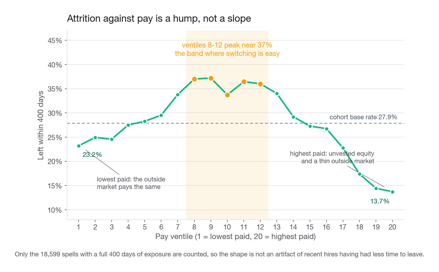
A monotone story does not survive this chart. A credible one does: at the bottom the outside market pays the same, so leaving buys nothing; at the top people hold large unvested equity and face few employers who need their skills. The middle is where switching is easy and profitable. That is the difference between reporting a shape and explaining one.
Is it pay, or is it job family wearing pay as a costume
Pay tracks job family hard. Firmware sits at a median of 182,500 and quits at 14.7 percent; field service sits at 88,500 and quits at 37.8; the other four fall between 24.3 and 28.9. Stop at the ventile chart and you may have discovered only that firmware engineers are expensive and stay. So stratify. Here is where most candidates make an error that inverts their own answer: they cut pay into terciles within each function. Do that and assembly shows attrition rising with pay (23.7, 27.2, 35.0 percent) while sales operations shows it falling (34.1, 29.7, 22.9), and the conclusion becomes "inconsistent, probably noise".
It is not noise. Function-relative bands re-express the variable so "high pay" means something different in every stratum. Assembly's top tercile lands mid-distribution company-wide, right on the peak; the sales operations top tercile lands past it, on the downslope. Each function shows the local slope of one curve.
Hold the bands on a common company-wide scale and the structure appears:
| Function | Global pay quintile 1 | Q2 | Q3 | Q4 | Q5 |
|---|---|---|---|---|---|
| assembly | 24.3 percent (n=2,735) | 31.6 percent (n=1,533) | 37.1 percent (n=761) | 31.3 percent (n=297) | 11.5 percent (n=26) |
| field_service | 29.3 percent (n=625) | 38.5 percent (n=1,112) | 44.8 percent (n=1,126) | 35.1 percent (n=829) | 32.8 percent (n=198) |
| quality | 22.4 percent (n=241) | 22.3 percent (n=528) | 28.9 percent (n=698) | 25.3 percent (n=596) | 11.2 percent (n=178) |
| supply_chain | 20.4 percent (n=108) | 28.1 percent (n=374) | 28.8 percent (n=636) | 27.8 percent (n=940) | 23.1 percent (n=389) |
| sales_ops | 35.1 percent (n=37) | 35.6 percent (n=177) | 32.5 percent (n=453) | 30.1 percent (n=836) | 21.9 percent (n=585) |
| firmware | no rows | 33.3 percent (n=3) | 22.2 percent (n=18) | 20.4 percent (n=216) | 14.1 percent (n=2,344) |
Four of six functions carry the shape on healthy counts: assembly, field service, quality and supply chain all peak at the middle quintile on more than 600 rows apiece and fall by the fifth, and every one of those falls holds up on a Fisher exact test of Q3 against Q5 (0.0065, 0.0018, below 0.0001, 0.0495). That is pay carrying signal beyond job family. The other two functions sit too far up the company-wide scale to show any shape. Firmware puts 91 percent of its rows in the top quintile and three people in Q2, and the apparent sales operations peak at Q2, 35.6 percent on 177, is indistinguishable from its Q1, 35.1 percent on 37, with a Fisher p of 1.00.
Italics mark the four cells under 50 rows. They stay in the table rather than being suppressed, because assembly Q5 is thin and still real: 3 of 26 against 282 of 761 at Q3 gives p equal to 0.0065, so dropping it would delete the downslope of the one function where the hump is cleanest. Read them with the width in mind, the 95 percent interval runs 25 points wide for assembly Q5 and 73 for firmware Q2, and say out loud that firmware Q2 is one leaver out of three. Note the empty cell as well: no firmware engineer earns in the bottom company-wide quintile, so that comparison does not exist. Print counts beside rates and say so, rather than letting a reader infer a zero or read a hump off three people.
Interview tip: When you stratify to break a confound, keep the exposure variable on a fixed shared scale. Re-binning inside each stratum re-encodes the thing you were holding constant and makes a real effect look like noise.
The site ranking flips when you correct for exposure
| Site | Opened | Share of spells ever ended | 400-day quit rate, eligible cohort | Rank change |
|---|---|---|---|---|
| 5 | 2024-07 | 28.4 percent (best) | 35.7 percent (worst) | 1st to 6th |
| 3 | 2022-02 | 29.5 percent | 24.6 percent (best) | 2nd to 1st |
| 1 | 2022-02 | 30.9 percent | 26.9 percent | 3rd to 3rd |
| 6 | 2022-02 | 36.1 percent | 31.3 percent | 6th to 2nd worst |
Site 5 opened in July 2024. Its workforce is young, most of it has not lived long enough to leave, and the raw "share who ever quit" figure flatters it into first place. Correct for exposure and it is the worst site in the network by nearly five points. Field service technicians there leave at 47.7 percent within 400 days against 37.8 company-wide, on 371 eligible people. That row is your headline: a specific, checkable, wrong belief the operations team almost certainly holds.
Step 8: Answer the question the executive actually asked
The VP does not want a coefficient on pay. She has an approved plan to run field service at 4,200 heads by year end, she is at 3,927 today, and she wants a hiring number. The naive answer is 273 hires, wrong by a factor of three and a half because it assumes nobody leaves meanwhile. The right answer starts from the tenure mix: each month carries its own hazard, and someone at month 10 crosses the vest cliff inside the window while someone at month 14 does not.
def hazard_curve(sub, K=60):
    out = []
    for k in range(K):
        at_risk = (sub.tm >= k).sum()
        out.append(((sub.tm == k) & (sub.left == 1)).sum() / at_risk if at_risk >= 60 else np.nan)
    return pd.Series(out).ffill().bfill()

H_fs = hazard_curve(roster[roster.function == "field_service"])
active_fs = roster[(roster.end_date.isna()) & (roster.function == "field_service")]

def survivors(tm, months, h):
    idx = np.clip(np.add.outer(tm, np.arange(months)), 0, len(h) - 1)
    return np.prod(1 - h.values[idx], axis=1)

for months in (3, 6):
    s = survivors(active_fs.tm.values, months, H_fs)
    print(months, len(active_fs), round((1 - s).sum()), round(s.sum()))
3 3927 314 3613
6 3927 579 3348Three hundred fourteen expected exits in ninety days, 579 over six months. Repeat per function to get the quarterly attrition budget:
| Function | Active today | Expected exits, next 90 days | Rate |
|---|---|---|---|
| assembly | 6,217 | 382 | 6.1 percent |
| field_service | 3,927 | 314 | 8.0 percent |
| supply_chain | 2,881 | 159 | 5.5 percent |
| firmware | 3,613 | 104 | 2.9 percent |
Sales operations and quality, left out for space, run 142 and 133. Compare the flat-rate forecast a business partner would produce: field service lost 353 people in the last ninety days, so assume 353 again. The tenure-mix model says 314, and the gap is the tenure distribution shifting as site 5's opening cohort ages past its first-year peak. Show both and explain the difference, because the flat number is what the VP already holds.
Turn survivors into requisitions
New hires do not arrive retained. If offers land evenly across six months the average new hire is exposed about three months, and field service hazard in months 0 through 2 runs 4.4, 4.1, and 3.9 percent, so 88.1 percent survive it.
new_surv = np.prod(1 - H_fs.values[0:3])
survivors_6m = survivors(active_fs.tm.values, 6, H_fs).sum()
gross = (4200 - survivors_6m) / new_surv
print(round(new_surv, 3), round(survivors_6m), round(gross), round(gross / 0.88))
0.881 3348 967 1099Nine hundred sixty-seven gross hires, roughly 161 a month, about 1,099 accepted offers at a 12 percent renege rate. With a 41-day time to fill the last requisition must open by 2026-11-20. Never hand over a point estimate: flex the hazard by plus and minus 15 percent, roughly the year-over-year drift here.
| Scenario | Hazard multiplier | Survivors at year end | Gross hires needed |
|---|---|---|---|
| Attrition improves | 0.85 | 3,430 | 858 |
| Attrition holds | 1.00 | 3,348 | 967 |
| Attrition worsens | 1.15 | 3,268 | 1,079 |
The band is 858 to 1,079. That is the deliverable: one sentence the VP can act on, a stated assumption she can argue with, and a derivation from the same hazard curve behind every other finding. Add the lever too. Pull site 5 field service to the company average and roughly 37 fewer technicians leave over the window, about a month of recruiting capacity freed.
The one extra field to request
Ask for a pay-change event log: person, effective date, old rate, new rate, reason code. It does two things at once. It converts base_pay from a retrospective average into a value computable as of any anchor date, which removes the definitional leak and makes a live score possible. And it gives the strongest observed driver direction and timing: a technician with no adjustment in eighteen months while the band moved is a different risk from one raised last quarter. Validate it in a week by checking whether months-since-last-increase separates the 400-day label inside the mid pay band, where the hump is steepest.
Runner-up is manager identifier. Attrition clusters under managers far more than under sites, and a site-level finding like the site 5 gap usually resolves into two or three teams. It ranks second because manager rates need eight to ten reports to mean anything, leaving much of the org unmeasurable. Two weaker asks: engagement scores, often collected after someone has decided, and performance ratings, compressed into three effective values at most companies.
Common traps
Treating a blank exit date as "retained". It means "not yet", and it means different things for a 2022 hire and a 2026 hire. Fix: restrict to a fully exposed cohort, or model time to event with a censoring indicator.
Reading the leaver tenure histogram as a hazard. It slopes down under a flat hazard in any growing company. Fix: divide by the at-risk count each month.
Building the label on the full roster. Costs 5.3 points of base rate at a 400-day horizon and 10.8 at 730 days, concentrated in recent cohorts. Fix: one filter line, then print the before-and-after rate.
Grouping events by day without a dense calendar. Days with no hire and no exit disappear for that site and the cumulative sum walks over the gap. Fix: cross join a full date range against every entity, zero-fill, sort before
cumsum, reconcile the last day.Putting tenure or any exit-derived column in the features. Produces AUC 1.000, which reads as a confession. Fix: run the availability audit and exclude anything uncomputable for a currently employed person.
Deduplicating on
person_id. Badge numbers restart at each site, so 22,939 of 31,400 rows collide. Fix: assert the composite key before any join.Re-binning pay inside each function to control for function. Turns a real hump into "inconsistent noise". Fix: hold the bands on a shared company-wide scale.
Stopping at the drivers. The three stated questions were the setup. The hiring number is what got the work commissioned. Fix: end on a range, an assumption, and a date.
Quick self-check
Answer these out loud, in full sentences, before looking anything up.
A colleague reports the newest plant has the company's lowest attrition. Using the words "exposure" and "censoring", explain why that is probably an artifact and name the calculation that settles it.
Your horizon is 400 days and your snapshot is 2026-06-30. Which employees are eligible for the modeling table, and what is the base rate before and after applying that filter?
The exit-tenure histogram spikes at 365 to 395 days. Give two mechanisms that produce it and the data that would tell them apart.
Your booster reports AUC 0.997 on a held-out split. Name the three columns most likely responsible and the one-line check that confirms it.
Attrition rises with pay inside assembly and falls inside sales operations. Explain why both are true at once without either being noise.
Field service is at 3,927 heads, the target is 4,200 in six months, and six-month survival of current staff is 85 percent. Compute the gross hires needed, state your new-hire attrition assumption, and say which way your answer is wrong if it is optimistic.