4.2 Challenge: Subscription Retention by Price Point
Find the core decision, design, or behavior signal.
Turn the lesson into a concise response blueprint.
Name the trap you would avoid in a real interview.
Use these checkpoints as your reading path before diving into the full lesson.
- 1What this lesson is for
- 2The prompt as it arrives
- 3The table
- 4What the three questions really ask
- 5Building the cohort table
Reelbox, a mid-size streaming service, sells three subscription tiers and wants to know which one to push in the checkout upsell. The top tier churns faster than the cheap tier, and everyone in the room already knows that. The question you are being paid to settle is whether the extra revenue per surviving month covers the shorter life, and by how much of a margin. That is a retention curve problem wearing a pricing costume, and the hardest part of it is not the curve. It is the fact that half the cohort has not churned yet, so the honest answer to "how long do these people stay" is "we do not know, and here is how I bounded it anyway."
What this lesson is for
By the end of this page you should be able to take a single-cohort subscription table, produce a defensible retention curve per price tier, extend that curve past the edge of your observation window without embarrassing yourself, and convert the whole thing into one contribution number per tier that a pricing lead can act on.
Three things separate a strong submission from a competent one here.
The first is that a large fraction of candidates compute retention with a one-line groupby that silently reports zero percent retention in the final month. It is the most common failure on this challenge, and it is invisible unless you look at the last row of your own output.
The second is extrapolation. You will be asked about twelve months and you will have nine. Fitting a line and reading off month twelve is fast, wrong in a predictable direction, and easy to catch. There is a standard model for this exact situation, it takes about fifteen lines, and knowing it is a strong signal.
The third is the causal disclaimer. Tier retention differences are almost entirely selection: people who choose the expensive plan are not the same people who choose the cheap one. If you write "raise prices, the data shows the top tier is more profitable" without that sentence, a senior reviewer marks you down even if every number is right.
Interview tip: Say "the last bucket of a subscription table is right-censored" out loud in the first two minutes. It is the fastest way to signal you have seen this shape of data before.
The prompt as it arrives
Reelbox launched paid subscriptions in February 2025. Every account in the extract signed up in that first month, which is convenient and also the reason this challenge is tractable: one cohort, one clock. You joined in November 2025, and the analyst who left pulled the table at the close of October. So each account has had exactly nine opportunities to be charged.
The table
One table, one row per subscriber, no event log.
| Column | Type | Meaning |
|---|---|---|
subscriber_id | int | Unique per account |
signup_month | string | Always 2025-02 in this extract |
monthly_price | int | Tier price in USD per month: 9, 19, or 39 |
region | string | US, CA, UK, BR, or IN |
acquisition_channel | string | paid_social, search_ads, referral, or organic |
billing_cycles_paid | int | Successful monthly charges collected, 1 through 9 |
is_active | int | 1 if the subscription was still live at the pull date |
Two facts about that schema decide everything downstream.
Nine is the ceiling on billing_cycles_paid, and the calendar imposed it, not behavior. Nobody here can have paid ten times, because ten months have not happened.
And is_active is not redundant with billing_cycles_paid == 9. A subscriber who paid nine times and then cancelled in the final week has billing_cycles_paid == 9 and is_active == 0. In the Reelbox extract there are 12,894 accounts sitting at nine cycles, and 571 of them are cancelled. If you assume the ceiling implies survival, you overstate month-nine retention by about 2.4 points. If you assume the ceiling implies churn, you understate it catastrophically.
What the three questions really ask
The prompt will hand you something like the following three bullets. Here is the translation.
| The bullet on the page | What the grader wants |
|---|---|
| "Model monthly retention by price point" | A fitted curve per tier, plus why that functional form and not another |
| "What share is still subscribed after twelve months?" | An extrapolation past the window, with an honest interval, not a point pulled from a line |
| "How do region and channel affect retention, and what would you do?" | A controlled effect estimate, then a budget reallocation with a number attached |
Only the first bullet is a modeling task. The second is extrapolation, a different skill. The third is a decision, and it carries more weight than the other two combined because it is where most candidates stop early.
Building the cohort table
Everything below runs on the block that follows. It generates a Reelbox-shaped extract from a known process, which means we can check our estimates against the truth later, an option you never get on a real take-home but which makes this lesson far more useful.
import numpy as np
import pandas as pd

SEED = 20260429
rng = np.random.default_rng(SEED)
N = 24_000
WINDOW = 9                       # billing cycles observable at the pull date

price = rng.choice([9, 19, 39], N, p=[0.38, 0.44, 0.18])
region = rng.choice(["US", "CA", "UK", "BR", "IN"], N, p=[.44, .10, .14, .18, .14])
channel = rng.choice(["paid_social", "search_ads", "referral", "organic"], N,
                     p=[.34, .28, .16, .22])

mu = np.select([price == 9, price == 19], [0.075, 0.105], 0.155)
mu = mu * np.select([region == "BR", region == "IN", region == "UK"],
                    [1.34, 1.28, 0.94], 1.0)
mu = mu * np.select([channel == "referral", channel == "organic",
                     channel == "paid_social"], [0.72, 0.86, 1.18], 1.0)
conc = 7.0                                     # spread of the churn-rate mixture
theta = rng.beta(mu * conc, (1 - mu) * conc)   # per-subscriber monthly churn rate
lifetime = rng.geometric(theta)                # cycle on which they cancel

subs = pd.DataFrame({
    "subscriber_id": np.arange(500_001, 500_001 + N),
    "signup_month": "2025-02",
    "monthly_price": price,
    "region": region,
    "acquisition_channel": channel,
    "billing_cycles_paid": np.minimum(lifetime, WINDOW),
    "is_active": (lifetime > WINDOW).astype(int),
})
The lifetime and theta arrays are the truth. In a real challenge they do not exist, and subs is all you are given. We will use them exactly twice, both times to grade our own answer.
A first look before any modeling:
print(subs.head(4).to_string(index=False))
print(subs.groupby("monthly_price")
          .agg(n=("subscriber_id", "size"),
               still_active=("is_active", "mean"),
               mean_cycles=("billing_cycles_paid", "mean"))
          .round(4))
subscriber_id signup_month monthly_price region acquisition_channel billing_cycles_paid is_active
500001 2025-02 9 US paid_social 4 0
500002 2025-02 19 US search_ads 9 1
500003 2025-02 19 US search_ads 9 1
500004 2025-02 9 US paid_social 9 1
n still_active mean_cycles
monthly_price
9 9201 0.6074 7.0188
19 10550 0.4972 6.3707
39 4249 0.3504 5.4246Look at mean_cycles and resist it. It averages a truncated variable: each of the 12,323 still-active accounts contributes a 9 when its real number is larger and unknown. The true average lifetime capped at twelve months is 7.93 cycles pooled, and this column says 6.45. Computing "average customer lifetime" this way and multiplying by price yields a lifetime value roughly 19 percent too low before any modeling error.
Interview tip: Any mean computed over a column that has a calendar-imposed ceiling is biased downward. Name the ceiling before you take the mean, every time.
Step 1: the retention curve, and the cell that lies to you
A definition that survives scrutiny
Define retention at cycle k as the share of the original cohort that is still subscribed after k charges have been collected, in other words the share that will be charged again if nothing changes. Formally that is the probability that a subscriber's lifetime exceeds k.
Written against this schema, "lifetime exceeds k" is true if either the account has already paid more than k times, or the account is still active. The second clause is the one people forget.
def retention(df, kmax=9):
    rows = []
    for k in range(1, kmax + 1):
        alive = ((df["billing_cycles_paid"] > k) | (df["is_active"] == 1)).mean()
        rows.append({"cycle": k, "retention": round(alive, 4)})
    return pd.DataFrame(rows)

curve = (subs.groupby("monthly_price", group_keys=True)
             .apply(retention, include_groups=False)
             .reset_index(level=0))
print(curve.pivot(index="cycle", columns="monthly_price", values="retention"))
monthly_price 9 19 39
cycle
1 0.9212 0.8859 0.8268
2 0.8570 0.7968 0.7077
3 0.8017 0.7301 0.6239
4 0.7533 0.6754 0.5451
5 0.7164 0.6252 0.4914
6 0.6855 0.5846 0.4467
7 0.6563 0.5495 0.4062
8 0.6274 0.5232 0.3768
9 0.6074 0.4972 0.3504That is the whole first deliverable and it already tells the story: the cheap tier keeps 60.7 percent of its cohort through nine charges, the middle tier 49.7, the top tier 35.0. Every curve is convex, dropping hard in the first two cycles and then flattening.
The same thing in SQL, because on a take-home you will often be asked for the query as well as the notebook:
WITH cycles AS (SELECT generate_series(1, 9) AS k)
SELECT s.monthly_price,
       c.k AS cycle,
       ROUND(AVG(CASE WHEN s.billing_cycles_paid > c.k
                       OR s.is_active = 1 THEN 1.0 ELSE 0.0 END), 4) AS retention
FROM subscriptions s
CROSS JOIN cycles c
GROUP BY s.monthly_price, c.k
ORDER BY s.monthly_price, c.k;
The bug that eats the last column
Now the failure mode. Drop the is_active clause, which is exactly what happens when you write the natural-looking version:
naive = {p: [round((g["billing_cycles_paid"] > k).mean(), 4) for k in range(1, 10)]
         for p, g in subs.groupby("monthly_price")}
for p, vals in naive.items():
    print(p, vals)
9 [0.9212, 0.857, 0.8017, 0.7533, 0.7164, 0.6855, 0.6563, 0.6274, 0.0]
19 [0.8859, 0.7968, 0.7301, 0.6754, 0.6252, 0.5846, 0.5495, 0.5232, 0.0]
39 [0.8268, 0.7077, 0.6239, 0.5451, 0.4914, 0.4467, 0.4062, 0.3768, 0.0]Cycles one through eight match the correct version, because below the ceiling "paid more than k times" already covers the survivors. Only cycle nine breaks, and it breaks to exactly zero, a number so obviously wrong it should stop you. It usually does not, because by then the value is inside a plot where the last point reads as a steep final drop rather than an impossibility.
A worse cousin of this bug produces no zero at all. Some candidates delete the ceiling bucket and renormalize the remaining counts to sum to one, which treats the censored group as though it never existed and yields a curve about churners rather than about the cohort.
Interview tip: Print the last row of any survival table before you plot it. A retention of exactly zero or exactly one at the final observed period is a bug until proven otherwise.
Why Kaplan-Meier is the same thing here, and when it stops being
Someone will ask why you did not use Kaplan-Meier. The answer is that you effectively did: the two estimators coincide under this data structure.
Kaplan-Meier earns its keep when subjects enter observation at different times, so at cycle five some people have not had the chance to reach cycle five. It shrinks the risk set, dividing events at each cycle by the subjects still under observation rather than by the original cohort.
At Reelbox every account signed up in the same month and every account has nine cycles of follow-up. Nobody leaves observation early, so the risk set at cycle k is just everyone who has not yet churned, and the Kaplan-Meier product equals the cumulative fraction computed above. Running lifelines here returns the same nine numbers with more imports.
It flips the moment the extract spans multiple signup months. If Reelbox handed you February through September signups pulled at the end of October, a September account has had two cycles of exposure and cannot show a churn at cycle six. Pooling those into a cohort-denominator calculation makes month-six retention look terrible because most of the denominator is ineligible. That is when Kaplan-Meier, or the person-period regression later on this page, becomes mandatory rather than decorative.
Interview tip: "One signup cohort, uniform follow-up, so the empirical survivor function and Kaplan-Meier are algebraically the same" is a sentence worth memorizing. It shows you know the estimator and know when it is overkill.
Step 2: three ways to turn nine points into a curve
Nine observed points are a curve only in the sense that dots are a picture. To answer a question about month twelve you need a functional form.
Option A: log-log linear regression
Plot the curves and the shape is obviously not linear. The decay slows down. That pattern, fast early attrition flattening into a long tail, tends to straighten out under a double-log transform, and there are two good reasons to try it: it often fits, and exponentiating the prediction guarantees retention stays positive, which a raw linear fit does not.
fits = {}
k = np.arange(1, 10)
for p, g in curve.groupby("monthly_price"):
    y = np.log(g.sort_values("cycle")["retention"].to_numpy())
    slope, intercept = np.polyfit(np.log(k), y, 1)
    resid = y - (intercept + slope * np.log(k))
    r2 = 1 - resid.var() / y.var()
    fits[p] = (intercept, slope, r2)
    print(f"tier {p}: intercept {intercept:.4f}  slope {slope:.4f}  R2 {r2:.4f}")
tier 9: intercept -0.0391 slope -0.1942 R2 0.9637
tier 19: intercept -0.0629 slope -0.2688 R2 0.9637
tier 39: intercept -0.1029 slope -0.4007 R2 0.9646Three tidy power laws with R-squared near 0.96 and a slope that steepens monotonically with price. That is a useful communication artifact: retention decays as cycle to the power of negative 0.19 on the cheap tier and negative 0.40 on the expensive one, and the ratio of those exponents summarizes the pricing penalty in one number.
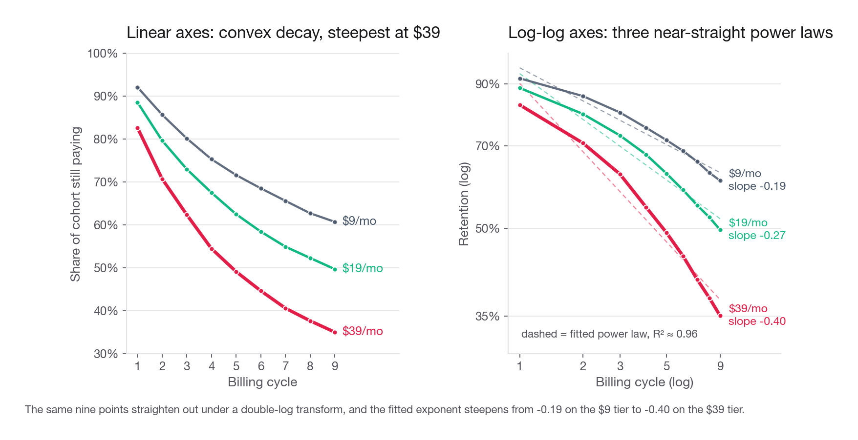
The trouble starts when you push it to cycle twelve. Extrapolating a power law fitted over cycles one to nine assumes the same exponent holds forever, and it does not. A power law forces the monthly hazard to fall like one over the cycle number, which is faster than a real mixed population's hazard falls. On the cheap tier the fitted hazard slides from 12.6 percent at cycle one to 2.3 percent at cycle eight, 18 percent of where it started, while the observed hazard only goes from 7.0 percent to 3.2 percent, 46 percent of where it started. Carry the fit to cycle eleven and its hazard is at 13 percent of its cycle-one value against a true 42 percent. The same rigidity shows at the near end: the fit predicts 96.2 percent retention at cycle one where the data show 92.1. From the third cycle onward the fitted curve is already losing less per period than the cohort actually loses, 0.9774 against an observed 0.9681 going into cycle nine, and its 9-to-12 decay is 0.9457 against a true 0.9104. The fit spends too much of its decay in the first two cycles and starves the tail, so month twelve reads high. The exponent language people reach for here is backwards too: in log-log coordinates the observed slope steepens with cycle, about negative 0.10 between cycles one and two and about negative 0.34 between seven and eight, so the single fitted negative 0.194 is inherited from the shallow early cycles and is too shallow for the tail.
Option B: shifted beta-geometric
The model that matches the actual mechanism assumes each subscriber has their own constant monthly churn probability, and that those probabilities are spread across the population by a beta distribution. Individually, everyone is memoryless. Collectively, the aggregate hazard falls over time purely because the high-churn types leave first. This is the shifted beta-geometric, and it has two parameters, alpha and beta.
The survival function has a recursion that makes it a fifteen-line fit:
def sbg_survival(alpha, beta, horizon):
    s, out = 1.0, []
    for t in range(1, horizon + 1):
        s *= (beta + t - 1) / (alpha + beta + t - 1)
        out.append(s)
    return np.array(out)

def sbg_pmf(alpha, beta, horizon):
    surv = sbg_survival(alpha, beta, horizon)
    return -np.diff(np.concatenate([[1.0], surv]))   # mass that churns at each t
The likelihood is where the censoring is handled properly, and this is the part to point at in a write-up. Every account that cancelled at cycle t contributes the probability mass at t. Every still-active account contributes the survivor probability past the window, not a probability of churning at nine.
from scipy.optimize import minimize

def fit_sbg(df, window=9):
    churn = np.array([((df["billing_cycles_paid"] == t) & (df["is_active"] == 0)).sum()
                      for t in range(1, window + 1)], dtype=float)
    survivors = float((df["is_active"] == 1).sum())

    def neg_ll(par):
        a, b = np.exp(par)                       # log-parameterized, keeps both positive
        pmf = sbg_pmf(a, b, window)
        alive = sbg_survival(a, b, window)[-1]
        return -(np.sum(churn * np.log(pmf + 1e-12)) + survivors * np.log(alive + 1e-12))

    res = minimize(neg_ll, [0.0, 0.0], method="Nelder-Mead",
                   options={"xatol": 1e-9, "fatol": 1e-9, "maxiter": 5000})
    return np.exp(res.x)
Fitting each tier separately and projecting out to three years:
for p, g in subs.groupby("monthly_price"):
    a, b = fit_sbg(g)
    s = sbg_survival(a, b, 36)
    print(f"tier {p}: alpha {a:.3f} beta {b:.3f} | "
          f"S(9) {s[8]:.4f}  S(12) {s[11]:.4f}  S(24) {s[23]:.4f}")
tier 9: alpha 0.543 beta 6.191 | S(9) 0.6073 S(12) 0.5499 S(24) 0.4166
tier 19: alpha 0.702 beta 5.418 | S(9) 0.4970 S(12) 0.4347 S(24) 0.3001
tier 39: alpha 0.991 beta 4.789 | S(9) 0.3504 S(12) 0.2882 S(24) 0.1689The in-sample fit is boringly close: month-nine survival lands within 0.0002 of observed on the cheap tier and matches the top tier to four decimals. What matters is the explicit censoring term in the likelihood, which makes the month-twelve number a projection from a coherent process rather than a line dragged past its data.
The parameters are worth one sentence in the write-up. Alpha divided by alpha plus beta is the average monthly churn probability across subscribers: 8.1 percent on the cheap tier, 11.5 on the middle, 17.2 on the top. Their sum controls dispersion, and smaller sums mean more spread, which means faster flattening.
Option C: refuse to extrapolate
The third option is to give the observed curve, state that month twelve is outside the data, and offer bounds instead of a point. Retention cannot rise, so month twelve is at most month nine's observed 0.5135 pooled. Freezing the hazard at the last observed monthly rate, 0.5135 over 0.5372 or 0.9558, and chaining it three more cycles gives the pessimistic end, about 0.448. Reporting that interval, roughly 0.448 to 0.514, and refusing to pick inside it is defensible, but it wins fewer points than a model plus a caveat. Note where the beta-geometric of Option B lands: 0.4530, inside that interval and near its floor.
The comparison that decides it
Because this dataset was generated, we can score all three against the truth.
| Method | Pooled S(12) | Pooled S(24) | Error at 12 | What it assumes |
|---|---|---|---|---|
| Flat hazard chained forward | 0.3903 | n/a | 6.3 points low | Churn rate is constant over time and across people |
| Log-log regression | 0.4982 | 0.4249 | 4.5 points high | The early-cycle power law holds indefinitely |
| Shifted beta-geometric | 0.4530 | 0.3266 | 0.00 points | Constant individual hazard, beta-distributed across people |
| Truth from the generator | 0.4530 | 0.3212 | reference | not available on a real challenge |
The flat-hazard row is the most common shortcut: total cancellations over total subscriber-months, here 11,677 over 154,840 or 7.54 percent per month, raised to the twelfth power. It runs 6.3 points pessimistic, and it will run pessimistic on essentially every real subscription business, because aggregate hazard declines whenever individual hazards differ.
Interview tip: If you only remember one line from this page: a single blended churn rate applied forward always understates long-run retention, because the surviving population is not the population you measured.
Step 3: answering the twelve-month question
The prompt asks what share of the cohort is still subscribed after at least twelve months. Blending the per-tier beta-geometric projections by tier size gives 45.3 percent, and here is the per-tier breakdown a reviewer can actually use.
| Tier (USD per month) | Subscribers | Observed S(9) | Projected S(12) | Projected S(24) | Mean monthly retention |
|---|---|---|---|---|---|
| 9 | 9,201 | 0.6074 | 0.550 | 0.417 | 0.946 |
| 19 | 10,550 | 0.4972 | 0.435 | 0.300 | 0.925 |
| 39 | 4,249 | 0.3504 | 0.288 | 0.169 | 0.890 |
| Blended | 24,000 | 0.5135 | 0.453 | 0.321 | 0.928 |
The mean monthly retention column is the geometric average across the nine observed cycles, computed as month-nine survival raised to the one-ninth power. It is the number executives repeat in meetings, so give it to them, but flag that it is an average of a declining series and therefore understates the retention of a month-twelve subscriber.
Three sentences belong under that table. Months ten through twelve are projections and no Reelbox subscriber has lived that long. The projection assumes no change in pricing, catalog, or billing, and a streaming catalog turns over constantly. And February is a launch cohort, launch cohorts skew toward enthusiasts, so steady-state numbers are probably worse across the board.
That last point requires no computation and shows you understand which population the number describes, which is exactly the kind of remark that gets a candidate advanced.
Step 4: is the top tier worth its churn?
Now the actual business question. Higher price, shorter life. Which wins?
Set the horizon at twelve months, which is the window finance uses for payback at most subscription companies. Expected charges collected in twelve months is one plus the sum of survival at cycles one through eleven. Multiply by price for revenue, apply tier gross margin, subtract blended acquisition cost.
Reelbox margins differ by tier: the top tier bundles 4K delivery and a sports add-on with per-subscriber rights fees, so its variable margin is thinner even though its price is higher. Blended acquisition cost is 26.14 per new subscriber, the cohort-weighted average of the four channel costs in Step 5, and it does not vary by tier because the tier is chosen after the click.
MARGIN = {9: 0.72, 19: 0.68, 39: 0.61}
CAC = 26.14

rows = []
for p, g in subs.groupby("monthly_price"):
    a, b = fit_sbg(g)
    s = sbg_survival(a, b, 24)
    charges_12 = 1.0 + s[:11].sum()
    revenue = p * charges_12
    rows.append({"tier": p, "charges_12": round(charges_12, 2),
                 "revenue_12": round(revenue, 2),
                 "gross_profit_12": round(revenue * MARGIN[p], 2),
                 "contribution_12": round(revenue * MARGIN[p] - CAC, 2)})
print(pd.DataFrame(rows).to_string(index=False))
tier charges_12 revenue_12 gross_profit_12 contribution_12
9 8.79 79.07 56.93 30.79
19 7.80 148.16 100.75 74.61
39 6.41 249.99 152.49 126.35| Tier (USD per month) | Charges in 12 months | Revenue | Gross profit | Contribution after CAC | Contribution at 24 months |
|---|---|---|---|---|---|
| 9 | 8.79 | 79.07 | 56.93 | 30.79 | 68.13 |
| 19 | 7.80 | 148.16 | 100.75 | 74.61 | 130.90 |
| 39 | 6.41 | 249.99 | 152.49 | 126.35 | 190.02 |
The top tier loses 2.4 charges relative to the cheap tier over a year and gains 171 in revenue for it. Even after a nine-point margin penalty its twelve-month contribution is 4.1 times the cheap tier's and 1.7 times the middle tier's, and the ranking holds at twenty-four months.
State the other direction plainly too: the 9 tier does not repay its acquisition cost until roughly month five and returns 30.79 over a year, which is 56.93 of gross profit against 26.14 of cost, a ratio of 2.2 and short of the 3-to-1 most subscription businesses want. That is a finding in its own right and more actionable than the headline, because it names a lever: stop buying paid traffic into the cheapest tier.
The break-even retention that makes the answer memorable
A point estimate invites the reply "but retention could get worse." Preempt it by solving for the retention at which the answer changes. Hold the top tier's price and margin fixed, replace its curve with a constant monthly retention r, and find the r that makes its twelve-month contribution equal the middle tier's 74.61.
from scipy.optimize import brentq

def charges_at(r, horizon=12):
    return (1 - r ** horizon) / (1 - r)          # 1 + r + r^2 + ... + r^(H-1)

gap = lambda r: 39 * MARGIN[39] * charges_at(r) - CAC - 74.61
print(round(brentq(gap, 0.30, 0.99), 4))0.7749The top tier's actual average monthly retention is 0.890. It would have to fall to 0.775, a loss of 11.5 points of monthly retention, and on that same average basis monthly churn would have to roughly double, from 11.0 percent to 22.5 percent, before the middle tier caught it on contribution. That is an enormous buffer, and one sentence carrying it is worth more than a paragraph of hedging. Two details are worth knowing before someone tests you on them. The 11.0 percent here is the aggregate observed hazard and is not the same object as the 17.2 percent mean individual churn the beta-geometric reported for this tier, and the gap between the two is the sorting effect again. And the acquisition cost cancels out of that equation, since it is subtracted from both sides, so 0.775 is the break-even retention at any CAC assumption you care to defend.
Interview tip: Whenever you deliver a comparison, also deliver the value of the key input at which the comparison reverses. It converts a fragile point estimate into a robust recommendation.
The causal caveat you must say out loud
Everything above describes tiers, not prices. Nobody at Reelbox randomized anyone into the 39 plan. Subscribers picked it, and people who pick the expensive plan skew toward households that watch a lot, own a 4K set, and care about sports rights. Their economics reflect who they are at least as much as what they pay.
So the recommendation that follows from this analysis is narrow and correct: the top tier is a healthy product, spend acquisition budget on the audiences that already choose it, and do not treat the cheapest tier as a growth engine because it barely clears its own acquisition cost.
The recommendation that does not follow is "move everyone up a tier." A subscriber nudged from 19 to 39 by an upsell module is a marginal buyer, not a self-selected enthusiast, and the marginal buyer's retention curve is very likely closer to the middle tier's than the top tier's. The clean way to learn that curve is a randomized test on the upsell module, which is exactly the shape of problem the pricing-test challenge later in this course walks through.
Step 5: region and channel, and what to do about them
The third bullet asks how region and acquisition channel move retention. Start descriptively.
def summarize(col):
    t = subs.groupby(col).agg(n=("subscriber_id", "size"),
                              S9=("is_active", "mean"))
    t["monthly_retention"] = t["S9"] ** (1 / 9)
    t["share_top_tier"] = subs.groupby(col)["monthly_price"].apply(lambda x: (x == 39).mean())
    return t.round(4)

print(summarize("acquisition_channel"))
print(summarize("region"))
n S9 monthly_retention share_top_tier
acquisition_channel
organic 5295 0.5630 0.9382 0.1792
paid_social 8154 0.4419 0.9132 0.1771
referral 3802 0.6113 0.9468 0.1694
search_ads 6749 0.5060 0.9271 0.1796
n S9 monthly_retention share_top_tier
region
BR 4412 0.4393 0.9126 0.1736
CA 2394 0.5376 0.9334 0.1600
IN 3293 0.4428 0.9135 0.1877
UK 3354 0.5775 0.9408 0.1813
US 10547 0.5407 0.9340 0.1777Referral subscribers hold at 61.1 percent through nine cycles against 44.2 percent for paid social, a 17-point spread. Brazil and India sit about 10 points below the US and 13 to 14 below the UK. And crucially, the top-tier share barely moves across groups, between 16.0 and 18.8 percent, so these gaps are not just a tier-mix artifact. That last check is the one candidates skip, and skipping it is how you end up reporting a channel effect that is really a price effect.
A discrete-time hazard model gets you the controlled effect
To quantify each factor holding the others fixed, expand the table to one row per subscriber per billing cycle they survived, mark the row where they cancelled, and fit a logistic regression. This is the person-period, or pooled logit, formulation of a discrete-time survival model, and it handles censoring by construction: an active subscriber simply contributes nine rows of zeros and no event row.
pp = subs.loc[subs.index.repeat(subs["billing_cycles_paid"])].copy()
pp["cycle"] = pp.groupby("subscriber_id").cumcount() + 1
pp["churned"] = ((pp["cycle"] == pp["billing_cycles_paid"]) &
                 (pp["is_active"] == 0)).astype(int)
pp["log_cycle"] = np.log(pp["cycle"])
pp["tier"] = pp["monthly_price"].astype(str)
print(len(pp), pp["churned"].sum())
154840 11677import statsmodels.formula.api as smf
model = smf.logit(
"churned ~ log_cycle + C(tier, Treatment('9')) "
"+ C(region, Treatment('US')) + C(acquisition_channel, Treatment('organic'))",
data=pp).fit(disp=0)
print(np.exp(model.params).round(3))
print(np.exp(model.params["log_cycle"] * np.log(2)).round(3)) # odds ratio per doublingIntercept 0.073
C(tier, Treatment('9'))[T.19] 1.434
C(tier, Treatment('9'))[T.39] 2.233
C(region, Treatment('US'))[T.BR] 1.380
C(region, Treatment('US'))[T.CA] 1.014
C(region, Treatment('US'))[T.IN] 1.364
C(region, Treatment('US'))[T.UK] 0.894
C(acquisition_channel, Treatment('organic'))[T.paid_social] 1.454
C(acquisition_channel, Treatment('organic'))[T.referral] 0.846
C(acquisition_channel, Treatment('organic'))[T.search_ads] 1.199
log_cycle 0.689
dtype: float64
0.773Read as odds ratios on monthly churn against the cheap tier, the US, and organic. The top tier churns at 2.23 times the odds of the cheap tier once region and channel are fixed. Paid social carries 1.45 times the odds of organic, referral 0.85. Brazil and India sit near 1.37. Canada is statistically indistinguishable from the US and should be reported as such, not as a 1.4 percent effect.
The log_cycle coefficient of 0.689 is the interesting one, and it is the one candidates misread. The predictor is np.log(cycle), so 0.689 is the odds ratio per one-unit rise in log tenure, which is per e-fold, a 2.7 times increase, not per doubling. For a doubling you raise the odds ratio to the power of the log ratio: 2 to the power of negative 0.372 is 0.77, so the odds of cancelling fall by about 23 percent each time tenure doubles. That is the second line the code block prints. Do not describe any of it as loyalty building. It is the sorting effect again: nobody's personal churn probability changed, the population composition did. Getting both halves right in the write-up, the exponent and the story, is a strong senior signal.
Turning that into a recommendation with a number
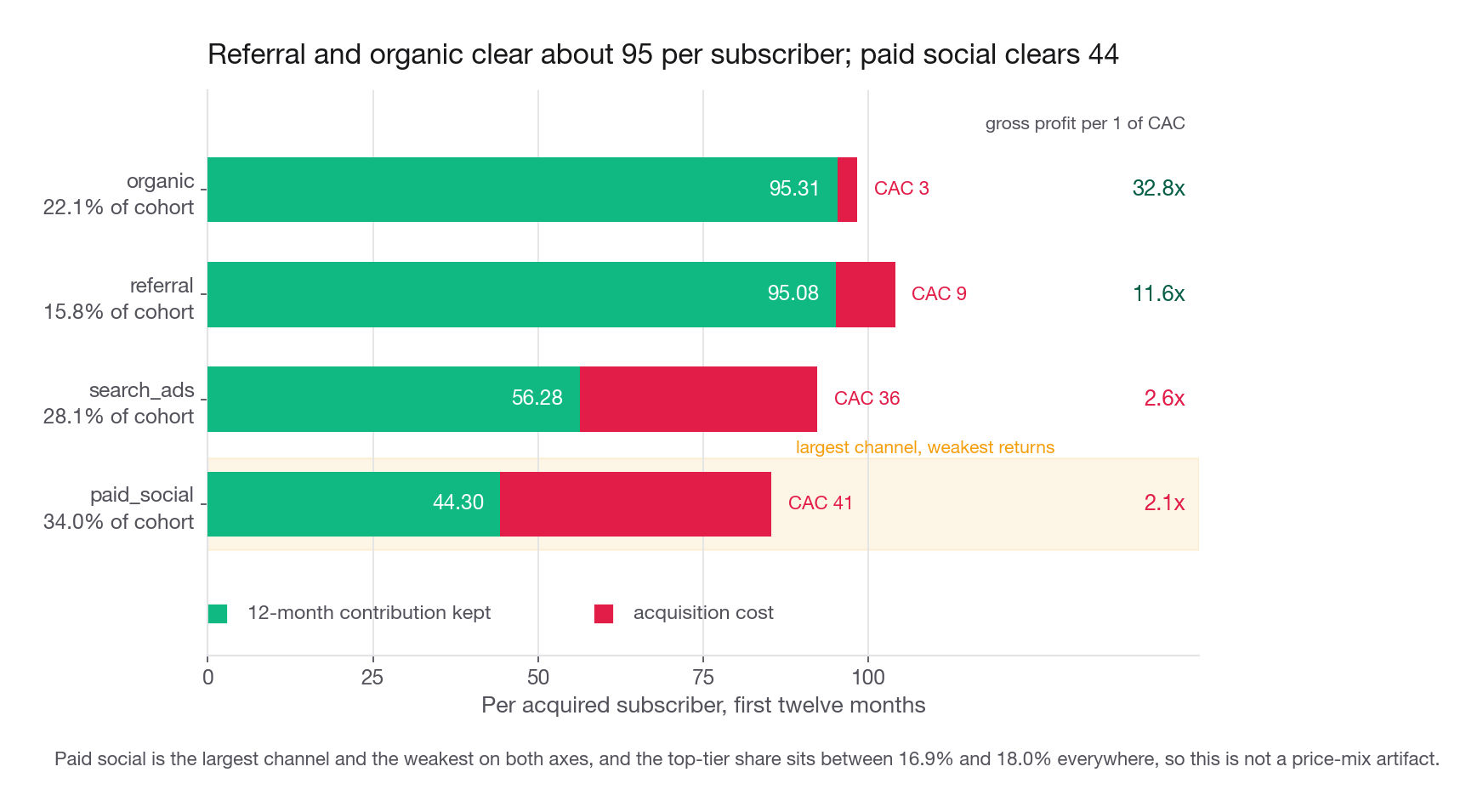
Retention by channel is only interesting once it meets acquisition cost. Reelbox pays 41 per paid-social subscriber, 36 for search, 9 for a referral bounty, and 3 for organic attribution overhead. Cohort-weighted by the channel counts above, those blend to the 26.14 used in Step 4: (8154 41 + 6749 36 + 3802 9 + 5295 3) / 24000. Fit the survival curve per channel, blend revenue across the channel's own tier mix, and compare.
| Channel | Share of cohort | Monthly retention | 12-month gross profit | CAC | 12-month contribution | Gross profit per CAC |
|---|---|---|---|---|---|---|
| referral | 15.8% | 0.947 | 104.08 | 9 | 95.08 | 11.6 |
| organic | 22.1% | 0.938 | 98.31 | 3 | 95.31 | 32.8 |
| search_ads | 28.1% | 0.927 | 92.28 | 36 | 56.28 | 2.6 |
| paid_social | 34.0% | 0.913 | 85.30 | 41 | 44.30 | 2.1 |
Paid social is the largest channel, 34 percent of the cohort, and the worst on both axes: it costs the most and retains the least. Its subscribers return 85.30 of twelve-month gross profit against 41 of acquisition cost, a ratio of 2.1, about 70 percent of the 3-to-1 most subscription businesses target, and that leaves 44.30 of contribution per acquired subscriber.
Referral is the finding worth leading with: 15.8 percent of the cohort at a bounty of 9, returning 104.08 of gross profit for a ratio of 11.6 and leaving 95.08 of contribution. Referral volume is supply-constrained rather than budget-constrained, so the recommendation is not "spend more" but "make it easier to refer": surface the invite in the post-play screen, raise the bounty, test a two-sided offer. Even at a bounty of 25 the ratio stays near 4, so there is a wide band to work in.
The proposal to close on: shift roughly a quarter of paid-social budget into referral incentives and creator partnerships, hold search flat, and re-measure the nine-cycle curve on cohorts acquired after the change. Attach the size. Moving 25 percent of paid social, about 2,040 subscribers, from a 44.30 contribution to something between referral and organic, call it 90, is on the order of 93,000 of extra twelve-month contribution on a cohort this size, before any volume loss from the smaller paid budget.
What goes in the write-up
The reviewer opens the document, not the notebook. Aim for two pages in this order.
Open with the answer in four sentences: 45.3 percent of the February cohort is projected to be subscribed at twelve months; the 39 tier contributes 126 per subscriber over that year against 75 for the 19 tier and 31 for the 9 tier; the top tier's retention would have to fall by 11.5 points of monthly retention before that ranking reverses; and paid social, the largest channel, is the weakest on both retention and cost.
Then three exhibits, each with a one-line takeaway written above it rather than below: the retention curves with the projected region dashed, the tier economics table, and the channel economics table.
Then a short methods section: censoring treatment in two sentences, the choice of beta-geometric over log-log in two more, and the fitted parameters in a table.
Then the recommendation with an owner and a measurement plan: reallocate paid-social budget toward referral, worth roughly 93,000 of twelve-month contribution per cohort this size, verified by re-running the nine-cycle curve on post-change cohorts against the February baseline.
Then the caveats, briefly: single launch cohort, nine months of data, self-selection into tiers, no experiment behind any of it.
Common traps
Computing retention without the active flag. The final period silently reports zero. Always include the survivor clause, and always print the last row before plotting.
Averaging a truncated lifetime column. Mean billing_cycles_paid is 6.45 here against a true twelve-month mean of 7.93. Anything built on that average, especially lifetime value, inherits a 19 percent understatement.
Chaining a single blended churn rate forward. The 7.54 percent monthly figure gives 39.0 percent at twelve months against a true 45.3. Aggregate hazard falls whenever individual hazards differ, which is always.
Extrapolating a log-log fit far past the data. It fits the nine observed points at R-squared 0.96 and still overshoots month twelve by 4.5 points, because a power law makes the hazard fall like one over k, faster than a real mixed population's, so past the data it under-decays: 0.9774 of fitted period retention going into cycle nine against 0.9681 observed. In-sample fit is not evidence about out-of-sample behavior.
Dropping the censored bucket and renormalizing. This produces a curve describing only the people who churned. It looks plausible, contains no zeros, and is wrong in a way that survives a casual read.
Reporting a group effect without checking mix. Channels here differ by at most 1.1 points in top-tier share, which is why the gaps are real. At a ten-point spread the whole channel ranking could have been a price effect in disguise.
Reading declining hazard as growing loyalty. The log_cycle odds ratio of 0.689 is composition, not behavior change. Saying otherwise invites a follow-up you will not enjoy.
Recommending a price increase from tier comparisons. Tier choice is self-selected. The number you have describes people who already wanted the expensive plan, not people you would push into it.
Skipping the region significance check. Canada's odds ratio of 1.014 is noise. Reporting it as a finding costs credibility and displaces something real.
Leaving the horizon undefined. "The top tier is worth 152" means nothing without "over twelve months, gross profit, before acquisition cost." Put the horizon and margin stage in the sentence, not a footnote.
Quick self-check
Answer these out loud before moving on. If any one of them takes more than thirty seconds, go back to that section.
A colleague computes retention as the share of subscribers whose
billing_cycles_paidexceeds k, for k from one to nine. Which single value is wrong, why is it wrong, and what value does it wrongly take?Under what data structure are the empirical survivor function and the Kaplan-Meier estimator numerically identical, and what change to the Reelbox extract would break that equality?
The log-log fit achieves an R-squared of 0.96 on all three tiers and still overstates twelve-month retention by roughly 4.5 points. Explain the mechanism, not just the fact.
The beta-geometric likelihood treats a still-active subscriber differently from one who cancelled at cycle nine. Write out, in words, the term each contributes.
The top tier collects 2.4 fewer charges per subscriber over a year than the cheap tier. Give the two quantities you must multiply through before that fact tells you anything about profit.
You are asked to recommend moving the checkout default from the 19 tier to the 39 tier. Name the assumption in your analysis that this recommendation violates, and name the study design that would fix it.