4.3 Challenge: Classifying Content Virality
Find the core decision, design, or behavior signal.
Turn the lesson into a concise response blueprint.
Name the trap you would avoid in a real interview.
Use these checkpoints as your reading path before diving into the full lesson.
- 1Why this matters in interviews
- 2The prompt, restated the way you should...
- 3The business situation
- 4The trap in the wording
- 5The data you are handed
Loop is a short-video app. It hands you fourteen days of daily play counts and asks you to sort every clip into three buckets: hot, stable and popular, or everything else. There is no label column, no ground truth, no accuracy number to optimize. This lesson is about where to draw the lines and how to defend them, because a challenge like this is graded on the defense, not the code.
Why this matters in interviews
Unsupervised labeling is the most under-prepared category in take-home challenges. Candidates who can build a gradient boosting model in twenty minutes freeze when nobody names the target, because they are hunting for a right answer and there isn't one. There is a rule, a justification, and consequences you either anticipated or did not. The grader is testing a chain of reasoning:
Did you turn a raw time series into features that mean something, rather than eyeballing one day?
Did you notice that the obvious growth metric is broken, and fix it?
Did you pick cut-offs from evidence in the data, and say plainly which cut-offs are arbitrary?
Did you check whether the labels survive perturbation, or did you present them as if they were facts?
Did you connect the labels back to the product decision that motivated the request?
Almost everyone does step one, half do step two, and very few do three through five, which is where the onsite invitation lives.
Interview tip: When a prompt gives you category names but no definitions, the definitions are the deliverable. Do not treat them as setup you rush past to get to modeling.
The prompt, restated the way you should restate it
Restating the prompt in your own words is the cheapest way to earn trust in a write-up, and it flushes out ambiguity before you spend two hours resolving it wrongly.
The business situation
Loop's home feed is the first screen after launch, and a large share of sessions end there: scroll a few cards, play nothing, leave. Loop buys installs at roughly 1.85 USD each, so a user who never plays is a straight loss. The trending shelf is curated by hand today, which makes it stale, small, and biased toward whatever the curation team watches.
Product wants an automated candidate set: flag two kinds of clip worth a home-feed slot. Clips taking off right now, where the audience is still building and the feed can add fuel. And clips that are not growing but are consistently enormous, the safe fallback that reliably gets plays from a cold-start user. Everything else stays off the shelf, and that third bucket holds most of the catalog.
The trap in the wording
"Hot" and "stable and popular" sound like independent categories. They are two regions in one two-dimensional space, defined by two quantities:
Trend: how fast the daily play count is moving, in relative terms, over the window.
Level: how many plays the clip gets on a typical day.
Say that out loud and the problem becomes a partition of a scatter plot, shifting the interview from "what algorithm" to "where do the boundaries go".
Interview tip: Name the two axes before you write any code. "Hot is high trend, stable and popular is near-zero trend plus high level, everything else is the remainder" is a complete answer to the framing question and takes fifteen seconds.
The data you are handed
Two tables, joined on the clip identifier.
| Table | Grain | Columns | Notes |
|---|---|---|---|
daily_plays | one row per clip per day | clip_id, play_date, plays | 14 consecutive days |
clip_meta | one row per clip | clip_id, duration_sec, audio_language, published_on, render_tier | set at upload time |
render_tier is one of sd_480, hd_720, hd_1080, uhd_2160. audio_language is uploader-selected, so it is self-reported and occasionally wrong. published_on can predate the window by weeks, which matters later.
The block below builds a stand-in so every number here is reproducible: 2,400 clips over fourteen days with three latent behaviours mixed in.
import numpy as np
import pandas as pd

SEED = 20270314
rng = np.random.default_rng(SEED)
N_CLIPS, DAYS = 2400, 14
dates = pd.date_range("2027-03-01", periods=DAYS, freq="D")
clip_id = np.arange(10001, 10001 + N_CLIPS)

age_days = rng.integers(1, 46, N_CLIPS)
duration = rng.integers(6, 181, N_CLIPS)
meta = pd.DataFrame({
    "clip_id": clip_id,
    "duration_sec": duration,
    "audio_language": rng.choice(["en", "es", "pt", "hi", "id", "other"], N_CLIPS,
                                 p=[.31, .17, .12, .15, .10, .15]),
    "published_on": pd.Timestamp("2027-03-01") - pd.to_timedelta(age_days, unit="D"),
    "render_tier": rng.choice(["sd_480", "hd_720", "hd_1080", "uhd_2160"], N_CLIPS,
                              p=[.18, .34, .36, .12]),
})
lift = -0.16 * (age_days - 9) - 0.011 * (duration - 40)
regime = np.where(rng.random(N_CLIPS) < 1.0 / (1.0 + np.exp(-lift)), 2,
                  np.where(rng.random(N_CLIPS) < 0.30, 1, 0))
drift = np.where(regime == 2, rng.normal(0.26, 0.06, N_CLIPS),
                 np.where(regime == 1, rng.normal(0.0, 0.014, N_CLIPS),
                          rng.normal(-0.085, 0.030, N_CLIPS)))
base = np.exp(rng.normal(9.8, 1.35, N_CLIPS) + 2.1 * (regime == 1))
t = np.arange(DAYS)
path = base[:, None] * np.exp(drift[:, None] * t[None, :] + rng.normal(0, 0.10, (N_CLIPS, DAYS)))
plays_long = pd.DataFrame({
    "clip_id": np.repeat(clip_id, DAYS),
    "play_date": np.tile(dates, N_CLIPS),
    "plays": np.clip(np.round(path), 1, None).astype(np.int64).ravel(),
})
You now have plays_long and meta. Everything below assumes both exist.
Step 1: Audit the panel before you compute a single trend
Every trend metric silently assumes the panel is rectangular: same clips, same days, no holes. If that is false and you never check, the growth rates are garbage in a way the output does not reveal.
grid = plays_long.groupby("clip_id")["play_date"].agg(["min", "max", "count"])
span = (grid["max"] - grid["min"]).dt.days + 1
print("clips:", len(grid))
print("panels shorter than 14 days:", int((grid["count"] != 14).sum()))
print("panels with internal gaps:", int((span != grid["count"]).sum()))
print("duplicate clip-days:", int(plays_long.duplicated(["clip_id", "play_date"]).sum()))
clips: 2400
panels shorter than 14 days: 0
panels with internal gaps: 0
duplicate clip-days: 0Clean. Say so and move on. Run it anyway, because when it is not clean you need three decisions ready, and interviewers ask about them even when the data cooperates.
The three decisions a ragged panel forces
Missing day versus zero day. A clip with no row either got zero plays or lost a logging partition. Opposite facts: zero plays is a real observation about a dying clip, a dropped partition is nothing at all. Fill a pipeline gap with zero and you manufacture a crash that never happened, which any log-based trend metric reads as an infinite decline.
Short panels. A clip published three days before the window ends has three observations, and a slope fit on three points has enormous variance. Short panels are also the clips most likely to be genuinely accelerating, so they flood the hot bucket with noise. Require a minimum history, seven days on a fourteen-day window, and route everything shorter into a separate insufficient_history label. That is not the same as everything_else: one means "we looked and it is not interesting", the other means "we cannot tell yet".
Partial final day. If the extract ran at 14:00 on the last date, that day is a partial count and every clip looks like it fell off a cliff. Check the last day's catalog-wide total against the prior days and drop it if it is short.
Interview tip: Say "I would separate insufficient history from everything else" out loud. It costs you one sentence and it is the single most reliable signal that you have shipped something like this before.
Step 2: The growth metric most candidates reach for is broken
The instinct is to compute the day-over-day percentage change, average it per clip, and call that the trend. It reads naturally and it is wrong three separate ways.
def trend_metrics(series):
    v = np.asarray(series, dtype=float)
    ratios = v[1:] / v[:-1]
    arithmetic = float((ratios - 1).mean())
    geometric = float((v[-1] / v[0]) ** (1.0 / (len(v) - 1)) - 1)
    x = np.arange(len(v), dtype=float)
    y = np.log(v)
    slope = ((x - x.mean()) * (y - y.mean())).sum() / ((x - x.mean()) ** 2).sum()
    return arithmetic, geometric, float(np.expm1(slope))

cases = [("bounce", [100, 200, 100]),
         ("dead_day", [50, 5, 400, 900, 1500]),
         ("clean_climb", [1000, 900, 1400, 1800, 2400])]
for name, series in cases:
print(name, [round(m, 3) for m in trend_metrics(series)])| Clip | Daily plays | Mean of daily percent change | Endpoint compound rate | OLS slope on log plays |
|---|---|---|---|---|
| bounce | 100, 200, 100 | +25.0% per day | 0.0% per day | 0.0% per day |
| dead_day | 50, 5, 400, 900, 1500 | +2,000% per day | +134% per day | +232% per day |
| clean_climb | 1000, 900, 1400, 1800, 2400 | +26.9% per day | +24.5% per day | +27.7% per day |
Three failures, worst first.
Failure one: the arithmetic mean of ratios is not a growth rate
bounce ends exactly where it started. Doubling is +100%, halving is -50%, and the average is +25%. Averaging ratios arithmetically returns a positive number for a clip that went nowhere. That is what the metric does to every volatile clip, and volatility correlates with being small, so the hot bucket fills with small noisy clips.
Failure two: one tiny denominator dominates everything
dead_day has one bad day of 5 plays. The next ratio is 80, a +7,900% change, dragging the average to +2,000% per day. Over fourteen days the mean divides by thirteen, so one outlier ratio carries about 8% of the weight. Any clip with a near-zero day is catapulted to the top of the ranking.
Failure three: even on clean data the mean is biased upward
This one is quiet and it is where a senior candidate stands out. If daily plays are a smooth path times multiplicative noise, the day-over-day ratio is true growth times a ratio of two noise terms. Take flat traffic with log-scale daily noise of standard deviation 0.10. The log ratio then has standard deviation about 0.14, so its variance is 2 * 0.10**2 = 0.02 and the expected ratio is exp(0.02 / 2), about 1.010. The exponent must be the variance of the log ratio; feed it the daily variance scaled by the square root of two instead and you get a harmless-looking +0.7%, hiding half the effect. The mean percent change reports roughly +1% per day on a clip that is not growing.
The catalog confirms it. Across the 103 clips this page labels stable and popular, the mean of daily percent changes averages +1.0% per day against +0.1% for the log slope. Over fourteen days that phantom rate compounds to a 15% apparent lift out of pure noise, and if your flat band is plus or minus 3% you have quietly shifted a third of it.
What to use instead
Fit an ordinary least squares line to log(plays) against the day index, per clip, and convert the slope to a daily multiplier with exp(slope) - 1. Three properties make this the default:
It uses every observation, so a bad day moves it by roughly
1/nof its log deviation instead of dominating.It is symmetric in log space, so a double followed by a halving cancels exactly.
The slope is interpretable: 0.07 means about 7% more plays per day, compounding to 2.6x over fourteen days.
The endpoint compound rate is a simpler alternative and easier to explain to a product manager, but it rests on two observations and inherits the outlier problem at the boundaries. If you use it, compare the first three days' median to the last three days' median.
Interview tip: If the interviewer pushes on robustness, offer Theil-Sen: the median of all pairwise slopes in log space. It costs a few lines, tolerates up to 29% contaminated points, and naming it signals you know OLS is not automatically robust.
Step 3: Two features, one for trend and one for level
panel = plays_long.sort_values(["clip_id", "play_date"]).copy()
panel["day_index"] = panel.groupby("clip_id").cumcount()
panel["log_plays"] = np.log(panel["plays"])

def log_slope(sub):
    x = sub["day_index"].to_numpy(dtype=float)
    y = sub["log_plays"].to_numpy()
    return ((x - x.mean()) * (y - y.mean())).sum() / ((x - x.mean()) ** 2).sum()

clips = (panel.groupby("clip_id")[["day_index", "log_plays"]]
              .apply(log_slope).rename("log_slope").to_frame())
clips["daily_growth"] = np.expm1(clips["log_slope"])
clips["median_plays"] = panel.groupby("clip_id")["plays"].median()
clips["total_plays"] = panel.groupby("clip_id")["plays"].sum()
Two choices there deserve a sentence each in the write-up.
Why day_index and not the raw date. Regressing on a date column leaves the slope's unit dependent on how pandas coerces the type, and it breaks when a clip's window starts on a different date. An integer index from zero per clip makes the slope unambiguous and handles ragged windows unchanged.
Why the median for level and not the mean. Take daily plays of 12,000, 11,500, 900,000, 12,500, 11,800, where one day an aggregator picked the clip up. The mean is 189,560, the median 12,000. The mean calls it a large clip, the median a small clip with one lucky day, and the median is right. Level is a question about a typical day. Use the mean and you promote yesterday's accident.
Here is the shape of the two features across the catalog.
       daily_growth   median_plays
count      2400.000       2400.000
mean         -0.002     176406.700
std           0.139    1093153.000
min          -0.181        158.000
25%          -0.090       7113.000
50%          -0.055      26339.250
75%           0.007     108785.500
max           0.512   48005520.000
The median clip is shrinking by about 5.5% per day. Worth stating: most content decays, and the interesting clips are a small minority in the right tail.
Step 4: Choosing thresholds you can defend
This section separates a strong submission from an average one. There are four thresholds and they are not the same kind of decision.
The trend cut is determined by the data
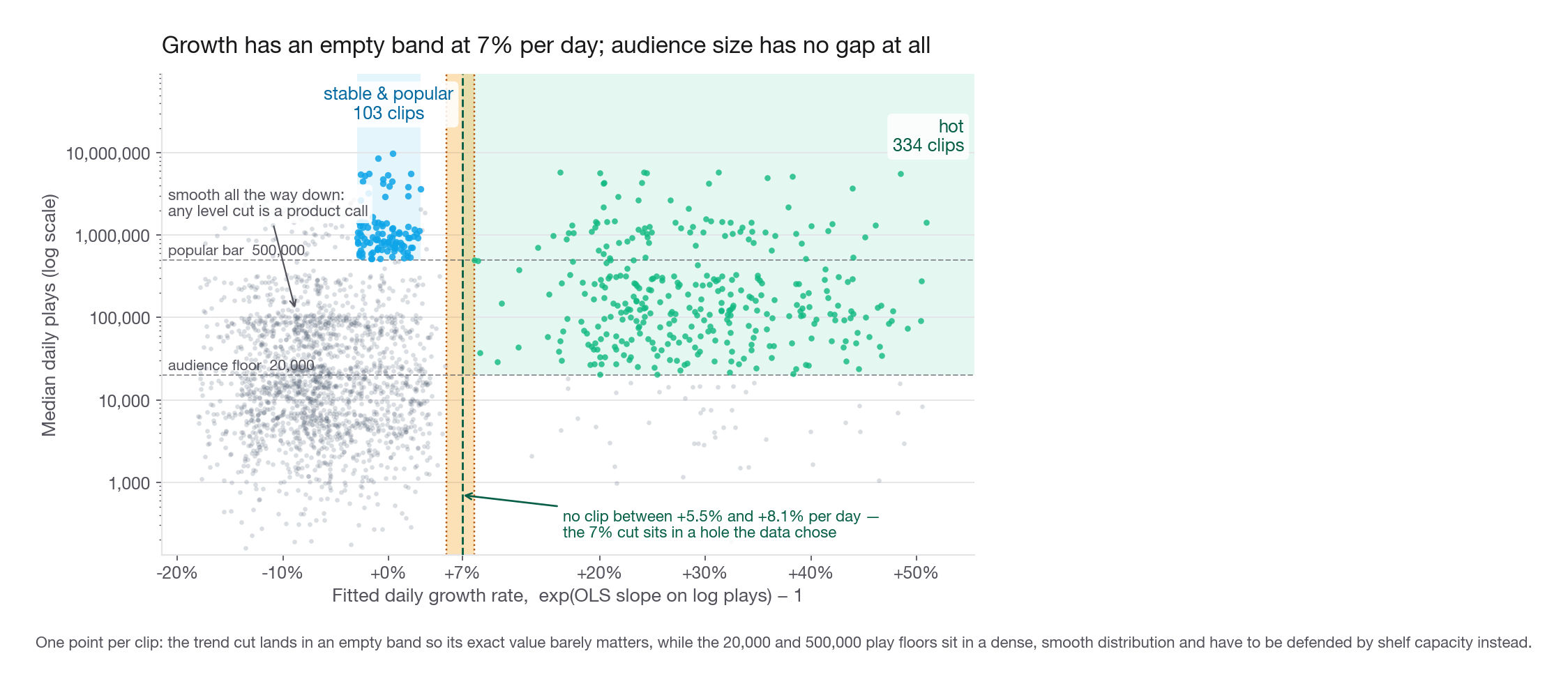
Sort the growth rates and look for a gap. The sorted values run continuously to +5.5% per day, then jump to +8.1%, with nothing between. Clips decay, hold flat, or genuinely compound, and almost nothing sits in between. Put the cut in the middle of the gap, at 7% per day. The payoff is that the choice barely matters, which is the strongest thing you can say about a threshold.
| Growth cut (per day) | Clips labelled hot | Change from baseline |
|---|---|---|
| 4% | 337 | +0.9% |
| 5% | 334 | 0 |
| 7% | 334 | baseline |
| 10% | 332 | -0.6% |
| 15% | 326 | -2.4% |
Moving the cut from 4% to 15% changes the hot bucket by eleven clips out of 334. Put that in the write-up: the exact number does not matter because the data has a hole where the number goes.
The flat band follows similar logic. Plus or minus 3% per day compounds to plus 52% or minus 33% over fourteen days, which is a lot to call "flat", so tighten it on a longer window. Below plus or minus 1% you are inside the noise floor of the slope estimate and the band stops meaning anything.
The level cuts are determined by capacity, not by the data
Now the honest part. The play-count distribution is smooth and heavy-tailed, with no gap anywhere. Any level threshold is a product decision wearing a statistics costume, and pretending otherwise is the most common way candidates lose credibility here.
| Threshold | Knob | Clips at loose setting | Clips at tight setting | Data supports a specific value? |
|---|---|---|---|---|
| Growth cut for hot | 4% to 15% per day | 337 | 326 | Yes, clear empty band |
| Flat band for stable | 1% to 5% per day | 111 | 42 | Partly, bounded below by noise |
| Audience floor for hot | 0 to 100,000 median plays | 381 | 193 | No |
| Level bar for stable | 200,000 to 1,000,000 median plays | 219 | 44 | No |
So derive the level cuts from the slot budget. Loop's home feed shows twelve cards above the fold and the trending shelf owns five. To rotate that shelf without repeating a clip in a session, and to leave personalization something to choose between, product wants 400 to 500 live candidates. An audience floor of 20,000 median plays and a popular bar of 500,000 yields 334 plus 103, or 437. That is a defense a product manager can argue with, which is what a threshold defense should be.
The audience floor is the piece the obvious solution omits. Without it, 381 clips clear the growth cut and 47 of them have a median under 20,000 daily plays. A clip going from 40 plays to 900 has a spectacular growth rate and no audience. Promoting it into a slot that millions of sessions will see is not a bet on a rising star, it is throwing a slot away. The floor converts "trending up" into "trending up and already large enough to matter".
Applying the rule
GROWTH_CUT = 0.07
AUDIENCE_FLOOR = 20_000
FLAT_BAND = 0.03
POPULAR_LEVEL = 500_000

hot = (clips["daily_growth"] >= GROWTH_CUT) & (clips["median_plays"] >= AUDIENCE_FLOOR)
stable = (clips["daily_growth"].abs() <= FLAT_BAND) & (clips["median_plays"] >= POPULAR_LEVEL)
clips["virality_class"] = np.select([hot, stable], ["hot", "stable_popular"],
                                    default="everything_else")
print(clips["virality_class"].value_counts())
everything_else 1963
hot 334
stable_popular 103The growth regions are disjoint, so evaluation order does not matter here. Do not rely on that in general: if regions can overlap, write the precedence down rather than letting a nested conditional decide silently.
The same rule in SQL
Most production versions run as a nightly query, not a notebook. Postgres gives you the regression directly.
WITH indexed AS (
    SELECT clip_id,
           plays,
           (play_date - MIN(play_date) OVER (PARTITION BY clip_id))::int AS day_index
    FROM daily_plays
    WHERE play_date BETWEEN DATE '2027-03-01' AND DATE '2027-03-14'
),
per_clip AS (
    SELECT clip_id,
           COUNT(*) AS days_seen,
           regr_slope(LN(GREATEST(plays, 1)), day_index) AS log_slope,
           PERCENTILE_CONT(0.5) WITHIN GROUP (ORDER BY plays) AS median_plays
    FROM indexed
    GROUP BY clip_id
)
SELECT clip_id,
       EXP(log_slope) - 1 AS daily_growth,
       median_plays,
       CASE
           WHEN days_seen < 7 THEN 'insufficient_history'
           WHEN EXP(log_slope) - 1 >= 0.07 AND median_plays >= 20000 THEN 'hot'
           WHEN ABS(EXP(log_slope) - 1) <= 0.03 AND median_plays >= 500000
                THEN 'stable_popular'
           ELSE 'everything_else'
       END AS virality_class
FROM per_clip;
Note how the zero days are handled. LN(0) is undefined, so the log input is floored with GREATEST(plays, 1). The tempting alternative, AND plays > 0 in the WHERE clause, strips those rows before every aggregate below it and breaks three things at once. COUNT(*) counts only surviving days, so a full fourteen-day panel with eight dead days reports days_seen = 6 and returns insufficient_history, exactly the conflation Step 1 forbids. The median is taken over the pre-crash days, so a clip that was enormous for eight days and then died reads as a flat 900,000-a-day clip and lands on the shelf. And an all-zero clip vanishes entirely instead of being classified. A clip with real zero days has a full history and belongs in everything_else. The Python path omits the seven-day guard only because Step 1 proved this panel rectangular; production tables are not.
Step 5: Prove the labels are not an artifact of your thresholds
A rule that answers differently on the first half of the window than the second is not a classification. Split the window and compare.
def label_window(day_range):
    part = panel[panel["day_index"].isin(list(day_range))]
    growth = np.expm1(part.groupby("clip_id")[["day_index", "log_plays"]].apply(log_slope))
    level = part.groupby("clip_id")["plays"].median()
    h = (growth >= GROWTH_CUT) & (level >= AUDIENCE_FLOOR)
    s = (growth.abs() <= FLAT_BAND) & (level >= POPULAR_LEVEL)
    return pd.Series(np.select([h, s], ["hot", "stable_popular"],
                               default="everything_else"), index=growth.index)

first_half = label_window(range(0, 7))
second_half = label_window(range(7, 14))
print(pd.crosstab(first_half, second_half))
print("overall agreement:", round(float((first_half == second_half).mean()), 3))
everything_else hot stable_popular
everything_else 1923 99 19
hot 2 265 1
stable_popular 23 0 68
overall agreement: 0.94Overall agreement is 94%, which sounds great and is the wrong number to quote.
| First-week label | Count | Kept the same label in week two | Interpretation |
|---|---|---|---|
| hot | 268 | 265 (98.9%) | Acceleration persists over a one-week horizon |
| stable_popular | 91 | 68 (74.7%) | Fragile under a seven-day re-measurement: 18 of the 23 flips fail the flatness test, 5 the level bar |
| everything_else | 2,041 | 1,923 (94.2%) | 99 became hot in week two, so the label misses new risers |
Three findings, none of which the 94% headline contains.
Hot is sticky over one week. Of 268 clips flagged hot on days one through seven, 265 were still hot on days eight through fourteen, so promoting a hot clip is not chasing a spike that already passed.
Stable and popular is the fragile bucket, and not for the reason it looks like. A quarter fall out. Decompose them before you explain them: of the 23 clips that lose the label, 18 fail only the flatness test, 5 fail only the 500,000 bar, and none fail both. The level story is real but it is a fifth of the churn. Five clips sat at 510,000 one week and 490,000 the next, which is the concrete cost of a threshold placed where there is no gap.
The other 18 are the estimator, not the clips. Halving the window nearly triples the slope's standard error: with log-scale daily noise of 0.10 it is 0.019 on seven days against 0.0066 on fourteen. The band half-width ln(1.03) is 0.030, so a band 4.5 standard errors wide in the production rule is only 1.6 wide here, and a genuinely flat clip tests outside it about one week in five. Predicted 20%, observed 18 of 91. Check those 18 against the generator's true drift and 17 are flat by construction, so the flip is measurement noise, not behaviour. Notice that rather than overclaim: the split-half test understates the stability of any two-sided band, and it does not do that to hot, whose one-sided cut sits nowhere near the mass, since hot clips grow about 30% a day against a 7% cut. Quoting 74.7% next to 98.9% compares a two-sided test to a one-sided one.
Fixes, ordered by what they buy. Require two consecutive periods outside the band before dropping the label, hysteresis on growth rather than only on level, which handles the 18. Scale the band to the window's slope standard error instead of pinning it at 3%; that is not licence to loosen the fourteen-day band, which Step 4 argues should be tighter. Shrink each slope toward the catalog mean so a seven-day estimate is not taken at face value. Then, for the 5, level hysteresis: a clip must fall 15% below the bar to lose the label, which moves the count from 23 to 18.
Refresh cadence is the real limiting parameter. Ninety-nine clips went from unremarkable to hot between week one and week two. A label computed once on days one through seven and shipped would have missed all ninety-nine for a full week, while the same seven-day fit recomputed on days eight through fourteen catches every one of them. The binding constraint is how often you recompute, not how much history you feed the fit.
If anything the pressure on length runs the other way. Refit those clips on the full fourteen-day window and only 68 of the 99 clear the growth cut, because seven flat days ahead of the takeoff halve the slope. Recall against these risers is 99 of 99 at a five to seven day window, 89 at ten days, 68 at fourteen. A longer window buys a steadier slope and pays for it in detection lag, worth saying out loud next to the rolling fourteen-day job in Step 7.
Interview tip: Never quote overall agreement on an imbalanced label set. Quote per-class persistence. Overall agreement here is 94% and it is 100% dominated by the 82% of clips that were never going to move.
Step 6: What do hot clips actually look like?
The prompt asks for characteristics. Join the labels to the metadata and compare.
profile = clips.join(meta.set_index("clip_id"))
profile["age_days"] = (pd.Timestamp("2027-03-01") - profile["published_on"]).dt.days
print(profile.groupby("virality_class")[["age_days", "duration_sec", "median_plays"]].median())
print(pd.crosstab(profile["render_tier"], profile["virality_class"], normalize="columns"))| Attribute | hot | stable_popular | everything_else |
|---|---|---|---|
| Share of catalog | 13.9% | 4.3% | 81.8% |
| Share of total plays | 54.6% | 24.3% | 21.1% |
| Median age at window start | 7 days | 26 days | 26 days |
| Share younger than 14 days | 76.3% | 20.9% | 21.4% |
| Median duration | 78 sec | 93 sec | 99 sec |
| Median daily plays | 135,004 | 933,478 | 16,863 |
| Median plays on day 1 | 26,446 | 928,643 | 25,372 |
| Median plays on day 14 | 681,795 | 913,102 | 10,968 |
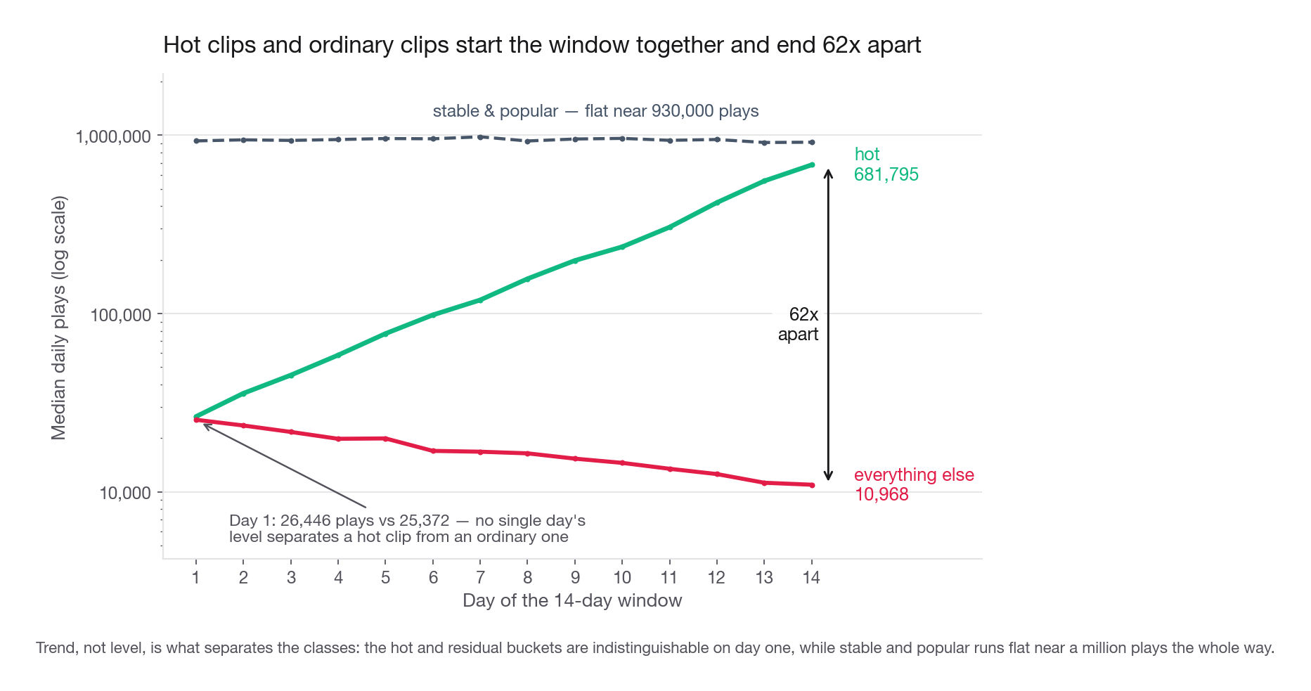
Read the last three rows together. On day one a hot clip and an average clip look almost identical, 26,446 plays against 25,372, and by day fourteen they differ by a factor of 62. Level on any single day cannot tell them apart. Trend can. That is the justification for doing any of this instead of sorting by yesterday's play count.
Two attributes carry signal, two do not:
Age carries strong signal. 76.3% of hot clips are under fourteen days old against 21.4% of the rest, making recency the best single predictor of acceleration.
Duration carries mild signal. Hot clips run a median 78 seconds against 99, a real gap with heavy overlap: interquartile ranges of 38 to 117 seconds against 54 to 141.
Render tier carries nothing.
hd_720is 35.6% of hot clips and 36.5% of everything else. Report the null, it stops someone building a "prefer high resolution" rule on noise.Language carries nothing meaningful. English is 34.7% of hot clips and 31.5% of the rest, well inside what 334 clips can resolve.
The confounding you must name out loud
The sentence that turns an average answer into a strong one: these are the characteristics of clips that became hot under the current promotion system, not of clips that are intrinsically viral.
The home feed already promotes things, whatever it promotes gets plays, and plays feed back into the trend. If the hand-curated shelf skews recent, "recent" looks predictive whether or not recency causes anything. You are measuring content and distribution jointly and cannot separate them here.
The consequence is a closed loop: a model that predicts hotness from age and duration promotes short recent clips, those get plays, the next training round confirms that short recent clips are hot, and the catalog collapses onto a narrower band. The fix is not statistical. It is an exploration budget in the ranker, plus a holdout slice where promotion is randomized so an unconfounded estimate survives.
Interview tip: Whenever a prompt asks "what are the characteristics of the winners", the expected senior answer includes the sentence "this is descriptive and confounded by how we currently distribute". Candidates who skip it get read as junior regardless of how good the analysis was.
Step 7: From labels to the home feed
The labels are a candidate filter, not a ranker and not a recommender. Keeping that distinction clean is most of the product answer.
Why the label must not be the ranking score
Sorting the shelf by growth rate puts the fastest-growing clip in slot one for every viewer on the planet. Growth rate is a property of the clip, not of the match between clip and viewer, so a cold-start user in Jakarta and one in Sao Paulo would see identical shelves. Worse, growth is self-reinforcing: slot one gets far more impressions than slot five, so whatever you rank first grows fastest tomorrow, and the incumbent can never be unseated. The label answers "is this clip worth considering", the ranker answers "which of these fits this viewer".
The exploration budget
Reserve one of the five slots for a clip drawn from outside the candidate set, weighted toward recent uploads with thin impression history. If a random clip converts at half the rate of a candidate, that costs about 10% of shelf play rate, and it buys a candidate set that keeps discovering content instead of recycling the same 437 clips until they decay together. State the cost: "one slot in five is exploration, costing roughly 10% of shelf play rate" beats "we should also explore".
Refresh cadence
Recompute daily. The split-half analysis found 99 clips entering the hot state within one week, so a weekly refresh spends up to seven days on a candidate set missing the newest risers. Daily is cheap: one grouped regression over fourteen days of a play-count table. Window length is the other half of that dial and points the opposite way, as Step 5 showed: fourteen days is the steadier slope bought with detection lag. Compute both and say which you would ship.
Step 8: How you would evaluate it
Two layers: an offline check that the labels carry predictive information, and an online test that the shelf changes behaviour. The offline metric is where candidates usually pick something that cannot fail.
Offline: choose a metric that popularity cannot win
The tempting evaluation asks what share of the holdout's plays came from labelled clips. Fit on the first ten days, hold out the last four, and run the dumbest baseline alongside it: the same number of clips, picked by plays so far.
early = label_window(range(0, 10))
cand = set(early.index[early != "everything_else"])
pop = set(panel[panel["day_index"] < 10].groupby("clip_id")["plays"]
          .sum().nlargest(len(cand)).index)
fut = panel[panel["day_index"] >= 10].groupby("clip_id")["plays"].sum()
print("candidates:", len(cand))
print("rule:", round(float(fut.reindex(list(cand)).sum() / fut.sum()), 3))
print("popularity:", round(float(fut.reindex(list(pop)).sum() / fut.sum()), 3))
candidates: 401
rule: 0.891
popularity: 0.877The ten-day fit flags 401 clips, fewer than the 437 the full window produces, and they capture 89.1% of holdout plays. That reads as a triumph until the line under it: sorting by plays so far gets 87.7% on the same 401 slots, so the rule wins by 1.3 points. Give the baseline exactly the slot count the rule gets, or the first question you face is whether the margin is a slot-count artifact.
That is a failure of the metric, not the rule. Volume capture is dominated by clips that are already large, so any metric denominated in total plays goes to a popularity sort. Evaluate what popularity cannot do: find clips that are not big yet and will be.
early = label_window(range(0, 10))
level_now = panel[panel["day_index"] < 10].groupby("clip_id")["plays"].median()
already_big = set(level_now.nlargest(200).index)
future_plays = panel[panel["day_index"] >= 10].groupby("clip_id")["plays"].sum()
newcomers = set(future_plays.nlargest(200).index) - already_big
candidates = set(early.index[early == "hot"]) - already_big
print("newcomers into the future top 200:", len(newcomers))
print("hot clips not already top 200:", len(candidates))
print("recall:", round(len(newcomers & candidates) / len(newcomers), 3))
print("precision:", round(len(newcomers & candidates) / len(candidates), 3))
newcomers into the future top 200: 86
hot clips not already top 200: 257
recall: 1.0
precision: 0.335Label on the first ten days, hold out the last four, and ask a discovery question: of the clips that break into the top 200 by plays during the holdout without having been there before, how many did the hot label flag in advance? All 86. Precision is 33.5% against a base rate of 3.9% for a random pick outside the current top 200, an 8.6x lift on exactly the question a popularity sort cannot answer. That is the number for the write-up. The 66.5% false positive rate is a design choice, not an apology: a false positive costs one impression of a merely good clip, a false negative costs a breakout.
Online: the experiment that decides it
Offline lift does not prove the shelf changes behaviour. Run a randomized test.
| Element | Choice | Why |
|---|---|---|
| Randomization unit | Device, hashed on the device identifier | Many first sessions have no account yet, and a returning user must see a consistent shelf |
| Analysis unit | Home-feed session | The problem is stated as a per-session rate |
| Arms | Hand-curated shelf versus rule-generated candidates plus ranker | The honest counterfactual is the current process, not an empty shelf |
| Primary metric | Share of home-feed sessions with at least one play started | The stated problem, phrased as a rate |
| Guardrails | Watch time, day-7 return rate, completion rate, report rate | Catches a shelf that wins clicks by being clickbait |
| Duration | 14 days minimum | Covers two weekly cycles and lets novelty decay |
Sizing. The baseline share of home-feed sessions with a play is 61.6%, so abandon is 38.4%. To detect a 1.5 point absolute improvement at 5% significance and 80% power, the two-proportion approximation gives 16 * 0.384 * 0.616 / 0.015 ** 2, about 16,800 sessions per arm. Loop sees 2.1 million home-feed sessions a day, so a 50/50 split clears that in under an hour.
Then volunteer the objection that number invites, because "what is your randomization unit, what is your analysis unit, how do you handle the mismatch" is one of the most common follow-ups there is. You randomized devices and you are counting sessions, and sessions inside a device are not independent draws: whether a device belongs to a heavy player or a lurker is the dominant variance component for "did this session contain a play". That makes the session rate a ratio metric over a clustered unit, wanting cluster-robust or delta-method standard errors rather than binomial ones. Equivalently, inflate 16,800 by a design effect of 1 + (sessions per device - 1) * ICC, remembering that sessions per device is right-skewed so the equal-cluster form understates it. None of it binds: a design effect of 10 still only needs 168,000 per arm, which 2.1 million daily sessions clear in under four hours.
That answer is a trap. When power is trivially available the binding constraint stops being sample size and becomes bias. Run the full fourteen days anyway: novelty inflates week one, weekday and weekend behaviour differ, and a shelf that lifts first-session plays while quietly reducing day-7 return is only visible across a full weekly cycle.
Sizing the prize before anyone asks
Convert the effect into money, because someone will ask whether it is worth an engineer.
A 1.5 point lift on 2.1 million daily sessions is 31,500 more sessions with a play. Valued as ad impressions at 2.4 impressions per engaged session and a 3.10 USD effective CPM, that is about 234 USD a day, roughly 86,000 USD a year. Say the unimpressive number out loud, because it is what makes the real argument credible.
The real argument is acquisition payback. About 240,000 of those daily sessions are first sessions from paid installs at 1.85 USD each, so 1.5 points activates roughly 3,600 additional new users a day. Activated users return at day 7 at 34% against 9% for users who never played anything. Do not hand that 25 point gap over as the causal effect of activation: users who play unprompted differ in intent, acquisition source, and content match, and the marginal user a shelf nudges comes from the low-intent end of that distribution. At full transfer the arithmetic gives 900 extra retained users a day and, at a twelve-month contribution near 4.40 USD each, about 1.4 million USD a year, sixteen times the ad number. Call that the optimistic ceiling it is, since it assumes the marginal user retains like the average self-selected player. The clean version needs no transfer assumption at all: day-7 return is already a listed guardrail, so the difference between arms measures the incremental retained users directly. Then discount the ceiling out loud, because even at 30% transfer the value is roughly 430,000 USD, still five times the ad number, and surviving a hostile discount is the whole point.
Interview tip: When the direct revenue math for your project is small, compute it anyway and then present the larger indirect mechanism. Volunteering the unflattering number is what makes the flattering one believable.
Common traps
Averaging daily percentage changes. Upward biased on noisy data, explodes on one small denominator, and reports growth for a clip that ends where it started. Fix: fit a line to log plays and convert with exp(slope) - 1.
Using the mean daily plays as the level. One aggregator pickup makes a small clip look large. Fix: use the median, or a trimmed mean if you want more of the distribution.
Classifying on the last day alone. Two clips with identical day-14 counts can be one rising and one falling, and telling them apart is the whole exercise. Fix: always combine trend with level.
No audience floor on hot. Without one, 381 clips clear the growth cut here and 47 have a median under 20,000 daily plays. Fix: require a minimum level before a clip is eligible to be called hot, derived from shelf capacity.
Presenting thresholds as if the data chose all of them. The growth cut sits in a real gap and is robust from 4% to 15%. The level bars sit in a smooth heavy tail and are product choices. Fix: label each threshold by which kind it is.
Quoting overall agreement on an imbalanced label. The 94% here is carried by the 82% of clips that were never going to change. Fix: report per-class persistence, which exposes 25% churn in stable and popular, most of it the flatness test under a halved window rather than the level bar.
Dropping short-history clips into everything else. A clip published two days ago was skipped, not evaluated, and merging the two makes the residual bucket mean two incompatible things. Fix: a separate insufficient_history label with a stated minimum.
Evaluating with a metric popularity wins for free. Share of future plays captured gives 89.1% for the rule and 87.7% for a naive popularity sort. Fix: evaluate discovery, clips that break into the top tier without already being there.
Treating the characteristics as causal. Age and duration describe clips that got hot inside the current promotion system. Fix: name the feedback loop and propose a randomized exploration slice.
Treating an activation gap as a causal lift. 34% day-7 return for players against 9% for non-players compares self-selected populations, and the marginal user is not the average player. Fix: size off the experiment's day-7 return delta, call the raw contrast a ceiling.
Conflating the randomization unit with the analysis unit. Hashing on the device assigns devices, so counting sessions as independent draws understates the variance. Fix: name both units, use cluster-robust errors, inflate by the design effect.
Handing over a one-time classification. Ninety-nine clips became hot within one week, so a static label is stale before it ships. Fix: a nightly job on a rolling window, plus hysteresis so boundary clips do not flicker.
Quick self-check
Answer these out loud, in full sentences, as if the interviewer just asked them.
A clip's daily plays are 400, 40, 900, 1,300, 1,900. What does the mean of daily percentage changes report, what does the log slope report, and which belongs in a production rule?
Your growth cut is robust from 4% to 15%, but the popularity bar moves the stable bucket from 219 clips to 44 across its plausible range. How do you describe those two thresholds differently to a product manager, and what do you tie the second one to?
Split-half agreement is 94% overall, but only 74.7% of stable-and-popular clips keep the label, and 18 of the 23 flips fail the flatness test rather than the level bar. Why does halving the window do that to a two-sided band and not to the one-sided hot cut, and what is one fix on each axis that needs no new data?
Someone proposes evaluating the classifier by the share of next week's plays coming from labelled clips. Give the number a naive popularity sort achieves, and propose a metric popularity cannot win.
Hot clips are 76.3% under fourteen days old. Why is it wrong to conclude that Loop should preferentially promote recent uploads, and what keeps that estimate honest?
Your naive sizing says 16,800 sessions per arm and you get 2.1 million a day. What is wrong with that 16,800, why would you still run fourteen days anyway, and which guardrail would make you kill a winning experiment?