Data Analyst Take-Home Presentation: Explain Your Findings and Handle Follow-Up Questions
Quick Overview
Turn completed analysis into a focused presentation, explain a recommendation with evidence, and answer follow-up questions without overstating the result.
A data analyst take-home presentation should make one decision easy to evaluate: what you recommend, which findings support it, and what would change your mind. Lead with that answer, show a small number of relevant comparisons, and keep the calculations behind them accessible for follow-up questions.
This guide starts after you have completed the analysis. It uses an original retail example to build a short talk and rehearse difficult questions about denominators, missing data, causality, and impact. The suggested structure is preparation advice, not an employer's required slide count or scoring rubric.
Official example: Wise lists analysis, problem solving, and presentation and communication among its analytics case-study assessment areas. That supports preparing your delivery alongside your analysis; it does not establish a universal interview format. Follow your own invitation for timing and deliverables. Wise analytics case study
For oral practice after reading, use PracHub's Data Analyst questions and explain your answer before opening supporting calculations.
Start with the decision, audience, and time available
Read the presentation instructions separately from the original assignment. Confirm who will attend, how long you should speak, whether questions interrupt the talk, and which files the panel expects. A technical reviewer may want to inspect your query; a business stakeholder may first need the decision and its consequences.
Another official example: Bonsai's public Data Analyst assignment asks for results presented to senior management, improvement areas, and a brief presentation of roughly 15 minutes. This is a published assignment example, not a timing rule for your interview or confirmation of Bonsai's current hiring process. Bonsai assignment
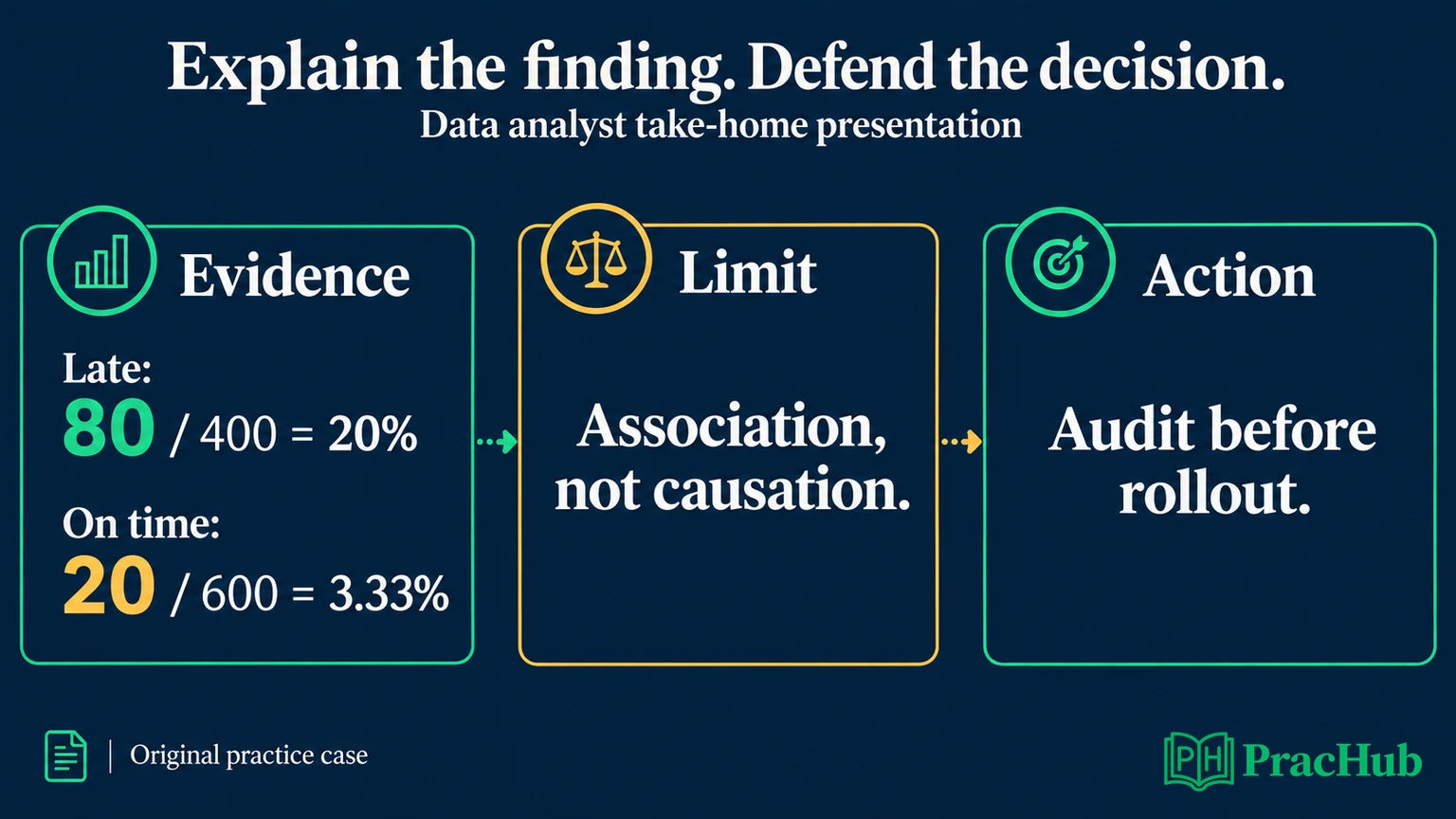
Write a one-sentence decision question before editing slides. For the original case below: “Where should the operations team investigate first to understand refund demand?” This is narrower than “What does the order dataset show?” It tells you which findings deserve speaking time.
If your invitation gives ten minutes, rehearse a version that fits ten minutes, including transitions. Do not assume that a scheduled interview hour means an hour of uninterrupted presenting.
Choose a finding you can explain and defend
Original synthetic case: You have finished reviewing a cohort of 1,080 delivered orders, all with a full 30-day refund observation window. Refund status is available for 1,000 orders and missing for 80. Among the known-status orders, 400 arrived late and 600 arrived on time.
Eighty late orders and 20 on-time orders received at least one refund within that window. The observed refund rates are therefore 80/400 = 20% and 20/600 = 3.33%. Across the known-status group, 100/1,000 = 10% received a refund.
This is invented practice data, independent of either employer's assignment. The unit is an order, not an item, customer, or refund transaction. An order with two refund transactions still counts once. “Late” means delivered after its promised date in this example.
A defensible recommendation is to audit late-delivery cases with operations before proposing a broad delivery intervention. The comparison identifies an investigation priority. It does not prove that lateness caused the refunds or that making every delivery punctual would remove them.
Choose this finding because it connects a measurable difference to an owner and a next step. Leave unrelated product rankings out of the main story unless they could change that priority.
Turn notebook chronology into a short talk
A weak opening narrates work: “I loaded four files, fixed missing values, joined the tables, and made these charts.” That may describe effort accurately, but it makes the audience wait to discover why the work matters.
A stronger opening for this case is:
I recommend starting with an operations review of late deliveries. Among 1,000 orders with known refund status, the refund rate was 20% for late orders and 3.33% for on-time orders. That is a useful investigation signal, not a causal estimate. Before recommending a rollout, I would resolve the 80 missing refund statuses and check whether product or carrier differences explain the gap.
This is an original sample talk, not a candidate quotation. It gives a recommendation, its strongest evidence, the key limitation, and the next check in one passage.
Use the following five-part sequence if it fits your brief. These are presentation functions; one function may need several slides, while two may share a slide in a shorter talk.
| Main section | What the audience should learn |
|---|---|
| Decision | Audit late deliveries first; no broad rollout recommendation yet. |
| Evidence | Compare 80/400 with 20/600 using the same order definition and observation window. |
| Reliability | Explain the 80 missing statuses and why the observed group may differ from the full cohort. |
| Interpretation | Identify plausible alternative explanations, such as product or carrier mix. |
| Next action | Name the review owner, evidence to collect, and conditions for testing an intervention. |
Do not spend equal time on every section automatically. If the panel already understands the brief, shorten the background. If a metric definition drives the entire recommendation, make room to explain it.
Make each chart answer a spoken question
Replace a title such as “Refund Analysis” with “Late orders had a higher observed refund rate.” The second title states the takeaway while retaining the word “observed,” which matters to the interpretation.
Official visualization guidance: The Office for National Statistics recommends concise chart titles describing the main trend and accompanying text that identifies the measure and period. We apply that communication principle here; it is not an interview requirement. ONS chart text guidance
In this case, two bars on the same zero-based scale are enough. Show the rates and their underlying counts. State that the comparison excludes 80 orders with unknown refund status. Repeat the same definition in your spoken explanation so the chart and the narrative agree.
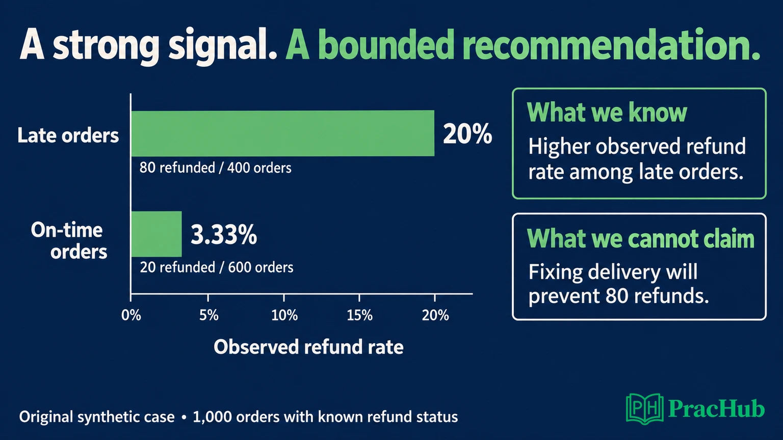
Say: “Twenty percent of the late group received a refund, compared with about three percent of the on-time group.” Then pause. Let the comparison land before explaining the qualification.
Avoid placing six exploratory charts on one slide and asking the audience to find your point. Move a chart to the appendix if its main purpose is answering a secondary question. Preserve the source, definitions, and extraction details so the simpler display remains traceable.
Keep an appendix that answers challenges quickly
An appendix is supporting material you can open when a question needs more detail. It should help the panel inspect a claim without forcing everyone through your entire notebook.
For this example, prepare a metric-definition page, the cohort reconciliation from 1,080 to 1,000 orders, the query or calculation behind the two rates, and any completed sensitivity or segment checks. Label each page by the question it answers: “Which orders were excluded?” is easier to navigate than “Extra analysis 7.”
Keep the exact submitted analysis available. If a check has not been run, label it as a proposed next step rather than presenting an empty chart or a confident verbal result. The appendix should distinguish completed work from ideas you would pursue with more time.
For help with the earlier analysis stage, PracHub's take-home data challenge lesson covers broader submission preparation. The presentation's task is to explain and defend the work you actually completed.
Handle five follow-up questions using the same evidence
Treat a challenge as a request to inspect the recommendation. Start with the direct answer, show the relevant evidence, then explain whether the proposed action changes. The following responses are original rehearsal examples.
“Why did you use orders as the denominator?”
“The decision concerns delivery operations, so I measured the share of orders receiving any refund. Counting refund transactions would count some orders more than once. If the business question is financial loss, I would also need refunded value and order value; this rate does not measure either.”
That answer defends the current definition while acknowledging another valid metric. Do not quietly switch to refund dollars halfway through the talk.
“Does late delivery cause refunds?”
“This comparison does not establish causality. Late and on-time orders could differ in product category, carrier, or other characteristics. I would inspect comparable segments and the recorded refund reasons before deciding which mechanism to test.”
Segment comparisons can challenge an explanation; they do not automatically make an observational result causal. The immediate recommendation remains investigation. Any intervention proposal needs a design capable of testing its effect.
“What happens to your result if the missing statuses matter?”
“For the full 1,080-order cohort, the overall refund rate could be as low as 100/1,080, or 9.26%, if none of the 80 unknown orders had a refund. It could be as high as 180/1,080, or 16.67%, if all did.”
These are extreme missing-status bounds, not a confidence interval or a prediction. They also do not establish the late-versus-on-time gap for the full cohort. You need the missing orders' group membership and outcomes to assess that comparison.
This answer changes the strength of the claim: 10% describes the known-status subset, not a verified whole-cohort rate. Resolving missing outcomes belongs ahead of confident financial sizing.
“How much money would your recommendation save?”
“I cannot estimate savings from refund counts alone. I need refund amounts, intervention costs, and evidence about how many refunds the intervention would prevent. The 80 refunded late orders are observed cases, not 80 avoidable refunds.”
You can explain how you would estimate impact without inventing it. A scenario calculation should label assumed preventable volume and value separately from measured inputs. If those assumptions drive the recommendation, show how changing them changes the decision.
“Would you still act with imperfect data?”
“I would take a low-cost diagnostic action: ask operations to review late-delivery refund reasons while we resolve the missing statuses. I would defer a broad rollout until we understand the mechanism, costs, and a suitable evaluation plan.”
This distinguishes an investigation from a commitment to change the business. Name what would reverse the priority—for example, evidence that the gap comes from a particular product mix and delivery timing is not the useful intervention target.
Explain uncertainty without burying the recommendation
A list of caveats is hard to use. Pair each important limitation with its consequence and next check: “Unknown refund outcomes affect the overall rate; reconcile those records before sizing the opportunity.” That gives the audience a reason to care.
Official analytical guidance: The UK Government Analysis Function recommends communicating quality and uncertainty clearly enough for users to judge what the statistics support. ONS guidance similarly emphasizes showing uncertainty when it changes interpretation. Communicating quality and uncertainty, ONS uncertainty guidance
Separate confidence in arithmetic from confidence in explanation. You may trust that 80/400 equals 20% while remaining unsure why those refunds occurred. Correct arithmetic does not resolve incomplete coverage or alternative causes.
If asked a question you cannot answer, name the missing information and the specific check you would run. Avoid promising an answer from a field that the supplied dataset does not contain.
Rehearse interruptions and correct mistakes openly
Practice once without interruption, then ask a partner to interrupt with one of the five questions above. Your goal is to answer and return to the decision, not restart the presentation from the beginning.
Keep a shorter ending ready. If questions consume your speaking time, close with the recommendation, its principal limitation, and the next action. Do not rush through every remaining appendix page to prove you prepared it.
If you spot an error, identify exactly what is wrong and which conclusions depend on it. “I need to correct the denominator on this slide; that rate is not reliable until I reconcile it” is more useful than improvising a replacement number. Follow the employer's process for supplying a correction afterward.
Practice explaining the answer before showing the work
These PracHub questions train relevant communication and reasoning. They are not predictions of your interview; several include broader data-science material. Use the focused oral exercise in the second column.
| PracHub question | Presentation practice |
|---|---|
| Present and defend your data challenge end-to-end | Present one conclusion, then defend its metric and validation choices. |
| Explain Statistical Outputs to Non-Technical Stakeholders | Explain a chart and its uncertainty without relying on jargon. |
| Explain tackling ambiguity and defending a decision | State a recommendation and the evidence that would change it. |
| Describe handling an urgent ad-hoc request | Explain what you prioritized and what remains unverified. |
| Diagnose 10–11% usage drop across geos | Distinguish an observed movement from a proposed explanation. |
Choose one Data Analyst practice question, record a short answer, and listen for unsupported jumps from a number to a recommendation. Revise those transitions before adding another slide.
Sources and Further Reading
- Wise: Analytics case study
- Bonsai: Public Data Analyst assignment
- ONS: Chart text guidance
- Government Analysis Function: Communicating quality, uncertainty and change
- ONS: Showing uncertainty in charts
Sources checked September 8, 2026. Employer examples are explicitly attributed; all case data and sample responses are original preparation material. No candidate reports establish a universal presentation format here.
Comments (0)