Duolingo Product Designer Interview: Rehearse the Design Sense Session
Quick Overview
Prepare Duolingo Design Sense with its published interview guidance, an original learning-flow critique, before-and-after screens and transfer evaluation. Primary references, original worked assets and explicit evidence boundaries support focused interview practice.
For a Duolingo Product Designer interview, rehearse explaining a learning interaction while you draw and revise it with another designer. The published Design Sense session calls for critique and design thinking in Figma; a useful rehearsal connects a visible interface decision to what a learner understands and does next. Visual polish alone does not establish that an interaction supports learning.
Official scope: Duolingo's product design interview post describes a 45-minute virtual Design Sense interview with a designer in Figma. The post was published May 9, 2023, with metadata last modified September 11, 2024. It is public preparation guidance, not confirmation of every current role's schedule. Ask your recruiter for your invitation's format. PracHub's rapid product design exercise can help you rehearse collaborative explanation before adding this learning-specific case.
Prepare for the published session without inventing a current loop
The official post asks candidates to think aloud, seek clarification, collaborate and distinguish their own contributions. Those are useful preparation directions even when a particular invitation differs. Do not infer a hidden scoring weight or private prompt from the fact that Figma appears in the published description.
Candidate evidence boundary: research for this article did not verify two independent same-cycle Product Designer reports. An older designer report summary and an internship anecdote do not establish the current full-time loop. Product Manager or engineering experiences describe different roles. Accordingly, the rest of this article is an original rehearsal, with editorial recommendations clearly separated from the official session description.
Before practicing, confirm whether you will critique an existing artifact, sketch a new flow, or respond to a supplied problem. Ask about file access, sharing permissions and accommodations. Prepare a blank, readable Figma workspace and test your ability to move between a flow overview and one detailed screen. These are preparation suggestions, not claims about a required file template.
If the interviewer changes direction, your goal is to make the new constraint visible and revise the decision. A polished memorized redesign is less adaptable than a clear account of the learner, the task and the uncertainty you are trying to reduce.
Use a learning-error recovery flow as the original case
The fictional brief is deliberately narrow: a beginner answers one grammar question incorrectly. The error screen shows the learner's response, a correct answer and a Continue button. Improve the path from receiving that feedback to attempting the skill again. This is not a screenshot of Duolingo, a leaked interview task or a report of observed user behavior.
Assume the learning objective is choosing a verb form that agrees with a sentence's subject. The learner should understand the relevant contrast and then apply it to a different sentence. Do not start by changing rewards, subscriptions, the course map and every lesson component. Those additions would hide the interaction under discussion.
Ask which learner population matters, what content is available and what “understand” means in the brief. Is audio essential to this exercise? Does the learner know the vocabulary? Is the error linguistic or an accidental tap? These distinctions can change whether a hint, explanation or input correction is appropriate.
The original case assumes the content team can provide one short explanation and one fresh transfer item. If that content does not exist, the design needs a different scope. A wireframe that depends on unavailable pedagogical material is not ready merely because its buttons look plausible.
Build an observation ledger before proposing changes
Separate what the supplied artifact shows from what you suspect it causes. You can observe that a correction is displayed without concluding that every learner notices or understands it. You can hypothesize that Continue encourages skipping feedback without claiming measured abandonment or learning loss.
| Evidence class | Original rehearsal statement | Next check |
|---|---|---|
| Visible in the fictional artifact | The selected response remains visible after the error | Preserve context while comparing alternatives |
| Visible in the fictional artifact | Continue is the only next action | Ask what the next exercise actually does |
| Hypothesis | Some learners may advance without noticing the subject–verb contrast | Observe a learner explain the correction |
| Unknown outcome | Whether a retry improves later independent performance | Test a fresh item after a suitable delay |
| Constraint to confirm | A short explanation and audio example are available | Confirm with learning-content and accessibility partners |
This ledger gives you a way to disagree constructively. If another designer says the screen is “too busy,” ask which part competes with the learner's immediate task. If they say an explanation is essential, ask what the learner should be able to do after reading it. The disagreement becomes about a decision and evidence rather than personal taste.
There is relevant official context without a current-feature promise. Duolingo's older adaptive lessons article discusses scaffolding and practice around mistakes. Its historical product examples should not be treated as today's interface inventory. The useful connection is that a learning interaction should be considered in relation to the skill being practiced.
Draw one before-and-after change you can defend
In the revised fictional screen, retain the selected answer, emphasize the subject that determines agreement, and provide a brief explanation such as “Check the subject.” Make Try again the primary action, with an optional Hear example control when appropriate. The retry should not simply reveal the answer and ask the learner to copy it.
| Element | Original screen | Revised proposal | Rationale and remaining risk |
|---|---|---|---|
| Error context | Selected response and correct answer | Selected response retained with one contrast highlighted | Helps comparison; highlighting may still be misunderstood |
| Explanation | None in the brief | Short skill-specific cue | Reduces explanation burden; content accuracy must be checked |
| Next action | Continue | Try again on a fresh item | Offers application; repeated attempts may increase frustration |
| Optional support | Not specified | Hear example when relevant | Adds another route; must not make sound mandatory |
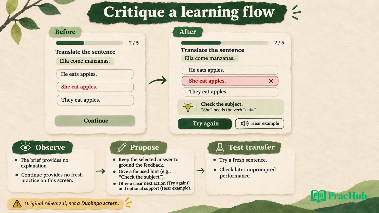
Explain the hierarchy in Figma. The learner should first locate the response, then understand the contrast, then identify the next action. Use spacing, grouping and labels to support that sequence. Do not rely on red versus green alone to convey correctness; pair visual treatment with clear language and state.
Official design context: Duolingo's art-style discussion explains historical choices around clarity, playfulness and illustration. That does not mean you should recreate its mascot or add decorative motion to every error state. In this rehearsal, an illustration earns space only if it supports the explanation without competing with the grammatical contrast.
State what you would preserve. Keeping the learner's response visible and retaining a clear forward path may be strengths of the original. A critique that treats every existing choice as a mistake cannot show how you prioritize change.
Evaluate learning without optimizing only for completion
The proposal has at least two possible effects: it may help the learner apply the concept, and it may add time or effort. Faster completion alone cannot establish better learning. More retries alone cannot establish engagement quality. Define the evaluation before choosing a success story.
For a small formative check, ask participants to explain why their first response was incorrect, use the revised screen and attempt a fresh sentence. Record where their interpretation differs from your intended cue. These observations can diagnose the interaction, but a small convenience sample is not proof of long-term learning improvement.
For a later comparative evaluation, define a primary transfer outcome: correctness on a fresh item that tests the same concept without exposing the previous answer. Specify the eligible learner group, assignment unit, timing and treatment of missing follow-up data. If the product intervention changes who returns, comparing only returning learners can bias the apparent result.
Useful guardrails include lesson abandonment, repeated-error loops, accessibility failures and time burden. A design can improve immediate retry accuracy while increasing guessing or dependence on a hint. Test an unprompted transfer item to investigate that possibility rather than declaring victory at the retry screen.
No experiment was run, so no uplift estimate is claimed. In an interview, a clear measurement contract is more defensible than invented percentages. Explain what result would make you revise the proposal, not only what result you hope to see.
Respond when the interviewer changes the constraint
Try three controlled changes during rehearsal. First, remove the ability to create a fresh item. Repeating the same sentence now risks answer recall, so narrow the claim: the interaction may support immediate correction, but you cannot call that independent transfer. Explain what evidence you can still collect.
Second, assume the screen must work without audio. The core explanation and retry must remain usable. Make the audio example optional and keep its state understandable when unavailable. Avoid adding a permission request that blocks the original learning goal.
Third, shorten the available explanation space. Preserve the specific contrast and move secondary detail behind an intentional action if needed. Test whether the shorter cue is understandable; do not merely shrink the font. Localization may expand text, and reading or assistive-technology needs can change the apparent efficiency of a compact layout.
Say what changed in your reasoning: “Without a fresh item, I can evaluate correction but should narrow the learning claim.” That is a more useful collaboration signal than silently moving boxes until the screen looks tidy. The revised artifact should show how the constraint changed your decision.
Rehearse the Figma conversation, not a finished presentation
Use a self-imposed practice split that leaves time to clarify, inspect, draw and challenge the proposal. This is an editorial rehearsal structure, not Duolingo's private agenda. Keep the observation ledger visible beside the frames so you can distinguish evidence from hypotheses as the conversation evolves.
Invite a partner to interrupt with “Why this learner?”, “What would you remove?” and “What if retry accuracy rises but later performance does not?” Answer at the decision level, then update the artifact. If you spend the entire practice session polishing icons, you will not discover whether the reasoning survives those questions.
Record your contribution accurately when discussing past work. For this fictional case, say you designed a rehearsal, not that you shipped a Duolingo improvement. For a real portfolio sample, separate your design decisions from content, research and engineering contributions. Keep confidential metrics or artifacts out of an unapproved presentation.
The general app-critique article covers observing a flow without inventing business metrics. This case adds a learning-specific requirement: the proposed next step must connect to the concept the learner should be able to apply.
Practice five related questions with the learning case
These verified PracHub questions cover design framing, metrics, trade-offs and review decisions. They are transferable practice rather than reported Duolingo prompts. Bring the fictional error-recovery flow into each answer only where its assumptions fit.
| PracHub question | Topic-specific rehearsal |
|---|---|
| 45-Minute Rapid Product Design Exercise | Rehearse clarifying the learner goal and revising the flow under interruption. |
| Favorite App – New Feature Design | Defend one added interaction and the strength of the evidence supporting it. |
| North Star Metrics & Experiment Design | Define transfer learning and burden guardrails without inventing Duolingo targets. |
| Balance Fraud Control with User Experience | Explain a user-experience trade-off while keeping fraud controls outside this learning case. |
| Setting Exit Criteria and Sign-offs for Closing a Design Review | Name the evidence needed before calling the design review complete. |
Open the rapid product design exercise, draw the before-and-after flow, and ask a partner to remove one of your assumptions. Finish with the evidence you would collect to distinguish a clearer error screen from a real improvement in independent learning.
Comments (0)