2.2 Designing Metrics That Survive Scrutiny
Find the core decision, design, or behavior signal.
Turn the lesson into a concise response blueprint.
Name the trap you would avoid in a real interview.
Use these checkpoints as your reading path before diving into the full lesson.
- 1Why this matters in interviews
- 2The five tests a metric has to pass
- 3Tied to a decision
- 4Sensitive enough to see the effect you...
- 5Hard to game
Every metrics question in a product loop collapses to one decision: several numbers all sound reasonable, and you have to pick the one a team will optimize for the next four quarters. The previous lesson took a metric as given and improved it. This one is about choosing it in the first place, and about surviving the twenty minutes of pushback that follows. By the end you should be able to state five tests a candidate metric must pass, show the arithmetic that decides between an average and a threshold, and explain when you deliberately want a metric that outliers can move.
Why this matters in interviews
The question shows up in about five disguises, and they are all the same question.
"You are launching a new product. Pick two metrics to watch for the first six months."
"Between metric A and metric B, which would you use and why."
"What is the north star for this product, and what would you watch alongside it."
"How would you measure the performance of the support organization."
"For a free-to-play game, do you expect mean revenue per player to sit above or below the median."
What is being scored is not whether you can recite a definition. It is whether you understand that a metric is an incentive. The moment a number goes on a dashboard with a target next to it, several hundred people begin steering toward it, and every gap between what the number measures and what the company wants gets found and exploited, usually without anyone intending to cheat. A senior candidate picks metrics the way you would write a contract with a counterparty who is smarter than you and not on your side.
Here is the weak answer to the launch question, and I hear it constantly: "I would track daily active users and retention." That is not wrong so much as empty. There is no population, no window, no numerator, and no reason a team would change what it builds based on either number moving three points.
The stronger version sounds like this: "I would track one acquisition metric and one engagement metric, and I would define each so that a bot farm creating fake accounts makes it go down, not up. For acquisition, new accounts per day that complete the core action within 48 hours. For engagement, the share of 28-day-active accounts that complete the core action at least three times in a rolling week. The first is a volume number and the second is a rate, so together they catch both a growth stall and a quality collapse."
Interview tip: Name the adversary before you name the metric. Saying "here is how a team could hit this target without helping the product, and here is the change that closes it" is the single clearest senior signal in a metrics question.
The five tests a metric has to pass
Run every candidate through these five. In an interview, say them out loud as a checklist and then apply them to your own proposal. It converts a taste argument into an evaluation.
| Test | The question you ask | What breaks if it fails |
|---|---|---|
| Tied to a decision | What would we do differently if this moved 10 percent | The number gets reported forever and never changes a roadmap |
| Sensitive | Can a realistic change move it more than its own weekly noise | Every experiment reads as flat and you learn nothing |
| Hard to game | What is the cheapest way to hit target without helping a user | The team optimizes the gap, not the product |
| Attributable | Which team can move it, and by changing what | Nobody owns it, so nobody works on it |
| Stable | Can a director read it weekly without being misled by noise | The metric generates false alarms and gets ignored |
Tied to a decision
The test is a sentence, not a philosophy: name the decision. If weekly cook rate rises four points, does anyone staff differently, ship differently, or spend differently? If the honest answer is no, you have a report, not a metric.
This is where vanity metrics die. Cumulative registered accounts cannot go down, so it carries no information. Total pageviews is worse, because it can be raised by making content harder to find.
Sensitive enough to see the effect you care about
A metric you cannot move in a readable amount of time is not a target, it is a mood. This is the test candidates skip, and it is the one with actual arithmetic behind it, so it is where you can separate yourself. We will do the full calculation on the freemium example below, where the same underlying business produces one metric with a 14.2 percent minimum detectable effect and another with a 61.2 percent minimum detectable effect at the same sample size.
Hard to game
Do not think of gaming as fraud. Think of it as three specific adversaries who all behave rationally.
The spammer is external: fake accounts, scripted actions, bought installs. Ask whether 50,000 fake accounts appearing tomorrow makes your number rise or fall. A raw signup count rises. A signup count filtered to accounts completing a real action inside two days barely moves, and any engagement rate whose denominator is all accounts falls, which is exactly the alarm you want.
The tired team is internal and honest. They are behind on a quarterly target and will find the least effortful path to it. Ask: what is the cheapest way for a competent team to hit this number without changing a user's experience for the better? Usually the answer is a denominator trick or a definitional narrowing.
The partner is the third party whose interests only partly overlap with yours: hosts, sellers, drivers, creators, advertisers. Ask: does this metric reward them for the behavior I want, or for withdrawing? The response time example below is exactly this case, and the naive metric pays partners to stop responding.
Attributable to someone who can move it
A metric that only moves when the macro economy moves is context, not a target. Ask which team owns it and what lever they pull. If the answer needs four organizations to cooperate, it is a board-deck number and needs decomposing into owned sub-metrics before any team is judged on it.
Stable enough to read on your cadence
A number whose week over week standard deviation is 9 percent cannot be reviewed weekly: most of what leadership sees is noise and they will react to it anyway. Widen the window, change the estimator, or say up front that this is a monthly metric.
Interview tip: When you propose a metric, immediately state its expected baseline and its noise band, for example "we expect about 70 percent, and week to week it wanders by roughly one point." Interviewers rarely hear this and it lands as operational experience.
Two datasets to argue with
Every claim below is computed. This block builds both tables deterministically, so you can rerun anything you doubt. The first is Perch, a marketplace where people rent workshop and studio space, one row per booking inquiry sent to a host. The second is Sandpiper, a free-to-play mobile game, one row per player-month.
import numpy as np
import pandas as pd

SEED = 4417
rng = np.random.default_rng(SEED)

N_INQ = 48_000
tier = rng.choice(["new", "established", "pro"], N_INQ, p=[0.31, 0.44, 0.25])
region = rng.choice(["west", "midwest", "south", "northeast"], N_INQ,
                    p=[0.30, 0.18, 0.29, 0.23])
p_reply = np.select([tier == "new", tier == "established"], [0.62, 0.81], default=0.93)
replied = rng.random(N_INQ) < p_reply
mu = np.select([tier == "new", tier == "established"], [1.55, 0.95], default=0.10)
hours = np.where(replied, rng.lognormal(mu, 1.15, N_INQ), np.nan)
perch = pd.DataFrame({
    "inquiry_id": np.arange(1, N_INQ + 1), "host_tier": tier, "region": region,
    "replied": replied.astype(int), "hours_to_reply": np.round(hours, 3),
})

N_PL = 90_000
seg = rng.choice(["free", "minnow", "dolphin", "whale"], N_PL,
                 p=[0.938, 0.048, 0.012, 0.002])
spend = np.zeros(N_PL)
m = seg == "minnow";  spend[m] = rng.gamma(2.0, 3.4, m.sum())
m = seg == "dolphin"; spend[m] = rng.gamma(2.6, 24.0, m.sum())
m = seg == "whale";   spend[m] = rng.gamma(2.2, 430.0, m.sum())
sandpiper = pd.DataFrame({
    "player_id": np.arange(1, N_PL + 1), "segment": seg,
    "sessions": rng.poisson(np.select(
        [seg == "free", seg == "minnow", seg == "dolphin"], [7, 19, 41], default=88)),
    "revenue": np.round(spend, 2),
})
print(perch.shape, sandpiper.shape, round(sandpiper["revenue"].mean(), 2))
(48000, 5) (90000, 4) 2.87Two orienting facts. On Perch, 78.1 percent of inquiries get any reply at all, and among replies the median wait is 2.4 hours while the mean is 5.2 hours. On Sandpiper, mean monthly revenue per player is 2.87 units of currency and the median is exactly zero.
Ratio or absolute: report both, always
Candidates pick one and defend it. The correct answer is that they answer different questions and shipping only one is how a team fools itself.
A ratio measures quality per unit and is comparable across time, geography, and cohort size. Its weakness is that it is a weighted average, so it moves when the weights move even if the product did not.
An absolute count measures the size of the outcome the business banks. Its weakness is that it grows with traffic, so it flatters any team whose marketing is spending more.
The mix shift that makes a ratio lie
Perch's headline reliability metric is the share of inquiries answered inside 12 hours: 70.2 percent. Break it by host tier and the reason is visible.
perch["fast12"] = (perch["hours_to_reply"] <= 12).astype(int)
by = perch.groupby("host_tier").agg(
    inquiries=("inquiry_id", "size"),
    within_12h=("fast12", "mean"),
    any_reply=("replied", "mean"),
)
by["mix"] = by["inquiries"] / by["inquiries"].sum()
print(by.round(4))
inquiries within_12h any_reply mix
host_tier
established 20977 0.7335 0.8099 0.4370
new 14951 0.4872 0.6202 0.3115
pro 12072 0.9145 0.9315 0.2515Now run a supply push. Marketing onboards a wave of new hosts, so the new tier's share of inquiries goes from 31.2 percent to 43.7 percent, total inquiry volume rises 20 percent, and every single tier improves its within-12h rate by two full points.
w_old = by["mix"].to_numpy()
r_old = by["within_12h"].to_numpy()
w_new = np.array([0.44 * 0.86, 0.46, 0.25 * 0.86]);  w_new = w_new / w_new.sum()
r_new = r_old + 0.02

print("ratio before", round((w_old * r_old).sum(), 4))
print("ratio after ", round((w_new * r_new).sum(), 4))
print("count before", round((w_old * r_old).sum() * 48_000))
print("count after ", round((w_new * r_new).sum() * 48_000 * 1.20))
ratio before 0.7023
ratio after 0.6829
count before 33711
count after 39335Every tier got better. The company answered 5,624 more inquiries inside 12 hours. And the headline ratio fell 1.9 points. If reliability is your only metric, this quarter reads as a regression and someone proposes slowing host acquisition, which is exactly backwards.
The reverse error is more dangerous because it looks like success: cut your weakest acquisition channel, watch every rate rise, and quietly ship fewer good outcomes.
| Situation | Ratio alone | Count alone | What to do |
|---|---|---|---|
| Supply or user mix is shifting | Falls even as quality rises | Rises with volume | Report both, plus the rate held at fixed mix |
| Marketing spend is changing | Stable and honest | Flatters the team | Lead with the ratio, footnote the count |
| Comparing regions of different sizes | Correct choice | Meaningless | Ratio, with counts shown for weight |
| Deciding whether to keep funding a team | Can hide shrinkage | Can hide inefficiency | Both, and state which one the target is set on |
The clean version of this in a review is a fixed-mix rate: recompute the current period's per-segment rates against last period's segment weights. That single line separates "we got better" from "our population changed."
Interview tip: Whenever you name a rate, say the denominator out loud and then say what would happen to your metric if that denominator grew 30 percent. If you cannot answer instantly, you have not finished designing the metric.
Average, percentile, or share above a threshold
This is the highest-frequency version of the question, and it usually arrives as a forced choice. Perch's version: would you measure host responsiveness as the share of inquiries answered inside 12 hours, or as the average reply time among replies that arrived inside 12 hours?
Both sound defensible. Only one is safe, and the reason is not statistical elegance, it is the incentive.
Why an average over responders pays partners to go silent
The average is computed only over hosts who replied. That means the population is chosen by the behavior you are trying to measure, which is a selection problem dressed as an aggregation choice. A host who never replies is simply absent from the denominator, so the worst possible outcome for a guest is invisible to the metric.
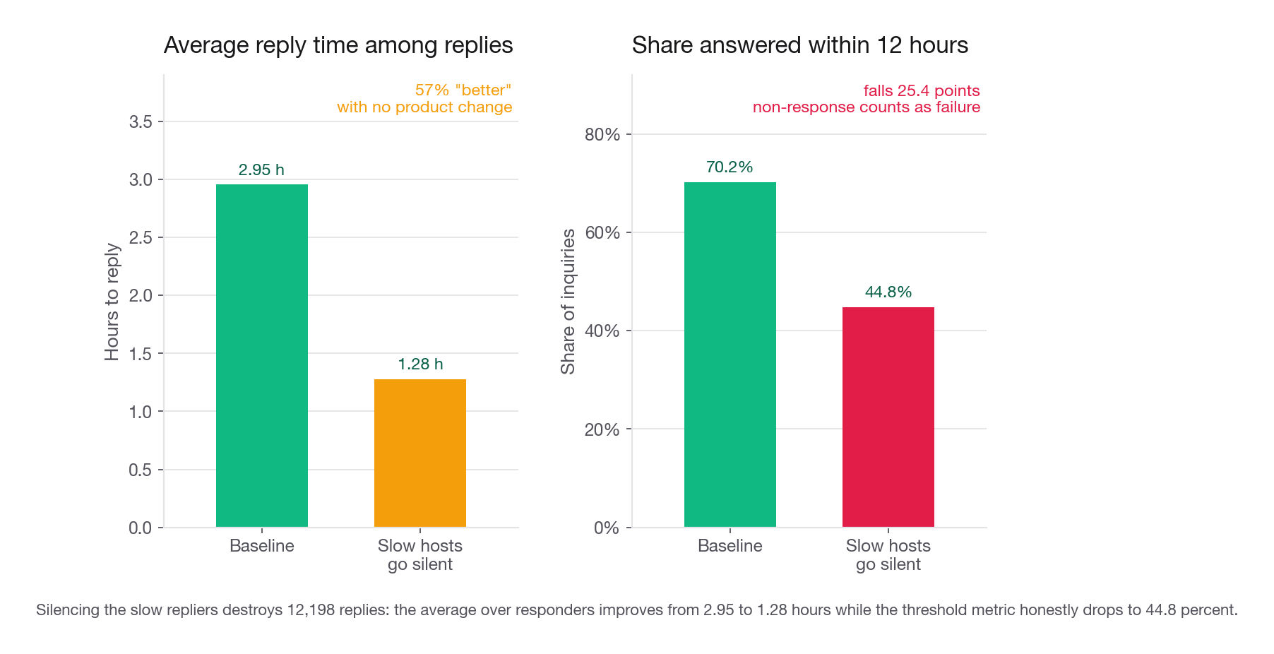
Watch what happens when the hosts who currently reply slowly, between 3 and 12 hours, stop replying at all. No product change, no improvement for any guest, purely withdrawal.
gamed = perch.copy()
slow = gamed["hours_to_reply"].between(3, 12)
gamed.loc[slow, ["hours_to_reply", "replied"]] = [np.nan, 0]

def scoreboard(df, label):
    h = df["hours_to_reply"]
    print(f"{label:24s} share<=12h={(h <= 12).mean():.4f} "
          f"avg_hours_of_those={h[h <= 12].mean():.3f} replies={int(h.notna().sum())}")

scoreboard(perch, "baseline")
scoreboard(gamed, "slow hosts go silent")
print("replies destroyed:", int(slow.sum()))
baseline share<=12h=0.7023 avg_hours_of_those=2.954 replies=37508
slow hosts go silent share<=12h=0.4482 avg_hours_of_those=1.278 replies=25310
replies destroyed: 12198The average improved from 2.95 hours to 1.28 hours. On a slide that is a 57 percent improvement in responsiveness, and it was produced by destroying 12,198 replies. The threshold metric did the honest thing and fell 25 points, because non-response counts as failure rather than as absence.
This generalizes. Any average computed over the subset that performed the action is gameable by shrinking that subset. Support raises average satisfaction by not surveying angry customers. Sales raises average deal size by disqualifying small leads. The metric improves and the business does not.
The structural fix is to define the metric over the full eligible population and let failure enter the numerator as a zero. A rate does this naturally. An average does not.
The cost of a threshold: nothing happens inside the bucket
Threshold metrics are not free. A reply at 40 seconds and one at 11 hours 50 minutes score identically, so a team already at 70 percent has no incentive to make good experiences excellent, only to drag stragglers past the line. In marketplaces this leaves a visible artifact: replies piled up just under the deadline.
A second cost candidates miss: a single threshold is a cliff, so the metric is maximally sensitive to hosts sitting near it and blind everywhere else. Move it from 12 hours to 10 and the same product looks different.
The two-threshold pattern
The production answer to a forced choice between an average and a threshold is usually to refuse the choice and ship a pair: one aggressive threshold that represents excellence, one generous threshold that represents an acceptable floor, and a rule that neither is allowed to fall while the other rises.
On Perch, 19.6 percent of inquiries are answered within 1 hour and 70.2 percent within 12. Together they describe the distribution far better than any single statistic, and they close each other's loopholes: suppressing slow replies to protect the 12-hour number does nothing for the 1-hour number, and cherry-picking easy inquiries to chase the 1-hour number makes the 12-hour number sag.
Note the last row. Percentiles are computed over the full population only if you decide what a non-reply is worth. The clean convention is to impute non-response as the maximum of the window, for example 168 hours for a one-week measurement period. Then p90 is well defined and a host who never replies is counted as the failure they are.
That convention carries a precondition nobody states, and Perch fails it. Imputed percentiles only work when non-response sits below 1 minus the percentile. Perch's non-reply rate is 21.9 percent, so once you impute 168, every percentile from p80 through p99 is exactly 168.000: the imputed non-repliers alone fill the top fifth of the sorted list. Make every real reply ten times faster and p90 does not move by a second. The boundary is p78.1 and the usable ceiling is lower still. p75 is 21.8 hours and a reply somebody actually sent, while p77.5 is 47.5 and p78 is 83.3, interpolation blends drifting toward 168. Treat p75 as the limit and fall back to a threshold rate above it, which is the real reason the two-threshold pair beats a percentile here. Percentiles suit engineering latency and ops queues because non-completion there is a fraction of a percent, not a fifth of the population. One wrinkle: 9 Perch replies exceed 168 hours, the slowest at 265.9, so the window maximum is a censoring floor, not a true maximum.
Per-user normalization and the denominator nobody wrote down
Three metrics that get called the same thing:
Total actions in the week.
Actions per active user in the week.
Share of users performing at least k actions in the week.
They disagree constantly and they answer different questions.
Total actions is a business volume number and drifts with the user base. Actions per active user is the classic per-user normalization, and its problem is that it is a mean, so a small heavy-usage cohort dominates it. Share of users above a threshold is the robust form and is what you want whenever the top of the distribution is not where the money is.
| Denominator choice | What it answers | The failure mode |
|---|---|---|
| All registered accounts | True penetration of the habit | Falls forever as dormant accounts pile up |
| 28-day active accounts | Depth among people who show up | Rises automatically when weak users churn out |
| Accounts eligible for the feature | Whether the feature works | Eligibility rules change and break the series |
| Sessions | Per-visit efficiency | Sessions are a product of your own timeout definition |
That second row is the one that ends interviews. Engagement per active user rises when your least engaged users leave, so a product that is quietly bleeding casual users shows an improving engagement metric while it dies. Anytime you use an activity-conditioned denominator, you owe a paired absolute count, and ideally a fixed-cohort version where the denominator is frozen at the start of the period.
The fourth row matters too. A session is not a natural object, it is whatever your inactivity timeout says it is, usually 30 minutes, so any metric with sessions in the denominator can be rewritten by an analytics config edit nobody announces.
Interview tip: If an interviewer offers you "per user" without saying which users, ask. "Per registered, per monthly active, or per user eligible for the feature" is a five-second question that reframes you as someone who has shipped a dashboard.
When you actually want the outliers: freemium and whales
Everything so far pushed toward robust statistics. Now the exception, and it is the exception interviewers use to find out whether you learned a rule or a reason.
Sandpiper gives the game away free and sells items inside it. Look at the distribution.
rev = sandpiper["revenue"]
print("mean          ", round(rev.mean(), 3))
print("median        ", round(rev.median(), 3))
print("payer rate    ", round((rev > 0).mean(), 4))
print("revenue/payer ", round(rev[rev > 0].mean(), 2))
top = rev.sort_values(ascending=False).head(int(len(rev) * 0.002))
print("top 0.2% share", round(top.sum() / rev.sum(), 4))
mean 2.872
median 0.0
payer rate 0.061
revenue/payer 47.08
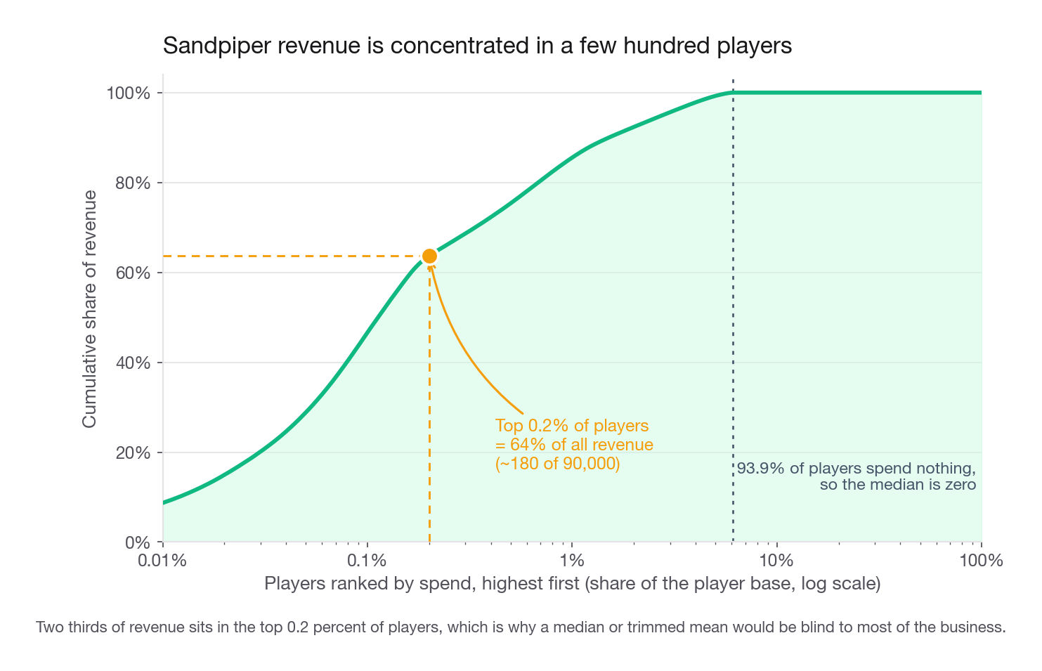
top 0.2% share 0.6366The median is zero, and it will be zero next quarter and the quarter after, because 93.9 percent of players never spend anything. The distribution is bounded below at zero and unbounded above, so the mean sits far above the median and every robust statistic you were just taught to prefer is blind to the business.
The number that matters here is the last one. Roughly 180 players out of 90,000 produce 64 percent of revenue. If your metric is the median, or a trimmed mean, or the share of players above a spending threshold set at any sane level, you have chosen a metric that cannot see two thirds of the company. When someone asks whether mean or median revenue per player is larger, the answer is mean, and the follow-up you should volunteer is that this is precisely why revenue metrics for freemium products are averages and not percentiles.
What that costs you in detection power
Outlier sensitivity is not free. A metric that a handful of players can move is also a metric that a handful of players make noisy. Here is the trade priced out, with a per-arm sample of 12,000 players and the minimum detectable effect at 80 percent power and a 5 percent two-sided test.
z = 1.959963985 + 0.8416212336   # 5 percent two-sided, 80 percent power
q99 = rev.quantile(0.99)         # pooled and pre-specified, never re-fit per arm
n_pay = round(12_000 * (rev > 0).mean())

def mde(label, x, n):
    se = x.std(ddof=1) / np.sqrt(n)
    print(f"{label:24s} {x.mean():7.3f}  se={se:.4f}"
          f"  lift={z * se * np.sqrt(2) / x.mean() * 100:.1f}%")

mde("mean revenue per player", rev, 12_000)
mde("share who pay anything", (rev > 0).astype(float), 12_000)
mde("revenue per payer", rev[rev > 0], n_pay)
mde("mean capped at p99", rev.clip(upper=q99), 12_000)
print("payers per arm:", n_pay, "cap keeps:",
round(rev.clip(upper=q99).sum() / rev.sum(), 3))| Metric | Value | Standard error at n=12,000 | Detectable lift |
|---|---|---|---|
| Mean revenue per player | 2.87 | 0.444 | 61.2 percent |
| Share who pay anything | 0.061 | 0.0022 | 14.2 percent |
| Revenue per payer (payers only) | 47.08 | 7.08 | 59.6 percent |
| Mean capped at the 99th percentile | 0.80 | 0.041 | 20.2 percent |
Note the parenthesis on the third row. It is computed on the 732 payers per arm, not the 12,000 assigned players, hence its far larger standard error.
Read the first two rows together. At the same sample size, payer conversion detects a 14.2 percent relative change while mean revenue per player needs 61.2 percent: a factor of more than four in required effect, or roughly nineteen times the sample for equal sensitivity.
That does not mean you target payer conversion. It means your experiment reads on payer conversion and your business reads on revenue, and you must say so rather than pretend one is the other. The arrangement most game teams land on: revenue per player is the north star, reviewed monthly on the full population, while experiments are powered on the decomposition of payer conversion times purchases per payer times average purchase value.
That last sentence hides a trap. Only payer conversion and unconditional revenue per assigned player are valid arm contrasts. Purchases per payer and average purchase value condition on an outcome the treatment moves, so the arms hold different sets of payers and the gap between them is not a causal effect, it is a real effect tangled with a composition shift. The direction is the tell: a feature that converts marginal, low-spend players adds them to the treated payer pool, dragging revenue per payer down while revenue per assigned player rises. Read only the conditional factors and you kill a winner. Use the decomposition to locate a change; quoting a lift on a conditional factor needs a principal-strata caveat or Lee bounds, not an effect claim.
Winsorizing looks smart and deletes the business
The obvious statistician's move is to cap revenue at the 99th percentile and take the mean. It is stable, its detectable lift improves from 61 percent to 20 percent, and it is still wrong here.
The capped mean is 0.80 against a true mean of 2.87. The cap keeps 27.7 percent of the revenue, so the trade is roughly three times the sensitivity bought by deleting 72 percent of the business from the metric. Any experiment that works by making whales spend more now reads as flat, and the team learns that whale features do not work, which is the opposite of true.
Capping is right when the tail is measurement error or abuse: a scraper generating 40,000 pageviews, a duplicated order, a bot session. It is wrong when the tail is the customer. The test is one sentence: would you be delighted to have more observations like the ones you are capping? If yes, do not cap them.
Interview tip: Say "I would cap outliers only if the tail is instrumentation or abuse rather than revenue" and then name which one it is in this business. That distinction is the entire answer to the winsorizing question.
The modeling consequence, briefly
The same logic reaches model choice. A tree splits on rank order and predicts the leaf mean, so it compresses the extreme tail toward its neighbors. For predicting who will spend at all, trees are excellent. For predicting how much a spender spends, a regression tree systematically under-predicts whales, and its errors are largest exactly where the revenue is.
The usual fixes: split it into a classifier for "will they pay" plus a magnitude model on payers only; or fit the magnitude model on a log scale, remembering that exponentiating a mean of logs yields a geometric mean biased low for the arithmetic quantity finance wants; or use a loss built for this shape, such as gamma or Tweedie regression.
Choosing a north star and its guardrails
A north star is the one number the whole company steers by. Most candidates propose one and stop. The complete answer is a north star plus the small set of guardrails that make it safe to optimize, because a north star with no guardrails is an instruction to find the cheapest path to it.
Guardrails are not a wishlist of nice numbers. Each one exists because a specific shortcut exists. Here are three fictional products worked through.
| Product | North star | Guardrail against the cheapest cheat | Quality guardrail | Cost guardrail |
|---|---|---|---|---|
| Perch, workshop space rental | Completed bookings per month with a review of 4 or higher | Share of inquiries answered within 12 hours, so bookings are not bought by spamming guests | Guest repeat rate at 90 days | Support contacts per 100 bookings |
| Sandpiper, free-to-play game | Revenue per active player per month | Day-30 retention of non-payers, so revenue is not bought by making the free game worse | Share of sessions ending in a rage quit event | Cost of user acquisition payback in months |
| Ledgerline, small business invoicing | Weekly active businesses sending at least one invoice | Share of invoices paid within terms, so activity is not padded by drafts and resends | Net promoter among owners with 3 or more months tenure | Failed payment rate |
Read the guardrail column carefully. Sandpiper's north star is revenue, and the cheapest way to raise revenue this quarter is to make the free experience worse until more people pay to escape it. That works for two quarters and then the funnel dries up. The guardrail is retention of the people who are not paying, which is the population the cheat harms. That is the shape a guardrail should always have: the metric that the shortcut damages.
One more property worth stating aloud. As a company matures, the north star gets replaced by a narrower proxy a team can move in a sprint, for example the share of new hosts who upload three photos in week one. That substitution is legitimate only if you have shown the proxy predicts the north star and moves when the team's own levers move. Without that evidence you have handed a team a target unconnected to the business, and no product manager will fund work against it. That tension gets its own lesson later in this section.
Metrics for a team that does not own a product surface
"How would you measure customer support" is the same question with the surface removed, and it separates candidates faster than almost anything else, because there is no obvious event to count.
The weak answer lists operational numbers: average handle time, tickets per agent, first response time, satisfaction. Each is gameable in an afternoon. Handle time falls if agents close tickets fast and unhelpfully, tickets per agent rises if you split one issue into three, satisfaction rises if you only survey resolved tickets.
The strong answer starts one level up. Support exists to protect growth, and growth comes from acquiring users and keeping them. Acquiring a customer costs far more than retaining one, which is why companies hand out credits so freely after a bad experience: the credit is cheap next to the replacement. So the target for support is the incremental lifetime value it preserves, and every operational number is a candidate proxy for that, not a substitute.
But lifetime value takes a year to observe, and you cannot run an organization on a metric with a one-year lag. So you make the standard long-horizon move: find a short-run signal that predicts the long-run outcome and also carries the effect of the changes support can actually make, then manage on that signal. Prediction alone is not enough.
Here is the pull, on a support ticket table joined to orders.
WITH t AS (
  SELECT ticket_id,
         account_id,
         opened_at,
         first_reply_minutes,
         resolution_minutes,
         reopen_count,
         csat_score,
         sentiment_delta,
         issue_topic
  FROM support_ticket
  WHERE opened_at >= DATE '2024-01-01'
    AND opened_at <  DATE '2025-01-01'
)
SELECT t.*,
       MAX(CASE WHEN o.placed_at >  t.opened_at
                 AND o.placed_at <= t.opened_at + INTERVAL '365 days'
                THEN 1 ELSE 0 END) AS bought_within_year
FROM t
LEFT JOIN orders o
  ON o.account_id = t.account_id
GROUP BY t.ticket_id, t.account_id, t.opened_at, t.first_reply_minutes,
         t.resolution_minutes, t.reopen_count, t.csat_score,
         t.sentiment_delta, t.issue_topic;
Then fit a model of bought_within_year on the ticket features, including text-derived ones such as topic and the change in sentiment between the customer's first and last message. Two outcomes are possible and you should name both.
If one variable carries most of the signal, make that the team's metric. Post-contact satisfaction often wins. Before adopting it, walk the levers support holds, speed, training, credits, deflection, root-cause fixes, and ask of each whether it moves that metric. Deflection and root-cause fixes are the awkward pair: they raise one-year purchase by removing the ticket entirely, so they produce no post-contact score and read as null. Those are the changes you most need to see. The coefficient says the variable predicts the outcome; it is not evidence your lever works.
If no single variable is enough, use the model's predicted probability as the metric. That is a legitimate answer and worth saying, because it shows you are comfortable with a composite target. But volunteer the three ways it goes wrong, because the interviewer will otherwise ask. Only the first is specific to a composite; the other two hit the single-variable pick just as hard, since both come from the same observational fit.
The composite is gameable through its inputs. Once agents know sentiment recovery drives the score, sentiment recovery gets engineered. Rotate the feature audit and hold out a raw outcome you never expose.
The relationship drifts. A model fit on last year's ticket mix decays as the product changes. Refit quarterly and monitor whether the historical link between the proxy and the one-year outcome still holds.
The population is selected. Only customers who contacted support are in the sample, and they differ from everyone else. The model tells you which contacts go well, not whether contact itself helps. Answering that needs a comparison against similar customers who had the same problem and did not write in, which is a matching or experiment question, not a modeling one.
Interview tip: For any team without a product surface, say the ladder out loud: growth, then retention, then lifetime value, then a short-run proxy that predicts lifetime value, carries the effect of the levers you hold, and has been checked against past cases where the truth eventually arrived.
Write the spec down
A metric that lives in someone's head gets redefined every quarter and the series becomes uninterpretable. Saying you would write a one-page spec is a small thing that reads as real experience.
That last item prevents the most expensive metric failure there is: an unlogged definition change, discovered six months later when someone tries to explain a step in the series.
Common traps
Proposing a metric with no population or window. "Engagement" and "retention" are directions. Fix: never say a metric name without saying who is counted and over what period.
Averaging over the people who acted. Any mean computed on completers is improved by removing the marginal completer. Fix: define over the full eligible population and count failure as a zero.
Reporting a rate without its count. A rate rises when weak users leave and falls when you grow into a harder segment. Fix: pair every rate with an absolute, and add a fixed-mix version when the population is moving.
Applying robustness reflexively. Medians, trims, and caps are correct for skew caused by noise and wrong when the tail is the revenue. Fix: ask whether you would want more observations like the ones you are discarding.
Choosing a metric you cannot detect a change in. A north star with a 60 percent minimum detectable effect will read flat for every experiment you ever run. Fix: compute the standard error at your realistic sample size before you commit, and if it is hopeless, power on a decomposed factor that is still defined over the full assigned population, and say so.
Shipping a north star with no guardrails. Every optimizable number has a cheap path. Fix: one guardrail per named shortcut, each one being the metric that shortcut damages.
Using an activity-conditioned denominator without a companion. Per-active-user metrics improve automatically as casual users churn. Fix: report the absolute alongside, or fix the cohort at period start.
Adopting a narrow proxy without proving it predicts the broad metric and carries your levers' effect on it. Profile photo completion is not a growth metric until you have shown it moves growth, and still not one if your shippable changes bypass it. Fix: state both pieces of evidence, or that establishing them is step one.
Letting a session-based denominator go unexamined. Sessions are defined by a timeout setting, so a config change silently rewrites your history. Fix: prefer user-based denominators for anything on a leadership dashboard.
Redefining mid-answer under pressure. If an interviewer pushes and you swap definitions, everything you computed becomes invalid. Fix: defend the original, or explicitly retract it and restate what changes.
Quick self-check
Answer these aloud, in complete sentences, before you call this lesson done.
A dating app proposes "average messages sent per matched pair" as its engagement metric. Name the population problem, the gaming vector, and a replacement metric that closes both.
Every region improves its on-time rate by 3 points and the company-wide on-time rate falls. Explain the mechanism and describe the one extra calculation that would have made this legible in the weekly review.
You must choose between the share of tickets resolved within 4 hours and the mean resolution time among tickets resolved within 4 hours. State which you pick, and describe the exact sequence of agent behavior that breaks the other one.
For a subscription product where the top 1 percent of accounts produce 40 percent of revenue, say whether you would cap outliers in your experiment analysis, and give the one-sentence test you used to decide.
Propose a north star for a food delivery marketplace, then name three guardrails and, for each, the specific shortcut it is there to catch.
Your north star has a 55 percent minimum detectable effect at realistic sample sizes. List two things you can change to make the program readable, and say what each one costs you.