2.3 Diagnosing Metric Movements and Finding Bugs
Find the core decision, design, or behavior signal.
Turn the lesson into a concise response blueprint.
Name the trap you would avoid in a real interview.
Use these checkpoints as your reading path before diving into the full lesson.
- 1Why this matters in interviews
- 2A dataset to make this concrete
- 3Step 1: prove the movement is real befo...
- 4Numerator, denominator, or both
- 5Is it outside the noise band
Someone pings you at 9am: the weekly engagement number fell twenty percent and the leadership review is at 2pm. This lesson is the procedure you run in those five hours, and more importantly the order you run it in. The decision it helps you make is whether to tell the room "we have a product regression", "we have a data bug, ignore the chart", or "nothing changed except who is in the denominator". Those three answers lead to completely different afternoons.
Why this matters in interviews
The previous lesson answered "how would you improve this metric", where nothing is broken and you are hunting for upside. This is the other half: something moved, and you have to explain it. Candidates who are fluent at the first are often terrible at the second, because improvement rewards creativity and diagnosis punishes it. The moment you start hypothesising about user psychology before you have confirmed the number is even real, you have lost.
Interviewers score four things here, and they score them in order.
Do you check the plumbing before the story. A large fraction of dramatic metric movements are not behaviour at all. They are a deploy, a schema migration, a bot filter that started or stopped working, a timezone, or a partial week of data. A candidate who spends ten minutes on user motivation and never asks whether the pipeline is healthy has revealed they have never been on call.
Do you decompose before you hypothesise. There are usually a hundred plausible stories and three arithmetic possibilities. Narrowing the arithmetic first turns a hundred stories into two.
Do you separate mix from rate. The highest-value skill in this lesson. An aggregate rate can fall while every subgroup rises, and if you cannot articulate why, you will ship a fix for a problem that does not exist.
Do you know a description from a cause. Finding the drop is concentrated in one country is a description. Believing that country caused it is the mistake.
Interview tip: Open with one sentence that names the branch you are on: "before I hypothesise about users, I want to establish that this is a real change in behaviour rather than a change in measurement or in population." That sentence alone separates you from most of the pool.
Everything below runs on a fictional product called Tessera, a photo and short-clip sharing app. The headline metric is reactions per active user per week: total reactions divided by weekly active accounts. Week 23 to week 24, it fell from 8.48 to 6.69, a drop of 21 percent. We are going to take that apart completely, and the answer turns out to have three separate pieces, only one of which anybody should act on.
A dataset to make this concrete
Every number below is computed on a synthetic account-week table with one row per active account per week. Columns are week, country, platform, tenure, app_version, reactions, uploads, and profile_photo. This block builds it deterministically, so you can reproduce each figure exactly.
import numpy as np
import pandas as pd

SEED = 611
rng = np.random.default_rng(SEED)

CTRY = ["US", "BR", "IN", "PH", "DE"]
MIX = {"w23": [0.36, 0.17, 0.20, 0.06, 0.21], "w24": [0.27, 0.13, 0.16, 0.31, 0.13]}
SIZE = {"w23": 40_000, "w24": 52_000}
LAM = {"US": 11.4, "BR": 8.2, "IN": 6.9, "PH": 2.9, "DE": 10.6}
PLAT = {"US": [.52, .34, .14], "DE": [.44, .42, .14], "BR": [.22, .68, .10],
        "IN": [.11, .81, .08], "PH": [.09, .84, .07]}

parts = []
for wk, n in SIZE.items():
    ctry = rng.choice(CTRY, n, p=MIX[wk])
    u = rng.random(n)
    cut = np.array([np.cumsum(PLAT[c]) for c in ctry])
    plat = np.array(["ios", "android", "web"])[(u[:, None] > cut).sum(1)]
    tenure = np.where(rng.random(n) < np.where(ctry == "PH", 0.88, 0.22), "new", "returning")
    ver = rng.choice(["8.3.1", "8.4.0"], n, p=([0.94, 0.06] if wk == "w23" else [0.25, 0.75]))
    lam = np.array([LAM[c] for c in ctry]) * np.where(tenure == "new", 0.62, 1.0)
    if wk == "w24":
        lam = lam * np.where((ctry == "US") & (plat == "web"), 0.71, 1.02)
    parts.append(pd.DataFrame({
        "week": wk, "country": ctry, "platform": plat, "tenure": tenure,
        "app_version": ver, "reactions": rng.poisson(lam),
        "uploads": np.where((wk == "w24") & (plat == "android") & (ver == "8.4.0"), 0,
                            rng.poisson(0.9 * np.where(tenure == "new", 0.5, 1.0))),
        "profile_photo": rng.random(n) < 1 / (1 + np.exp(2.4 - 0.32 * lam))}))

panel = pd.concat(parts, ignore_index=True)
Three things are buried in that generator and none is announced. Finding all three, and correctly refusing to act on two of them, is the exercise.
Step 1: prove the movement is real before you explain it
Numerator, denominator, or both
A ratio can fall four ways: the top fell, the bottom rose, both moved unfavourably, or both moved the same way by different amounts. Candidates habitually assume the first. Check.
head = panel.groupby("week").agg(
    accounts=("reactions", "size"),
    reactions=("reactions", "sum"),
    per_user=("reactions", "mean"),
)
head["se"] = panel.groupby("week")["reactions"].std() / np.sqrt(head["accounts"])
print(head.round(3))
accounts reactions per_user se
week
w23 40000 339374 8.484 0.020
w24 52000 348012 6.693 0.020That reframes the problem. Total reactions went up 2.5 percent while the account base went up 30 percent. Nobody at Tessera reacted less; there are simply many more accounts sharing a slightly larger pile. Whether that is bad news depends on who those extra 12,000 accounts are, which is a growth question, not an engagement regression.
The same logic answers the year-over-year variant. If the metric is this year divided by last year, a decline can mean this year fell or last year rose. A promotion that inflated the same week twelve months ago shows up today as a fall, and no amount of staring at current-quarter product changes will find it.
Interview tip: Say the words "numerator and denominator" in the first minute of any metric-movement question, then state which one you found moved. It costs eight seconds and reliably reads as senior.
Is it outside the noise band
Mind which quantity you are testing. The standard error on each weekly mean is about 0.020 reactions per account, but what moved is the difference between two weeks, and the standard error of a difference is sqrt(se23**2 + se24**2) = 0.028. The 1.79 movement is 63 standard errors, not the 89 you get by dividing through a single week. Say that and move on. Do the same arithmetic for smaller movements, because it usually kills the investigation early: 40,000 accounts with a per-account standard deviation of 4.0 gives a standard error of 0.020 on each week's level, so the 95 percent band on a week-over-week move is 1.96 times 0.020 times sqrt(2), or plus or minus 0.055. A move of 0.03 is a chart artefact, and even 0.05 is not yet news. That sqrt(2) assumes the two weeks are separate draws, the usual case when the population is growing; tracking one fixed cohort against itself, you pair the observations and the band is tighter.
For a metric you diagnose repeatedly, precompute both bands once and label which is which: the level band around the trailing mean for the points, and the plus or minus 0.055 move band for the deltas. Putting a level band on a change chart is the usual mistake, and it is anti-conservative: you end up explaining moves that sit inside noise. A large share of "why did this move" pages are answered by a control band nobody drew.
Is the comparison window honest
Confirm the two windows are actually comparable.
| Window trap | What it looks like | The check |
|---|---|---|
| Partial period | Sharp fall in the most recent bucket only | Is the current bucket closed, or still filling |
| Late-arriving events | Recent days quietly revise upward for 72 hours | Compare today's snapshot against the same query run three days ago |
| Calendar drift | A regular sawtooth with an occasional deep trough | Does the period contain 7 days, or 8 because of a reporting shift |
| Holiday and seasonality | Annual, repeats within a few days each year | Overlay the same weeks from two prior years |
| Timezone or DST change | Exactly one hour of events missing or doubled | Check hourly counts around the boundary |
| Backfill or reprocessing job | A historical week changed value since last read | Diff the stored history against a fresh recompute |
Only after those come back clean should you talk about users. In an interview you name them in fifteen seconds and say which you would run first given the shape of the move.
Step 2: split the change into mix and rate
Any average over segments is a weighted sum: the overall rate equals the sum of (segment share) times (segment rate). So a change between two periods has exactly two sources, the rates or the shares. Usually both, and the game is attributing how much to each.
Write the baseline overall rate as R0, segment shares as w, segment rates as r. Then
Rate effect for segment i is
w_i0 * (r_i1 - r_i0): what would have happened if only the rates had moved.Mix effect for segment i is
(w_i1 - w_i0) * (r_i0 - R0): what happens because the segment grew or shrank, scored against how far above or below the overall average it sat.Interaction is
(w_i1 - w_i0) * (r_i1 - r_i0), normally small, and you report it so the three add exactly to the total.
Centering the mix term on R0 matters. Without it every growing segment scores positive and every shrinking one negative regardless of quality, and the per-segment numbers stop meaning anything. With it, a growing segment drags the average down only when it sits below the average, which is what you actually mean.
def mix_rate(df, dim, value, key, base, curr):
    b, c = df[df[key] == base], df[df[key] == curr]
    idx = sorted(set(b[dim]) | set(c[dim]))
    r0 = b.groupby(dim)[value].mean().reindex(idx)
    r1 = c.groupby(dim)[value].mean().reindex(idx)
    w0 = b[dim].value_counts(normalize=True).reindex(idx)
    w1 = c[dim].value_counts(normalize=True).reindex(idx)
    R0 = b[value].mean()
    out = pd.DataFrame({
        "share_base": w0, "share_curr": w1, "rate_base": r0, "rate_curr": r1,
        "rate_effect": w0 * (r1 - r0),
        "mix_effect": (w1 - w0) * (r0 - R0),
        "interaction": (w1 - w0) * (r1 - r0),
    })
    out["total"] = out[["rate_effect", "mix_effect", "interaction"]].sum(axis=1)
    return out.sort_values("total")

print(mix_rate(panel, "country", "reactions", "week", "w23", "w24").round(3))
Reading the output
| Country | Share w23 | Share w24 | Rate w23 | Rate w24 | Rate effect | Mix effect | Total |
|---|---|---|---|---|---|---|---|
| PH | 6.0% | 31.2% | 1.94 | 1.98 | +0.002 | -1.647 | -1.636 |
| US | 36.5% | 27.3% | 10.48 | 10.22 | -0.094 | -0.184 | -0.254 |
| DE | 20.9% | 12.8% | 9.71 | 9.97 | +0.053 | -0.099 | -0.066 |
| BR | 17.1% | 12.9% | 7.51 | 7.73 | +0.037 | +0.041 | +0.069 |
| IN | 19.5% | 15.8% | 6.31 | 6.41 | +0.019 | +0.080 | +0.095 |
| Total | +0.017 | -1.809 | -1.792 |
The entire drop is mix. Rate effects sum to plus 0.017, meaning that if the population had held its week 23 composition, reactions per account would have been very slightly higher. Standardising week 24 rates to week 23 weights gives 8.50 against a baseline of 8.48, a change of plus 0.2 percent.
What happened is that the Philippines went from 2,399 accounts to 16,213, and those accounts react at 1.98 versus a company average near 8.5. There are 22,167 new accounts in week 24 and 14,305 of them are in that one country. Someone bought traffic.
Interview tip: Always report the mix-adjusted change next to the raw change. "Raw down 21 percent, mix-adjusted flat" is a complete finding in nine words, and it immediately redirects the room from the product team to the growth team.
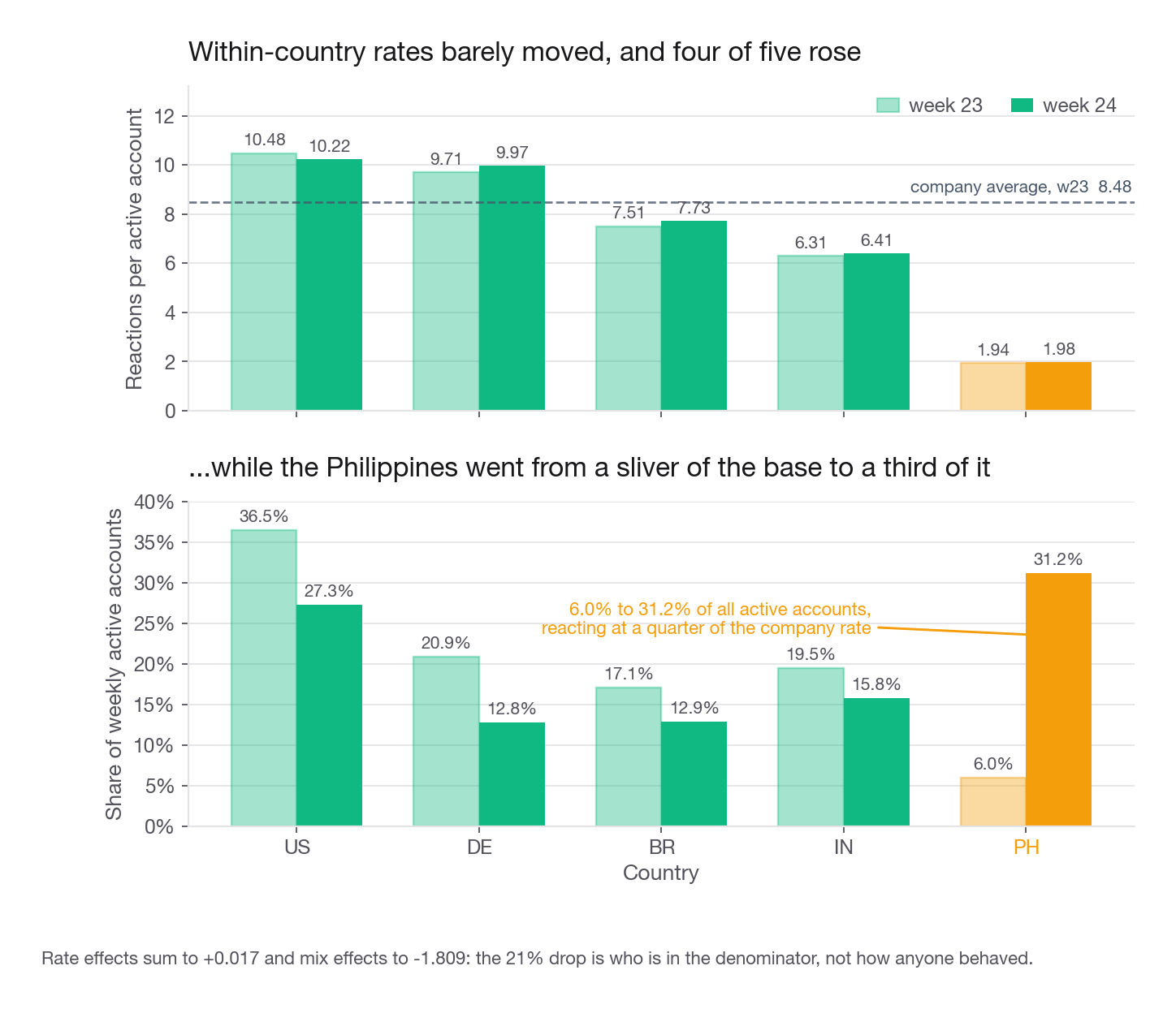
The recommendation is not "fix engagement". It is: report the acquisition cohort separately from the established base, then ask growth what the campaign optimised for. A channel delivering accounts that react at a quarter of the company rate is either badly targeted or measured against the wrong objective. If the vendor was paid on installs, they did their job and the objective is wrong.
Simpson's paradox is mix shift with the sign flipped
Simpson's paradox is the extreme case of the same arithmetic: every segment moves one way and the total moves the other. Not a curiosity, a weekly occurrence in any product with growing segments of unequal quality. The Tessera numbers are one step short of it: four of five countries improved and the total fell hard. Push the share shift further, or make the incoming cohort slightly worse, and the fifth flips too.
The three defences, in the order you should offer them:
Standardise. Hold the weights fixed at a reference period and report the resulting rate. Demographers call this direct standardization; it is three lines of pandas.
Report the segments. A number that mixes a mature base with a promotional cohort is a number nobody can act on.
Redefine the population if the mix change is permanent. If Tessera is genuinely now a company with a large Philippines base, standardising to last year's mix forever becomes its own lie. Change the definition deliberately, announce it, restate history.
The trap in the third option is that it doubles as perfect cover for a real regression, since somebody will always argue a decline is "just mix". Which is why you do the next step regardless.
Step 3: real change or logging change
You have shown the aggregate is mix. That does not mean nothing broke. Run the decomposition one level deeper and look for anything that fails to fit the pattern.
us = panel[panel.country == "US"]
detail = us.pivot_table(index="platform", columns="week", values="reactions", aggfunc="mean")
detail["pct"] = (detail["w24"] / detail["w23"] - 1).mul(100).round(1)
print(detail.round(2))
week w23 w24 pct
platform
android 10.51 10.68 1.6
ios 10.44 10.66 2.1
web 10.54 7.43 -29.5There it is. US web fell 29.5 percent while US mobile rose. There are 1,968 such accounts, costing about 6,100 reactions per week, a rounding error against 348,012 and invisible in the headline. It is still the only thing here a product team should fix this week.
Telling a broken metric from changed behaviour
Before filing a bug, decide which kind of failure this is. The signatures differ.
| Signature | Suggests instrumentation or pipeline | Suggests real behaviour |
|---|---|---|
| Shape | Vertical step inside one hour | Curve over several days |
| Floor | Lands on exactly zero, or an exact round number | Lands somewhere untidy |
| Breadth | Confined to one client, version, browser, or region | Bleeds across clients roughly in proportion to their size |
| Timing | Aligned to a deploy, SDK bump, schema change, or cron window | Aligned to a campaign, holiday, outage, or competitor launch |
| Corroboration | Payments ledger, support queue, and CDN logs disagree with the metric | They agree |
| Reversibility | Reprocessing the raw events restores the old value | The old value never comes back |
| Companion metrics | Everything from the same log moves by an identical percentage | Related metrics move by different amounts |
The single strongest tell is an exact zero for a well-defined subset. Real human behaviour is never unanimous. If not one of 14,000 Android accounts on a given build uploaded anything yesterday, that is not a change of heart, that is code.
w24 = panel[panel.week == "w24"]
print(w24.pivot_table(index="platform", columns="app_version",
                      values="uploads", aggfunc="mean").round(4))
app_version 8.3.1 8.4.0
platform
android 0.6850 0.0000
ios 0.8100 0.7716
web 0.7229 0.7591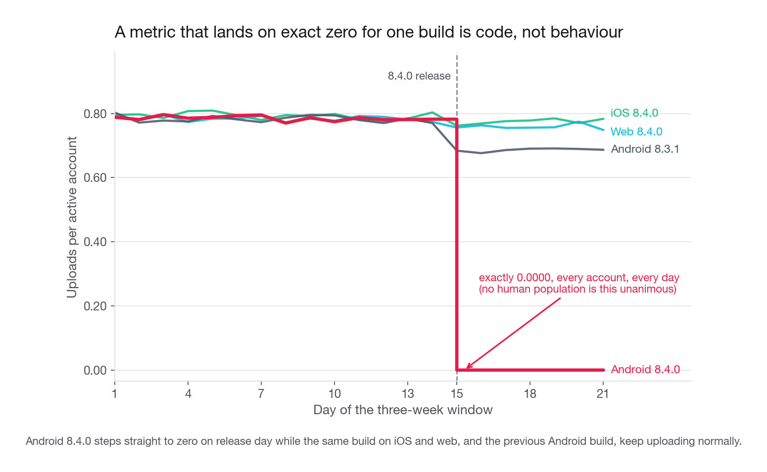
Uploads per account on Android build 8.4.0 are exactly 0.0000, while the same build on iOS and web is normal and the previous Android build is normal. That is the third thing hidden in the generator, and it is a bug with a two-dimensional fingerprint: one platform, one version. In the previous week every one of those cells sat between 0.77 and 0.82.
Notice too that the unaffected cells drifted from about 0.78 into the 0.69 to 0.81 range. That is the mix shift again, quietly moving a second metric. Two phenomena in one table, and you must name both or you will over-attribute the bug.
Interview tip: When a metric hits exactly zero for a subgroup, say "this is a code path, not a behaviour change" immediately and spend your remaining time on where in the stack it broke. Interviewers use the zero specifically to see whether you notice.
The four layers where a number can break
A dashboard number has travelled through four independent systems and any one can be the culprit. Enumerate them out loud; it is a two-sentence answer that sounds like experience.
Work outside in: the outer layers are cheapest to test and the most damaging if true. A broken upload button costs money right now, a broken dashboard costs only credibility. Two decisive probes: pull a single raw event for an affected account and see whether it exists, and check whether an independent system agrees. If uploads are zero but object storage still shows new blobs arriving from that build, the product is fine and the logging is broken, and you have localised the fault in one query.
If asked how to catch these sooner: user-facing breakage produces a support signal before a dashboard signal, since affected users complain in minutes while a weekly metric takes days. Classify inbound support text by product area, alert when an area exceeds its own trailing baseline, route it to the owning team. Cheap, and it routinely beats the analytics stack by a day.
Step 4: when the change is real, describe who changed
Suppose the mix shift were not obvious from a single dimension. With twenty candidate dimensions and interactions between them, hand-slicing is slow. The standard trick: turn "who is different this week" into a supervised problem. Label current-period rows 1, baseline rows 0, fit a shallow interpretable model, and read the splits.
from sklearn.tree import DecisionTreeClassifier, export_text

feats = ["country", "platform", "tenure"]
X = pd.get_dummies(panel[feats])
y = (panel["week"] == "w24").astype(int)

tree = DecisionTreeClassifier(max_depth=2, min_samples_leaf=800, random_state=0).fit(X, y)
print(export_text(tree, feature_names=list(X.columns)))

leaf = tree.apply(X)
summary = pd.DataFrame({"leaf": leaf, "curr": y}).groupby("leaf")["curr"].agg(["size", "mean"])
print(summary.round(3))
The first split is country_PH, isolating 18,612 rows that are 87 percent week 24 and 88 percent new accounts, against a base rate of 56 percent. That is the campaign, recovered automatically. A tree suits this: it handles correlated inputs, produces rules you can paste into a slide, and gives interactions free, since the leaf is not "PH" or "new" but both together.
The leakage that ruins this every time
Add app_version to the feature list and the tree stops being useful. Its first split becomes version 8.4.0, which sorts the weeks far better than any real cohort variable does and tells you nothing, because a release rolled out during the comparison window. Six percent of baseline rows and 75 percent of current rows carry that build, so the model has found a clock, not a cohort.
Any feature that is a function of time will dominate this model and teach you nothing. Your primary defence is a drop list written before fitting: app version, anything with a "days since" flavour, anything derived from the event timestamp, anything the pipeline started collecting recently. The backstop is to score each feature alone on how well it predicts the period a row came from.
from sklearn.metrics import roc_auc_score

y = (panel["week"] == "w24").astype(int)
for f in ["app_version", "country", "tenure", "platform"]:
    score = panel[f].map(y.groupby(panel[f]).mean())
    print(f, round(roc_auc_score(y, score), 3))
app_version 0.846
country 0.641
tenure 0.583
platform 0.543Anything clearing about 0.75 alone, or beating every real cohort variable by a wide margin, is a clock. Score AUC or balanced accuracy, not raw accuracy: app_version gets 83.4 percent raw against a 56.5 percent majority baseline only because the periods differ in size, 52,000 rows against 40,000, so the threshold will not travel. Note that it survives a naive 90 percent accuracy screen: the drop list comes first, the number is only a backstop. A purely relative rule fails the other way too: a genuine cohort shift big enough to dominate everything else trips it, and you bin it.
Two guardrails. Significance is meaningless here because n is enormous and every feature will clear any threshold, so rank by lift and leaf size, never by a p-value. And this model describes, it does not explain. That the new accounts are Filipino and new is a description; the cause is a purchase order somebody signed. The model narrows where to ask, a human still answers.
Self-selection: when moving A does not move B
Now the failure mode that costs the most engineering time. Tessera observes that accounts with a profile photo react far more than accounts without one.
base = panel[panel["week"] == "w23"]
print(base.groupby("profile_photo")["reactions"].agg(["size", "mean"]).round(2))
print(base.pivot_table(index="tenure", columns="profile_photo",
                       values="reactions", aggfunc="mean").round(2))
size mean
profile_photo
False 17080 7.22
True 22920 9.43
profile_photo False True
tenure
new 4.80 5.81
returning 8.85 10.08A 31 percent gap. The obvious product move: auto-generate a photo for everyone, or nag until they upload one, and harvest the engagement. It will not work, and you should be able to say why in twenty seconds.
Setting a profile photo is a choice, and the choice is made by people who already care. It is a symptom of intent, not a producer of it. Controlling for tenure shrinks the gap from 31 percent to 21 percent among new accounts and 14 percent among returning ones. The tempting next sentence is that the remainder is the part of caring that tenure does not capture. It is wrong here, and worth catching, because the remainder is sitting in the next column of that same table. Standardise both groups onto the joint distribution of country and tenure, the same move used for platform a section from now.
mix = base.groupby(["country", "tenure"]).size() / len(base)
for flag in [True, False]:
    cell = base[base.profile_photo == flag].groupby(["country", "tenure"])["reactions"].mean()
    print(flag, round(float((mix * cell).sum()), 2))
True 8.48
False 8.48Neither control alone is enough, which is the real lesson: tenure alone leaves 14 to 21 percent, country alone leaves 10 percent, and jointly the 31 percent gap goes to zero. All ten country-by-tenure cells have photo and no-photo means you cannot tell apart, the widest gap 1.7 standard errors: US returning is 11.41 with a photo against 11.45 without, IN returning 6.88 against 6.88, PH new 1.82 against 1.82. Accounts with a photo are 45 percent US and 2 percent PH; accounts without are 25 percent US and 12 percent PH, and PH reacts at a fifth of the US rate. Profile photo carries no information that country and tenure do not already carry, which is what a pure marker of intent looks like once you have measured the intent.
One honest limit: the PH returning cell holds 54 accounts with a photo against 219 without, so its agreement carries almost no weight, and the conclusion rests on the eight well-populated cells.
The product conclusion is unchanged, and now demonstrated rather than asserted. Assign the photo by fiat and you have moved the marker without moving anything the marker was marking. Most disengaged accounts will not notice; some will be annoyed that you touched their profile, so the effect can be negative.
Do not carry the clean zero into a real table. On production data the residual rarely closes completely, and the honest sentence has two clauses in this order: some of the remainder is composition I have not standardised on yet, and some may be intent I cannot measure. Reaching for the second before exhausting the first is how a photo-nag project gets funded.
The general form recurs constantly: when a variable is produced by user choice, forcing it moves the label off the behaviour instead of moving the behaviour. Users who enable notifications retain better. Users who join a group retain better. Users who connect a second device retain better. Each is mostly self-selection, and each has had an engineering quarter thrown at it somewhere.
So what is the finding good for? Quite a lot, if you invert the problem.
The tell for a self-selected variable is a single question: could a user have chosen not to have this value, and does that choice say something about how much they care? If yes, it is a symptom. Contrast that with something like assigned onboarding variant, which the user did not choose, and which is therefore a legitimate lever.
Interview tip: When you spot a self-selected driver, do not just say "correlation is not causation". Say the concrete failure: "we would set the flag without moving the underlying intent, so the association would break rather than transfer." Naming the mechanism is what scores.
Actionable insight or spurious relationship
The neighbouring failure mode: a variable the user did not choose that is still not a cause, because it stands in for something else.
b = panel[panel["week"] == "w23"]
print(b.groupby("platform")["reactions"].agg(["size", "mean"]).round(2))
print(b.pivot_table(index="country", columns="platform",
                    values="reactions", aggfunc="mean").round(2))
size mean android ios web
platform BR 7.55 7.42 7.48
android 21458 7.72 DE 9.73 9.71 9.67
ios 13810 9.49 IN 6.32 6.13 6.42
web 4732 9.00 PH 1.92 2.05 2.07
US 10.51 10.44 10.54In aggregate, iOS accounts react 23 percent more than Android accounts. Within every single country the three platforms are indistinguishable. Platform is a proxy for country: 54 percent of iOS accounts are in the US against 23 percent of Android accounts, and 29 percent of Android accounts are in India where the base rate is 6.3.
The cleanest way to prove it, and the one to describe in an interview, is direct standardization: recompute one group's average under the other group's covariate distribution.
ios_mix = b[b.platform == "ios"]["country"].value_counts(normalize=True)
android_rate = b[b.platform == "android"].groupby("country")["reactions"].mean()
print(round(float((ios_mix * android_rate).sum()), 2), round(b[b.platform == "ios"]["reactions"].mean(), 2))
9.55 9.49Standardised to the iOS country mix, Android accounts react at 9.55 against iOS at 9.49. The gap does not shrink, it inverts slightly and lands inside noise. Platform carries no information about reactions that country does not already carry.
Three tests, in increasing cost:
| Test | How it works | Strength | Weakness |
|---|---|---|---|
| Tree with the suspect variable included | Fit on all candidate drivers; see whether the tree ever splits on it | Fast, handles correlation, gives you the real drivers as a byproduct | A single tree is unstable; re-fit on bootstrap samples before believing an absence |
| Two models, with and without | Compare held-out performance of the full model against the model minus the variable | Directly answers "is there unique information here" | Says nothing about direction or magnitude; a tiny unique signal can still matter commercially |
| Direct standardization or reweighting | Recompute one group's mean under the other's covariate distribution | Interpretable, explainable to a PM in one sentence, no model to defend | Only balances variables you thought of, and gets thin when strata are sparse |
What if the variable survives all three? Then the difference really is attached to it, and your next move is mechanism. For a surviving platform gap, pull engineering telemetry rather than the user table: cold start time, crash-free session rate, time to first render, error rate on the reaction endpoint, and the spread of OS versions still in the field. A real platform effect is almost always a quality effect, and quality lives in latency and errors, not demographics.
Interview tip: Ask "is X a cause, a proxy, or a symptom" as an explicit three-way question. Proxies are fixed by finding the variable behind them; symptoms are fixed by treating them as labels; only causes are levers.
Behavioral versus demographic variables
Every investigation above eventually needs a set of candidate drivers, and you will be asked which family to reach for. Take Foxglove, an online homewares retailer buying in-feed ad inventory on Tessera, wanting to predict whether a given user clicks a given ad.
The demographic family says: this account is 34, in Lisbon, has been registered three years, uses Android. The behavioral family says: this account viewed four rug listings yesterday, saved two, and searched "runner rug hallway" twice this morning.
Behavioral wins, decisively, for two reasons that are worth being precise about.
Timing. Demographics give the base rate for a type of person over a year. Behaviour says a specific person is in-market right now. Click-priced advertising is a game about the next thirty minutes, and a variable that resolves the base rate but not the moment is nearly worthless in it. That is why the industry's economics changed when targeting moved from one to the other.
Purchase intent is not personal fit. People buy for other people: gifts, a partner's request, a shared household account, an order placed for a parent. A demographic model implicitly assumes every purchase is for the buyer and is wrong about a large slice of transactions. Browsing history does not care who the item is for, it records that this session is about rugs.
Where behavioral variables are weak is precisely where the earlier sections of this lesson bite.
| Property | Demographic | Behavioral |
|---|---|---|
| Predictive power for near-term action | Modest | Very high |
| Available at signup | Yes | No, cold start is real |
| Stable over months | Yes | Decays in hours or days |
| Endogenous with the outcome | Rarely | Frequently, browsing is often the first step of the outcome |
| Assignable by the product | Never | Sometimes, indirectly, through what you surface |
| Self-selection risk | Low | High, most behaviour is a choice |
| Regulatory and consent exposure | Moderate | High, and tightening |
Read the last four rows together and you get the sentence most candidates miss: behavioral variables dominate prediction and are the hardest to act on. "This user browsed rugs" is a superb feature and a terrible instruction, since you cannot make a user browse rugs. What you can change is what you show, when you show it, and how fast it loads.
The rule: build with behavioral variables when the task is prediction, switch to assignable variables the moment the task becomes a recommendation. A model that ranks browsing history at the top of its importance list has told you it works, not what to build.
One second-order point, useful on product-design prompts: if behavioral data is what earns the revenue, then features that generate honest interest signal, saves, collections, follows, are worth more than their direct engagement lift, because they feed everything downstream.
The ninety-second answer
Compressed, so you can rehearse the whole thing:
"Reactions per active account fell from 8.48 to 6.69, down 21 percent. First, numerator versus denominator: total reactions actually rose 2.5 percent while active accounts rose 30 percent, so nobody reacted less, the base grew. Second, mix versus rate: decomposing by country, rate effects sum to plus 0.02 and mix effects to minus 1.81. The Philippines went from 6 percent of accounts to 31 percent at a rate of 1.98 against a company average of 8.5, and 14,000 of the 22,000 new accounts are there, so this is an acquisition campaign, not an engagement regression. Standardised to last week's mix, the metric is flat. Third, I checked whether anything else hid under the mix. US web reactions fell 29.5 percent while US mobile rose 2 percent, which is small in absolute terms, about 6,100 reactions, but is a real regression worth fixing. And Android uploads on build 8.4.0 are exactly zero, which given the same build is fine on iOS is a client bug, not behaviour. So: three findings, one report split for growth, one web regression for the product team, one release bug for engineering. The headline number needs no fix, it needs a standardised twin."
No guesses about user psychology, and every claim is a number someone can check.
Common traps
Explaining a movement before confirming it exists. Fix: state the standard error on the difference, not on either level, and the comparison window first. A large share of pages are noise or a partial period.
Assuming the numerator moved. Fix: print both series. A ratio falling while the numerator rises is common and changes who owns the problem. Use the centered mix term (w1 - w0) * (r0 - R0) when you attribute, or every growing segment scores positive and the per-segment numbers mean nothing.
Ranking segments by rate change instead of contribution. A segment down 40 percent holding 200 accounts is not your problem. Fix: multiply by share, always report contribution in metric units.
Stopping at "it is just mix". Fix: after standardising, decompose one level deeper inside the largest segments. The US web regression is invisible at the top level and is the only actionable finding in this dataset.
Treating an exact zero as a behaviour change. Fix: exact zeros for a well-defined subgroup are code, every time. Go straight to the four layers.
Letting a time-correlated feature into the who-changed model. Fix: drop app version, tenure-in-days, and anything the pipeline started collecting recently. A feature that separates periods on its own is a clock.
Reading the who-changed tree as causal. Fix: say "this describes the incoming population" out loud, then go find the human who signed the purchase order.
Trying to move a self-selected marker. Fix: ask whether the user chose the value and whether the choice reveals intent. If yes, use it as a label, not a lever.
Accepting a segment difference without standardizing. Fix: recompute one group's average under the other's covariate mix before you write a single line of the recommendation.
Recommending a behavioral variable as an action. Fix: browsing history predicts, it does not instruct. Convert every finding into something the product actually sets.
Quick self-check
Answer aloud, in full sentences, as if just asked.
A weekly ratio metric is down 18 percent year over year. Name the four arithmetic possibilities before any hypothesis about users, and say which one you would test first and with what query.
Write the mix effect and rate effect formulas from memory, explain why the mix term is centered on the baseline overall mean, and state what goes wrong in the per-segment numbers if you forget.
Every country's conversion rate rose and the overall rate fell. Explain the mechanism in two sentences without using the phrase "Simpson's paradox", then name the two numbers you would put on the dashboard so it never surprises anyone again.
Checkout completions for one browser went to exactly zero on Tuesday at 14:00. List the four layers where the fault could live, say which you would test first and why, and name one independent system whose agreement or disagreement would localise it in a single query.
Accounts that enable notifications retain 25 points better. Someone proposes enabling notifications by default. Give the concrete mechanism by which that fails, and describe the analysis you would run instead.
You find that tablet users spend 40 percent more per order. Describe the standardization you would run before telling anyone, what result would make you drop the finding, and what you would investigate if it survived.