2.5 Feature Ideas, Similarity, and Predicting Behavior
Find the core decision, design, or behavior signal.
Turn the lesson into a concise response blueprint.
Name the trap you would avoid in a real interview.
Use these checkpoints as your reading path before diving into the full lesson.
- 1Why this matters in interviews
- 2A panel to make the modelling concrete
- 3Where feature ideas come from when you...
- 4The friction ledger
- 5Four grades of evidence
Four prompts that sound unrelated show up in every product loop: what feature would you add, how would you tell whether two users are close, should we build the thing the PM keeps pitching, and can you predict who is about to leave. They are one question in four costumes. Each asks whether you can start from behaviour already sitting in the logs and finish at something a team can ship and measure. This lesson gives you the moves for all four, and tells you when the honest answer is that no model should be built at all.
Why this matters in interviews
The failure mode here is the opposite of the one in the metric-improvement lesson. There, candidates jump to features. Here, they are invited to name a feature and take it as licence to be a product visionary for eight minutes: what users want, where the industry is going, what a competitor shipped last quarter. All of it unfalsifiable, none of it using the one asset the role gives you, a record of what millions of people actually did.
Three things are being checked. Can you locate demand in behaviour that has already happened. Can you turn a fuzzy word like close, similar, or likely to churn into something with a numerator, a population, and a window. Can you say what the output is for, meaning what changes on someone's screen or in someone's queue the day it ships.
The third decides the level. A mid-level candidate builds a churn model and reports an AUC. A senior candidate says the model exists to fill a retention team's daily queue, the team can work 400 contacts a day, and therefore the only number that matters is precision in the top 400. Same model, different conversation.
Interview tip: Before you describe any model, say the sentence "the output of this is a ranked list that goes to X, who can act on Y of them per day." If you cannot finish that sentence, you have not been asked for a model.
The three fictional products in this lesson are Perch, a group messaging app; Ember, a photo community; and Trailhead, a professional network. They recur later in the course, so the numbers below are worth remembering.
A panel to make the modelling concrete
The prediction half runs on a monthly snapshot panel from Trailhead. Each row is one member in one month, holding only information observable at the end of that month, plus a label for whether they started a new role in the following month. This block builds it deterministically.
import numpy as np
import pandas as pd

SEED = 4172026
rng = np.random.default_rng(SEED)

N_USERS, N_MONTHS = 9_000, 24
user = np.repeat(np.arange(N_USERS), N_MONTHS)
month = np.tile(np.arange(1, N_MONTHS + 1), N_USERS)
rep = lambda a: np.repeat(a, N_MONTHS)

level = rep(rng.choice(["ic1", "ic2", "ic3", "mgr"], N_USERS, p=[0.24, 0.36, 0.26, 0.14]))
sector = rep(rng.choice(["software", "health", "logistics"], N_USERS, p=[0.45, 0.31, 0.24]))
tenure = (rep(rng.gamma(2.0, 11.0, N_USERS)) + month).round(0)
restless = rep(rng.beta(1.6, 6.0, N_USERS))

seasonal = 0.62 + 0.38 * (month % 12 <= 2)
openings = np.clip(rng.normal(100, 12, N_USERS * N_MONTHS) * seasonal, 40, None)

edits = rng.poisson(0.18 + 3.4 * restless)
replies = rng.poisson(0.09 + 2.1 * restless)
searches = rng.poisson(0.30 + 6.0 * restless)
endorse = rng.poisson(0.05 + 1.3 * restless)

logit = (-4.60 + 2.9 * restless + 0.16 * np.log1p(searches)
         + 0.31 * np.log1p(replies) + 0.22 * np.log1p(edits)
         + 0.90 * (openings / 100 - 1) + 0.004 * np.minimum(tenure, 60))
moved = rng.binomial(1, 1 / (1 + np.exp(-logit)))

snap = pd.DataFrame({
    "user_id": user, "snapshot_month": month, "level": level, "sector": sector,
    "months_in_role": tenure, "profile_edits_30d": edits,
    "recruiter_replies_30d": replies, "search_sessions_30d": searches,
    "endorse_requests_30d": endorse, "sector_openings_index": openings.round(1),
    "moved_next_month": moved})
That gives 216,000 member-months at a 2.7 percent monthly move rate, roughly what a real professional network sees. The column families map onto the argument later about which features carry signal.
| Column | Family | Observable at snapshot time | Why it is here |
|---|---|---|---|
level, sector | Profile | Yes | Cheap, stable, weak on its own |
months_in_role | Profile, time-varying | Yes | Encodes the tenure hump |
sector_openings_index | External market | Yes | Demand shock raises leverage |
profile_edits_30d | Behaviour | Yes | The classic tell |
recruiter_replies_30d | Behaviour | Yes | Two-sided intent signal |
search_sessions_30d | Behaviour | Yes | Strongest single behaviour |
endorse_requests_30d | Behaviour | Yes | Preparation, not intent |
moved_next_month | Label | No, by construction | The thing being predicted |
The seasonal term is deliberate: hiring runs hot in months 1, 2, 12, 13, and 24. Split a panel like this at random and you train on the January you are about to be tested on.
Where feature ideas come from when you are not allowed to have opinions
The habit worth building: stop asking what users want, start asking what they already do the hard way.
The friction ledger
Every product contains jobs people accomplish today, but accomplish badly: a workaround, a copy-paste, a message to another human, a trip to a different app, six taps that could be one. Each is a demand signal somebody already paid for. So the ideation loop is not creative. It is forensic.
Enumerate the outcomes people reach today through effort.
Measure how much effort each one costs and how many people pay it.
Rank by people times effort, then divide by how hard the shortcut is to build.
Build the shortcut for the top item and test it.
Every step is checkable, so if the interviewer disagrees with your top idea they are disagreeing with a number, not with your taste. Keep the mirror image in your pocket too: to make people do something less, add steps. Teams do this deliberately, and naming it shows you read friction as a lever in both directions rather than as a bug.
Four grades of evidence
Not all demand evidence is worth the same. Interviewers rarely say this explicitly, but they grade your proposal by how directly the evidence proves that people already want the outcome.
| Evidence | What it actually proves | Cost to gather | How it fails |
|---|---|---|---|
| Users complete the outcome today via a multi-step workaround | Demand exists and is already being paid for | Low, it is in the event log | Workaround may serve a rarer job than you assume |
| Users start the outcome and abandon partway | Intent exists, execution is too costly | Low | Abandonment can mean the intent was weak, not the path |
| Users describe the outcome in free text | Intent exists, at least among the vocal | Medium, needs text processing | Writers are a biased slice of users |
| A competitor shipped it and it looks popular | Almost nothing about your users | Zero | Their user mix and business model differ from yours |
The top row is the strongest thing you can say. The bottom row is what most candidates reach for. If you catch yourself citing a competitor, follow it immediately with the internal signal that would confirm the same demand on your own product, and go measure that instead.
Running the ledger on Perch
Perch is a group messaging app. With every message and every tap, the ledger becomes a concrete pipeline.
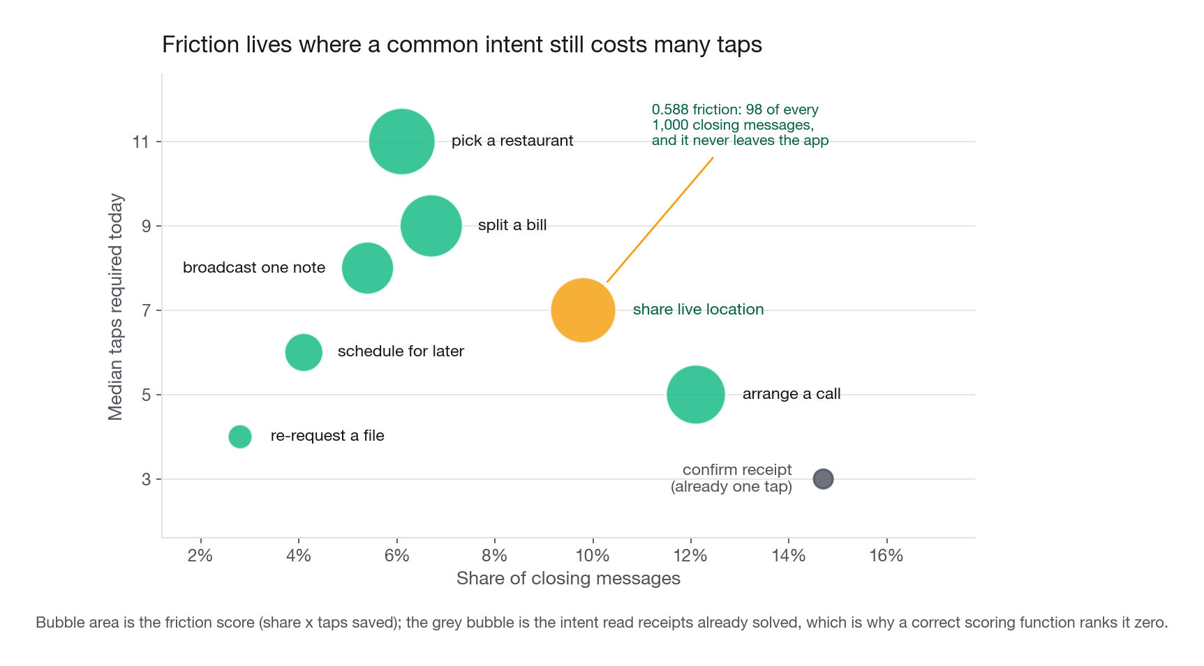
Classify intent, not text. "Can you call me" and "free for a quick chat" are one intent, so embed each message, cluster the embeddings, and hand-label the clusters once. Weight opening and closing messages more heavily: openers carry why a conversation exists, closers carry what it produced, and the middle is mostly negotiation. Then measure the taps and app switches each intent costs today. Below is that pipeline's output, hard-coded so the ranking is reproducible.
import pandas as pd

intents = pd.DataFrame({
    "intent": ["confirm receipt", "arrange a call", "share live location",
               "split a bill", "pick a restaurant", "broadcast one note",
               "schedule for later", "re-request a file"],
    "share_of_closing_msgs": [0.147, 0.121, 0.098, 0.067, 0.061, 0.054, 0.041, 0.028],
    "median_taps_today": [3, 5, 7, 9, 11, 8, 6, 4],
    "already_one_tap": [True, False, False, False, False, False, False, False],
})
intents["friction"] = (intents["share_of_closing_msgs"]
                       * (intents["median_taps_today"] - 1)
                       * (~intents["already_one_tap"]))
cols = ["intent", "share_of_closing_msgs", "median_taps_today", "friction"]
print(intents.sort_values("friction", ascending=False)[cols].head(6).round(3).to_string(index=False))
intent share_of_closing_msgs median_taps_today friction
pick a restaurant 0.061 11 0.610
share live location 0.098 7 0.588
split a bill 0.067 9 0.536
arrange a call 0.121 5 0.484
broadcast one note 0.054 8 0.378
schedule for later 0.041 6 0.205Two things in that output earn credit.
First, "confirm receipt" is the most common closing intent at 14.7 percent and scores zero. That is the ledger validating itself: read receipts already exist, so the intent is already one tap. If your scoring function ranked an existing feature first, the scoring function would be wrong.
Second, the top raw score is not what you build first. Eleven taps means picking a restaurant leaves the app and comes back, which is a venue catalogue, a partnership, and a payments conversation. Live location is 98 of every thousand closing messages, costs seven taps, and is self-contained. Friction gives you the list; dividing by build cost gives you the order.
From cluster to candidate
The last step translates an intent into something an engineer can build and a metric can see.
| Intent cluster | The workaround today | Candidate feature | Metric it should move |
|---|---|---|---|
| Share live location | Type an address, then a stream of updates | One-tap live location for a chosen duration | Share of coordination threads closed within 10 minutes |
| Split a bill | Photograph a receipt, do arithmetic, chase people | In-thread split with per-person amounts | Share of payment threads reaching all-settled |
| Arrange a call | Several messages negotiating a time | Call button plus a proposed time chip | Calls started per active thread |
| Broadcast one note | Paste the same text into 9 threads | Named broadcast list | Messages sent per sender, and reply rate per recipient |
The last row carries two metrics on purpose. Broadcast makes sending cheaper, which mechanically raises messages sent while lowering how much recipients care. Pairing a volume metric with a quality metric is the cheapest way to show you thought past the obvious win.
Interview tip: When you propose a feature, name the exact log-derived number that proves people already want the outcome, and the exact number that would fall if the feature succeeded for the wrong reason.
Similarity: define the target before you pick a distance
"How would you find the two users who are closest" is a ranking question in disguise: given one item and a candidate set, order the candidates. Nothing about it is specific to social networks. Nearest podcast, nearest listing, nearest support ticket, nearest fraud ring, identical shape and a different candidate set. So the interesting work happens before any distance function appears.
Write down what closeness is supposed to mean
There is no true definition of best friend, most similar song, or comparable listing. There is only the definition that makes the downstream product work. State one in a sentence and accept pushback: pushback on a stated definition is a conversation, pushback on an unstated one is a failure.
For Perch: the contact a member would choose to spend an unplanned free evening with. That is deliberately about offline preference rather than message volume, because volume is dominated by logistics. The person you message most is often a group admin, a landlord, or the coworker who owns the schedule.
Different definitions imply different features. If closeness meant who influences whose purchases, you would weight shared link clicks. If it meant who would notice a compromised account, you would weight response latency to odd requests. Say which one you picked and why the product needs it.
User-user versus item-item
These get conflated constantly, and their economics genuinely differ.
The practical rule: item-item is what you serve, user-user is what you analyse. Item neighbours move slowly enough for a nightly job, and there are usually far fewer items than users. A member's own neighbourhood shifts weekly, which is fine for a study and painful as a production dependency.
Structural overlap and why raw counts mislead
When your data is a graph, the first signal for the strength of a pair is how much their neighbourhoods overlap. It is the same intuition as co-occurrence in text: two things that keep appearing beside the same third things are related. But raw shared-count rewards hubs. Here is a small slice of a Perch graph in which Ana has two candidate close contacts, Bo and Zed.
import math

EDGES = [("ana", "bo"), ("ana", "zed"),
         ("ana", "cy"), ("ana", "dee"), ("ana", "eff"), ("ana", "gil"),
         ("ana", "hana"), ("ana", "ike"), ("ana", "jo"), ("ana", "kit"),
         ("bo", "cy"), ("bo", "dee"), ("bo", "eff"), ("bo", "gil"), ("bo", "lou"),
         ("zed", "gil"), ("zed", "hana"), ("zed", "ike"), ("zed", "lou")]
CIRCLE = {"cy": "work", "dee": "work", "eff": "work", "gil": "work", "lou": "work",
          "hana": "school", "ike": "family", "jo": "neighbours", "kit": "work",
          "ana": "self", "bo": "work", "zed": "school"}

graph = {}
for a, b in EDGES:
    graph.setdefault(a, set()).add(b)
    graph.setdefault(b, set()).add(a)

def scores(a, b):
    shared = graph[a] & graph[b]
    jac = len(shared) / len(graph[a] | graph[b])
    aa = sum(1 / math.log(len(graph[c])) for c in shared if len(graph[c]) > 1)
    return len(shared), round(jac, 3), round(aa, 3), len({CIRCLE[c] for c in shared})

for cand in ("bo", "zed"):
    s, j, aa, breadth = scores("ana", cand)
    print(f"ana-{cand:<4} shared={s} jaccard={j} adamic_adar={aa} circles={breadth}")
ana-bo shared=4 jaccard=0.333 adamic_adar=5.238 circles=1
ana-zed shared=3 jaccard=0.25 adamic_adar=3.796 circles=3Every structural measure picks Bo. Raw overlap picks Bo, Jaccard picks Bo, and Adamic-Adar, which downweights shared contacts connected to everyone, still picks Bo. Bo is a coworker.
Circle breadth is the signal that separates them
The fourth column gets it right. Ana and Bo share four contacts from one circle. Ana and Zed share three spanning work, school, and family, which means something specific: Zed has been introduced across the boundaries of Ana's life and Bo has not. Sharing an org chart is not intimacy.
The recipe: run community detection on each member's ego network to get circles, then score a pair by how many distinct circles their shared contacts span. A two-line change that flips the answer.
Interview tip: When an interviewer gives you a graph problem, propose the naive overlap metric, then immediately say how it fails, then give the fix. Showing the failure mode is worth more than arriving at the fix directly.
Behavioural evidence outranks structural evidence
Structure tells you who two people know. Behaviour tells you what they do with each other, and when both exist, behaviour wins. The principle underneath recurs in the prediction section: a signal carrying a timestamp of intent beats a signal describing a stable state.
For Perch, in rough order of usefulness:
Reciprocity of initiation. Close pairs both start conversations; one-directional threads are service relationships.
Response latency at unusual hours. Answering at 23:40 is a different relationship from answering at 10:15.
Photos where both faces appear, and events both attended.
Message register. Acquaintance messages are formal and templated. Close pairs write shorter, sloppier, funnier ones, and a typo-rate or perplexity feature separates them surprisingly well.
Threads that end with a plan rather than with information.
Assemble these into one vector per pair and score with cosine distance or a small learned ranker. What earns credit is that you separated definition, evidence, and distance function, and did not open by saying cosine similarity.
What a similarity score is allowed to do
State the product surface, because different surfaces impose different requirements on the same score.
| Surface | Needs symmetry | Needs calibration | Latency budget | Main risk |
|---|---|---|---|---|
| Suggest people to add | No | No, ranking is enough | Nightly batch is fine | Suggesting someone the member is avoiding |
| Order the contact list | No | No | Under 50 ms | Ordering by logistics volume, not closeness |
| Auto-build a close-friends group | Yes | Preferred, though a tuned cut on a comparable score also works | Nightly | A visible false positive is embarrassing |
The third row catches candidates, and in a subtler way than it is usually stated. A threshold needs a labelled eval set to pick the operating point, plus scores comparable enough across members that one cut gives everybody a sensible group size. Calibration is the cleanest route to that, and it is required once the threshold must be quoted as a probability, traded against a cost, or reused after a refresh without retuning. It is not required merely because a threshold exists: an ordinal score cut at a tuned percentile is a legitimate first version. Anything user-visible and named needs a defensible cut and a graceful way to be wrong.
Should we build it: two gates and a cannibalisation check
Ember, the photo community, has a PM who wants a Cheer button next to the existing Like. "Should we add it" gets answered badly in two ways: yes because it sounds nice, no because it sounds redundant. Both skip the work.
Gate one: if it worked perfectly, would it matter
Name the one metric the feature is supposed to move and ask whether a wild success on it would be genuinely good. If you cannot name the metric, stop. A feature with no metric is not a data science conversation.
For Ember, engagement is actions per active member per week, an action being a post, comment, like, save, or upload. Cheer moves that through two mechanisms: cheers are themselves actions, and a richer reaction vocabulary makes posting feel more rewarding, which raises supply. Attack the first mechanism yourself before the interviewer does. If members substitute a Cheer for a Like they would have given anyway, total actions do not move. Gate one is passed by "adds actions that would not otherwise have happened, or raises posting supply", not by "adds actions".
Gate two: find demand in today's data
This gate separates the answers. You need a behavioural proxy for demand drawn from the current product, and the strongest proxies are always workarounds.
For Cheer, the proxy is comments. Classify recent comments by intent and measure the share that are pure congratulation with no informational content: "amazing", "so proud of you", strings of celebratory emoji. If that share is 19 percent, a large group of members is paying a high price, opening a keyboard and typing, to express what one tap could express. That is demand, already paid for, in your own logs.
| Candidate feature | Demand proxy in today's logs | A number that would justify testing | A number that would kill it |
|---|---|---|---|
| Cheer reaction | Share of comments that are pure congratulation | Above 12 percent of comments | Below 3 percent, or concentrated in under 1 percent of posts |
| Save-for-later | Members screenshotting posts, or re-visiting the same post | Above 8 percent of sessions revisit a post seen earlier | Revisits are dominated by a handful of viral posts |
| Close-friends audience | Members deleting a post within 30 minutes of posting | Above 5 percent of posts deleted early | Early deletes are mostly duplicate uploads |
The kill column matters more than the justify column. Any proposal can find a supporting number. Naming in advance the number that would make you drop the idea is what reads as senior, and it stops the analysis from turning into advocacy.
The cannibalisation check nobody volunteers
Two gates are what most strong candidates give. The third separates them.
Every new control competes for the same tap. If Cheer takes 40 percent of the taps that would have been Likes, total reactions barely move and you have added interface complexity for nothing. Worse, if the feed ranker weights Likes and you have just split that signal in two, ranking quality can degrade while raw actions rise.
So: name what the feature takes from, and the metric that reveals the theft. For Cheer that is Likes per post among posts eligible for both controls, with total reactions per post as the guardrail rather than total Cheers.
Interview tip: Passing all three gates never earns the word ship. It earns the word test. Saying "so we should build it" after a clean analysis is the fastest way to lose points you already won.
Why "test it" is the only correct ending
You have shown the feature could matter, that demand exists, and that you know what it might cannibalise. None of that gives you an effect size, and effect size is the whole decision. Demand for an outcome does not guarantee that your implementation captures it, that people find it, or that the lift survives the novelty window. Only a controlled experiment answers those, which is where the next section goes.
Keep one exception ready: when a change is small, reversible, and a clean test costs more than the information is worth, a monitored rollout to a small percentage is defensible. Offer it only if you can say why this feature qualifies.
Predicting user behaviour: label, panel, leakage, action
The fourth costume. Trailhead wants to know who is about to change roles, and churn, propensity to upgrade, and likelihood to file a support ticket all use the same machinery.
Write the label as a full sentence
Almost every weak answer here is weak because the label was never pinned down. Write one sentence containing four things: event, horizon, population, snapshot moment.
"For every member active in month M, predict the probability that their profile shows a new employer in month M plus one."
Then argue with your own sentence, because the interviewer will.
Event. Is a title change at the same employer a move. Probably not, but a promotion shares many of the same behavioural precursors, so it deserves a separate label.
Horizon. One month keeps the base rate at 2.7 percent and makes precision hard. Three months raises the rate and blurs the timing. Match the horizon to how long the intervention takes to work.
Population. Members last seen 14 months ago are unreachable. Scoring them inflates the denominator and wastes capacity.
Snapshot. The moment features are frozen. This is the one that causes production incidents.
The panel and the embargo
Build the panel by stacking snapshots: for each member and month, take features observable up to the end of that month and attach the following month's outcome. Split by time, never at random, and leave a gap.
from sklearn.ensemble import HistGradientBoostingClassifier
from sklearn.metrics import roc_auc_score

FEATS = ["months_in_role", "profile_edits_30d", "recruiter_replies_30d",
         "search_sessions_30d", "endorse_requests_30d", "sector_openings_index"]

train = snap[snap["snapshot_month"] <= 18]
score = snap[snap["snapshot_month"] >= 20].copy()   # month 19 is an embargo gap

model = HistGradientBoostingClassifier(max_depth=4, learning_rate=0.06,
                                       max_iter=250, random_state=0)
model.fit(train[FEATS], train["moved_next_month"])
score["p"] = model.predict_proba(score[FEATS])[:, 1]
print(len(score), round(score["moved_next_month"].mean(), 4),
      round(roc_auc_score(score["moved_next_month"], score["p"]), 3))
45000 0.0278 0.661Month 19 is dropped on purpose. Month-18 features and the month-19 outcome overlap in real time, so training on 18 and testing on 19 lets slow-moving behaviour leak across the boundary. One embargo period costs a little data and removes a whole class of argument.
The comparison is instructive. Splitting these rows at random gives 0.656 against the time split's 0.661, a trivial difference, because the generator has no drift beyond a clean seasonal term. On a real panel, where the product, the logging, and the market all shift, that gap routinely runs 5 to 10 AUC points and always in the flattering direction.
Leakage is a column, not a concept
The abstract version of leakage is useless in an interview. The concrete version is a column whose value was written during or after the outcome window.
Suppose someone adds inmail_opened_outcome_month, a flag for opening a recruiter message during the month you are predicting. Validation AUC jumps from 0.661 to 0.795. That looks like a breakthrough and is worth nothing: at scoring time, on the last day of month M, the column is empty for everyone. The model leans on a feature that is all zeros in production, and live performance lands below the version without it.
The audit is boring and mandatory. For every feature, name the timestamp of the last event contributing to it and assert it falls at or before the snapshot boundary. If a column comes from a nightly aggregate, check when that table is written, not when its events happened: an aggregate running at 03:00 on the first of the month has quietly eaten a day of the future.
Interview tip: When asked how you would prevent leakage, do not define it. Name a specific column in the problem you were just given that would leak, say who would have added it and why it looks reasonable, and give the assertion that catches it.
Which features carry the signal
Split the same model three ways and the answer is blunt.
| Feature set | Test AUC | What it says |
|---|---|---|
| Behaviour only, 4 columns | 0.655 | Nearly all of the signal |
| Behaviour plus profile plus market, 6 columns | 0.661 | Context adds a rounding error |
| Profile and market only, 2 columns | 0.531 | Barely better than a coin flip |
Behaviour dominates because behaviour is timestamped intent. That a member is a senior engineer in logistics with four years of tenure tells you what kind of person they are. That they edited their headline twice and answered three recruiter messages in 30 days tells you what they are doing right now. Description is stable, action is dated, and only a dated signal can carry timing.
The design consequence: if your pipeline holds 40 profile attributes and 4 behavioural counts, you built it backwards, and the fix is not more attributes. It is more behavioural windows, the same counts at 7, 30, and 90 days plus their ratios, which encode acceleration. A member whose 7-day search count is triple their 90-day average is in a different state from one at a steady simmer, and a flat count cannot say so.
Rank metrics, not accuracy
At a 2.7 percent base rate, a model predicting that nobody moves is 97.3 percent accurate and useless. The metrics that matter follow from what the output is for.
base = score["moved_next_month"].mean()
for k in (500, 2000, 10000):
    top = score.nlargest(k, "p")
    print(k, round(top["moved_next_month"].mean(), 4), round(top["moved_next_month"].mean() / base, 2))

score["bucket"] = pd.qcut(score["p"], 10, labels=False, duplicates="drop")
cal = score.groupby("bucket").agg(predicted=("p", "mean"),
                                  observed=("moved_next_month", "mean"),
                                  n=("p", "size"))
print(cal.round(4).tail(4).to_string())
500 0.098 3.53
2000 0.0845 3.04
10000 0.0563 2.03
predicted observed n
bucket
6 0.0277 0.0240 4501
7 0.0325 0.0304 4500
8 0.0399 0.0484 4500
9 0.0663 0.0689 4499Those are two different claims. The first says ordering works: the top 500 member-months move at 9.8 percent against a 2.8 percent base, a lift of 3.5. The second says the probabilities mean something: the top decile predicts 6.6 percent and observes 6.9 percent, close enough to use in an expected-value calculation rather than only as a sort key.
Which one matters more depends on the intervention. For a team working a fixed-length queue, ordering is everything and calibration is a nicety. For a decision about whether contacting someone is worth the cost, calibration is everything, because that decision compares a probability to a price.
The number that actually decides the roll-out
This is the calculation almost nobody produces unprompted, and the one that turns a model into a recommendation. Say Trailhead's retention team sends a personalised outreach for 4.20 in currency per contact, that outreach persuades 11 percent of would-be movers to stay, and a retained member is worth 520 over the following year.
UPLIFT, VALUE_RETAINED, COST_PER_TOUCH = 0.11, 520.0, 4.20

for k in (500, 2000, 3000, 5000, 10000):
    top = score.nlargest(k, "p")
    movers = top["moved_next_month"].sum()
    net = movers * UPLIFT * VALUE_RETAINED - k * COST_PER_TOUCH
    print(k, int(movers), round(net))
500 49 703
2000 169 1267
3000 230 556
5000 341 -1495
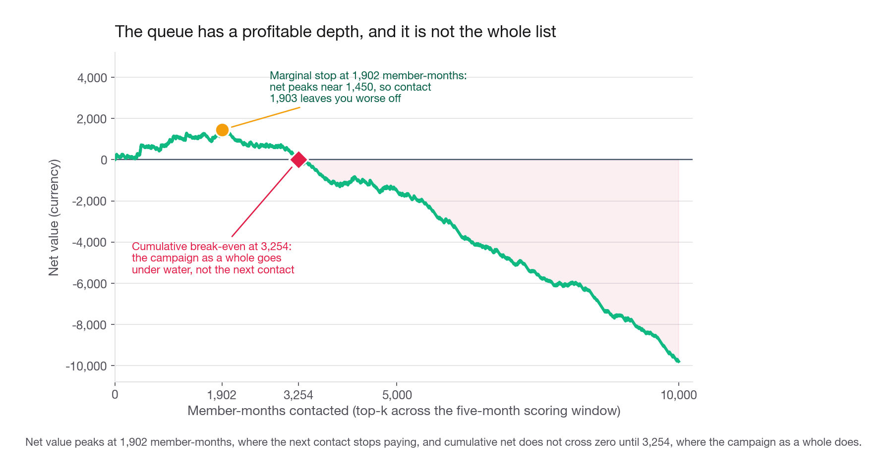
10000 563 -9796Read the units before the curve. score is months 20 through 24, five snapshots of 9,000 members, so k counts member-months pooled across the whole window, not contacts in one month. Every row is a five-month total, so k equal to 2,000 is about 400 members a month. Run the queue at 2,000 a month instead, 10,000 contacts across the window, and it nets minus 10,254.
It peaks near 2,000 and turns negative before 5,000. But where it peaks, where the next contact stops paying, and where the whole campaign goes under water are three questions, and a five-row table answers none exactly. Sweep every k, and add the rule the calibration paragraph set up.
ranked = score.sort_values("p", ascending=False)["moved_next_month"].to_numpy()
ks = np.arange(1, len(ranked) + 1)
curve = ranked.cumsum() * UPLIFT * VALUE_RETAINED - ks * COST_PER_TOUCH
p_star = COST_PER_TOUCH / (UPLIFT * VALUE_RETAINED)

print("peak", ks[curve.argmax()], round(curve.max(), 1),
      "| positive to", int(ks[curve > 0][-1]),
      "| p_star", round(p_star, 4), "clears", int((score["p"] >= p_star).sum()))
print(score.nlargest(2000, "p").groupby("snapshot_month").size().to_dict())
peak 1902 1449.6 | positive to 3254 | p_star 0.0734 clears 1042
{20: 262, 21: 289, 22: 273, 23: 295, 24: 881}The next contact stops paying at 1,902, where net peaks near 1,450: contact 1,903 and you are worse off than stopping. Cumulative net stays positive to 3,254, but that is where the programme as a whole stops paying, and sliding between the two is how this calculation usually gets misquoted. The 1,042 is what the principled rule picks: contact a member only when p times 0.11 times 520 beats 4.20, so p above 7.3 percent.
The two rules disagree, and say so rather than claiming they are equivalent. The 860 member-months ranked between them predict 0.067 on average and actually move at 0.080, the same under-prediction the calibration table showed at bucket 8, so they pay despite failing the calibrated bar. Only perfect calibration makes the two rules coincide. The month split adds one more warning: 881 of the top 2,000, 44 percent, land in month 24, the one hot hiring month, against 262 to 295 in each of the others, so a fixed monthly depth is the wrong shape.
That turns "we built a model with AUC 0.66" into "contact the top 2,000 member-months across the five-month window, about 400 a month, for roughly 19 retained members and 1,270 in net value over that window; the next contact stops paying near 1,900, and the campaign goes under water past about 3,250."
It also says where to push next. Net value is linear in both the uplift rate and the retained value, and only the uplift is under your control. Doubling the persuasiveness of the outreach beats squeezing two more AUC points out of the model, and that reframing is the product judgement being tested.
Churn models and the intervention trap
A churn model ranks accounts by probability of leaving, the retention team works the top of the list, and six months later the campaign reports a healthy save rate. The problem is that the highest-probability churners are often the least persuadable: the contract ended, the person left, the use case disappeared. Members sitting at a 30 percent probability with genuine ambivalence are the ones a check-in could flip, and they are at rank 12,000.
What you want to rank by is the change in probability the intervention causes, which is an uplift model. Start by holding out 10 percent of the targeted top and contacting nobody in it: that tells you whether the campaign is incremental at all, or whether it is a well-sorted list of people who were staying anyway.
Then say what that experiment cannot do, because this is where a candidate should notice rather than overclaim. Treatment varies only inside the top, so it produces no treated outcomes anywhere near rank 12,000, and an uplift model fitted on it has no support exactly where the persuadable members were said to sit. It reads flat everywhere it can see, so extrapolating predicts nothing at rank 12,000, the opposite of the truth. Uplift labels need randomised treatment across the score range: a few percent of contacts spent at random, stratified over deciles. Those contacts look wasteful on the net value curve, and that is the price of learning influenceability rather than likelihood. Size that budget by the uplift you need to detect, not by what looks affordable, because uplift is a difference of two noisy rates and a token 1 percent returns zero everywhere and gets mistaken for an answer. Whenever a model output drives an action, ask whether you are ranking likelihood or influenceability.
The whole family in ninety seconds
Compressed, to rehearse the shape:
"For a feature question I would find outcomes members already reach through effort, measure how many people pay it and how many steps it costs, and rank by people times steps divided by build cost. On Perch that puts live location first once build cost is included. For similarity I would state what closeness means for the product, note that shared-connection counts and Jaccard both pick the coworker, and fix it by scoring how many distinct circles the shared contacts span, plus behavioural evidence like reciprocal initiation and late-night response latency. For should-we-build I would check that a wild success moves a named metric, find the workaround in today's logs, say in advance the number that would kill the idea, name what it cannibalises, and conclude that we test rather than ship. For prediction I would write the label as one sentence with event, horizon, population, and snapshot, split by time with an embargo month, audit every feature's last timestamp, lean on behavioural windows over profile attributes, evaluate at the queue length the team can work, and finish with a net value curve naming both where the next contact stops paying and where the campaign as a whole does."
Every clause is checkable, and none of it required a product opinion.
Common traps
Answering a feature question as a visionary. Fix: open with "here is the behaviour in the logs I would look for", and only name a feature after you have named the friction it removes.
Citing a competitor as evidence of demand. Their user mix, price point, and business model differ from yours. Fix: name the internal signal that would confirm the same demand, and go measure it.
Ranking ideas by friction alone. The highest-friction job often leaves your app entirely and needs a partnership. Fix: divide by build cost before choosing what to ship first.
Reaching for cosine similarity before defining closeness. Fix: one sentence on what closeness means for this product, then the features, then the distance.
Trusting shared-connection counts. They rank the coworker above the closest friend, and Adamic-Adar does not save you. Fix: score how many distinct circles the shared contacts span, and add behavioural evidence.
Assuming a user-visible score has to be calibrated. A named close-friends group needs a threshold, and a threshold needs a labelled eval set to pick the operating point plus scores that mean the same thing across members. Fix: decide the surface first, then say how you would choose and re-check the cut, calibrating when it must survive a refresh or be traded against a cost.
Concluding "so we should build it". Fix: the analysis earns a test, never a launch. Say the word test.
Skipping cannibalisation. A new control takes taps from an old one and can split a ranking signal in two. Fix: name what it competes with and the guardrail that reveals the trade.
Splitting a panel at random, or adding a feature written during the outcome window. Fix: split by time with an embargo, and audit the last contributing timestamp for every column, nightly aggregates included.
Reporting accuracy on a 2.7 percent base rate, or building a model with no named consumer. Fix: report precision at the queue length the team can serve plus lift over base, and before modelling finish the sentence "this ranked list goes to X, who can act on Y per day".
Ranking churn probability when you meant persuadability. Fix: hold out 10 percent of the targeted top to measure whether the campaign is incremental at all, then spend a small randomised exploration budget across the whole score range for uplift labels. The top-of-list holdout on its own gives you no treated outcomes where the persuadable members are.
Quick self-check
Answer these out loud, in full sentences.
For a food delivery app, describe the specific log query that would surface a multi-step workaround worth turning into a one-tap feature, and say which existing feature should score near zero on your friction measure as a sanity check.
Define closeness between two accounts on a photo-sharing product in one sentence, then name one structural feature and two behavioural features that follow from that definition, and say why the behavioural ones rank higher.
Shared-connection count picks the coworker over the closest friend. Explain the mechanism, and describe the two-line change to the feature that fixes it.
A PM proposes a save-for-later button. State the metric it should move, the proxy in today's logs that would prove demand, the number at which you would abandon the idea, and the existing behaviour it might cannibalise.
Write the label sentence for a model predicting which subscribers will cancel, including event, horizon, population, and snapshot moment. Then name one plausible-looking column that would leak, and the assertion that catches it.
Your model has AUC 0.66 and a top-decile lift of 3.5. The retention team can contact 800 accounts a week. State which metric you report to the team, and sketch the calculation that decides whether 800 is the right number.