2.1 How to Improve a Given Metric
Find the core decision, design, or behavior signal.
Turn the lesson into a concise response blueprint.
Name the trap you would avoid in a real interview.
Use these checkpoints as your reading path before diving into the full lesson.
- 1Why this matters in interviews
- 2Step 0: turn the goal into a metric you...
- 3The test a definition has to pass
- 4Weak answer, stronger answer
- 5A dataset to make this concrete
"How would you improve engagement?" is the single most common opening in a product data science loop, and it is the one candidates most often answer with a list of feature ideas. This lesson gives you the alternative: a six-step answer that turns a fuzzy goal into arithmetic, locates the loss in that arithmetic, and arrives at a ranked test plan. The decision it helps you make is which one thing to build next and how you will know whether it worked.
Why this matters in interviews
The prompt sounds open-ended, so most candidates treat it as a creativity test and start naming features: better notifications, a referral program, a redesigned home feed. Any of those may be fine ideas. None is an answer, because the interviewer cannot tell whether you reasoned your way there or free-associated.
What is actually being scored is four things in sequence under time pressure. Can you make a vague goal computable. Can you break the computed number into parts that add or multiply. Can you find which part carries the loss, by volume and not just by rate. Can you get from that part to a change you can ship and measure.
Notice this is an improve question, not a diagnose question. Nothing broke; the metric is simply below where someone wants it. Diagnosing a sudden movement is a different discipline with different first moves and gets its own lesson later in this section. Open an improvement question by asking about last Tuesday's logging change and you have answered a question nobody asked.
Interview tip: Say out loud in your first thirty seconds that you are going to define the metric, decompose it, localize the loss, generate hypotheses, rank them, and propose a test. Naming the plan buys you the room to execute it.
The rest of this lesson runs that plan on a concrete product, with a dataset you can regenerate, and then does the marketplace version where the loss is not in one funnel but split across two sides that want different things.
Step 0: turn the goal into a metric you can compute
Engagement is not a metric. Neither is retention, growth, quality, or satisfaction. Those are directions. A metric is a number with a numerator, a denominator, a population, and a window, such that two people with the same data compute the same value.
The test a definition has to pass
Before you accept your own definition, run it through four checks.
Can you write the query. If you cannot describe the table, the filter, and the aggregation, the definition is a slogan. "Users are more active" fails. "Share of accounts active in the last 28 days that log at least one cooked meal in a calendar week" passes, because you can see the SQL.
Does it move only when the product gets better. Page views per session sounds like engagement and is famously satisfied by making things harder to find.
Is it aligned with what the company is trying to be. Candidates skip this, and it is the part that reads as senior. If your metric can rise while the company's reason for existing falls, you chose wrong.
Is it stable enough to read. A metric too noisy week to week to distinguish a five percent change from nothing is unusable as a target, however pure. Sensitivity and stability get a full treatment in the next lesson.
Weak answer, stronger answer
Here are four fictional products and the move from a goal to something computable.
| Product | The vague goal | A weak metric | A metric you can defend |
|---|---|---|---|
| Kettle, a meal planning app | "Improve engagement" | Sessions per user | Share of 28-day-active accounts that log at least one cooked meal in the week |
| Almanac, an expert Q&A community | "Improve answer quality" | Answers posted per day | Share of questions receiving an answer with 3 or more upvotes within 48 hours |
| Loomlane, a handmade textiles marketplace | "Improve the buyer experience" | Average time on site | Share of category searches that produce a purchase within 7 days |
| Halyard, a B2B scheduling tool | "Improve adoption" | Seats provisioned | Share of provisioned seats that book at least 4 meetings in a rolling month |
Every entry in the last column has a population, a numerator condition, and a window, and each one closes the cheat available in the weak column. Almanac's cannot be gamed by dumping low-effort answers, because the upvote threshold makes volume without quality worthless. Halyard's cannot be gamed by the sales team handing out seats. If the interviewer disagrees with your definition, that is a productive disagreement. Having no definition and improvising a new one every two minutes is not recoverable.
For the rest of this lesson the running example is Kettle, and the metric is the one in the table: weekly cook rate, the share of active accounts that log at least one cooked meal in the week.
A dataset to make this concrete
Everything below is computed on a synthetic account-week table with the schema described, so you can run every block yourself. This block generates it deterministically.
import numpy as np
import pandas as pd

SEED = 20260826
rng = np.random.default_rng(SEED)

N = 60_000
country = rng.choice(["US", "BR", "IN", "DE"], N, p=[0.46, 0.19, 0.24, 0.11])
platform = rng.choice(["ios", "android", "web"], N, p=[0.38, 0.49, 0.13])
tenure = rng.choice(["week_1", "month_1", "tenured"], N, p=[0.17, 0.23, 0.60])
channel = rng.choice(["organic", "paid_social", "referral", "search"], N,
                     p=[0.40, 0.24, 0.15, 0.21])

open_t = {"week_1": 0.62, "month_1": 0.55, "tenured": 0.71}
open_p = {"ios": 0.04, "android": 0.0, "web": -0.11}
p_open = np.array([open_t[t] for t in tenure]) + np.array([open_p[p] for p in platform])
opened = rng.random(N) < p_open

plan_t = {"week_1": 0.30, "month_1": 0.44, "tenured": 0.52}
plan_c = {"US": 0.0, "BR": -0.07, "IN": -0.19, "DE": -0.03}
p_plan = np.array([plan_t[t] for t in tenure]) + np.array([plan_c[c] for c in country])
started_plan = opened & (rng.random(N) < p_plan)

saved_recipe = started_plan & (rng.random(N) < np.where(platform == "web", 0.58, 0.74))

cook_t = {"week_1": 0.41, "month_1": 0.52, "tenured": 0.63}
p_cook = np.array([cook_t[t] for t in tenure]) - 0.09 * (channel == "paid_social")
logged_cook = saved_recipe & (rng.random(N) < p_cook)

kettle = pd.DataFrame({
    "account_id": np.arange(1, N + 1),
    "country": country, "platform": platform, "tenure": tenure, "channel": channel,
    "opened_app": opened.astype(int), "started_plan": started_plan.astype(int),
    "saved_recipe": saved_recipe.astype(int), "logged_cook": logged_cook.astype(int),
})
print(kettle.shape, round(kettle["logged_cook"].mean(), 4))
(60000, 9) 0.1118One row is one account in one week. The weekly cook rate is 11.18 percent, or 6,711 accounts out of 60,000. Hold onto that denominator: every proposal later is sized against it.
Step 1: write the metric as arithmetic
Two decompositions are worth knowing, and a strong answer uses both. They answer different questions and suggest different kinds of fix.
The multiplicative chain
A rate that requires several things to happen in order is a product of conditional rates. For Kettle:
weekly cook rate = P(open) x P(start a plan | open) x P(save a recipe | start a plan) x P(log a cook | save a recipe)
Each factor is a step where people leave, and multiplying them reconstructs the metric exactly. That exactness is what makes the decomposition trustworthy: there is no residual to hand-wave about.
steps = ["opened_app", "started_plan", "saved_recipe", "logged_cook"]
prev = pd.Series(1, index=kettle.index)
rows = []
for s in steps:
    cur = kettle[s]
    rows.append({"step": s,
                 "reached": int(cur.sum()),
                 "pass_rate": round(cur.sum() / prev.sum(), 4),
                 "lost_here": int(prev.sum() - cur.sum())})
    prev = cur
funnel = pd.DataFrame(rows)
print(funnel)
step reached pass_rate lost_here
0 opened_app 39709 0.6618 20291
1 started_plan 16131 0.4062 23578
2 saved_recipe 11670 0.7235 4461
3 logged_cook 6711 0.5751 4959The plan-start step has both the worst pass rate, 40.6 percent, and the largest absolute loss, 23,578 accounts. Those two facts do not always coincide, and when they disagree you follow the absolute number. A step with a 20 percent pass rate that only 300 people reach is not where your quarter goes.
The additive mix
The second decomposition slices the same metric across a dimension. If accounts fall into disjoint segments with weights that sum to one:
metric = sum over segments of (segment share) x (segment rate)
This form exposes what the funnel hides: there are two ways to raise the total. Raise a segment's rate, or raise the share of a segment whose rate is already high. The first is product work. The second is acquisition or targeting, a real lever most candidates never mention.
def mix(df, dim, target="logged_cook"):
    g = df.groupby(dim).agg(accounts=("account_id", "size"), rate=(target, "mean"))
    g["weight"] = g["accounts"] / len(df)
    g["contribution"] = (g["weight"] * g["rate"]).round(4)
    g["gap_to_best"] = (g["rate"].max() - g["rate"]).round(4)
    g["cooks_left_on_table"] = (g["gap_to_best"] * g["accounts"]).round(0)
    return g.round(4).sort_values("cooks_left_on_table", ascending=False)

print(mix(kettle, "tenure"))
accounts rate weight contribution gap_to_best cooks_left_on_table
week_1 10162 0.0396 0.1694 0.0067 0.1073 1090.0
month_1 13824 0.0738 0.2304 0.0170 0.0731 1010.0
tenured 36014 0.1469 0.6002 0.0881 0.0000 0.0The cooks_left_on_table column does the real work: if this segment behaved like the best comparable one, how many additional accounts would log a cook. That converts a rate gap into volume, the only currency in which competing proposals compare.
Why you need both
The chain tells you where in the experience the loss happens. The mix tells you who it happens to. A step-only answer redesigns the plan-start screen for everyone and gets a diluted effect, because two thirds of accounts were already fine there. A segment-only answer says "new users are weak" without naming a screen. The move that separates a strong candidate is crossing them: pass rates per step, computed inside each segment.
Step 2: find where the loss is concentrated
Now cross the two decompositions. For each segment, compute the conditional pass rate at every step.
def cond_rates(df):
    out, prev = {}, len(df)
    for s in ["opened_app", "started_plan", "saved_recipe", "logged_cook"]:
        cur = int(df[s].sum())
        out[s] = round(cur / prev, 4) if prev else float("nan")
        prev = cur
    return pd.Series(out)

for dim in ["tenure", "platform", "country", "channel"]:
    print("\n", dim)
    print(kettle.groupby(dim).apply(cond_rates, include_groups=False))
platform
opened_app started_plan saved_recipe logged_cook
android 0.6615 0.4052 0.7488 0.5723
ios 0.7010 0.4065 0.7372 0.5857
web 0.5473 0.4101 0.5581 0.5395
country
opened_app started_plan saved_recipe logged_cook
BR 0.6656 0.3881 0.7230 0.5857
DE 0.6581 0.4394 0.7239 0.5696
IN 0.6646 0.2822 0.7221 0.5886
US 0.6597 0.4698 0.7239 0.5685
channel
opened_app started_plan saved_recipe logged_cook
organic 0.6634 0.4058 0.7215 0.6063
paid_social 0.6628 0.4103 0.7196 0.4942
referral 0.6578 0.3979 0.7181 0.5885
search 0.6607 0.4083 0.7351 0.5962Reading the grid
Read it as a heat map and hunt for isolated weakness: one bad cell in an otherwise normal row. Isolated weakness is a mechanism. Uniform weakness is usually a population difference, and it is much harder to act on. Three cells stand out.
India loses at plan start and nowhere else. Indian accounts open at 66.5 percent, the same as everyone, and save and cook normally once in a plan. But only 28.2 percent of Indian openers start a plan, against 47.0 percent in the United States. That points at the plan-start experience specifically: catalogue coverage, ingredient availability, unit systems, language, or a default meal structure built for the wrong cuisine.
Web loses at recipe save. Web opens less, as you would expect from a surface people reach deliberately. The interesting cell is save-given-plan at 55.8 percent against about 74 percent on both mobile platforms, with plan-start identical across all three. Same plan rate, then failure to save. That smells like an interface defect, not a preference.
Paid social loses at the very last step. Every upstream rate matches the other channels almost exactly, then cook-given-save collapses to 49.4 percent against 60.6 percent organic. These accounts complete the whole flow and do not cook. That is intent, not product, and the fix lives in targeting or in creative that sets a different expectation.
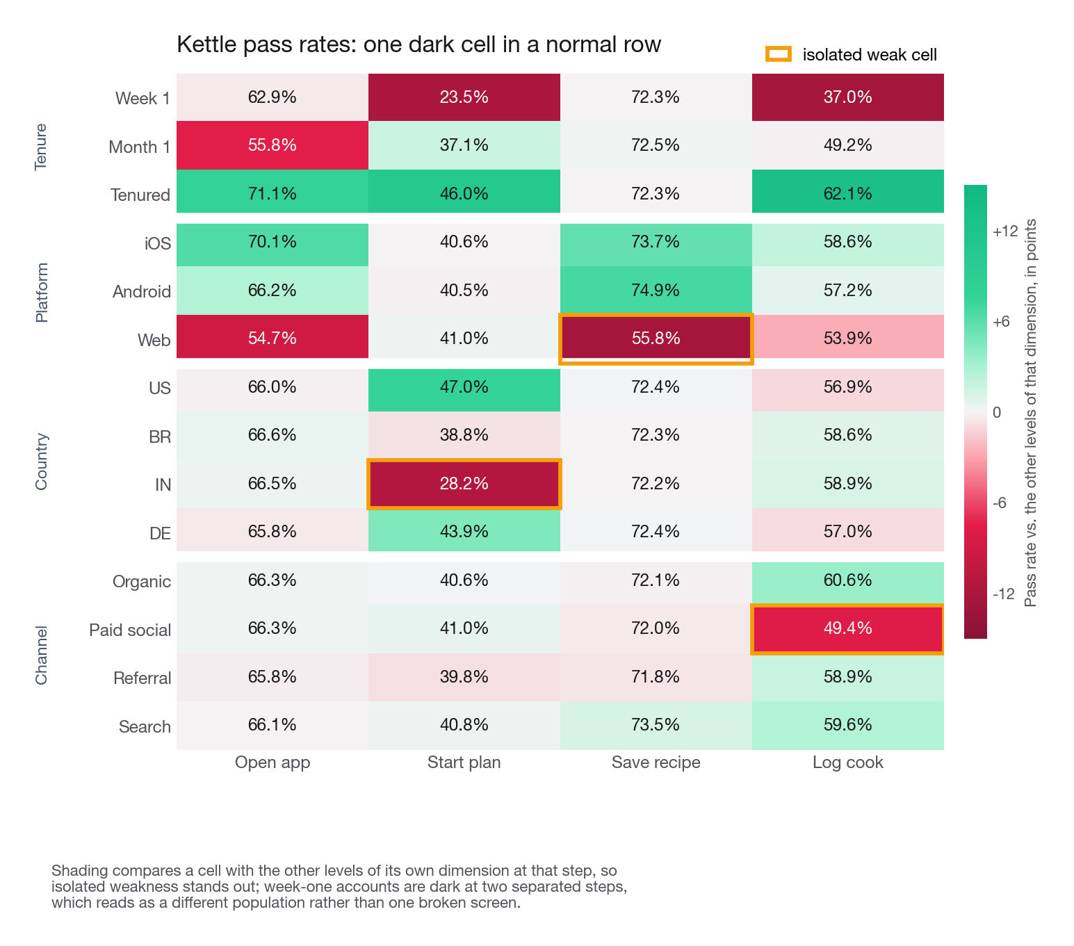
Interview tip: When you find a weak cell, say what the rest of the row looks like before you propose anything. "India is weak only at plan start, everything downstream is normal" is a diagnosis. "India is weak" is an observation.
One more pattern deserves naming because candidates over-index on it. Week-one accounts are weak at plan start (23.5 percent) and at cook logging (37.0 percent). Weakness at two separated steps is the signature of a different population, not a broken surface: new accounts include people who signed up out of curiosity and were never going to cook. Onboarding can recover some of that, but expect a lower ceiling than the raw gap suggests, and say so.
One check before any of this becomes a proposal
Every grid above is a marginal slice, so a weak cell can be an echo of a dimension you did not slice on. If Indian accounts skewed web, or week-one, the country table would look exactly like this while the mechanism sat somewhere else, and eight engineer-weeks of localization would buy nothing. The isolated-weakness rule does not protect you here, because a confounder that reaches only one step produces exactly one weak cell and reads as a mechanism. Recompute the weak rate inside the other dimensions, against the same reference group, before you propose anything.
def plan_given_open(d):
    return d["started_plan"].sum() / d["opened_app"].sum()

for dim in ["platform", "tenure"]:
    print("mix by", dim)
    print(pd.crosstab(kettle.country, kettle[dim], normalize="index").round(3))
    print("plan start given open, by country and", dim)
    print(kettle.groupby(["country", dim])
                .apply(plan_given_open, include_groups=False).unstack().round(4), "\n")
mix by tenure
tenure month_1 tenured week_1
country
BR 0.228 0.595 0.178
DE 0.237 0.596 0.166
IN 0.230 0.603 0.167
US 0.230 0.602 0.168
plan start given open, by country and tenure
tenure month_1 tenured week_1
country
BR 0.3525 0.4448 0.2175
DE 0.3918 0.4885 0.2931
IN 0.2408 0.3380 0.1039
US 0.4390 0.5219 0.2967India's tenure mix sits within a percentage point of every other country, and its plan-start rate is weak inside all three tenure levels against the same United States reference. The platform iteration, printed first and omitted here, says the same: mix within a percentage point, and India at 0.2772, 0.2894 and 0.2774 on android, ios and web against 0.4629, 0.4748 and 0.4827. The gap is not a mix artifact and the proposal survives. This is the first follow-up an interviewer asks about the India finding.
Step 3: separate levers from context
Not every segment you can slice is one you can act on. This is where otherwise good answers quietly go wrong: the candidate finds a real gap, then proposes something the company cannot do.
| Dimension | Lever or context | What you can actually change | What you cannot |
|---|---|---|---|
| Surface or platform | Lever | Layout, defaults, which features ship where, whether web is even supported | Which device someone owns |
| Onboarding path | Lever | Steps, defaults, when you ask for a preference, first-session content | Whether someone arrives motivated |
| Notification cadence | Lever | Timing, frequency, content, opt-in flow | Whether the OS suppresses them |
| Ranking and defaults | Lever | The default meal plan, recipe ordering, filter presets | The size of the catalogue this week |
| Acquisition channel mix | Lever, slow | Budget split, creative, targeting, landing page | Auction prices, competitor bidding |
| Country | Mostly context, some lever | Localization, catalogue, payment methods, unit systems | Grocery infrastructure, cuisine norms |
| Tenure | Context by construction | Nothing directly, tenure is time | The passage of time |
| Seasonality | Context | Nothing | Holidays, weather, back-to-school |
Two rows need a comment. Tenure is context by construction, but it is still a useful frame: you cannot make an account tenured, you can change what happens during week one so fewer accounts stall there. Country is the interesting hybrid. You cannot change India, but you can change the catalogue, the units, the default template, and the language. The India cell is worth a proposal and the tenure cell is worth less precisely because the India weakness sits at a step you own.
The last row is not a joke. Candidates propose it accidentally, by drifting to a looser definition partway through so the number looks better.
Step 4: generate hypotheses per segment
You now have three or four localized weaknesses. Each needs a hypothesis specific enough to be wrong.
The form to use: for [segment], at [step], [rate] is [current] versus [reference], because [mechanism], so [change] should move it to about [target]. If you cannot fill in the mechanism, you do not have a hypothesis, you have an observation with a feature attached.
Bad segments are product work
Take the India cell. Candidate mechanisms, from most to least testable:
The default plan template assumes a Western week of dinners, so the first screen shows food people do not cook, and they abandon before committing.
The catalogue has thin coverage for the ingredients people actually buy, so search inside plan creation returns little.
Measurement units and portion defaults are wrong, making every recipe feel like extra work.
Payment or grocery-partner integration is absent, so a downstream promise in the plan-start flow is empty.
Each implies a different change and a different measurable intermediate. Hypothesis 1 predicts abandonment on the template picker specifically; hypothesis 2 predicts a high zero-result search rate inside plan creation. Both are checkable before you build anything, which is what you should say you would do.
Good segments are acquisition work
Now look at the mix table again from the other direction. Search and organic accounts cook at about 11.8 percent, paid social at 9.7 percent. Paid social is 23.5 percent of the base. Two distinct moves are available and they are not the same proposal.
The product move fixes what paid social accounts hit at the last step, but they complete every earlier step normally, which argues against a broken surface.
The mix move reallocates budget toward channels whose users cook, or changes the creative so it selects for people who intend to cook rather than people who like the video. Moving weight from a 9.7 percent segment to an 11.8 percent segment raises the blended metric without changing anyone's behaviour.
Most candidates fall silent here, so it is a place to stand out, with one catch you must flag immediately: acquisition segments are not exchangeable. Cut paid social and you do not recover those accounts through search, you just have fewer accounts, and total cooks can fall while the rate rises. A metric that improves because you removed your worst users is a metric you gamed.
Interview tip: Whenever you propose a mix shift, immediately state what happens to the absolute count, not just the rate. Interviewers plant this trap on purpose.
Where hypotheses actually come from
Three sources, in the order you should reach for them. First, the funnel grid: isolated weakness plus knowledge of what that step does. Second, session-level behaviour in the fifteen seconds before the drop, whether people searched and got nothing, toggled a filter, or hit the bottom of a short list; the modelling techniques from the first section of this course earn their place here because a fitted tree or a rule set hands you segment definitions you would not have thought to slice on. Third, qualitative evidence: support tickets, reviews filtered to the segment, five interviews. Naming that last one is not soft, it shows you know a funnel tells you where and almost never why.
Step 5: rank by size times feasibility
You now have more ideas than quarters. Ranking turns the answer into a plan.
The score to use out loud: expected value = addressable volume x plausible relative lift x probability it works, divided by build cost in engineer-weeks.
Every term matters. Volume alone favours anything touching the biggest segment. Lift alone favours a heroic change to a tiny cell. Probability keeps you honest where the mechanism is a guess. Dividing by cost turns a wish list into a sequence. Size the volume term with one helper for every candidate, so the numbers are comparable.
STEPS = ["opened_app", "started_plan", "saved_recipe", "logged_cook"]

def size_lift(df, mask, step, target_rate):
    sub = df[mask]
    i = STEPS.index(step)
    entering = len(sub) if i == 0 else int(sub[STEPS[i - 1]].sum())
    current = sub[STEPS[i]].sum() / entering
    downstream = 1.0
    for j in range(i + 1, len(STEPS)):
        downstream *= sub[STEPS[j]].sum() / sub[STEPS[j - 1]].sum()
    extra = entering * (target_rate - current) * downstream
    return {"entering": entering, "current": round(current, 4),
            "target": target_rate, "extra_cooks": round(extra, 1)}

print(size_lift(kettle, kettle.country == "IN", "started_plan", 0.40))
print(size_lift(kettle, kettle.platform == "web", "saved_recipe", 0.70))
print(size_lift(kettle, kettle.channel == "paid_social", "logged_cook", 0.56))
print(size_lift(kettle, kettle.tenure == "week_1", "started_plan", 0.30))
{'entering': 9448, 'current': 0.2822, 'target': 0.4, 'extra_cooks': 473.1}
{'entering': 1747, 'current': 0.5581, 'target': 0.7, 'extra_cooks': 133.7}
{'entering': 2756, 'current': 0.4942, 'target': 0.56, 'extra_cooks': 181.4}
{'entering': 6389, 'current': 0.2351, 'target': 0.3, 'extra_cooks': 111.0}The downstream factor separates careful sizing from sloppy. Fixing plan start in India does not create 1,114 extra cooks, because only about 43 percent of the extra plan starters survive the two remaining steps.
Now the ranking table. Total weekly cooks is 6,711, so the relative column is what matters to a reviewer.
| Proposal | Extra cooks per week | Lift on the metric | Confidence | Engineer-weeks | Score |
|---|---|---|---|---|---|
| Localized plan templates and catalogue for India | 473 | 7.0% | Medium | 8 | 0.53 |
| Retarget paid social creative toward cooking intent | 181 | 2.7% | Medium | 2 | 0.81 |
| Fix the web recipe-save interaction | 134 | 2.0% | High | 1 | 1.80 |
| Restructure week-one onboarding | 111 | 1.7% | Low | 6 | 0.09 |
Score is the lift column in percent, times confidence read off its own label with High 0.9, Medium 0.6 and Low 0.3, divided by engineer-weeks. India is 7.0 x 0.6 / 8 = 0.53, the web fix is 2.0 x 0.9 / 1 = 1.80, onboarding is 1.7 x 0.3 / 6 = 0.085, shown as 0.09. Compute it from the columns as printed so a reader can check every row without rerunning anything, and if you prefer different units, scale every row by the same constant rather than picking one per row. Only three factors appear because the lift column already carries volume times plausible lift, being extra cooks over the 6,711 base, so all four terms of the Step 5 formula are present with two collapsed into one column.
The ordering is not the ordering by size. The web fix is last by volume and first by score, because it is cheap and the mechanism is nearly certain. The India work is the biggest prize and still worth doing, just not first. Onboarding, which most candidates propose first, ranks last: expensive, and weak across two steps, which suggests population rather than mechanism.
Interview tip: Ship the cheap high-confidence fix first even when it is small, then use the time it buys to reduce uncertainty on the big expensive one. Saying that sequencing out loud reads as someone who has actually shipped.
Step 6: propose the test
A proposal without a test is an opinion. You do not need a full experimental design here, that arrives later in this course, but you do need six lines.
Two points distinguish a candidate who has run tests from one who has read about them.
Restrict the population to the eligible. Randomize all 60,000 accounts when only 7,784 can see a web change and you have diluted a real effect roughly eightfold. Randomize among the eligible, or analyse an eligible subset defined by pre-treatment attributes only, never by post-treatment behaviour.
Pick the minimum detectable effect from the business, then check the sample can reach it. The size_lift call already named the effect you are buying: moving web save-given-plan from 55.8 percent to 70 percent is a 25 percent relative lift, and 133.7 extra cooks against the segment's 526 is the same 25 percent read on the outcome. Size for that. Choosing a detectable effect because it fits a week of traffic is how teams run tests that could never have answered anything, and choosing a small round one your eligible population can never reach is the same mistake pointed the other way.
Sizing the web test
Do the arithmetic out loud; the assertion is what gets audited.
from scipy.stats import norm

ZA, Z = norm.ppf(0.975), norm.ppf(0.975) + norm.ppf(0.80)
sd = lambda p, n: (2 * p * (1 - p) / n) ** 0.5      # sd of the arm difference

def mde_rel(p, n):                                  # smallest lift at 80% power
    return round(Z * sd(p, n) / p, 4)

def power(p, rel, n):                               # power for a lift you name
    return round(norm.cdf(p * rel / sd(p, n) - ZA), 4)
Two weeks of eligible web traffic puts one week of accounts in each arm, so the per-arm sample is the weekly eligible count.
web = kettle[kettle.platform == "web"]
starters = int(web["started_plan"].sum())
p_cook = web["logged_cook"].mean()
p_save = web["saved_recipe"].sum() / starters
print("cook rate", round(p_cook, 4), "| n/arm", len(web),
      "| MDE", mde_rel(p_cook, len(web)), "| power at +3%", power(p_cook, 0.03, len(web)))
print("save rate", round(p_save, 4), "| n/arm", starters,
      "| MDE", mde_rel(p_save, starters), "| power at +25%", power(p_save, 0.25, starters))
cook rate 0.0676 | n/arm 7784 | MDE 0.1668 | power at +3% 0.0727
save rate 0.5581 | n/arm 1747 | MDE 0.0843 | power at +25% 1.0Weekly cook rate detects about a 17 percent relative lift over two weeks, which the 25 percent effect clears with margin. Size for 3 percent instead and the same test runs at 7 percent power, barely above the 5 percent false-positive rate, so the two weeks answer nothing. Treat the 17 percent as approximate: it assumes the second week adds roughly independent information, and the honest phrasing is that you would check the account-level correlation on a pre-period first.
A better primary metric is sitting right there, and proposing it is what reads as senior. Weekly cook rate runs the effect through two later steps the fix does not touch, each adding noise and carrying no signal. Make save-given-plan among web plan starters the primary: 1,747 accounts a week detects an 8 percent relative lift, so the 25 percent target is powered several times over. Keep weekly cook rate as the secondary business read and say plainly that alone it is thin here. Naming your own underpowered metric before the interviewer does beats a confident number that dies on the first follow-up.
SQL you would actually run
Interviewers often ask for the funnel query. Keep it flat and readable.
SELECT
  country,
  COUNT(*)                                          AS accounts,
  AVG(opened_app)                                   AS open_rate,
  SUM(started_plan) * 1.0 / NULLIF(SUM(opened_app), 0)   AS plan_given_open,
  SUM(saved_recipe) * 1.0 / NULLIF(SUM(started_plan), 0) AS save_given_plan,
  SUM(logged_cook) * 1.0 / NULLIF(SUM(saved_recipe), 0)  AS cook_given_save,
  AVG(logged_cook)                                  AS weekly_cook_rate
FROM kettle_account_week
WHERE week_start = DATE '2026-08-17'
GROUP BY country
ORDER BY accounts DESC;
The NULLIF guards are not decoration. A segment with zero accounts at a step divides by zero and takes down the report, and an interviewer who has been on call will notice you handled it.
The marketplace variant: when the two sides pull apart
On a marketplace the same prompt arrives as: one category is underperforming, is that demand or supply. Loomlane sells handmade home textiles, wool rugs are the weak category, and weekly sales are flat while the rest of the catalogue grows.
This is hard because the two sides create each other. Buyers show up where selection is good; sellers list where buyers are. Whichever side you measure, its weakness is partly an echo of the other's, so "conversion is low, therefore supply is bad" mistakes an equilibrium for a cause.
Split the funnel at the point where intent is established
Find the moment a buyer reveals intent, then treat everything before it as demand and everything after as supply. On a search-driven marketplace that moment is the search. Someone who typed "wool rug" and applied a filter wants a wool rug; what happens next is a referendum on the inventory.
| Question | Demand-side proxies | Supply-side proxies |
|---|---|---|
| Is there appetite for this category | Category search volume per active buyer, category landing page entries, saves and wishlist adds | Not applicable |
| Is intent being met | Not applicable | Searches to click, click to purchase, purchase within 7 days of first search |
| Is the inventory adequate | Not applicable | Results per search, zero-result rate, share of searches where every result is out of stock |
| Is pricing the blocker | Willingness to pay from a paid test landing page | Price filter usage with low conversion, share of listings above the median competing price |
| Is quality the blocker | Not applicable | Return rate, listing photo quality score, seller response time, review score distribution |
| Is external interest present at all | Click-through on a category-specific ad campaign, organic search volume for the category | Not applicable |
The last row gives an answer independent of your own site. Run a small ad campaign on category terms. Healthy click-through means people want wool rugs and whatever is wrong is on your side of the door. Weak click-through against competitive creative means the category may simply be small, and no amount of seller recruitment fixes that.
The diagnostic that separates them
Sharpen the intent definition and watch conversion respond. This is the most useful single move in the whole variant.
Start with everyone who searched the category, then narrow to people who applied at least one filter, then to people who filtered and spent over 90 seconds in the category. Each narrowing removes browsers and keeps buyers.
Run the ladder on the weak category and on the whole catalogue at once, and compare the top-to-bottom ratios rather than the levels. The comparison is the diagnostic; a rise on its own is not. Conditioning on filter use and dwell selects on a correlate of purchase, so conversion climbs in every category on every marketplace, healthy or broken. The ratio is the readable statistic because it barely moves with inventory quality and moves a lot with how diluted the traffic is, and the benchmark must come from the same platform, since the ratio also reflects how sharply your own filter and dwell screens separate browsers from buyers.
Say it with numbers. In wool rugs conversion goes 4.1 to 4.8 to 5.2 percent as intent tightens, a 1.3x rise; catalogue-wide the same ladder goes 6.8 to 13.1 to 21.4 percent, a 3.1x rise. Against that benchmark the wool rug curve is flat, so tightening intent does not recover conversion and the problem is on the supply side, the more expensive one. A ratio steep relative to the benchmark points the other way: low-intent traffic against inventory that serves real buyers fine, which is demand quality, fixed in acquisition and merchandising. Flat is the stronger of the two readings, because selection should mechanically produce a rise and its absence is evidence by itself.
Filter usage then localizes it. Heavy price-filter use with the lowest conversion of any filter cohort points at inventory priced above what this audience pays. Heavy size or colour filtering with a high zero-result rate points at assortment gaps. Heavy shipping-speed filtering points at fulfilment, which neither more listings nor lower prices will fix.
Interview tip: Say "I would tighten the intent definition and see whether conversion responds relative to the same ladder run catalogue-wide" as an explicit diagnostic step. The comparison clause is what stops the interviewer answering with "steeper than what?"
Why a fix on one side breaks the other
Here is where candidates who have only seen one-sided products come apart. Every lever on a marketplace has a sign on both sides, and the signs often disagree.
| Lever | Effect on the demand side | Effect on the supply side | The trap |
|---|---|---|---|
| Buy more category traffic | More searches, more sessions | Conversion per search falls, sellers see impressions without sales | Sellers read low conversion as a dead category and delist |
| Subsidize seller listing fees | More selection, better matching | Listing count rises, average quality falls | Search relevance degrades and buyer conversion drops |
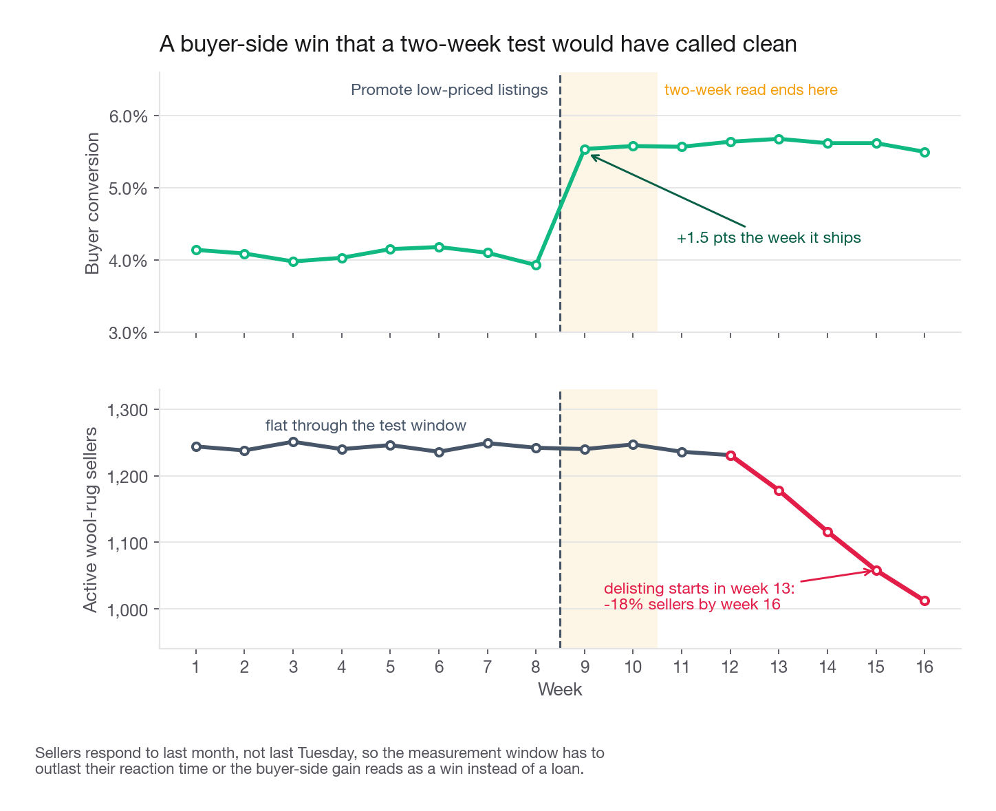
| Promote the cheapest listings | Buyer conversion rises this week | Established sellers lose share and margin | Quality sellers leave, and the category becomes discount-only |
| Tighten quality standards | Better reviews, higher repeat rate | Listing count falls immediately | Short-term selection loss shows up before the quality gain |
| Guarantee shipping speed | Higher conversion at the end of the funnel | Cost and operational burden on sellers | Small sellers, who provide the differentiated inventory, opt out |
Two consequences follow.
Every marketplace proposal needs a guardrail on the opposite side. Test buyer-side promotion of cheap listings and the guardrail is seller-side: active seller count, share of gross merchandise value from sellers outside the top decile, seller churn at thirty days. A buyer-side win with a seller-side regression is a loan, not a win.
The measurement window has to outlast the seller's reaction time. Sellers respond to last month, not last Tuesday. A two-week test can show a clean buyer-side gain and miss the delisting that arrives in week five. That is the short-term versus long-term tension covered later in this section, and marketplaces are where it bites hardest.
Liquidity as the arbiter
When the sides genuinely conflict you need a number both live inside. That number is liquidity, in a buyer version and a seller version.
Buyer liquidity: share of category searches that end in a purchase within seven days.
Seller liquidity: share of listings created that sell within thirty days.
Liquidity arbitrates because you cannot push one side indefinitely at the other's expense without the pair falling. Flooding the category with cheap listings raises buyer liquidity briefly and craters seller liquidity, since each seller's odds of selling drop as the pile grows. Recruiting only premium sellers does the reverse. A change that raises both is real category growth; a change that raises one and lowers the other is a transfer, and you should name which side you are taxing and why.
For Loomlane: buyer liquidity in wool rugs is 4.1 percent against 6.8 percent catalogue-wide, and seller liquidity is 31 percent against 44 percent. Both low points at a matching problem rather than a shortage on either side, so I would check the zero-result rate on size and colour filters before spending anything on acquisition or seller recruitment.
What the whole answer sounds like in ninety seconds
Compressed, so you can rehearse it:
"I would define engagement as the share of 28-day-active accounts that log at least one cooked meal in a week, because cooking is what the product exists to cause. Today that is 11.2 percent. I would break it into four conditional steps, open, start a plan, save a recipe, log a cook, and then compute those four rates inside each segment. That grid shows three isolated weak cells: India loses only at plan start, web loses only at recipe save, paid social loses only at the final step. I would size each as extra weekly cooks after multiplying through the downstream rates, which gives roughly 470, 130, and 180 against a base of 6,700. I would ship the web fix first because it is one engineer-week and the mechanism is nearly certain, then the paid social targeting change, then scope the India work, which is the biggest prize and the largest build. For the web fix, randomize eligible web accounts, primary metric is save-given-plan among web plan starters because that is the step the fix touches, with weekly cook rate as the secondary business read, guardrails are recipe saves and support contacts, minimum detectable effect set from the roughly 25 percent relative lift the sizing already implies, which two weeks of eligible web traffic detects with margin, run two full weeks."
Nothing in it is a feature brainstorm, and no metric appeared partway through. Every number came from the decomposition.
Common traps
Answering with a feature list. The most common failure. Fix: never name a feature before you have named the weak cell it addresses.
Confusing improve with diagnose. Fix: ask one clarifying question at the top, "has this declined, or is it just below where we want it," and take the right branch.
Ranking by rate gap instead of volume. A segment 20 points below average that contains 400 accounts is not the priority. Fix: always convert a rate gap into accounts, then into metric units.
Forgetting downstream conversion when sizing. A middle-step fix does not deliver its full gain to the end. Fix: multiply by the segment's own downstream pass rates, as size_lift does.
Proposing changes to context. Country, tenure, device ownership, and seasonality are slices, not levers. Fix: for each proposal, name the specific thing an engineer would change.
Gaming the metric with a mix shift and calling it growth. Cutting your worst acquisition channel raises the rate and can lower the total. Fix: report absolute count alongside every rate.
Treating a marketplace as one funnel. Buyer conversion in a weak category is not a supply verdict on its own. Fix: split at the intent point, tighten the intent definition, and check whether conversion responds relative to the same ladder run catalogue-wide, since tightening intent raises conversion everywhere.
Shipping a one-sided marketplace fix. A buyer-side lift with no seller-side guardrail is borrowed. Fix: pair every marketplace proposal with an opposite-side guardrail and a window long enough for the other side to react.
Attributing a mechanism to a marginal cell. A weak cell in one dimension can be an artifact of the segment's mix on a dimension you did not slice, and a confounder reaching only one step looks isolated. Fix: recompute the weak rate inside the other dimensions against the same reference group before proposing.
Sizing a test for an effect the population cannot deliver. A small round minimum detectable effect sounds conservative and often leaves you at single-digit power. Fix: size for the effect the proposal is buying, then print the achievable MDE for your eligible sample and say which one binds.
Changing the definition mid-answer. Once you drift, nothing you computed earlier still applies. Fix: write the definition down at the start and refer back to it by name.
Quick self-check
Answer these out loud, in full sentences.
State a computable definition of engagement for a podcast app, and name the specific way a competitor's obvious definition could be gamed by a bad product change.
Given a four-step funnel with pass rates 0.70, 0.35, 0.90, 0.60, which step has the worst rate and which loses the most accounts. Explain when those two answers disagree and which one you follow.
A segment is 15 points below the best comparable rate at the second of four steps. Sketch the calculation that turns that gap into extra units of the top-line metric, and say what you multiply by and why.
Name three dimensions you could slice by that are context rather than levers, and for one of them, describe the lever that sits inside it.
You propose reallocating acquisition budget away from the channel with the lowest per-user rate. State the two numbers you must report together, and what could go wrong if you report only one.
For a weak marketplace category, describe the diagnostic that distinguishes a demand problem from a supply problem, name the benchmark you read it against and why you need one, and say what a flat result implies.