1.1 The Insight Extraction Loop
Find the core decision, design, or behavior signal.
Turn the lesson into a concise response blueprint.
Name the trap you would avoid in a real interview.
Use these checkpoints as your reading path before diving into the full lesson.
- 1What this lesson is for
- 2The loop, end to end
- 3The dataset we will use all section
- 4Step one: choose a label tied to a deci...
- 5Say this about proxy labels
Every product data science loop ends at the same awkward moment: the model is trained, the metrics are printed, and someone asks what the product team should actually change. This lesson is about the path from a raw event table to one sentence a PM can put on a roadmap, and the three places that path quietly collapses. By the end you should be able to draw the loop on a whiteboard in ninety seconds, defend every step under pushback, and say which of the four model-reading techniques you would reach for and why.
What this lesson is for
Interviewers do not ask "extract insights" because they want a definition. They ask to see whether you know the difference between a model that predicts and a model that explains, and whether you understand that neither, on its own, authorizes a product change.
Here is the weak answer, which I hear constantly:
"I would look at feature importance and report the top five features to the PM."
That fails for four reasons and a good interviewer finds all four. Feature importance in a tree ensemble rewards high-cardinality continuous variables regardless of whether they matter. It reports magnitude without direction, so the PM cannot tell whether to push a lever up or down. It says nothing about whether the relationship survives an intervention. And it produces no recommendation, only a ranked list, which is the artifact PMs are tired of receiving.
The stronger version:
"I would start from the decision the PM has to make, pick a label that changes if that decision changes, build the smallest model that beats the base rate meaningfully, then read it with whichever technique matches the shape of the question. Then I would convert two or three findings into testable hypotheses, size each by reach times effect times cost, and hand back a ranked list of A/B tests rather than a ranked list of features."
That is the loop. The rest of this lesson unpacks each step and shows where it breaks.
Interview tip: Say the words "hypotheses to test", not "insights". It signals that you know an observational model cannot license a launch, and it is the single fastest way to sound senior in this question.
The loop, end to end
Two things deserve emphasis.
Steps four and five must be walled off from each other. Look at the insights, dislike them, go back to retune, and you have started fitting the model to the story you wanted. That is p-hacking with extra steps. Decide the selection rule in advance, apply it, freeze the model, then open the hood.
And the output is never "we should ship X". It is "we should test X, and here is why that test beats the alternatives". Observational data gives a ranked list of bets; experiments give answers. Keeping that boundary clean is most of what separates a strong candidate from a confident one.
The dataset we will use all section
Every technique in this section reads the same table, so understand it properly once.
The setting: Cadence is a subscription audiobook app with roughly 320,000 active members. The growth team sends one "Picked for you" push notification per member per week, recommending a title from listening history. The lifecycle PM wants a higher tap-through rate and has one quarter to try two or three changes.
One row is one notification sent. The label is whether the member opened the app from it within 24 hours.
| Column | Type | Meaning |
|---|---|---|
notif_id | integer | Unique per notification sent |
copy_length | brief / detailed | Body is one line, or three lines with a plot summary |
greeting | named / generic | Opens with the member's first name, or with no name |
send_hour | integer 6 to 22 | Member's local hour at send time |
weekday | Mon to Sun | Member's local day at send time |
market | US, UK, CA, AU, DE | Account market, set at signup |
titles_finished | integer | Audiobooks the member had completed before this send |
days_since_last_listen | integer | Days since the member last played anything, at send time |
tapped | 0 / 1 | Label: member opened the app from this notification within 24 hours |
Notice the shape. Two columns are per-send design choices (copy_length, greeting). Two are scheduling choices controlled in aggregate (send_hour, weekday). Three describe the member and cannot be changed by editing a notification. That split matters more than any modeling decision you will make.
The block below builds a deterministic stand-in so every number below is reproducible.
import numpy as np
import pandas as pd

SEED = 20260826
rng = np.random.default_rng(SEED)
N = 80_000

weekdays = np.array(["Mon", "Tue", "Wed", "Thu", "Fri", "Sat", "Sun"])
markets = np.array(["US", "UK", "CA", "AU", "DE"])

copy_length = rng.choice(["brief", "detailed"], N)
greeting = rng.choice(["named", "generic"], N)
send_hour = rng.integers(6, 23, N)
weekday = rng.choice(weekdays, N, p=[.16, .16, .16, .16, .14, .11, .11])
market = rng.choice(markets, N, p=[.46, .18, .14, .12, .10])
titles_finished = rng.poisson(3.1, N)
days_since_last_listen = rng.geometric(0.11, N) - 1

z = np.full(N, -3.85, dtype=float)
z += np.where(copy_length == "brief", 0.34, 0.0)
z += np.where(greeting == "named", 0.22, 0.0)
z += np.where(np.isin(weekday, ["Sat", "Sun"]), -0.47, 0.0)
z += 0.58 * np.exp(-((send_hour - 8.5) ** 2) / 5.5)      # commute peak
z += 0.71 * np.exp(-((send_hour - 20.0) ** 2) / 6.5)     # evening peak
z += np.select([market == "DE", market == "AU"], [-0.93, -0.14], 0.0)
z += 0.31 * np.log1p(titles_finished)
z += -0.028 * np.minimum(days_since_last_listen, 45)
z += 0.86 * ((market == "DE") & (copy_length == "detailed"))          # interaction
z += 0.52 * ((days_since_last_listen > 21) & (greeting == "named"))   # interaction

notifs = pd.DataFrame({
    "notif_id": np.arange(1, N + 1),
    "copy_length": copy_length,
    "greeting": greeting,
    "send_hour": send_hour,
    "weekday": weekday,
    "market": market,
    "titles_finished": titles_finished,
    "days_since_last_listen": days_since_last_listen,
    "tapped": rng.binomial(1, 1.0 / (1.0 + np.exp(-z))),
})
Before modeling, look at the label by segment. Two minutes of groupby beats an hour of hyperparameter search.
print(notifs.shape, round(notifs["tapped"].mean(), 4))

by_day = notifs.groupby("weekday")["tapped"].mean().round(4)
by_mkt = notifs.groupby("market")["tapped"].agg(["mean", "size"]).round(4)
by_pair = notifs.groupby(["market", "copy_length"])["tapped"].mean().round(4)
print(by_day.to_string())
print(by_mkt.to_string())
print(by_pair.loc[["US", "DE"]].to_string())
(80000, 9) 0.0432
weekday
Fri 0.0466
Mon 0.0496
Sat 0.0337
Sun 0.0276
Thu 0.0456
Tue 0.0460
Wed 0.0457
mean size
market
AU 0.0382 9441
CA 0.0449 11181
DE 0.0289 8119
UK 0.0479 14296
US 0.0452 36963
market copy_length
US brief 0.0548
detailed 0.0356
DE brief 0.0210
detailed 0.0367A base rate of 4.32 percent is realistic for a weekly recommendation push, and it governs which metrics mean anything, how large a sample any test needs, and how much room the PM has. At this base rate a one-point change is a 23 percent relative swing. State the effect next to the base rate, always.
Three things jump out. Sunday loses more than forty percent of the tap rate against Monday, 2.76 against 4.96 percent. Germany trails every market. And the copy length effect reverses in Germany: brief wins in the United States by nearly two points and loses in Germany by 1.6. That is an interaction, exactly what a plain coefficient table hides from you.
Now the second interaction, less obvious and more valuable, because it pairs a lever with a segment.
notifs["lapsed"] = notifs["days_since_last_listen"] > 21
gr = notifs.groupby(["lapsed", "greeting"])["tapped"].agg(["mean", "size"]).round(4)
print(gr.to_string())
print("lapsed share:", round(notifs["lapsed"].mean(), 4))
mean size
lapsed greeting
False generic 0.0394 36781
named 0.0488 37069
True generic 0.0215 3165
named 0.0422 2985
lapsed share: 0.0769Among members who listened recently, the name is worth about one point, 3.94 to 4.88 percent. Among members silent past three weeks it is worth two, 2.15 to 4.22 percent, a near doubling. That slice is 7.7 percent of volume, which is why it vanishes in the global average, and it is the most useful thing in this table.
Step one: choose a label tied to a decision
The label is the highest-leverage choice in the loop, and candidates routinely spend thirty seconds on it and twenty minutes on the model.
The rule: a good label changes when the decision changes, and can be observed within the horizon of the decision. Both clauses are load-bearing.
The Cadence PM is choosing between copy variants, greeting styles, and send timing. Four candidate labels.
| Candidate label | Moves when copy changes? | Observable in time? | Verdict |
|---|---|---|---|
tapped within 24h | Yes, directly | Yes, next day | Primary label |
| Listened 10+ minutes in 24h | Yes, but weakly | Yes, next day | Secondary, guards against clickbait |
| Subscription renewed at month end | Barely, one send is noise | 30 days | Too diluted, wrong horizon |
| Member still active in 6 months | No detectable link | 180 days | Useless for this decision |
Renewal is the metric the business cares about and still the wrong label here. One notification out of thirteen in a quarter cannot move a renewal decision enough to be estimable at this sample size. Pick renewal and your model finds nothing, and you conclude, incorrectly, that push does not matter.
That is the trap in both directions. Too far downstream and you get a null caused by dilution, not by the world. Too close and you optimize a gameable proxy. Clickbait copy raises tapped and lowers listening minutes, which is why the second label is a guardrail, not the target.
Say this about proxy labels
When an interviewer pushes on your label, the answer has three parts: what you optimize, what could rise while the real goal falls, and how you detect it. For Cadence: I optimize tap rate, the failure mode is a tap with no listening behind it, and I track minutes listened per notification sent alongside tap rate, refusing anything that raises one while dropping the other. The sharpest version is a change that lifts taps among lapsed members without any of them pressing play.
Interview tip: Whenever you name a primary metric, name the metric it could cannibalize in the same breath. Interviewers score that pairing heavily and most candidates never volunteer it.
Step two: assemble candidate drivers
Now list the features. The useful discipline is not "which features are predictive" but "which could ever become a product change", because that determines what the PM can do with your answer. Sort every column into three buckets.
| Bucket | Cadence examples | What a finding here buys you |
|---|---|---|
| Levers you control | copy_length, greeting, send_hour, weekday | A direct A/B test, shippable this quarter |
| Targeting keys | market, titles_finished, days_since_last_listen | Not changeable, but you can vary a lever by it |
| Context you cannot act on | Device OS version, network carrier | Explains variance, rarely a roadmap item |
A finding on a lever is a test. A finding on a targeting key is a personalization rule, a test with a segment attached. A finding on pure context is a footnote.
Germany is a targeting key, so "Germany converts worse" is not actionable alone. But "brief copy wins in every other market and loses by 1.6 points in Germany" pairs a key with a lever, which is shippable. Recency works the same way: you cannot make a member less lapsed by editing a push, but you can decide lapsed members always get their name. That is the difference between a chart and a project.
The cost column nobody adds
Model output ranks features by effect. Roadmaps rank changes by effect divided by cost. Collect cost estimates before you build the model, from whoever would do the work: they change the ordering and take five minutes to get.
Cadence sends about 4.16 million notifications a quarter (320,000 members times 13 weeks), roughly 179,500 taps at the 4.32 percent base rate. Every effect below is multiplied by the volume it touches.
| Change | Rough cost | Effect and reach | Extra taps per quarter |
|---|---|---|---|
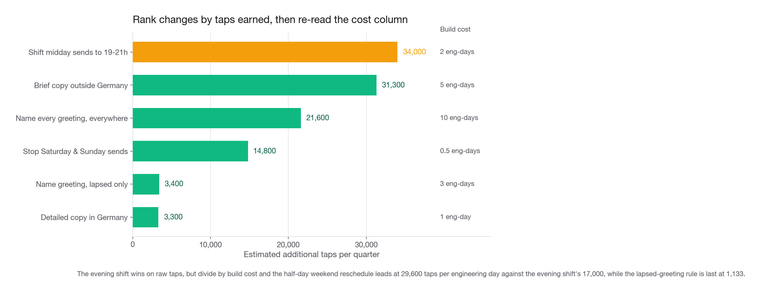
| Move midday sends into the 19:00 to 21:00 window | Two days, timezone handling | +2.8 points on 1.23M sends | About 34,000 |
| Default to brief copy outside Germany | One week of copy plus review in four markets | +1.7 points on 1.87M sends | About 31,300 |
| Name every greeting, everywhere | Two weeks, needs a name-quality backfill | +1.0 points on 2.08M sends | About 21,600 |
| Stop sending on Saturday and Sunday | Half a day of scheduler config | +1.6 points on 920K sends | About 14,800 |
| Name the greeting for lapsed members only | Three days, no backfill needed | +2.1 points on 165K sends | About 3,400 |
| Send detailed copy in Germany | One day of translation review | +1.6 points on 208K sends | About 3,300 |
Watch what the cost column does to the ordering. Divide taps by engineering days and the ranking inverts: weekends 29,600, evening shift 17,000, brief copy outside Germany 6,260, German detailed copy 3,300, name everywhere 2,160, lapsed greeting 1,133. The greeting change is the third biggest raw win and still not the one I would run first: the name field is empty for roughly 40 percent of accounts, so two weeks pass before a single notification changes. The scheduler change is worth less than half as much in raw taps, ships in an afternoon, and still tops the cost-adjusted list. Nothing in the model told you either fact.
The second row from the bottom is the one to notice, and not because it wins on that ratio. At 3,400 taps for three days of work it lands dead last, 1,133 taps per engineering day against 29,600 for the half-day scheduler change, and worse per day than the global rollout it is supposedly the smart alternative to. Run it anyway, for two reasons the ranking hides. It carries the largest greeting effect in the table, 2.1 points per send against 1.0 for naming everyone, because it aims the lever at the slice where the name works. And it is the only way to learn whether personalization moves anything before the two-week backfill lands, which de-risks the 21,600-tap global version. Sell it as the cheap read, not the biggest win. It exists only because someone read the interaction instead of the main effect.
Interview tip: Ask "how expensive is each of these to change?" out loud during the case. It is the question that most reliably makes an interviewer write something positive down, and almost nobody asks it.
Leakage, the failure that voids the whole loop
A leaked feature is any input that would not exist, or would not hold that value, at the moment the model is supposed to predict. Leakage does not degrade a model gracefully. It produces one that looks excellent and teaches you something false. Three flavors, in descending order of how often I see them.
Post-outcome features
The obvious one. Cadence logs minutes_listened_next_day in the same warehouse table as the notification. It is numeric, it joins cleanly, and it is measured after the tap. Watch what happens when it sneaks into the feature set.
from sklearn.linear_model import LogisticRegression
from sklearn.model_selection import train_test_split
from sklearn.metrics import roc_auc_score

rng2 = np.random.default_rng(11)
leaky = notifs.copy()
leaky["minutes_listened_next_day"] = np.where(
    leaky["tapped"] == 1,
    rng2.gamma(2.0, 9.0, len(leaky)),
    rng2.gamma(1.1, 2.0, len(leaky)),
).round(1)

cats = ["copy_length", "greeting", "weekday", "market"]
cols = ["copy_length", "greeting", "send_hour", "weekday", "market",
        "titles_finished", "days_since_last_listen", "minutes_listened_next_day"]
X = pd.get_dummies(leaky[cols], columns=cats, drop_first=True)
y = leaky["tapped"]
X_tr, X_te, y_tr, y_te = train_test_split(
    X, y, test_size=0.3, random_state=7, stratify=y)
clf = LogisticRegression(max_iter=3000).fit(X_tr, y_tr)
print("AUC:", round(roc_auc_score(y_te, clf.predict_proba(X_te)[:, 1]), 4))
per_sd = (pd.Series(clf.coef_[0], index=X.columns) * X.astype(float).std()).abs()
print(per_sd.sort_values(ascending=False).head(3).round(3).to_string())
AUC: 0.9622
minutes_listened_next_day 2.520
weekday_Sun 0.205
days_since_last_listen 0.173An AUC of 0.96 on tap prediction is not a triumph, it is a bug report. Nobody predicts marketing response that well. When a model suddenly gets good, the correct first reaction is suspicion, not celebration.
The second print is the diagnostic to memorize. Raw coefficients are not comparable across columns on different scales, so multiply each by its column's standard deviation for the log-odds swing per typical unit of movement. The leaked column carries 2.52; the largest legitimate feature carries 0.205, twelve times smaller. One input owning that much of the model, and being the only one whose meaning involves the future, is the signature.
Aggregate leakage
Subtler and far more common in real pipelines. Add market_tap_rate, computed from the full table including the rows you are about to train on, and every row now carries a little of its own label. On a market with 8,119 rows the contamination is tiny; on one with 80 rows it is severe, and the model decides some obscure market is wildly predictive.
Fix: compute any label-derived aggregate on a strictly earlier window than the rows that use it, or with a leave-one-out correction, then confirm it still helps on a period the aggregate never saw.
Time leakage
Randomly splitting rows lets the model see week 34 and week 36 while predicting week 35. Something always drifts, so a random split overstates performance. Split by date instead: train on the first ten weeks, test on the last three. The AUC drops and the drop is the honest number. Recency makes it worse here, because days_since_last_listen is autocorrelated within a member across weeks, so a random row split half-memorizes members. Split by member too.
Interview tip: If you are handed a model with an implausibly high AUC in a case study, say "before I read this model I want to check for leakage" and name one candidate feature. That single move separates you from the field.
Step three: fit a model good enough to interrogate
Model reading is meaningful only if the model learned something real. A model that cannot beat the base rate fitted noise, and its coefficients are noise with standard errors attached.
But "good enough" is a much lower bar than "good", and candidates get this backwards. You are not shipping this model; it never scores a live request. Its job is to be a compressed, queryable summary of the table. AUC 0.61 that reliably ranks segments is fine. AUC 0.88 built by tuning toward the insights you wanted is not.
Fit the honest version.
feat = ["copy_length", "greeting", "send_hour", "weekday",
        "market", "titles_finished", "days_since_last_listen"]
Xc = pd.get_dummies(notifs[feat], columns=cats, drop_first=True)
yc = notifs["tapped"]
Xc_tr, Xc_te, yc_tr, yc_te = train_test_split(
    Xc, yc, test_size=0.3, random_state=7, stratify=yc)

m = LogisticRegression(max_iter=2000).fit(Xc_tr, yc_tr)
p_hat = m.predict_proba(Xc_te)[:, 1]

scored = pd.DataFrame({"p": p_hat, "y": yc_te.values}).sort_values("p", ascending=False)
top = scored.head(len(scored) // 10)["y"].mean()
print("AUC        ", round(roc_auc_score(yc_te, p_hat), 4))
print("base rate  ", round(yc_te.mean(), 4))
print("top decile ", round(top, 4), " lift:", round(top / yc_te.mean(), 2))
AUC 0.6116
base rate 0.0432
top decile 0.0712 lift: 1.65AUC 0.61 sounds bad. It is normal. Marketing response has a low ceiling because most of the variance lives in whether a person happened to have their phone in hand. What matters is that the top decile taps at 7.12 percent against a 4.32 percent base, a lift of 1.65. The model found real structure, and that structure is what we read.
The quality gate, concretely
| Check | What it answers | Pass condition for Cadence |
|---|---|---|
| AUC vs 0.5 | Is there any signal at all | Comfortably above, 0.6116 |
| Top-decile lift | Does the ranking separate anyone useful | 1.65, well above 1.0 |
| Brier vs base-rate constant | Are probabilities better than guessing the mean | 0.04105 vs 0.04130, marginal but correct direction |
| Stability across a time split | Does the signal persist out of period | Rerun on the last three weeks, coefficients keep sign |
| Sanity of the top features | Do the strongest effects have a stateable mechanism | Sunday, evening hour, market, recency, all explainable |
The Brier line deserves a word. It barely improves, because at a 4.3 percent base rate a constant predictor is already close in squared error, and the rarer the event the closer it gets. Normal, not evidence against the model. Discrimination and calibration answer different questions, and for insight extraction discrimination is the one that matters.
What to do when the model genuinely has no signal
If AUC lands at 0.51 and the top decile lifts to 1.02, stop. Do not read the coefficients. Say this: the available features do not explain tap behavior, which is itself a finding, and it points at instrumentation. Perhaps the body text is not logged, or the recommended title is not joined in, or the send time is stored in UTC. If send_hour were UTC, the timing story would smear across five markets into mush, and the null would be a logging bug in a modeling costume.
Interview tip: "The model has no signal" is a legitimate and impressive answer, but only if you follow it with the instrumentation gap you would fix. A null result without a next step reads as giving up.
Step four: pick the right way to read the model
Four techniques do the bulk of the work, each answering a different question. The next lessons take one apiece. Your job in an interview is to name the right one and say why, not recite all four.
Map that onto the Cadence questions.
"Is brief copy better than detailed?" is one lever with two levels. That is a coefficient: one number, one sign, one confidence interval, done.
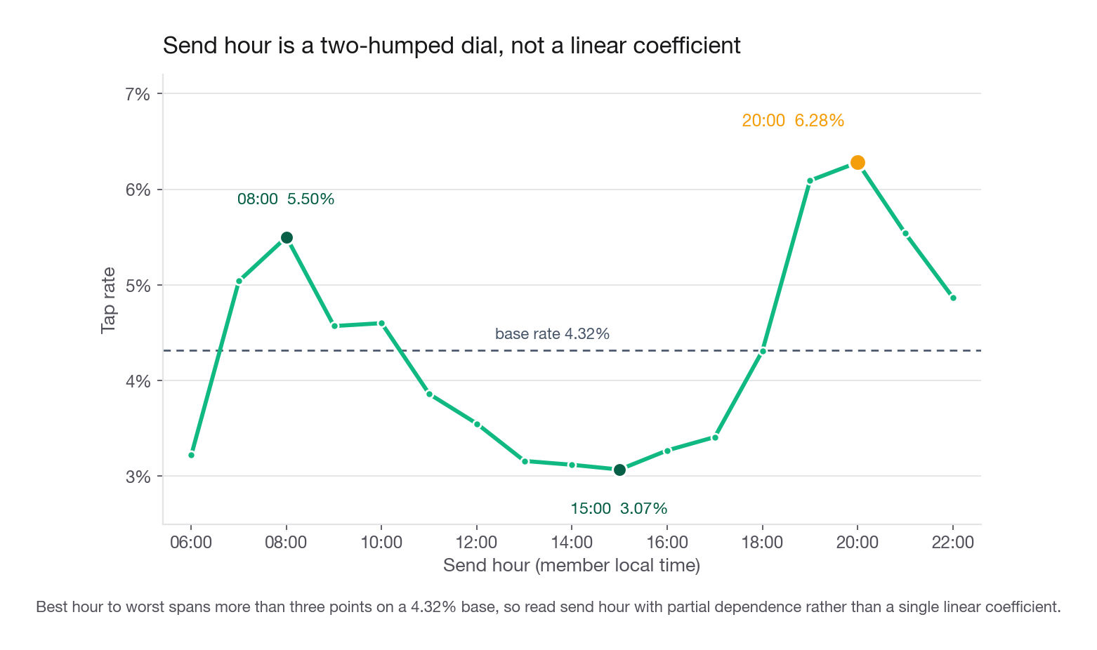
"What time should we send?" is a two-humped dial. Tap rate runs 3.22 percent at 06:00, climbs to 5.50 percent at 08:00 as members commute, sags all afternoon to a floor of 3.07 percent at 15:00, then climbs onto a broad evening plateau: 6.09 percent at 19:00, 6.28 at 20:00, 5.54 at 21:00. The plateau, not 20:00 alone, is why the recommendation is a three-hour window. A linear coefficient on send_hour reports 0.012 in log-odds, rounding to "the hour does not matter". Exactly wrong: best hour to worst is more than three points on a 4.3 percent base. This is a partial dependence question.
"Which members should get which copy, and which greeting?" is an interaction between a targeting key and a lever. That is a tree, or RuleFit if you want the answer as a rule the campaign tool can execute directly.
Here is the honest limit of the additive model: it sees neither interaction. Hand it the German copy reversal, the lapsed-greeting lift, and two hour bands, and watch what it recovers.
d = notifs.copy()
d["de_detailed"] = ((d["market"] == "DE") & (d["copy_length"] == "detailed")).astype(int)
d["lapsed_named"] = (d["lapsed"] & (d["greeting"] == "named")).astype(int)
d["evening"] = d["send_hour"].between(19, 21).astype(int)
d["morning"] = d["send_hour"].between(7, 9).astype(int)

extra = ["de_detailed", "lapsed_named", "evening", "morning"]
Xi = pd.get_dummies(d[feat + extra], columns=cats, drop_first=True)
Xi_tr, Xi_te, yi_tr, yi_te = train_test_split(
    Xi, yc, test_size=0.3, random_state=7, stratify=yc)
mi = LogisticRegression(max_iter=3000).fit(Xi_tr, yi_tr)
pi = mi.predict_proba(Xi_te)[:, 1]
si = pd.DataFrame({"p": pi, "y": yi_te.values}).sort_values("p", ascending=False)
tp = si.head(len(si) // 10)["y"].mean()
print("AUC with interactions:", round(roc_auc_score(yi_te, pi), 4))
print("top decile lift      :", round(tp / yi_te.mean(), 2))
AUC with interactions: 0.637
top decile lift : 1.94AUC moves from 0.6116 to 0.637 and top-decile lift from 1.65 to 1.94. That 0.29 of lift is the two interactions and the hour shape, none of it reachable by the main-effects model however long you leave it fitting. A depth-4 tree finds the same structure unprompted, which is the argument for a tree when the question is "who".
Hand-built interactions are not the answer. The lesson is that the technique you choose decides which findings are visible at all, so choose it from the question rather than from habit.
Correlation, causation, and how to say it to a PM
This is where candidates either hedge into uselessness or overclaim into recklessness. The calibrated position is narrow; rehearse it.
Everything the model reports is an association measured under the current sending policy. It licenses a hypothesis, not a launch. Refusing to recommend anything because "it is only correlational" is equally wrong, because generating well-ordered hypotheses is the job.
The productive move is to name the specific alternative explanation for each finding, out loud, before the interviewer does. Three families.
Confounding
Something else drives both the feature and the outcome. Cadence sends 22.1 percent of notifications on weekends, and the weekend tap rate is 3.06 percent against 4.67 on weekdays. Is the day causal, or does the scheduler put lower-engagement members into weekend batches? Check the mix: titles_finished averages 3.10 on weekends against 3.09 on weekdays, recency 8.05 days against 8.11. Identical, so mix is not doing the work, and ten seconds closes the obvious objection before it is raised.
Selection
The rows you have are not the rows you would have under the new policy. Every observation here comes from members with push enabled. Members who disabled it are invisible, and they are exactly the population an aggressive timing change creates more of. Your model cannot see the cost it would cause.
Reverse causality and simultaneity
titles_finished predicts tapping, and members who tap finish more titles. The 5.31 percent tap rate among members with six to nine finished titles versus 2.83 percent among those with zero is real, but the arrow runs both ways. Recommending "get members to finish more books" on that coefficient is circular. days_since_last_listen has the same problem in mirror image.
Now apply all three to the German finding, the one an interviewer will press on. Detailed copy beats brief in Germany, 3.67 against 2.10 percent, while brief wins by 1.7 points across the other four markets. Three readings:
The German brief translation is bad. Perhaps the one-line version drops the book title after translation, so the notification says nothing specific. A copy bug, cheap to fix, and a real causal effect.
Germany's base skews toward longer-form nonfiction listeners who want the plot summary. The effect is real but it is about the audience, not the translation, and the fix differs.
The German cohort is newer and the brief variant landed disproportionately in their first weeks. Confounding, nothing to fix.
You can partially separate these without an experiment. Reading the translated string tells you in ten minutes whether the title is missing. Splitting German members by titles_finished and re-checking the gap tests reading three. What you cannot do from this table is prove reading one, and you should say so.
Interview tip: For every finding you present, name the one alternative explanation you find most plausible and the cheapest check that would rule it out. Two sentences. It converts a claim into a piece of reasoning.
Guarding against insights that are just noise
With 80,000 rows and nine columns you can find something interesting by accident. With 80 million rows and 300 columns you are guaranteed to. It is the same mechanism as running many A/B tests and celebrating the ones that clear 0.05: enough comparisons and the tail supplies a story. Four habits that help.
Write the analysis plan before you look. Three sentences: which models you will fit, how you will choose between them, which technique reads the winner. Every deviation based on something you saw mid-analysis raises your false-discovery rate by an amount you cannot quantify.
Prefer the model that underfits. An overfit model gives you rich, specific, confident nonsense. A depth-3 tree gives you four segments, and a real segment survives being coarse. Between gradient boosting at AUC 0.64 and logistic regression at 0.61, take the regression: insight extraction rewards stability, not the third decimal.
Try to kill your own finding. The highest-value habit here. You believe weekends are worse, so go looking for evidence they are not. Does the penalty hold in all five markets? For brand-new members and heavy ones? In the lapsed slice? A finding that survives four honest attempts to break it is worth a PM's time.
def weekend_gap(frame):
    wknd = frame["weekday"].isin(["Sat", "Sun"])
    return round(frame.loc[~wknd, "tapped"].mean() - frame.loc[wknd, "tapped"].mean(), 4)

print("overall     ", weekend_gap(notifs))
for mk in ["US", "UK", "CA", "AU", "DE"]:
    print(f"market {mk}   ", weekend_gap(notifs[notifs["market"] == mk]))
print("new members ", weekend_gap(notifs[notifs["titles_finished"] <= 1]))
print("tenured     ", weekend_gap(notifs[notifs["titles_finished"] >= 5]))
print("lapsed      ", weekend_gap(notifs[notifs["lapsed"]]))
overall 0.0161
market US 0.0152
market UK 0.0173
market CA 0.019
market AU 0.0203
market DE 0.0092
new members 0.0103
tenured 0.0202
lapsed 0.0163The gap is positive in all five markets and in every tenure and recency band. It is narrowest in Germany at 0.9 points and among members with at most one finished title at 1.0, worth a sentence because it says a global schedule change is not uniformly good. But the direction never flips. That is what a robust finding looks like, and this table is far more persuasive than a p-value.
Do not go back and refit. If the insights disappoint you, the disappointing insights are your result. Refitting until the story improves is how teams ship changes that do not replicate.
Step five: convert findings into recommendations
Here is the format that works. Four sentences, in this order.
Finding, with the number and the population it applies to.
Mechanism, your best guess at why, stated as a guess.
Expected size, in units the business already tracks.
Proposed test, with the unit of randomization and how long it runs.
Applied to the weekend finding, on a program sending 4.16 million notifications a quarter with 22.1 percent landing on a weekend:
"Saturday and Sunday sends tap at 3.1 percent against 4.7 percent on weekdays, a gap that holds in all five markets and every tenure band we checked. My guess is that the weekly pick competes with weekend routines and gets swiped away. Moving weekend volume onto Tuesday and Thursday touches about 920,000 sends a quarter, which at the observed gap is roughly 14,800 extra taps, about 8 percent more overall, worth on the order of 16,000 USD at our current 1.10 USD per tap. I would randomize members rather than sends, hold half the weekend cohort on the current schedule for three weeks, and read tap rate with minutes listened as a guardrail."
Compare the two ways of saying the same thing.
| Weak phrasing | Stronger phrasing |
|---|---|
| "Weekday is an important feature" | "Weekend sends tap 1.6 points lower on a 4.3 percent base, in every market" |
| "The model shows send hour matters" | "Tap rate peaks at 20:00 at 6.3 percent and bottoms at 15:00 at 3.1 percent, so the dial is worth about 3 points" |
| "Germany underperforms" | "Brief copy loses 1.6 points in Germany and wins by 1.7 everywhere else, which points at the translated one-line variant" |
| "We should personalize" | "Put the member's name in the greeting for anyone lapsed past 21 days: 2.2 to 4.2 percent, one rule, testable in three weeks" |
| "We should improve engagement" | "Ranked by taps per engineering day: reschedule weekends at 29,600, shift midday sends to evening at 17,000, default to brief copy outside Germany at 6,260" |
The right column is not padded. It is longer because it carries the number, the population, and the action. That is what actionable means.
Presenting it
Lead with the recommendation, not the method. The PM does not care that you fitted a logistic regression, and saying it first signals you thought the modeling was the point. Open with the ranked list of tests, support each with its number, and put the model in an appendix slide.
Then, the part people skip: present the strongest evidence against your top recommendation. For the weekend finding it is that the effect is weakest in Germany and among new members. Volunteering that buys credibility and costs nothing, because someone finds it anyway.
Finally, be explicit that these are bets. The output is a ranked test queue with expected values attached. If the PM hears "weekends are bad so we turned them off", the loop has been misused.
Common traps
Optimizing the model instead of the question. Tuning to AUC 0.64 when 0.61 already answers the PM. The model is an instrument, not a deliverable. Fix: set a quality bar first, hit it, freeze, and spend the rest of the session on interpretation and sizing.
Reading a model that has no signal. Coefficients at AUC 0.51 are noise with decimal places. Fix: print the base rate, the AUC, and the top-decile lift before you read a single coefficient, and be willing to report a null.
Leaked features producing a beautiful, useless model. Fix: timestamp every feature against prediction time, rank coefficients by standard-deviation-scaled magnitude, and treat any suspiciously high score as a bug until proven otherwise.
Reporting importance instead of direction. "Send hour is the top feature" says nothing about whether to send earlier or later. Fix: every finding gets a sign and a magnitude in business units.
Quoting an effect without its base rate. "Plus one point" means nothing alone; on a 4.32 percent base it is a 23 percent relative lift. Fix: never state a percentage-point change without the denominator beside it.
Confusing a targeting key with a lever. "Germany converts worse" cannot be shipped, because you cannot change a member's market. Fix: pair every non-controllable finding with a lever to make a personalization rule.
Averaging over an interaction. A global coefficient on copy_length says brief is better and buries the fact that it is worse in Germany. The greeting coefficient does it in reverse: a modest one point that hides a near doubling among lapsed members. Fix: before trusting any main effect, split it by your two or three most plausible moderators and check both sign and size.
Refitting after seeing disappointing insights. Fix: write the model selection rule down first, then treat the wall between fitting and reading as real.
Choosing a label because it is easy to compute. Tap rate sits in the notifications table, so it becomes the label by default and the clickbait failure mode goes unmonitored. Fix: choose the label from the decision, then add the guardrail that catches how it can be gamed.
Presenting method before recommendation. Fix: recommendation, number, mechanism, test, and only then, if asked, the model.
Sizing an effect without reach. "Detailed copy is 1.6 points better in Germany" sounds worth doing until you notice Germany is 10 percent of volume and half of those sends already use the winner, so the whole win is 3,300 taps a quarter against 34,000 for the evening shift. Fix: multiply every effect by the population it applies to before it enters the ranking.
Quick self-check
Answer each out loud, in full sentences, as if an interviewer just asked it. If any answer takes more than forty seconds, that is the one to rehearse.
A PM asks you to raise tap rate. Walk the loop from decision to test queue in ninety seconds, naming what happens at each step and what could break there.
You are handed a churn model with test AUC 0.94. What are your first three questions, which features do you inspect, and how do you rank coefficients on different scales?
Members with more finished titles tap more often. Give the causal, reverse-causal, and confounded readings, then say what you recommend given you cannot separate them from this table.
Explain to a non-technical PM, in two sentences and without the words "correlation" or "causation", why the weekend finding is a reason to run a test rather than to change the schedule.
The named greeting is worth 1.0 points on the 2.08 million sends that currently open generically, and 2.1 points on the 165,000 of those that go to lapsed members. Which do you propose first, and what would flip your answer?
Your model shows no signal: AUC 0.51, top-decile lift 1.02. What do you tell the PM, and what do you check first in the pipeline?
The next four lessons take the interrogation techniques one at a time on this same Cadence table: coefficients, then trees as a segment finder, then partial dependence for the send-hour dial, then RuleFit for turning the German copy reversal and the lapsed-greeting lift into rules the campaign tool can execute.