1.4 Partial Dependence Plots: Isolating One Variable
Find the core decision, design, or behavior signal.
Turn the lesson into a concise response blueprint.
Name the trap you would avoid in a real interview.
Use these checkpoints as your reading path before diving into the full lesson.
- 1Why this matters in interviews
- 2The scenario and the data
- 3What a marginal effect actually is
- 4When the naive conditional mean happens...
- 5What a targeted log does to the same co...
A coefficient tells you a direction. A tree tells you a segment. Neither tells you the shape of a variable: whether 09:00 beats 07:00, whether the gain keeps coming as you push later, or where the curve turns around. Partial dependence answers "what value should we pick", the only version of the question a product manager can act on. This lesson builds a PDP by hand so you know exactly what the plot claims, then covers the three situations where that claim is wrong.
Why this matters in interviews
Interviewers rarely ask "explain partial dependence" as a definition. They ask something that sounds like product work and expect you to reach for PDP unprompted:
"You trained a gradient boosting model that predicts push engagement well. What do you tell the growth team on Monday?"
"Variable importance says send hour matters most. So what?"
"The model says shorter copy is better. Do you believe it everywhere?"
The trap in all three is that a model score and a ranking of feature names are not decisions. Feature importance is a scalar per variable, with no sign, no shape, and no units anybody outside the modeling team cares about. Say "send time is the second most important feature" and the PM's next sentence is "fine, what time". Fail that and the insight round is over.
What separates a strong candidate is not knowing PDP exists, because nearly everyone does. It is saying in forty seconds what the y-axis value is, what the averaging is over, and when the curve stops being trustworthy.
The technique also earns its place by being model agnostic. Coefficients need a linear fit and inherit its assumptions; tree structure needs a single shallow tree, which is unstable. Partial dependence needs only an object with a predict method, so you can chase accuracy as hard as you like and still recover a readable story. That is the standard industry workflow: fit the strongest black box you can, then interrogate it with PDP and ICE.
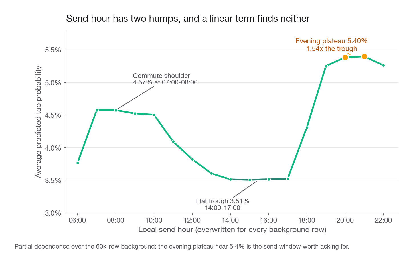
Interview tip: When asked what a variable does, never answer with an importance rank. Answer with a shape and a number: "tap rate runs about 3.5 percent through the mid-afternoon, climbs to 5.4 percent by 20:00, and has a second smaller bump near 08:00."
The scenario and the data
You are on the lifecycle data science team at Cadence, a subscription audiobook app with roughly 320,000 active members. Every member gets one "Picked for you" push per week, so the send budget is fixed and the only levers are what the message says and when it lands. The PM owns one metric, the share of notifications that bring a member back into the app within 24 hours, and wants ideas that do not require buying inventory.
The event table has one row per notification sent.
| Column | Type | Meaning |
|---|---|---|
notif_id | integer | Unique per send, no product meaning |
copy_length | categorical | brief (one line) or detailed (three lines plus a blurb) |
greeting | categorical | named (account first name) or generic |
send_hour | integer 6 to 22 | Local delivery hour |
weekday | categorical | Mon through Sun |
market | categorical | US, UK, CA, AU, DE |
titles_finished | integer | Lifetime completions before this send |
days_since_last_listen | integer | Recency at send time |
tapped | binary | Label: app opened within 24 hours |
Run this block once. Every later block assumes the resulting notifs frame exists.
import numpy as np
import pandas as pd

SEED = 20260826
rng = np.random.default_rng(SEED)
N = 80_000

weekdays = np.array(["Mon", "Tue", "Wed", "Thu", "Fri", "Sat", "Sun"])
markets = np.array(["US", "UK", "CA", "AU", "DE"])

copy_length = rng.choice(["brief", "detailed"], N)
greeting = rng.choice(["named", "generic"], N)
send_hour = rng.integers(6, 23, N)
weekday = rng.choice(weekdays, N, p=[.16, .16, .16, .16, .14, .11, .11])
market = rng.choice(markets, N, p=[.46, .18, .14, .12, .10])
titles_finished = rng.poisson(3.1, N)
days_since_last_listen = rng.geometric(0.11, N) - 1

z = np.full(N, -3.85, dtype=float)
z += np.where(copy_length == "brief", 0.34, 0.0)
z += np.where(greeting == "named", 0.22, 0.0)
z += np.where(np.isin(weekday, ["Sat", "Sun"]), -0.47, 0.0)
z += 0.58 * np.exp(-((send_hour - 8.5) ** 2) / 5.5)      # commute peak
z += 0.71 * np.exp(-((send_hour - 20.0) ** 2) / 6.5)     # evening peak
z += np.select([market == "DE", market == "AU"], [-0.93, -0.14], 0.0)
z += 0.31 * np.log1p(titles_finished)
z += -0.028 * np.minimum(days_since_last_listen, 45)
z += 0.86 * ((market == "DE") & (copy_length == "detailed"))          # interaction
z += 0.52 * ((days_since_last_listen > 21) & (greeting == "named"))   # interaction

notifs = pd.DataFrame({
    "notif_id": np.arange(1, N + 1),
    "copy_length": copy_length,
    "greeting": greeting,
    "send_hour": send_hour,
    "weekday": weekday,
    "market": market,
    "titles_finished": titles_finished,
    "days_since_last_listen": days_since_last_listen,
    "tapped": rng.binomial(1, 1.0 / (1.0 + np.exp(-z))),
})
The overall tap rate lands at 4.32 percent, the kind of imbalance you should expect for any push label. Two raw marginals are worth holding in your head before any modeling starts, because the PDPs will later have to reproduce or contradict them: brief copy taps at 4.99 percent against 3.64 percent for detailed, and a named greeting taps at 4.83 percent against 3.80 percent for generic.
Now fit something strong enough to be worth interrogating. Gradient boosted trees with native categorical handling keep the feature space honest and avoid a trap we will get to shortly.
from sklearn.ensemble import HistGradientBoostingClassifier
from sklearn.model_selection import train_test_split
from sklearn.metrics import roc_auc_score

CATS = ["copy_length", "greeting", "weekday", "market"]
NUMS = ["send_hour", "titles_finished", "days_since_last_listen"]

X = notifs[CATS + NUMS].copy()
for c in CATS:
    X[c] = X[c].astype("category")
X[NUMS] = X[NUMS].astype(float)
y = notifs["tapped"]

X_tr, X_te, y_tr, y_te = train_test_split(X, y, test_size=0.25,
                                          random_state=11, stratify=y)
clf = HistGradientBoostingClassifier(
    categorical_features=CATS, max_iter=240, learning_rate=0.05,
    max_leaf_nodes=12, min_samples_leaf=300, random_state=11).fit(X_tr, y_tr)
background = X_te.sample(6000, random_state=5)
print("holdout AUC:", round(roc_auc_score(y_te, clf.predict_proba(X_te)[:, 1]), 4))
holdout AUC: 0.6244An AUC of 0.62 is modest, and you should say so rather than hope nobody asks. Push response is mostly idiosyncratic: whether somebody is near their phone is not in any table. The bar for interpretation is not "accurate enough to target with", it is "has learned real structure rather than noise", and 0.62 on 20,000 held out rows clears it. Note what is missing from the feature list too: notif_id is a row counter, and leaving it in would poison every interpretation step.
Interview tip: Say out loud that you checked model quality before interpreting it. An AUC near 0.5 makes every PDP on that model a picture of noise, and interviewers do listen for whether you skipped that gate.
What a marginal effect actually is
Here is the sentence to have ready. A partial dependence curve answers a counterfactual about the model, not a question about the observed data: if every notification in this sample had gone out at 20:00, with everything else about each member and message left as it was, what average tap probability would the model predict?
That phrasing carries three commitments, and interviewers pull on each.
It is a whole-population counterfactual, not a subgroup average. The naive number is the observed rate among notifications that happened to go out at 20:00, which mixes the hour with who gets pushed then. Partial dependence forces the whole sample to 20:00, holding composition fixed by construction.
It is a statement about the model. Learn a spurious pattern and the PDP draws it faithfully. It is a microscope, not a truth serum.
It averages away everything else. The value at 20:00 is one number over 6,000 predictions, and averages hide disagreement. That is the whole motivation for ICE plots later.
When the naive conditional mean happens to be fine
Start with the check, not the conclusion. Bucket by recency, read the raw tap rate, and in the same table read what else moves across buckets. Composition is what you are hunting.
bins = [0, 3, 7, 14, 21, 35, 100]
naive = (notifs.assign(bucket=pd.cut(notifs["days_since_last_listen"], bins, right=False))
               .groupby("bucket", observed=True)
               .agg(n=("tapped", "size"),
                    raw_rate=("tapped", "mean"),
                    mean_titles=("titles_finished", "mean"),
                    pct_named=("greeting", lambda s: (s == "named").mean())))
print(naive.round(4).rename_axis(None).to_string())
n raw_rate mean_titles pct_named
[0, 3) 23442 0.0504 3.0808 0.5009
[3, 7) 21108 0.0458 3.1073 0.5063
[7, 14) 19776 0.0403 3.0951 0.5003
[14, 21) 8732 0.0337 3.0980 0.4984
[21, 35) 5618 0.0310 3.0778 0.4868
[35, 100) 1324 0.0287 3.0869 0.4864The tap rate falls from 5.04 percent to 2.87 percent, a factor of 1.76, and the composition columns are flat: every bucket carries about 3.09 completed titles and about half named greetings. That is a clean randomized send log. Cadence assigns copy, greeting and hour by coin flip, so nothing travels with recency.
Compare the partial dependence version, which holds the rest fixed by force rather than by luck:
p99 = np.percentile(notifs["days_since_last_listen"], 99)
recency_grid = np.array([1.0, 5.0, 10.0, 17.0, 28.0, 35.0])   # trimmed to support
pdp_recency = [clf.predict_proba(
    background.assign(days_since_last_listen=v))[:, 1].mean() for v in recency_grid]
print("99th percentile of recency:", p99)
print(dict(zip(recency_grid.astype(int), np.round(pdp_recency, 5))))
99th percentile of recency: 39.0
{1: 0.04862, 5: 0.04537, 10: 0.0423, 17: 0.03359, 28: 0.03189, 35: 0.03189}| Recency | Naive bucket rate | Partial dependence | What the gap means |
|---|---|---|---|
| Fresh (about 1 day) | 5.04 percent | 4.86 percent | No confounder to remove |
| Mid (about 17 days) | 3.37 percent | 3.36 percent | Essentially identical |
| Lapsed (35 days plus) | 2.87 percent | 3.19 percent | PDP flatter, from shrinkage |
| Ratio fresh to lapsed | 1.76x | 1.52x | The model pulls the tails inward |
The two curves broadly agree, and the residual gap is not confounding, it is the ensemble pulling extreme leaves toward the base rate. Note where the grid stops. The 99th percentile of recency is 39 and the model's last split on that column is at 36, so a grid point at 50 would be the terminal leaf repeating itself, not data. Even inside support the curve has gone flat: 3.19 percent at both 28 and 35 days. On a regularized ensemble the fitted surface is compressed toward the base rate, which is why the partial dependence range here, 1.52x, is narrower than the raw one, 1.76x.
Do not turn that into a general rule. Shrinkage bounds how far a fitted surface can stretch, and it says nothing about confounding, which has no guaranteed sign. With a confounder missing from the model, or an overwrite that lands in a region the data never covered, a PDP can just as easily overstate, and where the plotted variable has no causal effect at all it will draw one anyway, faithfully, because it is a picture of the model. Treat a PDP gap as a description of the model and size it as a hypothesis to test, never as a conservative lower bound on lift.
What a targeted log does to the same comparison
Production logs are almost never randomized, so ask what happens when they are not. Suppose Cadence used to run a scheduler that pushed long detailed copy in the evening and short brief copy during the working day, the kind of rule that has sat in a cron job since before you joined. Simulate the log it would have produced, then fit the same model on it.
rng2 = np.random.default_rng(404)
evening = notifs["send_hour"].values >= 18
detailed = notifs["copy_length"].values == "detailed"
logged = notifs[rng2.random(len(notifs)) < np.where(detailed == evening, 0.95, 0.10)]
print(logged.groupby("copy_length").agg(n=("tapped", "size"),
      raw_rate=("tapped", "mean"), mean_hour=("send_hour", "mean")).round(4).to_string())

Xl = logged[CATS + NUMS].copy()
for c in CATS:
    Xl[c] = Xl[c].astype("category")
Xl[NUMS] = Xl[NUMS].astype(float)
clf_log = HistGradientBoostingClassifier(
    categorical_features=CATS, max_iter=240, learning_rate=0.05,
    max_leaf_nodes=12, min_samples_leaf=300, random_state=11).fit(Xl, logged["tapped"])

def force(frame, col, level):
    out = frame.copy()
    out[col] = pd.Categorical([level] * len(out), categories=frame[col].cat.categories)
    return out

bg_log = Xl.sample(6000, random_state=5)
b = clf_log.predict_proba(force(bg_log, "copy_length", "brief"))[:, 1].mean()
d = clf_log.predict_proba(force(bg_log, "copy_length", "detailed"))[:, 1].mean()
print("pdp ratio on the biased log:", round(b, 5), round(d, 5), round(d / b, 3))
n raw_rate mean_hour
copy_length
brief 27965 0.0453 11.8613
detailed 13856 0.0437 18.2465
pdp ratio on the biased log: 0.0461 0.04185 0.908The naive comparison on that log reads as a tie, 4.53 percent against 4.37 percent, a ratio of 0.96, and a PM reading it drops copy length. The randomized truth is 4.99 against 3.64, a ratio of 0.73, so brief wins by more than a quarter. The scheduler handed detailed the best hours of the day and the groupby credited the copy for the clock.
Partial dependence pulls the answer back to 0.91, because the model sees send_hour and the overwrite pins it while the copy flips. It does not reach the 0.80 the same procedure gives on the clean table, and the reason is overlap: 4 percent of brief rows in that log ever went out in the evening against 79 percent of detailed rows, so the model fills that region from surrounding structure instead of evidence. Do not read the direction off this example either. The leftover bias attenuates here, 0.91 against a randomized 0.73, only because this scheduler handed detailed the best hours. Fire detailed at 03:00 instead and the identical procedure overshoots. Overlap tells you how much bias can survive, not which way it points.
Memorize the honest statement in three parts. Partial dependence removes composition bias a groupby cannot, but only for confounders present in the model, and only where the arms overlap.
Interview tip: If an interviewer shows you a groupby table and asks for the driver, name the confounder before you name the driver. "Before I read this, what else moves with the bucket variable?" is the single highest-signal sentence in the insight round.
The averaging procedure, step by step
You should be able to describe this without notes and write it in about eight lines of code.
Written directly, with no library:
hour_grid = np.arange(6.0, 23.0)
own_pdp = np.array([
    clf.predict_proba(background.assign(send_hour=h))[:, 1].mean()
    for h in hour_grid])
print(np.round(own_pdp[:6], 5))
print(np.round(own_pdp[8:], 5))
[0.03767 0.04574 0.04574 0.04523 0.04504 0.04094]
[0.03512 0.03507 0.03514 0.03524 0.04309 0.05251 0.05384 0.05398 0.05263]Six lines. That is the whole algorithm. Confirm it against the library so you trust both:
from sklearn.inspection import partial_dependence

lib = partial_dependence(clf, background, features=["send_hour"],
                         custom_values={"send_hour": hour_grid},
                         kind="average", method="brute")
print(np.allclose(own_pdp, lib["average"][0]))TrueThe 17 point curve tells a clear story. The day opens cold at 3.77 percent, jumps to a commute shoulder of 4.57 percent at 07:00 and 08:00, then decays to a flat trough near 3.51 percent between 14:00 and 17:00. From 18:00 it climbs hard: 5.25 percent at 19:00, a broad plateau near 5.40 percent from 20:00 to 21:00, then 5.26 percent at 22:00. Peak over trough is 1.54x, in two humps of unequal size.
That last detail is the whole argument for this technique. A logistic regression with one linear send_hour term must summarize the day with a single slope, and fitting one here gives about +0.015 per hour. Right average direction, completely useless: it recommends sending later without bound and cannot express that 08:00 beats 12:00 while 15:00 loses to both. The PDP recovers both peaks and the trough between them from the same rows, with nobody guessing at a spline basis or hour buckets in advance.
Cost, and how to keep it sane
The loop scores len(grid) * len(background) rows: 102,000 predictions for one variable here, and it climbs fast on the full 60,000 row training set with every column plotted.
| Lever | What it costs you | When to use it |
|---|---|---|
| Subsample the background to 5k to 10k rows | A little Monte Carlo noise in the curve | Almost always, this is the default |
| Coarsen the grid to deciles | Miss narrow features of the curve | Continuous variables with wide ranges |
| Plot only the top 6 to 8 variables by importance | Might skip a variable with a strange shape | Wide feature sets, over about 40 columns |
Reading the y-axis without getting fooled
This is where most candidates get sloppy, and it is a favorite follow-up. The same curve appears on at least three different vertical scales.
Score the peak hour three ways, once with method="brute", once with method="recursion", and once by averaging 0.5 * log(p / (1 - p)) across the per-row predictions, and you get three different numbers for the same point.
| Convention | Value at send_hour 21 | Where you see it | How to read it |
|---|---|---|---|
| Mean predicted probability | 0.0540 | scikit-learn method="brute" | Direct: 5.40 percent of notifications get tapped |
| Raw decision function | 0.1854 | scikit-learn method="recursion" | Monotone in probability, but not a rate |
Half log odds of 0.5 * log(p / (1 - p)) | -1.4603 | classic R random forest partial plots | Zero is probability 0.5, negative is below |
Three things follow, and you should say all three.
First, the raw decision function is not a probability. The recursion path runs from -0.26 at 15:00 to 0.19 at 21:00. Label that axis "tap rate" and you have made a correctness error: it is monotone in probability, so the ranking and the argmax are identical, but the values are not rates and cannot be multiplied by send volume.
Second, the half log odds convention is a mean of transformed predictions, not a transform of the mean. For greeting the probability scale gives 3.95 percent for generic and 4.63 percent for named; averaging per-row 0.5 * log(p / (1 - p)) gives -1.6272 and -1.5416, a gap of 0.0856 and an odds ratio near 1.19. The transform is nonlinear, so averaging per-row logits and taking the logit of the averaged probability differ, though at a 4 percent base rate they land close.
Third, and this is the one that matters commercially: at a 4.3 percent base rate every point sits near zero on a probability axis and well below zero on a log odds axis. That is arithmetic, not a problem. The 5.40 percent peak against the 3.51 percent trough still means 95 percent of recipients ignore the push, and it also means one window earns half again what another does on identical inventory at zero marginal cost.
Interview tip: Always convert a PDP gap into the business unit before you stop talking. "1.9 points on 320,000 weekly sends" beats "the curve is higher in the evening" every time.
Categorical PDPs and the one-hot trap
For a categorical variable the procedure is identical: the grid is the set of levels and the plot is bars instead of a line. The force helper defined earlier does the overwrite while preserving the category dtype, which matters because a plain string assignment silently breaks the encoding.
greeting_pdp = {lv: clf.predict_proba(force(background, "greeting", lv))[:, 1].mean()
                for lv in ["generic", "named"]}
copy_pdp = {lv: clf.predict_proba(force(background, "copy_length", lv))[:, 1].mean()
            for lv in ["brief", "detailed"]}
print({k: round(v, 5) for k, v in greeting_pdp.items()})
print({k: round(v, 5) for k, v in copy_pdp.items()})
{'generic': 0.03949, 'named': 0.04633}
{'brief': 0.04771, 'detailed': 0.03806}A named greeting buys 0.68 points, a 1.17x lift. Brief copy buys 0.97 points over detailed, a 1.25x lift. Both are properties of the message rather than the member, so both apply to every notification Cadence sends, which makes them better first recommendations than anything needing targeting logic. Hold on to the copy number, because the next section takes it apart.
Now the trap. Suppose you one-hot encoded first and fit on greeting_named as a 0/1 column. The library will happily sweep that column from 0 to 1, and with drop_first=True there is exactly one column, so the counterfactual is coherent. But market has five levels and four dummies. Sweeping market_DE from 0 to 1 while market_UK and market_US keep their values builds rows encoding two markets at once, or none, for much of the sample. Those rows never existed, and predictions there are arbitrary.
| Encoding | What a naive one-column sweep does | Verdict |
|---|---|---|
Native categorical (category dtype) | Sets the whole variable to one level | Correct, use this |
| One-hot, binary variable, one dummy | Flips the only dummy | Correct by luck |
| One-hot, k levels, k or k-1 dummies | Creates impossible multi-level rows | Wrong, fix before plotting |
| Ordinal integer codes for an unordered variable | Interpolates between arbitrary codes | Wrong, and the plot looks plausible |
The fix is mechanical: move one level on and force the sibling dummies off in the same overwrite, or use native categorical support, which is what the model above does. The last row deserves a beat. Encode market as 0 through 4, hand it to a tree, and the PDP draws a smooth looking line across the five codes. It is nonsense, because CA does not sit between UK and AU in any real sense, and a different alphabetical accident would give a different curve from identical data.
Three ways a PDP lies
This is where interview answers separate. Anyone can describe the algorithm. Fewer people name the failure modes without prompting, and that is the difference between "knows the tool" and "has used it on real data".
Extrapolation into empty space
The overwrite step never asks whether a value is plausible for a given row, it just writes it. Push titles_finished to 12 for every member and most of those rows describe somebody who does not exist.
titles_grid = np.arange(0.0, 13.0)
pdp_titles = np.array([clf.predict_proba(
    background.assign(titles_finished=v))[:, 1].mean() for v in titles_grid])
support = notifs["titles_finished"].value_counts().sort_index().reindex(
    range(13), fill_value=0).values
cells = [f"{v:>3} {p:.5f} n={n:<6}" for v, p, n in
         zip(titles_grid.astype(int), pdp_titles.round(5), support)]
for i in range(0, 12, 4):
    print("".join(cells[i:i + 4]))
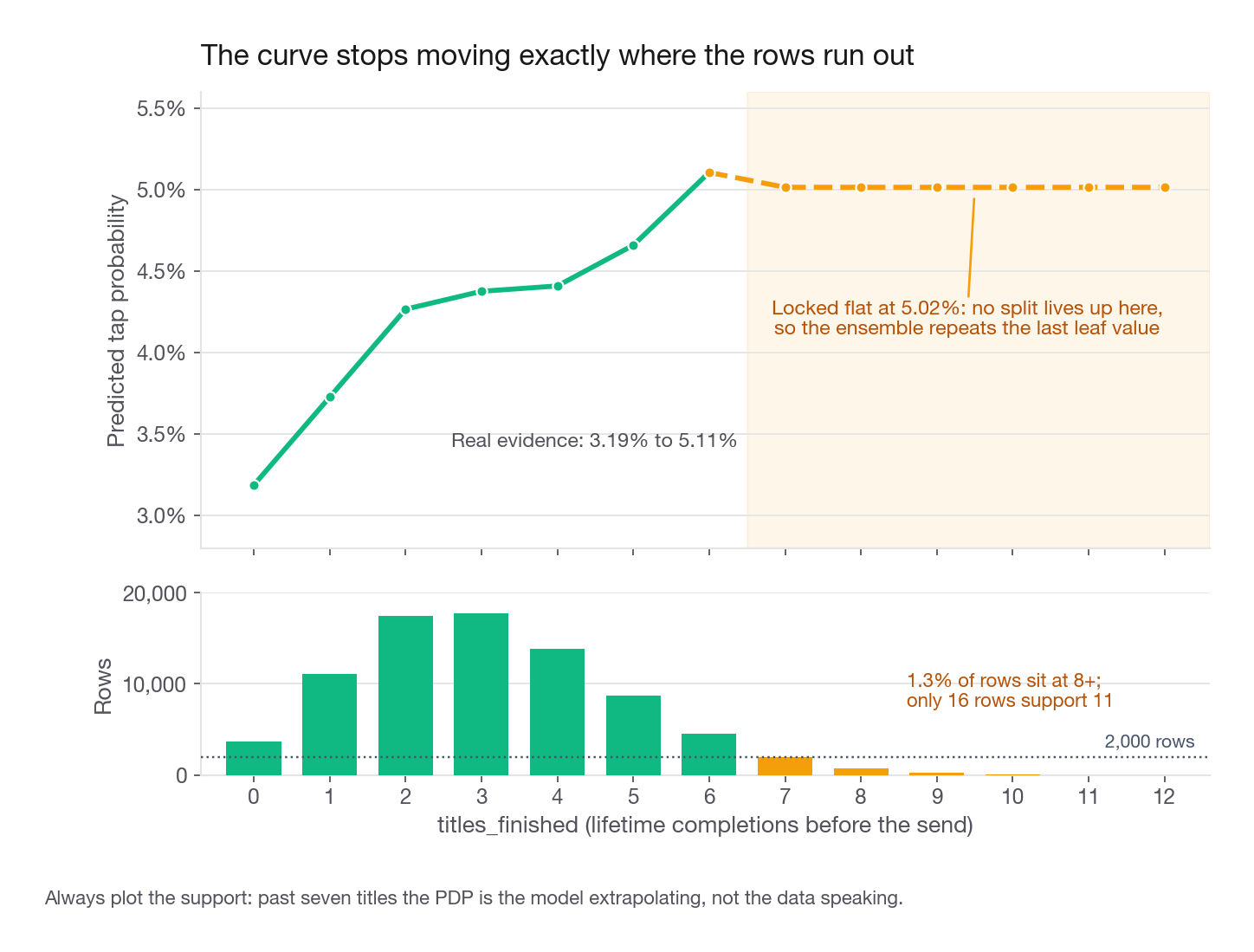
0 0.03186 n=3677 1 0.03726 n=11113 2 0.04266 n=17473 3 0.04376 n=17706
4 0.04409 n=13878 5 0.04659 n=8675 6 0.05106 n=4487 7 0.05015 n=1920
8 0.05015 n=741 9 0.05015 n=241 10 0.05015 n=65 11 0.05015 n=16The curve climbs from 3.19 percent at zero completed titles to 5.11 percent at six, then locks at 5.02 percent and never moves again. It is flat because the ensemble has no split above that region, so it repeats the last leaf value forever. A reader who skips the support column concludes engagement saturates around six titles. The honest statement is that the data runs out there: 1.3 percent of rows sit at eight or more, the 99th percentile is exactly 8, and 16 rows support the value at 11.
The fix is a habit, not clever statistics: plot the support under the curve as a rug or histogram and truncate at the 1st and 99th percentiles, which here means showing 0 through 8 and stopping.
Correlated features and impossible rows
Extrapolation gets worse when two variables are entangled, because the overwrite breaks the joint distribution even when each value is individually common. This is the failure mode people quote most often, and this table is a good place to learn the check precisely because it comes back clean.
print(notifs[NUMS].corr().round(4).to_string())
corner = (notifs["titles_finished"] >= 8) & (notifs["days_since_last_listen"] >= 45)
print("heavy and dormant:", int(corner.sum()),
      "expected if independent:",
      round((notifs["titles_finished"] >= 8).mean()
            * (notifs["days_since_last_listen"] >= 45).mean() * len(notifs), 1))
send_hour titles_finished days_since_last_listen
send_hour 1.0000 0.0005 0.0031
titles_finished 0.0005 1.0000 0.0006
days_since_last_listen 0.0031 0.0006 1.0000
heavy and dormant: 7 observed, 5.7 expected if independentEvery pairwise correlation is under 0.004, and the sparse corner holds almost exactly the rows independence predicts, so the overwrite never builds a member who could not exist. Say that explicitly when you present, because "I checked and it was fine" beats silence.
Now say what would have happened otherwise, because the interviewer will ask. In a real listening log those columns run strongly negative: heavy listeners return constantly, dormant accounts have finished almost nothing. At a correlation near -0.6, eight titles is common, 60 days dormant is common, both at once is nonexistent. Yet a recency PDP at 60 days shoves every heavy listener into that empty corner and scores them anyway. Two honest responses: annotate the plot with the correlation and the thin region, or switch to accumulated local effects, which average changes in a narrow window around each row's own value.
Averaging away heterogeneity
The third failure needs no correlation at all, and on this table it is live. If one slice responds positively and another negatively, the mean can be flat, or worse, confidently wrong for a slice big enough to matter. The variable looks settled while it does opposite things in different places, and nothing in the average warns you. Only the curves before they are averaged do, which is the next section.
ICE plots: undoing the average
An individual conditional expectation plot is the same computation with the last step removed. Instead of collapsing to a mean at each grid point, keep every row's own curve: 6,000 background rows and a 17 point grid give a 6,000 by 17 matrix, one line per member.
ice = partial_dependence(clf, background, features=["send_hour"],
                         custom_values={"send_hour": hour_grid},
                         kind="both", method="brute")
curves = ice["individual"][0]
print(curves.shape, np.allclose(curves.mean(axis=0), own_pdp))
anchor, j20 = list(hour_grid).index(15.0), list(hour_grid).index(20.0)
centered = curves - curves[:, [anchor]]
print("15:00 to 20:00 delta   min", round(centered[:, j20].min(), 4),
      " max", round(centered[:, j20].max(), 4),
      " share positive", round((centered[:, j20] > 0).mean(), 4))
(6000, 17) True
15:00 to 20:00 delta min -0.0012 max 0.0581 share positive 0.999The PDP is literally the column mean of the ICE matrix. Say that in an interview and the follow-up usually stops.
Raw ICE curves are hard to read because they sit at different baselines: a fresh heavy listener is high everywhere, a dormant account low everywhere, so the plot looks like vertical noise. Centering fixes it. Subtract each row's value at an anchor, here the 15:00 trough, so every curve starts at zero and you read change instead of level.
That result is good news, and good news is a finding too. Moving a member from the 15:00 trough to the 20:00 peak helps 99.9 percent of the background. The spread is real, roughly zero to 5.8 points, but nobody is meaningfully hurt, so the average is an honest summary and one global send window is a defensible policy.
Run the same check on copy length, split by market at the same time, because copy is written and localized per market.
p_brief = clf.predict_proba(force(background, "copy_length", "brief"))[:, 1]
p_detail = clf.predict_proba(force(background, "copy_length", "detailed"))[:, 1]
delta = p_detail - p_brief
print("all   mean", round(delta.mean(), 5), " min", round(delta.min(), 5),
      " max", round(delta.max(), 5), " share positive", round((delta > 0).mean(), 4))
for m in ["US", "UK", "CA", "AU", "DE"]:
    k = (background["market"].values == m)
    print(f"{m}  n={k.sum():>5} brief={p_brief[k].mean():.5f} "
          f"detailed={p_detail[k].mean():.5f} delta={delta[k].mean():+.5f} "
          f"share_positive={(delta[k] > 0).mean():.3f}")
all mean -0.00965 min -0.04663 max 0.02995 share positive 0.1148
US n= 2716 brief=0.05123 detailed=0.03817 delta=-0.01307 share_positive=0.006
UK n= 1086 brief=0.05056 detailed=0.04081 delta=-0.00975 share_positive=0.056
CA n= 837 brief=0.05038 detailed=0.03747 delta=-0.01290 share_positive=0.007
AU n= 758 brief=0.04588 detailed=0.03446 delta=-0.01142 share_positive=0.004
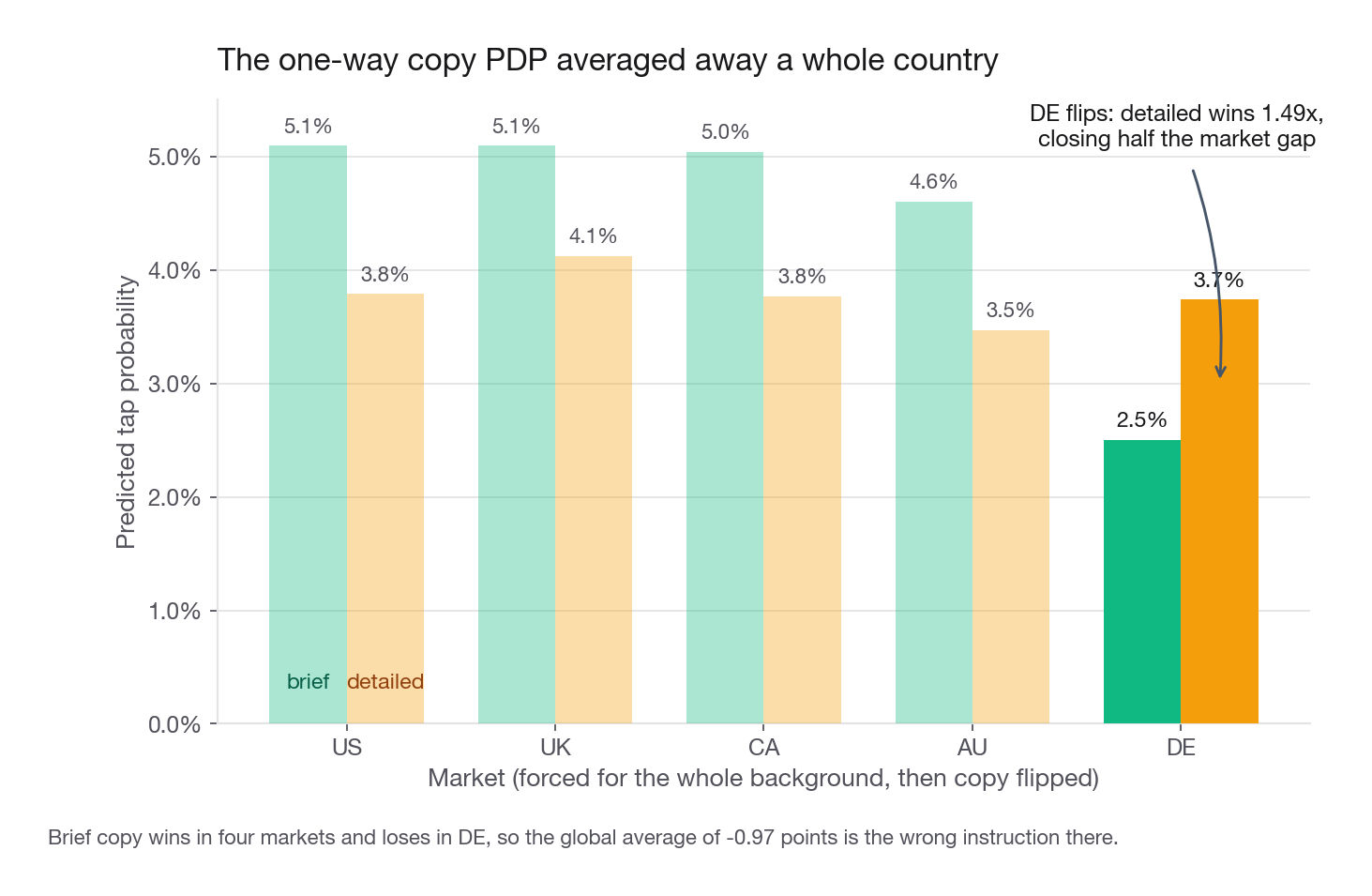
DE n= 603 brief=0.02532 detailed=0.03796 delta=+0.01265 share_positive=1.000The average says detailed copy costs 0.97 points. The individual curves say it costs up to 4.7 points for some members and gains up to 3.0 for others, with 11.5 percent in the gaining group. That is two populations, not noise around a mean, and the split falls almost perfectly on one column. Detailed copy loses by 1.0 to 1.3 points in four markets and wins by 1.3 points in DE, for every member in that slice. The one-way PDP averaged a strong negative across 90 percent of sends against a strong positive across 10 percent and reported the negative: arithmetically correct, operationally wrong for a whole country.
Confirm the segment with a two-way PDP
Grouped ICE tells you which slice disagrees. A two-way PDP overwrites both columns at once, so the answer stops depending on who lands in each market slice of the background.
for m in ["US", "UK", "DE"]:
    scoped = force(background, "market", m)
    b = clf.predict_proba(force(scoped, "copy_length", "brief"))[:, 1].mean()
    d = clf.predict_proba(force(scoped, "copy_length", "detailed"))[:, 1].mean()
    print(f"{m}  brief={b:.5f} detailed={d:.5f} ratio={d / b:.2f}")
US brief=0.05096 detailed=0.03789 ratio=0.74
UK brief=0.05096 detailed=0.04124 ratio=0.81
DE brief=0.02501 detailed=0.03739 ratio=1.49Same story, cleaner construction. DE is the weakest market overall, 3.11 percent on the one-way market PDP against 4.61 percent for UK, and what closes almost half that gap is the format that hurts everywhere else: detailed lifts DE from 2.50 to 3.74 percent, a 1.49x gain, while it costs the US a quarter of its tap rate.
The same sweep finds a second interaction, this time between a lever and a trait. Force days_since_last_listen to a value, flip the greeting inside it, and the named lift runs from 1.14x at three days (4.28 to 4.88 percent) to 1.52x at thirty days (2.54 to 3.85 percent). Thirty is the top of that grid on purpose: it sits at the 97th percentile and below the model's last recency split at 36, so the number comes from a step the model actually resolved, the band from 28 to 36 days, which holds 1,846 real rows. Quote the same ratio at forty-five days and it is arithmetically identical but evidentially empty: only 428 rows sit at 45 or beyond, and the curve has not budged since 36. The one-way greeting PDP reported 1.17x, a weighted average dominated by the active majority, and given only that a reactivation team deprioritizes the name field. The two-way view says the name earns nearly four times as much exactly where that team is trying to win.
Interview tip: If a PDP looks suspiciously flat or suspiciously one-sided, do not report the average and stop. Report "the average says X, so I checked ICE", then say whether the curves agree or split.
Turning a PDP into a product recommendation
A curve is not a recommendation. The PM needs an action, an expected size, and a way to find out if you were wrong. Most candidates produce this:
"The partial dependence plot shows send hour is important and the evening looks best, so we should send in the evening."
Here is the version that gets funded:
"Three things. The hour curve has two humps, a commute shoulder near 4.6 percent and a bigger evening plateau near 5.4 percent, with a flat 3.5 percent trough through the afternoon. We fire the whole batch at 15:00, the worst window in the day. Centered ICE says the evening move helps 99.9 percent of members, so apply it globally rather than by segment. Moving the batch to 20:00 is worth 1.9 points on 320,000 weekly sends, about 6,000 extra sessions a week and 312,000 a year, which at the 0.42 USD of retained margin finance credits to a push-driven session is roughly 131,000 USD a year. I want an A/B test before I believe that, because send hour was randomized here and will not be in production."
Everything that makes the second version better comes from the plots plus arithmetic.
WEEKLY_SENDS, VALUE_PER_TAP = 320_000, 0.42
hour_lift = own_pdp[list(hour_grid).index(20.0)] - own_pdp[list(hour_grid).index(15.0)]
extra = WEEKLY_SENDS * hour_lift
print(round(hour_lift, 5), round(extra), round(extra * 52),
      round(extra * 52 * VALUE_PER_TAP))

de_scoped = force(background, "market", "DE")
de_lift = (clf.predict_proba(force(de_scoped, "copy_length", "detailed"))[:, 1].mean()
           - clf.predict_proba(force(de_scoped, "copy_length", "brief"))[:, 1].mean())
de_extra = WEEKLY_SENDS * 0.10 * de_lift
print(round(de_lift, 5), round(de_extra), round(de_extra * 52 * VALUE_PER_TAP))
0.01876 6004 312203 131125
0.01238 396 8649The DE copy switch is worth about 8,600 USD a year on a tenth of the inventory. Small next to the send time change, and still worth doing because the localization team writes the DE copy either way. More importantly it stops Cadence shipping a global "shorten every push" rule that would have quietly cost DE a third of its weakest-in-class tap rate. Preventing a bad rollout is a legitimate result, and candidates under-report it.
That last item decides which findings are worth reporting at all. Levers are what Cadence controls: send_hour, weekday, copy_length, greeting. Traits are what the member brings: titles_finished, days_since_last_listen, market. A PDP on a lever becomes a change you ship this sprint; a PDP on a trait becomes targeting or a segment definition, never a direct intervention.
The best findings live where the two piles meet, which is what the two-way PDPs produced: copy length is a lever and market a trait, greeting is a lever and recency a trait, and neither interaction appears in a one-way curve. Asked how you would rank a backlog, lever-by-trait interactions are the answer, because they are actionable and targeted at once. The causal caveat is not throat clearing either: send hour was randomized here, so the model recovers the real shape, while the biased log earlier shows how far a real scheduler pushes it.
Interview tip: Close every PDP answer with the experiment. "Hold out 5 percent of the DE list on brief copy for four weeks" turns an observational claim into a plan, and most candidates leave it out.
Common traps
Presenting variable importance as an insight. Importance says a variable matters, with no direction, shape, or units. Fix: use it only to choose which PDPs to build, then present the PDP.
Reading the decision function as a probability. Some libraries return raw model output rather than a rate for tree ensembles, and a y-axis running from -0.26 to 0.19 is not a tap rate. Fix: check the method argument, use the brute force path when you need probabilities, and label the axis with the units you have.
Trusting the flat tail. A PDP that flattens at the top of a range is almost always the model running out of data, not the effect saturating: titles_finished locks at 5.02 percent from seven onward on about 1,000 rows. Fix: overlay support and truncate at the 1st and 99th percentile.
Sweeping one dummy of a multi-level categorical. With five markets this builds rows encoding two markets at once or none, and predictions there are arbitrary. Fix: move the whole dummy block together, or use native categorical support.
Leaving an ID column in the model. High-cardinality identifiers give trees enormous splitting freedom, so notif_id often ranks near the top of importance and its PDP is a jagged line with no shape. Fix: drop identifiers before fitting anything you intend to interpret.
Reporting a one-way categorical PDP as the policy. Brief copy wins by 0.97 points on average and loses by 1.24 points in DE. Fix: check the ICE spread and the share of rows whose sign disagrees with the mean before writing a global rule.
Interpreting a bad model. A model at AUC 0.52 produces beautiful, meaningless PDPs. Fix: report holdout performance in the same breath as the interpretation.
Treating a PDP as a causal estimate. It is a statement about a model fitted to whatever log you had. Fix: name the assignment mechanism, check overlap between the arms, and name the experiment that would settle it.
Quick self-check
Answer each of these out loud, in full sentences, as if the interviewer just asked.
Describe the algorithm in six steps, then say what the y-axis value is on a probability scale and on a half log odds scale.
Your naive rate by recency bucket and your recency PDP agree closely. Give the two conditions that make that expected, and describe a log where they would diverge badly.
A colleague's PDP for
titles_finishedis flat above six. What do you check first, and what do you add to the plot?Two features correlate at 0.7. Explain what goes wrong inside the overwrite step and name one estimand that avoids it.
The one-way PDP says brief copy beats detailed by a point. Name the two plots you build before recommending a global copy rule.
You have the hour curve, the centered ICE, and the two-way copy-by-market PDP. Give the recommendation, the annual arithmetic, and the caveat, in under sixty seconds.
If question 4 or question 5 comes out fuzzy, reread those sections. They are the follow-ups an interviewer reaches for once you have shown you can build the plot.