6.3 Metrics Rapid-Fire
Find the core decision, design, or behavior signal.
Turn the lesson into a concise response blueprint.
Name the trap you would avoid in a real interview.
Use these checkpoints as your reading path before diving into the full lesson.
- 1Why this matters in interviews
- 2The four-beat answer shape
- 3The numbers behind this lesson
- 4Prompt 1: conversions are up, conversio...
- 5Split mix from rate before you say a wo...
Seven prompts, four to six minutes each, and every one of them is really asking whether you know what a number is made of before you have an opinion about it. This lesson is the drill: the exact words to open with, the arithmetic to do out loud, the follow-up the interviewer has queued up, and the second-order point that separates a candidate who has read about metrics from one who has been on the hook for them.
Why this matters in interviews
The back half of a product data science loop is not where you get to think slowly. Five minutes a prompt, and the interviewer scores three things: whether you decompose before you speculate, whether you can hold a business consequence and a statistical fact in one sentence, and whether you volunteer the thing that makes the easy answer wrong.
Metric prompts have a trap built in. Almost every one is worded so the obvious answer sounds responsible. Conversion rate fell, that is bad. Accuracy is 98 percent, that is good. The bug is fixed, so we move on. Each is the answer of somebody who has never defended a number in a review, and the interviewer knows it.
Candidates who fail here are rarely wrong on the statistics. They are wrong on scope: they answer the question as asked instead of the question that was meant. Two versions of the same opening, on the conversion prompt:
The weaker one: "A lower conversion rate is usually bad, so I would look into what changed on the site and check the funnel."
The stronger one: "Conversions up and rate down means sessions grew faster than conversions, so I want the split: which channel added sessions, and did within-channel rates move at all. If they did not, this is pure mix and the product did not get worse. Whether it is good is then a margin question, not a rate question."
That is the whole lesson in one contrast. Earlier sections built the machinery. Here you learn to deploy it in four minutes without notes.
Interview tip: In a rapid-fire round, never open with a hypothesis. Open with the decomposition you are about to run, then the hypothesis. It costs eight seconds and it changes how the rest of your answer is heard.
The four-beat answer shape
Every prompt below fits the same skeleton, so learn it once and the seven are practice reps.
Beat four is the one candidates skip and it is worth the most. Interviewers probe for it anyway ("when would that not be true?"), so volunteering it turns a follow-up you might fumble into evidence you thought ahead.
Timing: about 30 seconds on beat one, 60 on beat two, 90 on beat three, 45 on beat four.
Interview tip: Say the sentence "the answer depends on X, and here is which way it goes for each value of X" rather than the bare word "depends". Bare "it depends" reads as hedging; the conditional version reads as judgment.
The numbers behind this lesson
Two fictional products carry all seven prompts. Kestrel is an online marketplace for home and outdoor goods, roughly 300,000 sessions in four weeks, average order near 56. Junco is a short-video app with about 80,000 daily viewers. Everything numeric below runs off one deterministic generator; later blocks assume sessions and viewers exist.
import numpy as np
import pandas as pd

SEED = 20260419
rng = np.random.default_rng(SEED)
sig = lambda z: 1 / (1 + np.exp(-z))

N = 300_000
weight = np.where(np.arange(28) >= 14, 1.34, 1.0)
day = rng.choice(28, N, p=weight / weight.sum())
post = day >= 14

chans = np.array(["organic_search", "paid_social", "direct", "email_blast", "app_store"])
cp_pre = np.array([0.38, 0.22, 0.26, 0.09, 0.05]).cumsum()
cp_post = np.array([0.28, 0.17, 0.19, 0.22, 0.14]).cumsum()
u = rng.random(N)
channel = chans[np.where(post, np.searchsorted(cp_post, u), np.searchsorted(cp_pre, u))]

country = rng.choice(["US", "GB", "DE", "BR", "IN"], N, p=[0.50, 0.13, 0.12, 0.14, 0.11])
device = rng.choice(["mobile", "desktop"], N, p=[0.68, 0.32])
cbase = {"organic_search": -3.05, "paid_social": -3.70, "direct": -2.55,
         "email_blast": -3.95, "app_store": -4.40}
cty = {"US": 0.22, "GB": 0.10, "DE": 0.05, "BR": -0.30, "IN": -0.45}
z = (np.array([cbase[c] for c in channel]) + np.array([cty[k] for k in country])
     - 0.18 * (device == "mobile") + rng.normal(0, 0.35, N))
converted = (rng.random(N) < sig(z)).astype(int)

sessions = pd.DataFrame({
    "day": day, "period": np.where(post, "after", "before"), "channel": channel,
    "country": country, "device": device, "converted": converted,
    "order_value": np.round(rng.gamma(2.2, 26.0, N) * converted, 2),
    "pages_viewed": 1 + rng.poisson(0.86, N)})

NU = 80_000
eng = rng.normal(0, 1, NU)
minutes = np.round(np.exp(2.55 + 0.42 * eng + rng.normal(0, 1.05, NU)), 1)
viewers = pd.DataFrame({"minutes_per_day": minutes,
                        "likes_per_day": rng.poisson(0.055 * minutes) * (rng.random(NU) < 0.56)})
Prompt 1: conversions are up, conversion rate is down
The prompt, as it lands: at Kestrel, weekly conversions rose but conversion rate fell. Good or bad, and what would produce that?
Beat one. The decision is whether anyone should intervene. A mix effect from new traffic means segment and improve the new cohort. A within-segment decline means find what broke. Different work orders, so separating them comes first.
Beat two. Rate is conversions over sessions. Both are up, sessions more so, which means somebody added sessions converting below the existing blend. That is forced by the arithmetic, not speculation.
per = sessions.groupby("period").agg(sessions=("converted", "size"),
                                     conversions=("converted", "sum"),
                                     gmv=("order_value", "sum"))
per["cr_pct"] = (per.conversions / per.sessions * 100).round(2)
print(per)
sessions conversions gmv cr_pct
after 172022 6280 348538.28 3.65
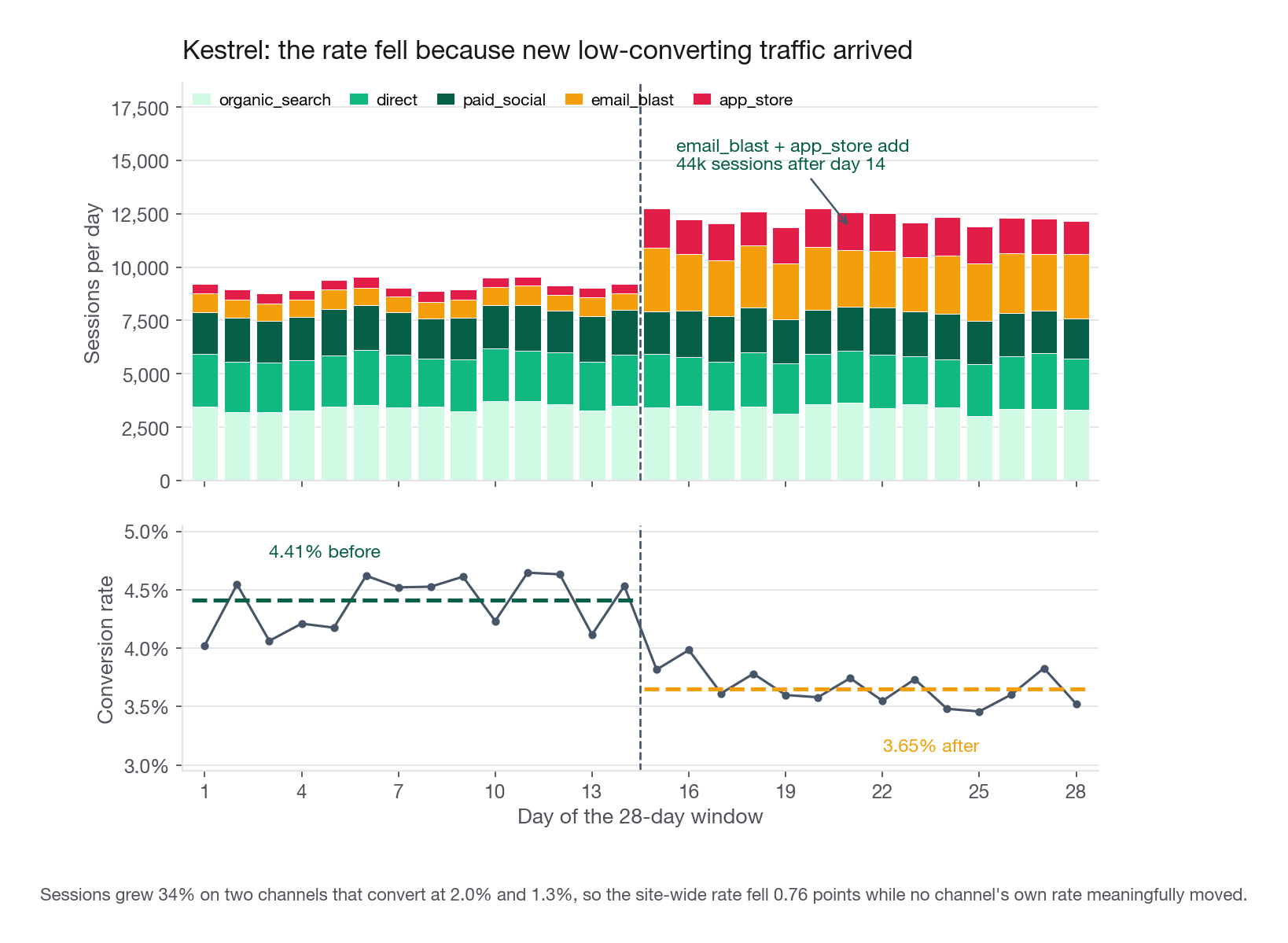
before 127978 5650 323484.63 4.41Sessions up 34.4 percent, conversions up 11.2 percent, revenue up 7.7 percent, rate down 0.76 points. The only question that matters: is the 0.76 mix, or decay?
Split mix from rate before you say a word about causes
The standardized decomposition does this in six lines. Hold within-channel rates at their old values, let only traffic shares move, and whatever gap remains is real per-channel decline.
piv = sessions.pivot_table(index="channel", columns="period",
                           values="converted", aggfunc=["size", "mean"])
n_b, n_a = piv[("size", "before")], piv[("size", "after")]
r_b, r_a = piv[("mean", "before")], piv[("mean", "after")]
s_b, s_a = n_b / n_b.sum(), n_a / n_a.sum()
mix = float(((s_a - s_b) * r_b).sum())
rate = float((s_a * (r_a - r_b)).sum())
print(f"mix {mix*100:+.2f} pp   rate {rate*100:+.2f} pp   total {(mix+rate)*100:+.2f} pp")
mix -0.69 pp rate -0.08 pp total -0.76 ppNinety-one percent of the drop is composition. Per-channel behaviour barely moved. Say that number out loud; it settles the prompt in one sentence. The channel table shows where the traffic came from.
| Channel | Sessions before | Sessions after | Rate before | Rate after | Conversions before | Conversions after |
|---|---|---|---|---|---|---|
| direct | 33,390 | 32,863 | 7.23% | 7.18% | 2,414 | 2,360 |
| organic_search | 48,535 | 47,881 | 4.55% | 4.44% | 2,206 | 2,127 |
| paid_social | 28,148 | 29,083 | 2.48% | 2.51% | 697 | 730 |
| email_blast | 11,494 | 37,868 | 2.18% | 2.00% | 251 | 757 |
| app_store | 6,411 | 24,327 | 1.28% | 1.26% | 82 | 306 |
Two channels tripled: an email campaign to the lapsed list, and a store feature placement. Between them they added 730 conversions, while the rest of the site lost about 100, inside week-to-week noise. Nothing degraded.
Whether it is good is a margin question
Beat three, where most candidates stop too early. More conversions is not automatically good. The two spiking channels added 730 conversions, and at an average order near 56 with a 12 percent take rate that is about 4,900 in contribution over two weeks. Whether the quarter is better depends on what the traffic cost.
| Scenario | Cost of the incremental traffic | Two-week contribution | Verdict |
|---|---|---|---|
| Email to owned list | near zero, sunk | +4,900 | Clearly good, and the rate drop is cosmetic |
| Store feature, unpaid placement | zero | +4,900 | Good, plus a durable install base |
| Paid campaign at 4 per click | about 177,000 | +4,900 | Badly negative, kill it |
That table is the answer. The rate movement told you nothing about whether this was good; cost per incremental conversion told you everything.
One more argument, worth 20 seconds. Attention is the scarce input and conversion is the improvable one. A store-feature visitor converting at 1.26 percent is a segment nobody has optimised yet, and landing them on category pages rather than the home feed is an ordinary fix. Losing the visit is permanent; a low rate on a visit you already have is a backlog item.
The symmetric case, which is the real test
Interviewers love to reverse it: rate up, conversions down. Almost every candidate says that is fine. It is usually bad. You can manufacture a rate improvement by shutting off your worst-converting country, or by making the funnel harder so only high-intent users survive it. Both raise the ratio and shrink the business.
The rule to carry: a ratio movement is uninterpretable until you have looked at numerator and denominator separately. Report all three or you have reported nothing.
Interview tip: When a ratio moves, always answer with three numbers, numerator change, denominator change, ratio change, before you offer a single cause.
Follow-ups to expect: "How would you find the segment?" (acquisition source and geography first, since those carry campaign and placement shocks). "When would you worry?" (when the standardized rate moves, not the raw one). "What if the mix shift is permanent?" (re-baseline the target, because the old rate belonged to a different population).
Prompt 2: average watch time, or share of viewers above a threshold
The prompt: for Junco, compare average minutes watched per viewer per day against the percentage of viewers who watch at least 30 minutes a day. Which do you pick?
Beat one. These are not two ways of saying the same thing. They point teams at different users and produce different roadmaps, and that framing wins the question immediately.
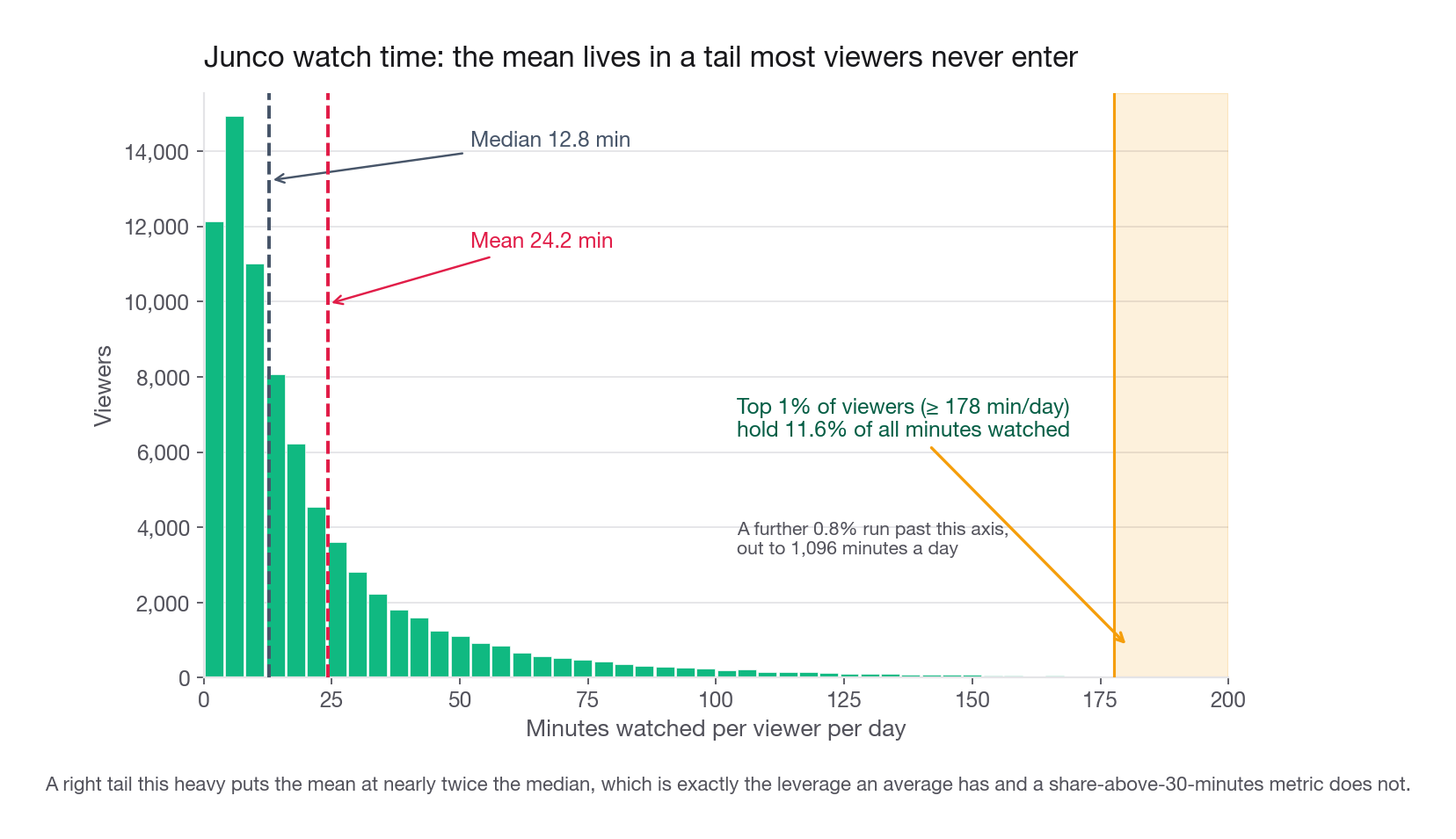
Beat two. An average is a total over a count, so it inherits the tail. A share above a cut point counts a binary event, so the tail is invisible to it. Here the top one percent of viewers hold 11.6 percent of all minutes, which is exactly the leverage the average has and the threshold metric does not.
m = viewers.minutes_per_day
print(f"mean {m.mean():.2f}   median {m.median():.1f}   share>=30 {(m >= 30).mean():.4f}")
mean 24.17 median 12.8 share>=30 0.2276Two changes, and only one of them shows up in each metric
Simulate a feature that lifts already-heavy viewers by 9 percent, and a separate one that adds four and a half minutes to viewers sitting just under the cut.
base_mean, base_share = m.mean(), (m >= 30).mean()
heavy = m >= 45
near = (m >= 26) & (m < 30)
for name, adj in [("power-user feature", np.where(heavy, m * 1.09, m)),
                  ("near-threshold feature", np.where(near, m + 4.5, m))]:
    print(f"{name}: mean {adj.mean()/base_mean - 1:+.2%}  "
          f"share {(adj >= 30).mean() - base_share:+.2%} pts")
power-user feature: mean +4.55% share +0.00% pts
near-threshold feature: mean +0.72% share +3.88% ptsThe power-user feature moves the average by 4.6 percent and the threshold metric by nothing, because it never pushes anyone across 30. The near-threshold feature is the mirror image. Pick a metric and you have picked which roadmap gets funded.
Beat three, the recommendation. For Junco I take the threshold metric and report the average beside it. Ads make revenue roughly linear in total minutes, but growth comes from how many viewers are habitual, and each additional habitual viewer pulls in more creators and their audiences. Making the already-addicted more addicted does not compound that way.
Beat four, the flip. Three conditions change my answer. If revenue concentrates in a small paying tier, the average is the honest metric and the threshold hides the business. If the company is pre-product-market-fit with 4,000 users, the average is right, because the only question that early is whether anyone loves it. And if the threshold sits somewhere unmotivated, the metric becomes gameable, since anyone can nudge users from 29 to 31 minutes with an autoplay change that helps nobody.
Say this part out loud: the threshold has to be derived, not guessed. Fit it where retention curves separate. If viewers above 30 minutes retain at 71 percent into week four and viewers below retain at 34 percent, the line is defensible. A round number is not.
Interview tip: Never propose a threshold metric without saying how the threshold was chosen; an undefended cut point is the fastest way to look junior on a metrics question.
Close with the compromise: threshold metric as the team goal, total minutes monitored beside it, and a guardrail that heavy-viewer minutes may not fall more than 2 percent. That covers the one real risk of a threshold metric, quietly harvesting your best users to move the middle.
Prompt 3: would you test on more than one metric
The prompt: Kestrel is testing a checkout redesign against conversion rate. Would you also test revenue and visits? Pros and cons.
Beat one. Yes, with structure, and the structure is what is scored. An unstructured yes is worse than a structured no.
Beat two, the cost. Each independent test at the 5 percent level carries its own 5 percent chance of a spurious call, and running several compounds the chance that at least one comes back falsely significant.
| Metrics evaluated | Chance at least one false positive | What that feels like in practice |
|---|---|---|
| 1 | 5.0% | Normal |
| 3 | 14.3% | One in seven readouts contains a ghost |
| 5 | 22.6% | You will explain a fake result to a PM this quarter |
| 8 | 33.7% | The readout is now a fishing report |
The standard correction is to divide the level across the family, so four metrics get evaluated at 0.0125 each. It works: the family-level chance lands back at 4.9 percent. It is not free, and quoting the price is what separates a memorised answer from an operational one. At Kestrel's 3.65 percent baseline, detecting a 2 percent relative lift at 80 percent power needs roughly 1.05 million sessions per arm at 0.05. At 0.0125 it needs about 1.49 million, a 42 percent increase.
Now hold that against the traffic, the step most candidates skip. Kestrel runs 300,000 sessions in four weeks, about 10,700 a day, so two arms at 1.05 million each is a 195-day test, and 277 days once you correct. Say those numbers out loud, because they are the more useful finding: at this traffic a 2 percent MDE was never fundable, corrected or not. The correction did not break the design, it exposed that the design was already broken. Quoting the 42 percent premium and stopping there is the textbook half of the answer with the operational half missing.
The fix is to raise the MDE, pool surfaces, or move to a metric with more signal per session. Take the first and price it honestly. A 7 percent relative lift needs about 87,000 sessions per arm at 0.05 and about 124,000 at 0.0125, the same 42 percent premium since it depends only on the alpha change, and that is a 16-day test becoming a 23-day one. There the correction has a real and payable cost: on that surface you drop from roughly five and a half tests a quarter to under four, about 30 percent fewer things you get to learn.
The part most candidates miss: not every metric belongs in the family
The correction applies to the family of claims you would act on, not to every number on the readout. Sort your metrics into three tiers and the whole problem shrinks.
| Tier | Example for the checkout test | Alpha treatment | What a move means |
|---|---|---|---|
| Primary | Session-to-order conversion | Full alpha, 0.05 | Decides ship or not |
| Secondary | Revenue per session, orders per user | Share the corrected alpha | Supports the story, cannot justify shipping alone |
| Guardrail | Payment errors, latency, refund rate | One-sided, uncorrected, generous alpha | Can block a launch, never approves one |
Guardrails should not be alpha-corrected in the same pool, and the reason is worth saying out loud. Correction protects against declaring a win that is not there. A guardrail exists to catch harm, so the expensive mistake runs the other way. Correcting a guardrail makes you slower to notice damage, which is precisely backwards. Guardrails should be framed as non-inferiority checks: is the payment error rate confidently below a tolerance you wrote down before the test?
And every metric needs a mechanism
You cannot legitimately test a metric you have no causal story for. The checkout redesign can plausibly move conversion, revenue per session, and payment errors. It cannot move site visits, because visits happen before anyone reaches checkout. Including visits burns alpha and invites you to explain a random 1.4 percent wiggle as a product effect. No one-sentence mechanism, no place in the family.
Beat four, the flip. Large organisations correctly test on more metrics, for three reasons: the cost of shipping harm exceeds the cost of a missed modest win once the installed base is large, assumed metric relationships need verifying as surfaces multiply, and attribution requires the north star measured inside your own test when six other teams are pushing it too. A 30-person startup with 12,000 weekly users has the opposite calculus: one primary metric and two guardrails.
Interview tip: Answer this prompt with the tier table, primary, secondary, guardrail, rather than the word "Bonferroni"; the correction is one line inside a design, and the design is what is being graded.
Follow-ups: "What if the metrics are correlated?" (the correction is then conservative, and a permutation or a hierarchical procedure recovers power). "What if a secondary metric moves and the primary does not?" (do not ship on it, log it as a hypothesis for a purpose-built test). "How do you stop teams gaming the tier list?" (the tier assignment goes in the test doc before the data exists, with the ship rule).
Prompt 4: our fraud model has 98 percent accuracy
The prompt: Kestrel's refund-abuse model reports 98 percent accuracy. Good or bad? Follow-up: what if missing an abuser costs almost nothing?
Beat one. I cannot judge accuracy without the base rate. If abusive claims are 1.9 percent of the total, a model returning "legitimate" for every request scores 98.1 percent, catches nobody, and required no modelling. Accuracy on a rare event mostly restates the prevalence.
Beat two, the table that ends it. Per million claims at a 1.9 percent abuse rate:
| Policy | Accuracy | Recall | Precision | 1 minus both class errors | Abusers caught | Legitimate customers challenged |
|---|---|---|---|---|---|---|
| Approve everything | 98.10% | 0% | undefined | 0.000 | 0 | 0 |
| Model A, tight threshold | 98.49% | 62% | 60.0% | 0.612 | 11,780 | 7,848 |
| Model B, loose threshold | 95.52% | 86% | 27.9% | 0.817 | 16,340 | 42,183 |
Model B has lower accuracy than doing nothing and is transparently the better classifier. Any cost-blind metric, meaning one that prices a missed abuser and a challenged customer the same, that ranks "approve everything" above Model B is the wrong way to judge the classifier. Use one that charges for both mistakes: balanced accuracy, one minus the two class errors, recall at fixed precision, or area under the precision-recall curve, far more informative than ROC when positives are scarce. Keep the word "classifier" there, because it is load-bearing. The next subsection puts real prices on the two errors, and this ranking does not survive it.
Interview tip: The instant you hear a headline accuracy number, ask for the positive base rate; if the interviewer does not supply one, state the prevalence at which the number becomes trivial and proceed from there.
The follow-up is a cost question, and the honest answer is uncomfortable
Now weight the errors with money. Suppose an unchallenged abusive refund costs 62, being the goods plus handling. A false challenge costs a support touch of about 6, and roughly 18 percent of falsely challenged customers stop buying, with a remaining lifetime value near 240, so about 43 in expectation, for 49 total.
Keep the table per million claims, and keep track of what a million claims would mean here, because that is where this prompt is usually lost. Kestrel books about 155,000 orders a year, and if roughly 4 percent of them become a refund claim that is about 6,000 claims a year. Every figure below gets multiplied by 0.006 before it describes Kestrel rather than a company forty times its size.
def policy_cost(fn, fp, c_fn, c_fp):
    return fn * c_fn + fp * c_fp

rows = {"approve everything": (19_000, 0), "model A": (7_220, 7_848), "model B": (2_660, 42_183)}
for name, (fn, fp) in rows.items():
    print(f"{name:20s} costly-FN {policy_cost(fn, fp, 62, 49):>10,.0f}   "
          f"cheap-FN {policy_cost(fn, fp, 9, 49):>10,.0f}")
approve everything 1,178,000 171,000
model A 832,192 449,532
model B 2,231,887 2,090,907Model B first, because this is where it vanishes from most candidates' answers. On every cost-blind metric above it was the best classifier, and once the errors are priced it is the worst policy in the table under both cost structures, 2,231,887 against 1,178,000 for doing nothing. Its 86 percent recall is bought at 27.9 percent precision, so it writes 42,183 false challenges at 49 each, a bill near 2.07 million to avoid about 1.01 million of abuse loss. Model B only overtakes Model A once a false negative costs more than about 7.5 times a false positive, roughly 369 here against the 62 the business actually loses. A better operating point is not a better policy until you have priced both errors.
Model A next. With a costly false negative it is the cheapest policy per claim, saving about 346,000 per million against doing nothing. At Kestrel's 6,000 claims a year that is roughly 2,100 a year, set against the 90,000 a year of engineering time the model consumes. Make the false negative cheap and approving everything wins outright, before you charge anything for engineering at all. So the model loses in both branches at this volume, and it would need something like 260,000 claims a year, more than forty times what Kestrel generates, merely to break even on its own upkeep.
Interview tip: When someone quotes what a model saves, ask what volume the figure is per, then set it against the fixed cost of owning the model; a per-unit win that never clears the maintenance bill is not a win.
That is the uncomfortable, correct answer to the follow-up: yes, 98 percent accuracy is fine, because the right policy is no model. Notice what settled it. Not the cost ratio, which is the part everyone wants to argue about, but the volume: a per-claim saving multiplied by a small enough number never clears a fixed cost. Self-service refund flows where everyone who finishes gets refunded exist because somebody ran this arithmetic. Their deliberate friction, several steps, a form, a wait, is a self-selection filter: people with a genuine grievance persist, people idly testing the boundary usually do not.
The failure mode that makes this whole analysis expire
Every number above assumes the population is fixed. It is not, because your policy is an input to it. Stop challenging refunds and the profitable move for an abuser gets better, the word travels, and next quarter the abuse rate is 4.5 percent rather than 1.9. Now the cheap-false-negative arithmetic that justified the policy no longer holds, and you found out from the profit and loss statement.
The mitigation to name: keep a challenged holdout, a random fraction of claims that always get verified, so you retain an unbiased read on the true base rate under the current policy, and re-run the cost comparison monthly. Any decision this dependent on prevalence needs prevalence measured, not remembered. The same warning applies to pricing, ranking, and moderation.
Prompt 5: a metric dropped because of a logging bug, now fixed
The prompt: a Junco dashboard showed a sharp drop, engineering traced it to events not being written for four hours, the fix shipped. Is there still analysis to do?
Beat one. Yes, because "logging bug" names the cause, not the blast radius. Nobody's experience changed at the moment, but plenty of systems consumed those tables afterwards, and each is a place where a cosmetic incident became a real one.
Beat two. Work outward from the missing rows.
The messaging item reliably lands well. A win-back email to somebody who watched 40 minutes yesterday reads as a product that does not know you, and the campaign's own metrics get polluted by a cohort it was never built for. Both effects are downstream of a bug that "did not affect users".
Beat three, the arithmetic. Estimate the counterfactual so the series stays readable. A same-hour-last-week ratio takes two minutes.
SELECT h.hour_of_day,
       SUM(CASE WHEN h.day = '2026-04-11' THEN h.plays END) AS during_gap,
       AVG(CASE WHEN h.day BETWEEN '2026-04-04' AND '2026-04-10' THEN h.plays END) AS prior_week
FROM hourly_plays h
WHERE h.hour_of_day BETWEEN 13 AND 17
GROUP BY h.hour_of_day
ORDER BY h.hour_of_day;
Whatever you impute, mark it. An unflagged imputed point becomes a real point three months later when another analyst pulls the table.
Beat four, the flip. If the gap ran days rather than hours, imputation stops being credible and the honest move is to null the window and re-baseline. And if the missing events feed a user-visible surface, a watch history tab, a continue-watching row, it was never only a logging bug, which is the next prompt.
Interview tip: Answer the logging-bug prompt by walking outward, tables, then models, then messaging, then experiments, then reporting; the walk itself demonstrates that you know what consumes event data.
Prompt 6: a metric dropped because of a product bug, now fixed
The prompt: for six hours Junco's recommendation service failed open and everyone got an unranked feed. Fixed. Anything to analyse?
Beat one. Everything from prompt 5 still applies, since a broken product also breaks logging. On top of that, real people had a worse experience, and that tail outlives the incident.
Beat two, the harm estimate. Retention responds with a lag, so the dashboard looks recovered days before the damage lands. Define the exposed cohort precisely, viewers who requested a feed inside the window, and compare their returns against a matched unexposed set from the previous week.
exposed = pd.DataFrame({"returned_d1": rng.random(52_000) < 0.508,
                        "returned_d7": rng.random(52_000) < 0.641})
control = pd.DataFrame({"returned_d1": rng.random(52_000) < 0.547,
                        "returned_d7": rng.random(52_000) < 0.663})
for col in ["returned_d1", "returned_d7"]:
    gap = control[col].mean() - exposed[col].mean()
    print(f"{col}: exposed {exposed[col].mean():.3f}  control {control[col].mean():.3f}  gap {gap:+.3f}")
returned_d1: exposed 0.512 control 0.544 gap +0.032
returned_d7: exposed 0.643 control 0.666 gap +0.023A 3.2 point deficit in next-day return across 52,000 exposed viewers is about 1,660 sessions that did not happen, and the day-7 gap says roughly two thirds of that persists rather than washing out. Put that number in front of the incident review, because it converts "the site was weird for six hours" into a figure that funds the fix that prevents recurrence.
Beat three, the recovery play. Churn caused by a bug is the cheapest churn to reverse: you do not need a better product for these people, you need one more visit under normal conditions. Score the exposed cohort for return probability, take everyone below a cut, and hand the list to lifecycle marketing with a message that names the incident. A generic "we miss you" to someone who left over a broken feed lands badly.
Treat the incident as evidence, with the caveats stated
Here is the part that impresses. A six-hour outage of the ranker is close to an experiment nobody would ever have approved: shipping an unranked feed to everyone. That data is worth mining.
| Question the incident can answer | What you compare | Caveat you must state |
|---|---|---|
| How much engagement does ranking actually produce | Exposed window against matched prior windows | Not randomised, so time of day and day of week confound |
| Which viewer segments depend on it most | Per-segment deficit during the window | Segments differ in when they use the app, so exposure is uneven |
| Which unranked items over-performed | Item-level engagement inside the window | Survivorship: only items that surfaced can be measured |
If heavy viewers held steady on an unranked feed, that is worth a real experiment on exploration weight in the ranker. The incident generates hypotheses, it does not settle them. Saying "we would treat it as an A/B test" sounds careless. Saying "it is observational, time-confounded and unblinded, and here are three hypotheses I would take to a proper test" sounds like someone you would let near an incident review.
Beat four, the flip. If the bug touched trust rather than convenience, an exposed payment field, an incorrect charge, stop the engagement analysis and escalate. And if it ran long enough for behaviour to adapt, the exposed cohort stops being comparable to a prior-week cohort and the estimate needs a difference-in-differences design.
Prompt 7: average or median likes per user, and when they flip
The prompt: is average likes per Junco viewer per day above, below, or equal to the median? Then give a metric where the ordering reverses.
Beat one. Above, confidently. Engagement counts are bounded below at zero, unbounded above, and dominated by a small hyperactive tail, and that shape puts the mean above the median almost every time.
Beat two, the numbers.
lk, mn = viewers.likes_per_day, viewers.minutes_per_day
print(f"likes:   mean {lk.mean():.3f}  median {lk.median():.1f}  zero share {(lk == 0).mean():.3f}")
print(f"minutes: mean {mn.mean():.2f}   median {mn.median():.1f}")
two_plus = (sessions.pages_viewed >= 2).astype(int)
print(f"two_plus: mean {two_plus.mean():.3f}  median {two_plus.median():.1f}")
likes: mean 0.735 median 0.0 zero share 0.706
minutes: mean 24.17 median 12.8
two_plus: mean 0.578 median 1.0Mean likes 0.735, median exactly 0. The median sits on the floor because most viewers like nothing on a given day, while the mean is dragged up by the minority who like 15 things before lunch.
The product consequence, which is the real question
The interviewer cares less about skew than about what each choice does to a roadmap. The mean is a power-user metric, the median is a dormancy metric. Chase the mean and you build depth features for people who already love the product. Chase the median and you must move an inactive majority to take one action, which is harder, slower, and usually the better long-run bet under network effects.
One mechanical trap. A median of 0 is useless for tracking: it cannot move until you have changed half your users, which no single feature does. Use a percentile inside the live part of the distribution, or a share above a floor, "viewers with at least one like today", currently 29.4 percent.
Two metrics where the ordering reverses
You need the mechanism, not just an example. The mean sits below the median when the distribution is left-skewed, which in product data means bounded above with most units near the ceiling.
| Metric | Mean | Median | Why it reverses |
|---|---|---|---|
| Kestrel sessions viewing 2 or more pages, per session, 0 or 1 | 0.578 | 1 | Any binary variable with p above 0.5 has median 1 and mean p |
| Kestrel courier weekly on-time delivery rate | 0.94 | 0.98 | Ceiling at 1.0, most couriers near it, a few bad weeks pull the mean down |
| Junco video playback success rate per session | 0.981 | 1.000 | Almost every session is perfect, rare failures create a left tail |
The binary case generalises: for a 0/1 variable the mean is the proportion and the median is whatever the majority holds, so the two cross exactly at 0.5. That is why "share of sessions viewing more than one page" behaves so differently from "pages per session" despite describing the same behaviour.
Interview tip: When asked for a mean-below-median example, give the mechanism first, bounded above with mass at the ceiling, then the example; the mechanism is what is being tested and the example is just proof you have one.
Follow-ups: "Which would you report to leadership?" (both, with the gap as its own signal, since a widening gap means growth is concentrating in the tail). "What if the mean moved and the median did not?" (the gain came from existing heavy users, fine as a deliberate choice, bad as a surprise). "How would you detect a whale problem?" (track the share held by the top one percent over time; at Junco it is 11.6 percent of minutes, and past roughly 20 percent your averages have stopped describing your users).
Common traps
Answering the question as asked instead of as meant. "Is a lower conversion rate bad" is really "should we intervene, and is the business better off".
Treating a ratio movement as a fact about the product. Until you have split numerator from denominator and mix from rate, you have an observation, not a finding. The fix is one groupby.
Quoting accuracy without the base rate. At 1.9 percent positives, 98.1 percent accuracy is the do-nothing baseline. Convert to a measure that charges for both error types.
Correcting alpha on guardrails. Corrections guard against false alarms, guardrails catch harm, and the costly error runs the other way. Keep guardrails as one-sided non-inferiority checks outside the family.
Adding metrics to a test with no mechanism. No one-sentence causal story means the metric is monitoring, not evidence. Including it burns alpha and invites storytelling.
Calling a logging bug harmless. Missing rows feed models, trigger lifecycle sends, and skew live experiments. The experience changed even though nobody touched it.
Mining a bug as though it were a clean experiment. It is observational, time-confounded, and unblinded. Generate hypotheses from it, do not ship from it.
Picking an unmotivated threshold. Derive the cut from where retention separates; a round number is an invitation to game the metric.
Tracking a median that is pinned at zero. It cannot move on any realistic intervention. Use a live percentile or a share-above-floor instead.
Comparing a per-unit saving against a fixed cost. A model that saves 346,000 per million claims saves 2,100 a year at 6,000 claims. Put both sides in the same units before you claim the model pays for itself.
Assuming yesterday's base rate survives your policy. Stop enforcing and abuse grows. Keep a verified holdout so prevalence stays measured.
Quick self-check
Answer each aloud in under 90 seconds, without notes.
Kestrel's conversion rate fell 0.76 points while conversions rose 11 percent. What two numbers do you need before you say whether this is good, and what would make you call it bad?
A feature raises average minutes by 4.6 percent and share of viewers above 30 minutes by exactly zero. What did that feature do, and which team should be worried?
You are testing four metrics at a corrected level of 0.0125 instead of 0.05. What does that cost in sample size, what does it cost in calendar days at 10,700 sessions a day, and at what point do you tell the PM the test is not worth running at all?
Your model has 98.5 percent accuracy and the do-nothing baseline has 98.1 percent. Name two metrics that would separate them honestly, the two prices you need before choosing an operating point, and the volume figure that decides whether the model is worth owning at all.
A four-hour logging gap is fixed and a six-hour ranker outage is fixed. Name three systems that consumed the missing rows, and the one caveat you must state before treating the outage as evidence.
Junco's mean likes per viewer is 0.735 and the median is 0. Give a metric where the ordering reverses, state the mechanism, and say which of the two belongs on a team's goal sheet.
If any answer ran long, the missing piece is almost always the decomposition. Say what the number is made of first, and the rest follows.
Premium Content
Upgrade to Premium to unlock this lesson and all other premium content.